查看完整案例

收藏

下载
01.迷宫
The Maze
「阿那亚六期海边市集」是一处社区内部超市,基地由一栋公寓的六间底商店铺打通而成。我们最初踏勘时,被基地现场各种里出外进的剪力墙、高低参差的结构梁和砌块墙上大大小小的预留洞口搞得晕头转向、如入迷宫。与同等规模超市常见的整齐柱网大空间相比,这样拥塞曲折的环境显然不太适合超市这种目的性消费业态。于是,我们设计工作的首要任务便是为基地梳理出一个明确的空间秩序,以便合理布置功能区并引导顾客动线。
“Aranya Seaside Market” is a supermarket inside a residential community. The original site was composed of six street retail stores of an apartment. When we visited the site for the first time, we were confused by the various shear walls, structural beams of varying heights, and reserved holes on the block walls in the site, which made us feel like we were in a maze. Compared to supermarkets of the same size which typically have large-scale space divided by regular column grids, such a crowded space is obviously unsuitable for supermarket shopping. Therefore, the first task of our design work is to find out a clear spatial logic for the site in order to rationally arrange the functional areas and guide the circulation of customers.
▼海边市集位于一栋社区公寓楼的底层,Seaside market is located on the ground floor of a community apartment©刘松恺
02. 围室
The Rooms
在行走体验中混乱林立的剪力墙,在平面上实际有着清晰的结构逻辑:它们的位置与折角来自于楼上公寓房间的轮廓和墙角,在首层暗示出一系列居住尺度的「格式塔闭合(Gestalt Closure)」。这为我们提供了一种有趣的空间操作可能性——把「公共功能」与「居住尺度」并置:社区超市作为服务居民的公共场所具有一定社交性,其内部空间却是顾客们自己居所房间的尺度。我们想,这种「熟悉的陌生感」或许能成为令这间社区超市区别于一般城镇超市的空间契机。
▼原始平面图,Original site plan©Studio NOR
The chaotic rows of shear walls actually have a clear structural logic in term of layout: their positions come from the apartment rooms upstairs, suggesting a series of residential-scale “Gestalts” on the ground floor. It provides us with an interesting possibility of spatial operation – juxtaposing “public functions” and “residential scale”: as a public place serving residents, community supermarkets have a certain degree of sociability, whereas its space is in the scale of the customers’ own apartment rooms. We thought that this “familiar sense of strangeness” might be a spatial opportunity that differentiates this community supermarket serving residents from usual urban supermarkets that serve for all public citizens.
▼市集相互连通的“房间”与上方公寓单元的空间尺度相似,Interconnected “rooms” of the market are similar to the apartment units upstairs in spatial scale©刘松恺
▼高度 2.2m 的灰色墙裙,2.2 meters high grey wainscot©刘松恺
▼与墙裙等高的连续白色墙面围合出“房间”边界,Continuous white walls above the wainscots define boundary of the room©刘松恺
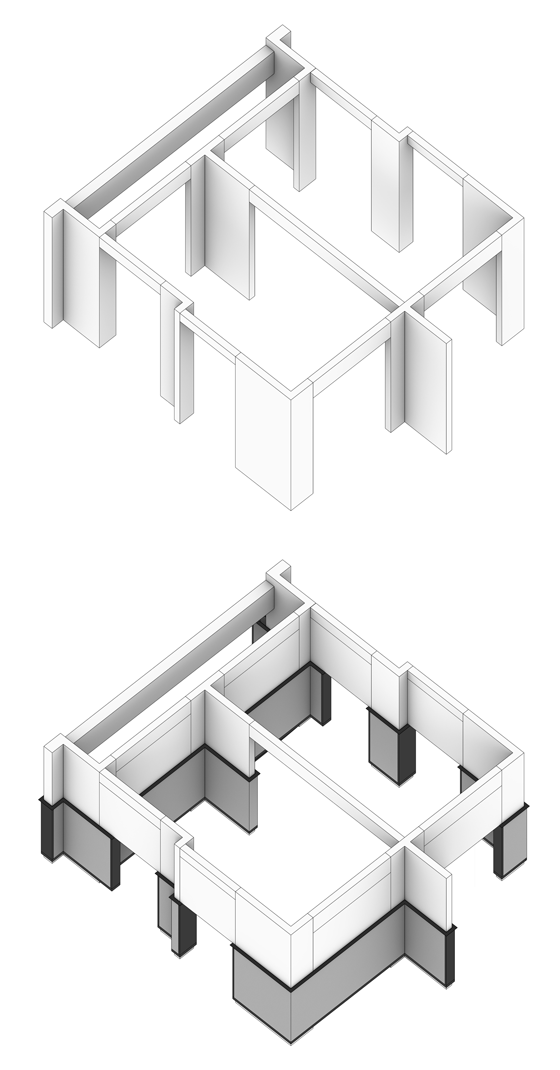
于是,我们干脆强化基地既有的结构-空间逻辑,根据剪力墙的折角连线,将面客区分隔成一间间与楼上公寓尺度相近的、互相连通的「房间」,并在每个「房间」内分别布置一种功能或售卖一类货物。我们沿所有室内墙面设置了 2.2m 高的灰色墙裙,将原本高低各异的结构洞口统一压低至这些墙裙顶部挑檐位置,令墙裙上方呈现出连续等高的白色墙面,在视觉上如同被墙裙撑起的「深梁」,强势围合出每个「房间」的边界。
▼围合房间轴测示意图,Axonometric of enclosed room©Studio NOR
Therefore, by connecting the shear walls, we simply strengthened the existing structural-spatial logic of the site and divided the shopping area into interconnected “rooms” that are similar in size to the apartments upstairs. Every “room” has a different function or sells a different type of products. Besides, we introduced a 2.2m-high gray wainscot to all indoor walls, and lowered the original structural openings of different heights to the overhangs at the top of the wainscot, so that a continuous white wall of equal height appears above, which visually looks like the “deep beams”, strongly defining the boundaries of each “room”.
▼与墙裙等高的连续白色墙面围合出“房间”边界,Continuous white walls above the wainscots define boundary of the room©刘松恺
▼与墙裙等高的连续白色墙面围合出”房间“边界,Continuous white walls above the wainscots define boundary of the room©刘松恺
▼墙裙顶部的装饰灯带向上打亮墙面,Light strips on the top of the wainscot illuminate the walls upwards©刘松恺
03.穿墙
The Shelves
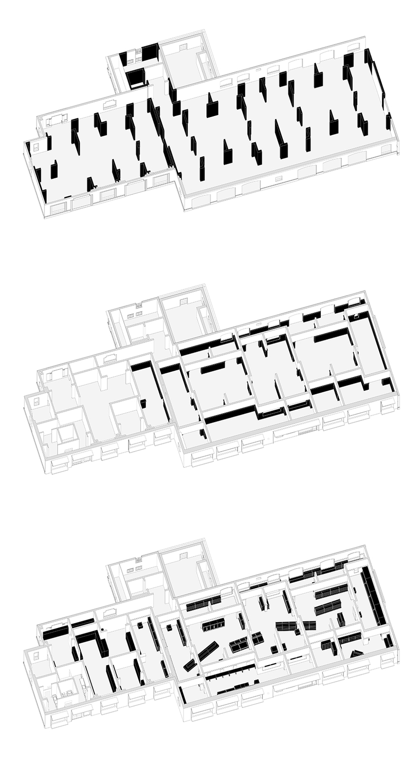
根据业主要求,顾客出入超市需共用一个出入口,这意味着室内购物动线需呈环形设置。然而「围合房间」形成的四通八达的「纵射式(Enfilade)」平面虽然为基地确立了清晰的空间秩序,却缺少单向动线引导性。我们决定通过货架的布置来完成这一任务。
▼概念生成过程,Concept diagram© Studio NOR
According to the requirements of the client, there would be only one shared entrance and exit of the supermarket, which means that the indoor customer circulation needs to be set up in a ring. However, although the “enfilade” plane formed by the “enclosed rooms” makes every space unit lead to all directions and establishes a clear spatial order for the base, it lacks the guidance of one-way circulation. So, we decided to guide the circulation by designing the layout of the product shelves.
▼货架与“房间”的正交网格之间呈一定角度旋转,The shelve are rotated at a certain angle to the orthogonal grid of the room©刘松恺
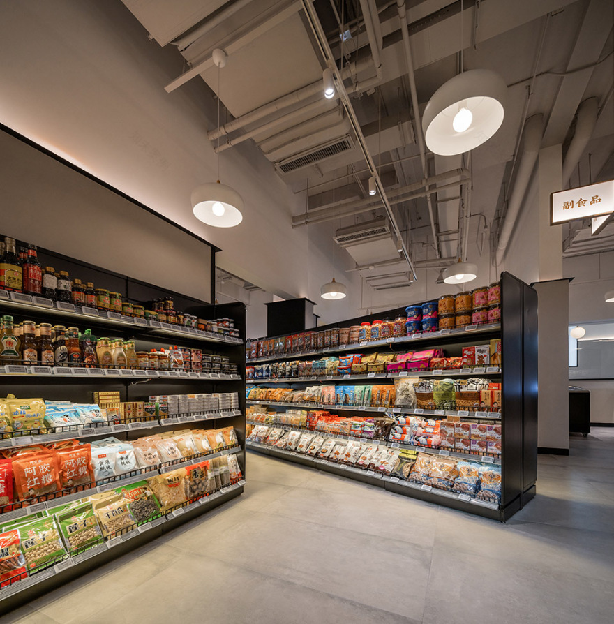
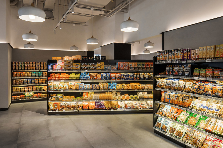
与通常超市采用的在开敞空间里成排阵列的货架不同,我们将大部分货架及设备紧贴每个「房间」的墙面布置,在「房间」中央则只留下引导和分流顾客动线用的少量家具。其中,对主动线引导最为强烈的三组家具,被设置在超市中央三个大「房间」相连的门洞处。它们均为线性延展的条形货架,在平面上与「房间」的正交网格呈一定角度旋转,按购物动线的行进方向,从上一房间直接「穿墙」进入下一房间,借由平面旋转带来的强化透视效果,既充分展示了架上货品,又层层深入地诱导顾客前行。
Different from the ordinary supermarkets, where the shelves are usually arranged row by row in open spaces, we arrange most of the shelves and equipment against the walls of each “room”, leaving only a small amount of furniture and open space in the center to guide the customers. Among them, three groups of shelves are set up at the door openings connecting the three largest “rooms” in the center of the supermarket. They are all extending strip shelves that are rotated at a certain angle with the orthogonal grid of the “room” on the plane. According to the direction of the shopping circulation, the shelves directly “pass through the wall” from the previous room to the next room. The enhanced perspective effect brought by plane rotation, not only makes the goods on the shelves be well displayed, but also induces customers to move forward.
▼货架与“房间”的正交网格之间呈一定角度旋转,The shelve are rotated at a certain angle to the orthogonal grid of the room©刘松恺
▼货架穿房而过,The shelves pass through the room©刘松恺
▼货架与“房间”的正交网格之间呈一定角度旋转,The shelve are rotated at a certain angle to the orthogonal grid of the room©刘松恺
这样,在货架布局与十三间面客区「围合房间」的配合下,原本迷宫式的基地被梳理成一所空间逻辑清晰、使用功能完备、动线明确的社区超市。顾客无需借助平面导视系统,仅通过空间本身的暗示,就可以顺畅地完成从入店、存包、取用购物篮/车、分品类购物,到收银结账、归还购物篮/车直至离店的全过程。
In this way, with the cooperation of the well arranged shelves and thirteen “enclosed rooms” of the shopping area, the original maze-like site was reformed into a community supermarket with clear spatial logic, complete functions, and clear shopping circulation. Customers do not need to rely on the visual identity system, but only through the hints of the space itself, they can smoothly complete the process from entering the store, depositing bags, taking shopping baskets or carts, shopping by category, to checking out, returning shopping basket or cart and leaving the store.
▼线型货架延展引导动线,The shelves guide customer circulation©刘松恺
▼顾客进入市集,The entrance©刘松恺
▼入口存包处,The entrance locker©刘松恺
▼花店,Flower shop©刘松恺
▼购物区空间自身的暗示引导购物动线,The hints of the space itself guide the shopping circulation©刘松恺
▼收银区,Cashier©刘松恺
04.开放而亲近的社区
The Open and Welcoming Community
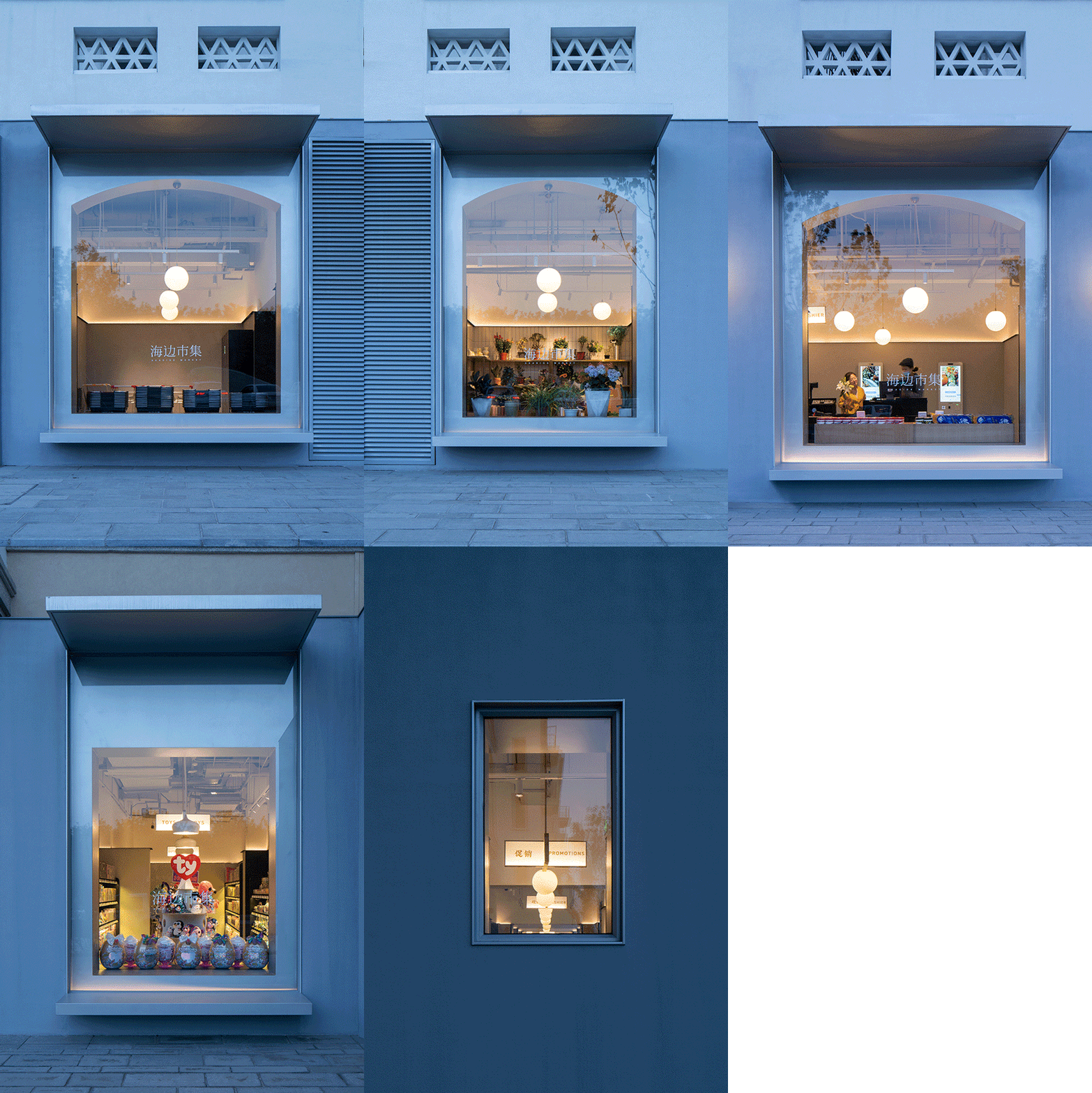
我们希望延续超市室内对公寓居住尺度的映射,让作为社区底商的超市门头也和谐融入整个公寓楼的外立面。
我们以一道矮于原建筑裙房高度的灰色墙体直接罩贴在立面外,形成一面室外「墙裙」,以此对原裙房的立面比例进行更加近人尺度的修正。
原建筑的拱形门窗洞口被完整保留,气候边界则从窗洞处外推至新墙上的矩形玻璃罩。
这些扩大的玻璃罩在视觉上放大了原有窗洞,在不影响公寓楼西班牙复兴风格(Spanish Revival Style)立面的古典节奏的前提下,赋予了超市更加轻盈和开放的社区表情。
考虑到超市位于人流量较大的街角,我们特地在新窗下方设置了挑板座凳供往来行人休息,并在窗户上方提供挑檐遮蔽。
We try to make the entrance of the supermarket be harmoniously integrated into the facade of the entire apartment, as an extension of the living scale implication from the supermarket interior. We used a gray wall that is lower than the height of the original building’s podium to cover the facade, forming an outdoor wainscot to modify the proportions to a more human scale. The arched door and window openings of the original building were fully retained, and the climate boundary was pushed out from the window openings to the rectangular glass cover on the new wall. These glass covers visually enlarge the original window openings, giving the supermarket a lighter and more open community expression without affecting the classical rhythm of the Spanish Revival Style facade of the apartment building. Considering that the supermarket is located on a street corner with heavy traffic, we specially set up cantilevered benches under windows for pedestrians to rest and provided overhanging shelter above the windows.
▼市集立面更新与公寓原有风格的呼应,Facades of the seaside market respond to the apartment in style©刘松恺
▼立面连续的拱形窗洞口,Continuous arched window openings©刘松恺
从街对面的沙丘美术馆望向六期海边市集,视线越过三三两两在窗前座凳上小憩的路人,可以看到拱形洞口内一间间功能各异的「房间」内,人们各自忙碌:一位年轻女孩刚刚存好手袋、提起购物篮;一位阿姨饶有兴致地打量着花店新到的百合;一对中年夫妇正试图将儿子拖离玩具展柜;两位老先生在自助收银台前研究付款……每个窗洞中、每个「房间」里,同时上演着充满烟火气息的不同场景,又被连续的灰色墙裙统一包裹在柔和的球灯光晕中。
Looking across the street from the Dune Art Museum to the VI Seaside Market, through the passers-by having a rest on the benches in front of the windows, one can see people busy in the “rooms” with different functions in the arched openings: A young girl has just stored her handbag and lifted her shopping basket; an aunt is looking at the newly arrived lilies from the flower shop with interest; a middle-aged couple is trying to drag their son away from the toy display cabinet; two old gentlemen are checking out in front of the self-service machine… In every window and every “room”, different lively scenes are performed at the same time, uniformly wrapped by continuous gray wainscot in the soft halo of ball lights.
▼供来往行人休息的挑板座凳与挑檐,Cantileved benches and roof overhangs are provided for pedestrains©刘松恺
我们希望这间超市在为居住区提供商业配套服务之余,能够通过它的开放态度和亲近尺度,在迎来送往间促进居民交流、培养社区凝聚力,进而成为一处让人们产生联系、甚至发生故事的公共舞台——或许会有人在随货架指引斜穿「房间」时、在微微拉长的动线与时间中,跟随空间转一下身,暂时把视线从货品上移开,透过身旁洞口,偶然瞥见隔壁「房间」里的那个他/她。
We hope that in addition to providing service to the community, this supermarket can promote residents’ communication and cultivate community cohesion through its open attitude and human scale. And then become a place where people can connect to each other, or even a public stage where stories take place. When someone follows the guidance of the shelves and walks across the “room”, turns around following the space and temporarily takes eyes away from the goods and looks through the space, he might accidentally catch a glimpse of a he or she in the “room” next door.
▼市集窗户映射社区一隅,Reflection of the surroundings©刘松恺
▼每个窗洞里都呈现不同的购物场景,Each window shows a different scene©刘松恺
▼平面图,plan©Studio NOR
▼轴测示意图,axonometric©Studio NOR
项目名称:阿那亚文创小镇海边市集
设计方:不也设计工作室
项目设计 & 完成年份:2019-2021
主创及设计团队:姜伯源 刘中元 王静雯 杨硕
项目地址:中国 河北省 秦皇岛市
建筑面积:700 平方米
摄影版权:刘松恺
合作方:照明顾问:张宸露
施工图深化:上海呈煜空间设计有限公司
施工方:北京万丹绘建筑装饰工程有限公司
客户:秦皇岛阿那亚房地产开发有限公司
Project name:The Aranya Cultural and Art Town Seaside Market
Design:Studio NOR
Website:
Design year & Completion Year:2019-2021
Leader designer & Team:Boyuan Jiang,Zhongyuan Liu,Jingwen Wang,Shuo Yang
Project location:Qinhuangdao,HeBei,China
Gross Built Area (square meters):700㎡
Photo credits:Songkai Liu
Partners:Lighting Consultant: Chole Zhang
Construction Documents Consultant:Shanghai c-yuspace Design Co.,Ltd
Construction:Beijing Wandanhui Architecture and Decoration Engineering Co.,Ltd
Clients:Aranya
客服
消息
收藏
下载
最近


