查看完整案例


收藏

下载

翻译
Why did we stop playing? The client, a young entrepreneur, finds the action of playing not only as an entertainment, but as a social instrument. He seeks to point out the importance of ‘playing’ as an activity inherent in culture, and the main tool for the development of thought, memory, reason and social relations.
METAMORFO is the result of an adventure. A fun place that offers a specialized area of children's games, a board games store with exhibition, tournaments, classes and display spaces. A place to play, which seeks to include adults, families and children. The project answers to the ambitious need to achieve this meeting space, flexible and representative of the brand, with a minimal budget. The intervention focuses on three design strategies: open-plan organization, maximum storage capacity and material contrast.
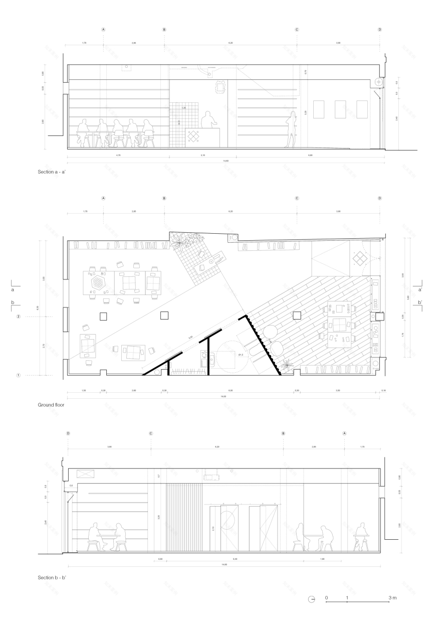
Open plan. The site is located on the ground floor of a residential building built in 1994. It is placed between two retail spaces and has a width of 6m. In addition, it has direct access from the street throughout its north facade and has two narrow window openings towards the south inner courtyard.
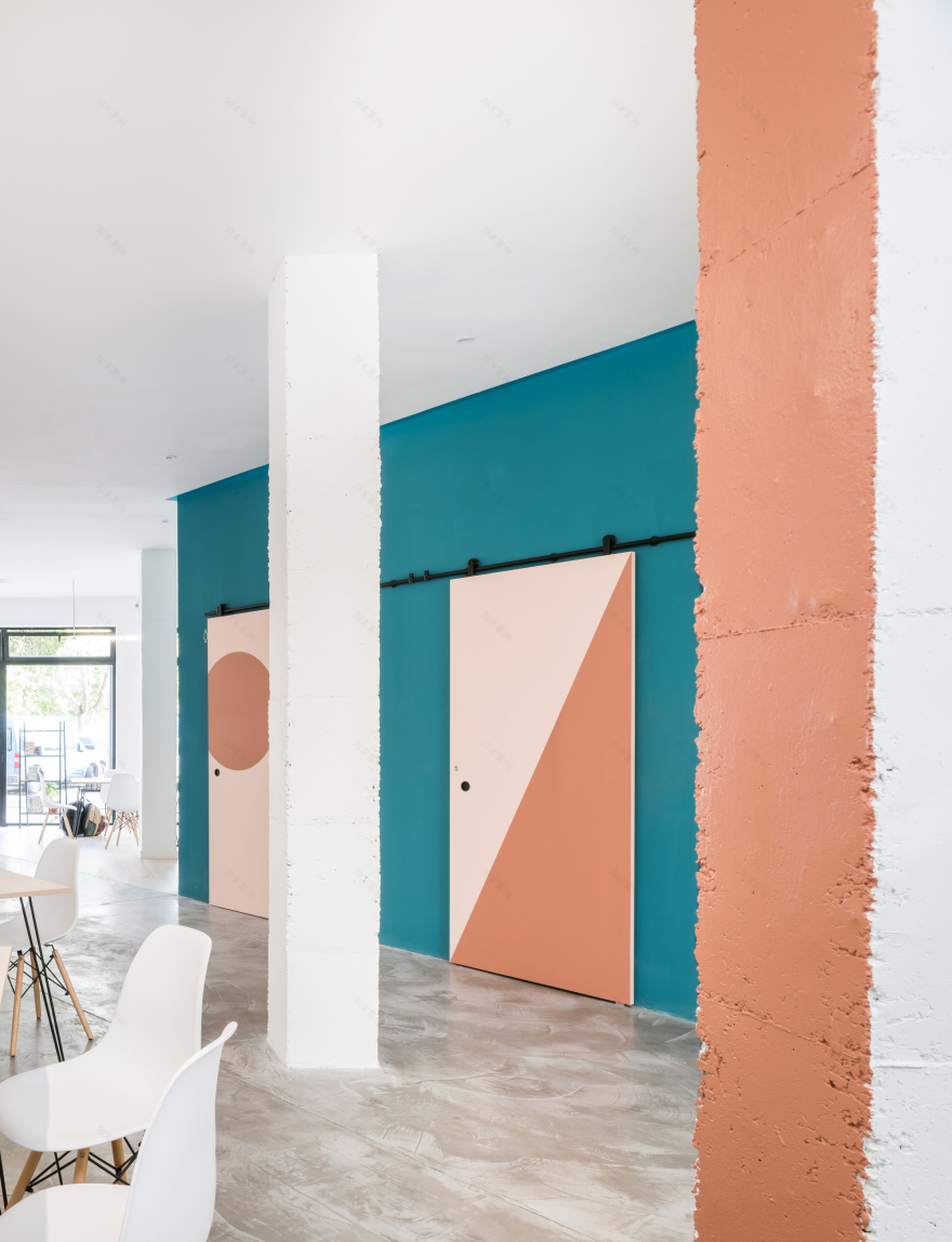
The first step was to avoid subdividing walls, to let natural light reach all corners. The revamped space mediates with a strong geometrical insertion, that contains the private spaces and allows an overall vision of the space from the entrance, and the counter. Once accessed, a high open-plan space unfolds. A main space divided, but not separated, into three large ambiences: the exhibition area and children's games at the entrance, a compressed space where the counter is located and, finally, the board game and tournaments area. Private spaces can’t be seen, but can be imagined. The intervention is open to incorporate a series of curtains to frame the main space according to the needs of each event.
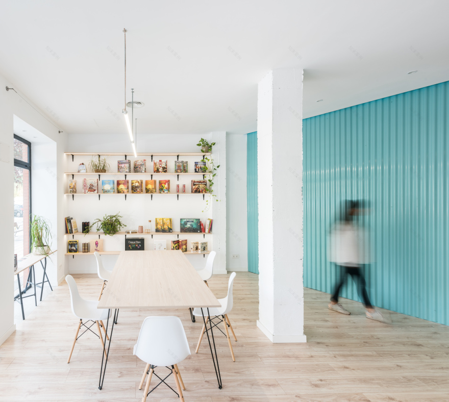
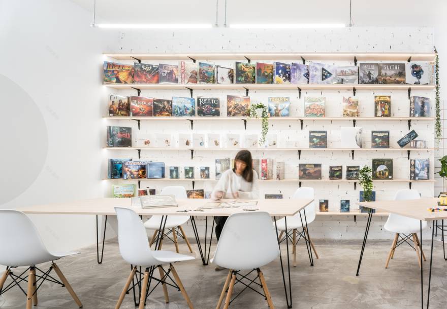
Storage. One of the premises was to have as much storage capacity as possible. For that purpose, an equipped perimeter wall benefits from the store’s exhibition layout, allowing to implement shelves in all its height and to keep the main space clear and open. In addition, the box of private spaces is minimized to comply with the regulations and provide the space with an accessible bathroom and a closed storage room.
Material Contrast. The intervention explores material confrontations. It clarifies the space between served and servant spaces by the selection of simple materials to achieve maximum visual impact. Keeping the low budget, the constructive palette had to organize the space and solve as many technical issues as possible.
The space is organized by three singularities: the colour box, the island of tiles and the wooden floor. All inserted in a pure neutral space that signifies them, and identifies each of the uses. Each event reveals its own distinct colour, adopted today by the intervention.
客服
消息
收藏
下载
最近


