查看完整案例

收藏

下载
在店铺设计充满感官刺激与猎奇打卡的当下,消费者逐渐感到倦怠,如何让店铺回归平和的状态,摒弃过度的设计与夸张的表达,塑造环保且能够长久留存的购物空间,让商业产生可持续的有机更新,是一个值得思考的问题。
FireBird 是一个经营了二十多年的服装店铺。距上一次装修已过去十年之久,过往的装修风格已经无法满足消费者对购物环境体验感的需求。“重新装修”并不意味着要推翻所有过往,在过去十年店铺的装修是其店铺的一种标志性符号,但也带来消费者审美的疲劳。所以我们需要控制对品牌语言延续的“度”,思考如何在延续中表达新的态度。
In an era where store designs are filled with sensory stimuli and quirky attractions, consumers are gradually growing weary. How can we bring stores back to a state of calm by eliminating excessive design and exaggerated expressions? How can we create eco-friendly and enduring shopping spaces that allow businesses to achieve sustainable organic renewal? These are questions worth contemplating.
Fire Bird is a clothing store that has been in business for over 20 years. It’s been a decade since its last renovation, and the previous design style no longer meets consumers’ expectations for an engaging shopping environment. However, “renovation” doesn’t mean discarding everything from the past. The store’s design over the past decade has become a signature symbol, but it has also led to aesthetic fatigue among consumers. Therefore, we need to find the right balance in carrying on the brand’s language while introducing a new attitude through the renovation.
▼门头概览,storefront ©️ 汪敏杰
有机更新,重塑品牌与消费者的关系
Organically updating and reshaping the relationship between brand and consumers
此次设计我们将 FireBird 店铺的“重装计划”目标设定为:延续中更新,在简洁的基础框架之下,材料、美学上能经得起时间洗礼。或许下次装修又将是十年之后。
For this redesign, the goal for Fire Bird’s “revamp plan” is renewal in continuity. Under a simple framework, the materials and aesthetics can withstand the test of time, and thus the next renovation might be another ten years down the road.
▼店内概览,interior overview©️ 汪敏杰
店铺的一楼主要是服装展示区和收银空间。简洁的线条和利落的布局,能够让消费者更加专注于服装产品本身,同时也为店铺的陈列和展示提供了更多的可能性。
The first floor of the store is primarily for clothing displays and the cashier area. The clean lines and neat layout allow consumers to focus more on the clothing itself, while also providing greater flexibility for the arrangement and display of products.
▼一楼服装展示区和收银空间,clothing displays and the cashier area©️ 汪敏杰
可持续材料的重生 Rebirth of sustainable materials
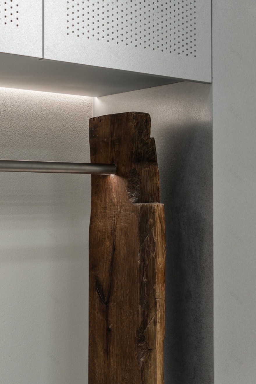
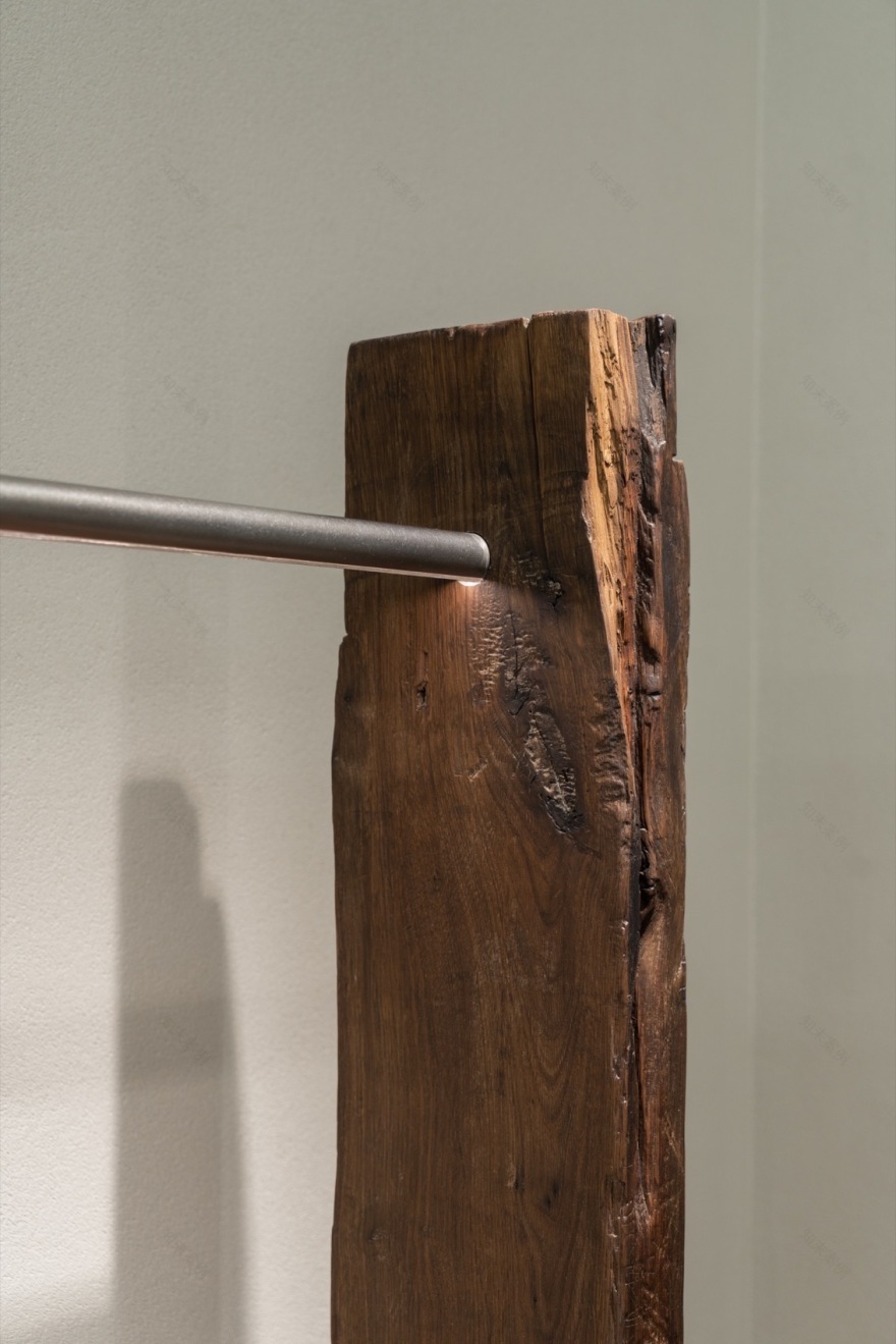
现象设计坚持环保可持续的观念,在商业体实践中,探寻回收材料循环再利用,赋予回收材料新的功能性与艺术性,成为空间中不可或缺的组成。大门与货架使用的是回收来的老木头,通过一些专业处理,让老物件拥有了新的生命。
▼回收的木梁,Recycled wooden beams
Xianxiang Design adheres to the principles of environmental sustainability. In the practice of business, it constantly explores the reuse and recycling of furniture and materials, and makes recycled materials an indispensable part of the space by giving them new functions and artistic value.
▼老木梁,Recycled wooden beams©️ 汪敏杰
▼木板,Recycled wooden board©️ 汪敏杰
▼衣架细部,rack details©️ 汪敏杰
引导性动线,自然向前 Guided pathways, naturally forward
一楼的中心位置是收银空间。半开放式的布局令这个区域更像是一个打开的“盒子”,跳脱于原场地的小空间,经过嵌套、转折、开合,呈现出不同角度多维的视觉体验。整个空间中“粗粝与光滑”“新与旧”类似的冲突无处不在,让消费者获得直观而丰富的体验,拥有不断向空间的各个区域进行探索的欲望。
At the center of the first floor is the cashier area. The semi-open layout makes this area more like an open “box,” breaking away from the original small space. Through nesting, turning, opening and closing, it presents a multi-dimensional visual experience from different angles. Throughout the space, contrasts such as “roughness and smoothness” and “new and old” are ubiquitous, offering consumers a rich and direct experience while stimulating their desire to explore every corner of the space.
▼收银台,counter©️ 汪敏杰
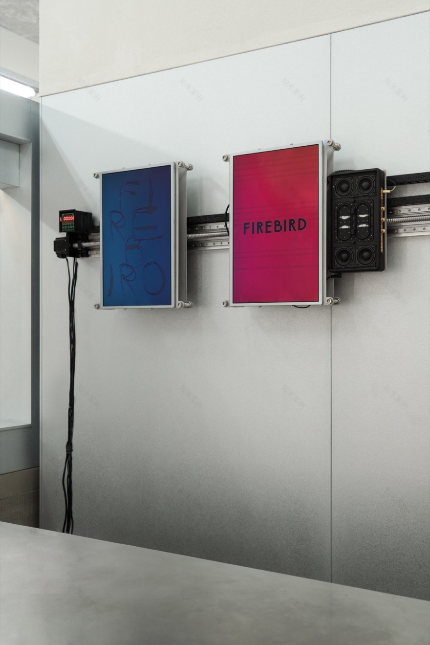
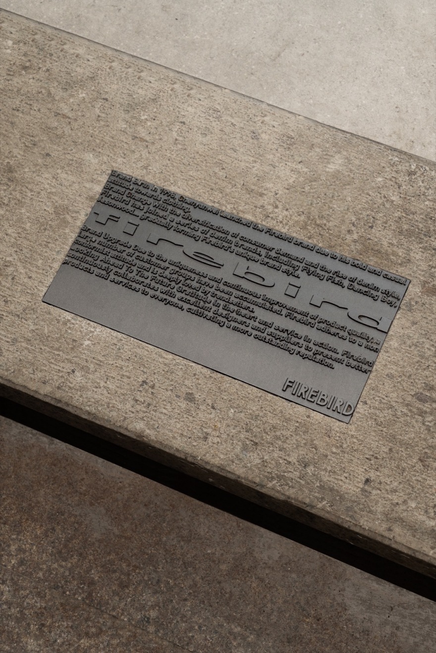
▼屏幕装置与标牌,screen devices and logo©️ 汪敏杰
传统的镀锌板经过精细的加工,有着工业的时尚感,与服装店的定位相契合;水泥板则营造出质朴的氛围;老木头有着天然的温暖质与触感。不同质感、形态与肌理的材料丰富了空间体验的层次感。
Traditional galvanized sheets, finely processed to exude an industrial chicness, align with the positioning of the clothing store. Cement slabs create a plain atmosphere, while the old wood offers a natural warmth and touch. The varying textures, sizes, forms, and grains of the materials enrich the spatial experience with layers of depth.
▼工业的时尚感,an industrial fashion atmosphere©️ 汪敏杰
▼一瞥,a glimpse©️ 汪敏杰
▼镀锌板,galvanized sheets©️ 汪敏杰
▼楼梯,staircase©️ 汪敏杰
过去店铺二楼的人流量较差,在此次的设计中,我们保留了楼梯主体结构,但将其表面材质和颜色进行了调整,同时增加了一些细节装饰,以提升楼梯空间的互动性与吸引力,大大增加了二楼的客流量。我们在墙面、转角处设置了多个大小不一的屏幕艺术装置,增加了视觉体验。
In the past, the store’s second floor struggled to attract foot traffic. In this renovation, we retained the main structure of the staircase, adjusted its surface materials and colors, and added some detailed decorations to enhance the staircase’s interaction and appeal, significantly increasing the flow of customers to the second floor. We set up a number of screen art installations of different sizes on the walls and corners. The screen content can be replaced, adding to the visual experience.
▼屏幕艺术装置,screen art installations©️ 汪敏杰
▼二层楼梯间,upper floor stiarwell©️ 汪敏杰
精致感通常代表着一种高度打磨和雕琢的完美状态,但往往会令人产生距离。在新的空间中,我们选择性地保留了墙面、顶面和楼梯原有的“痕迹”。暴露的建筑材料提醒着人们空间建造施工“未完待续”的状态,拉近了空间与消费者之间的距离。
Refinement often represents a state of perfection that is highly polished, yet this can create a sense of distance. In this new space, we selectively preserved the original “traces” on the walls, ceilings, and stairs. The exposed building materials remind people that the construction process is “a work in progress,” narrowing the physical distance between the space and its customers.
▼二层室内概览,upper floor space overview©️ 汪敏杰©️ 汪敏杰
▼平面示意图,Floor plan diagram ©️ 现象设计
项目名称:FireBird 男装店
位置:台州
面积:约 180㎡
主创设计:元立俊
设计团队:黄美凤
施工:杭州久维装饰工程有限公司
标识:骁勇标识
材料:镀锌板、水泥板、回收木头
拍摄:汪敏杰
客服
消息
收藏
下载
最近


