查看完整案例

收藏

下载
山岩空谷有回音
Echoes in the Mountain Valley
红,被视作多种红颜色的集合与统称,是唐代以后的事。唐代之前,红仅是数种红颜色里的一种。不同的红色,有不同的字与义,其来源与属性大有不同,色彩浓淡及色调冷暖略有区别。出现在商代甲骨文中的意味着红色的字,至少有三个:赤、丹和朱。
Red, viewed as a collection and general term for various shades, became popular during the Tang Dynasty. Before that, red was just one of the many shades of red. Different reds had different meanings, origins, and attributes. They varied slightly in intensity and warmth. As early as the Shang Dynasty, at least three characters for red appeared in oracle bone script: “Chi”, “Dan”, and “Zhu”.
▼空间概览, overview of the space©吴辉
赤,观念
Chi – Concept
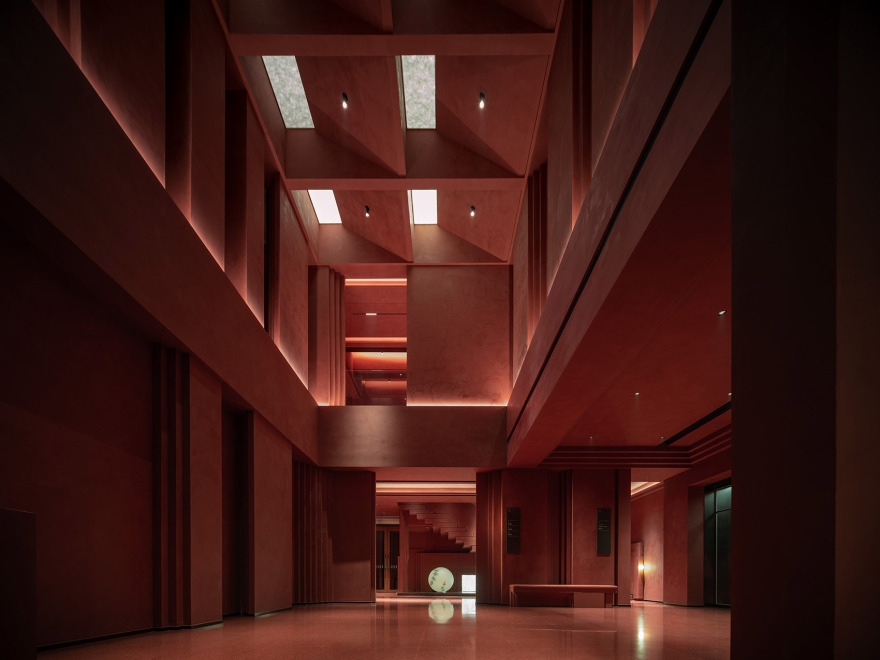
作为正色的赤,本是不可直接获取的颜色,其在甲骨文中的字形为上“大”、下“火”,意是大火一样的红色,后引申为太阳之色,隐含有热烈之意。《释名》记载:赤,赫也,太阳之色也。古文中的赫,是赤色之炽盛。
As a primary color, “Chi” originally represented a color that couldn’t be obtained directly. Its oracle bone script character shows “big” above and “Fire” below, symbolizing the red of a great fire. It later came to represent the color of the sun, suggesting heat and intensity. “Shuowen Jiezi” records: “Chi is blazing, the color of the sun.” In ancient texts, “He” is the blazing intensity of red.
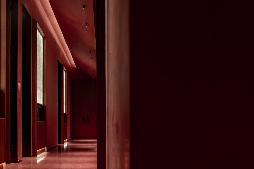
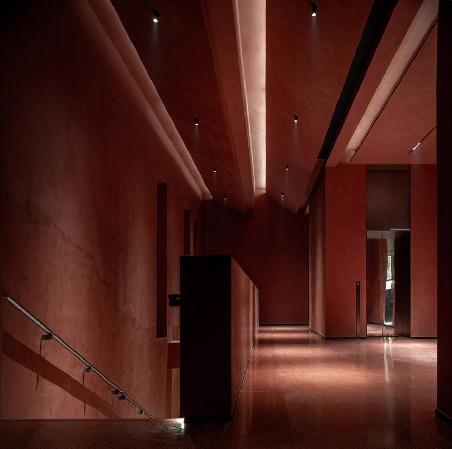
▼赤色大堂, red lobby©吴辉
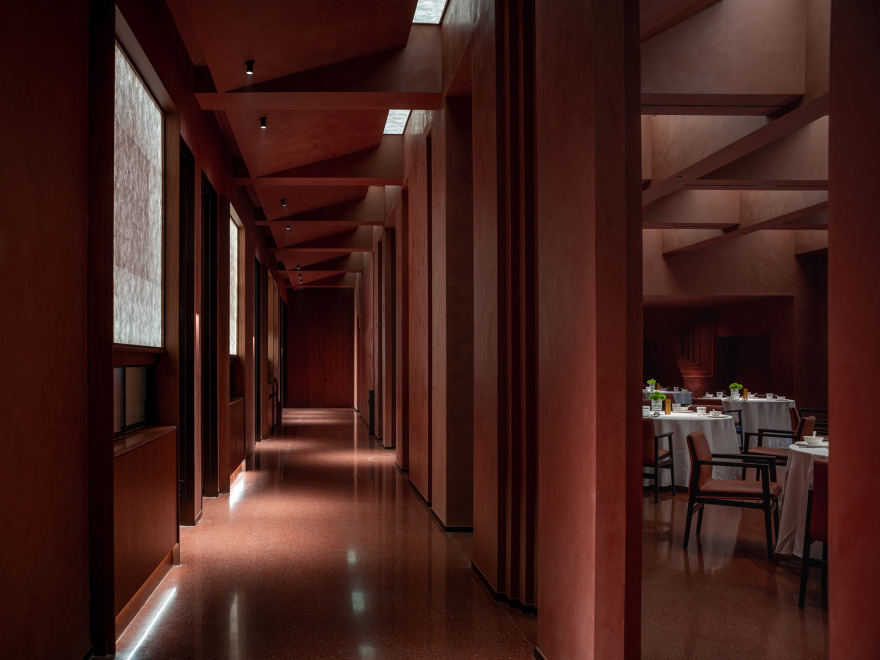
▼大堂走廊, lobby corridor©吴辉
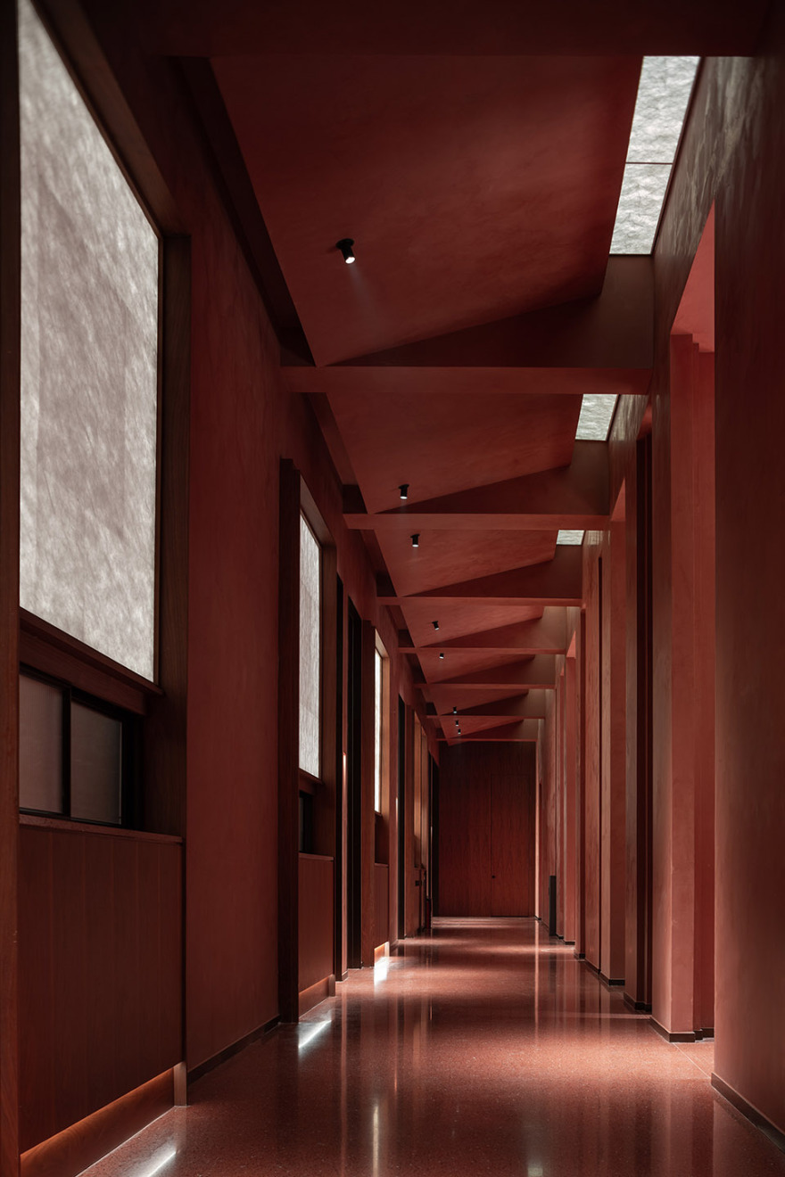
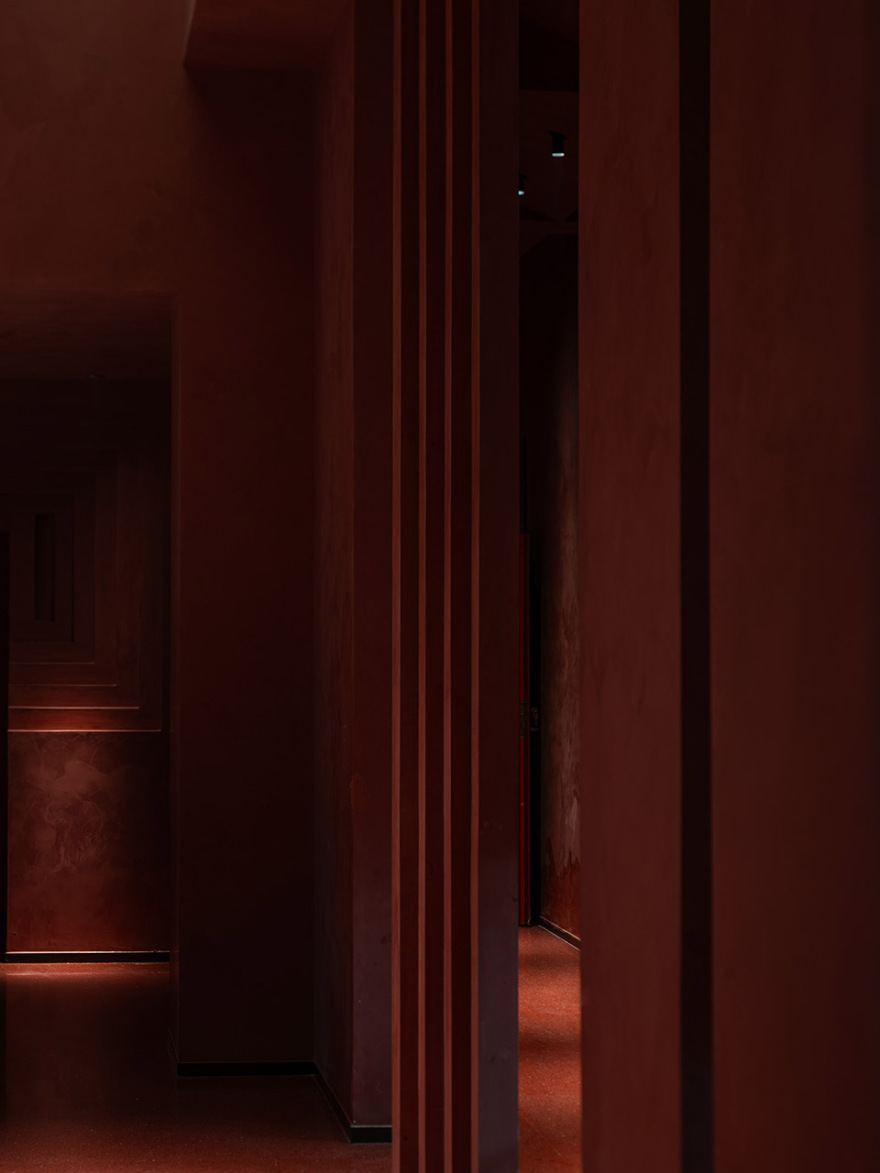
▼大堂走廊, lobby corridor©吴辉
不对称线条处理是一种充满创造性和表现力的设计方法,强调建筑空间的个性动感和不规则美感。通过引入不对称元素,打破了对称性的束缚,创造出独特而多变的建筑体验,为建筑设计领域带来了新的审美视角。
Asymmetrical lines are a creative and expressive design approach, emphasizing the dynamic and irregular beauty of architectural spaces. Introducing asymmetry breaks free from the constraints of symmetry, creating unique and varied architectural experiences. This new aesthetic perspective enriches the field of architectural design.
▼强调建筑空间的个性动感和不规则美感, emphasizing the dynamic and irregular beauty of architectural spaces©吴辉
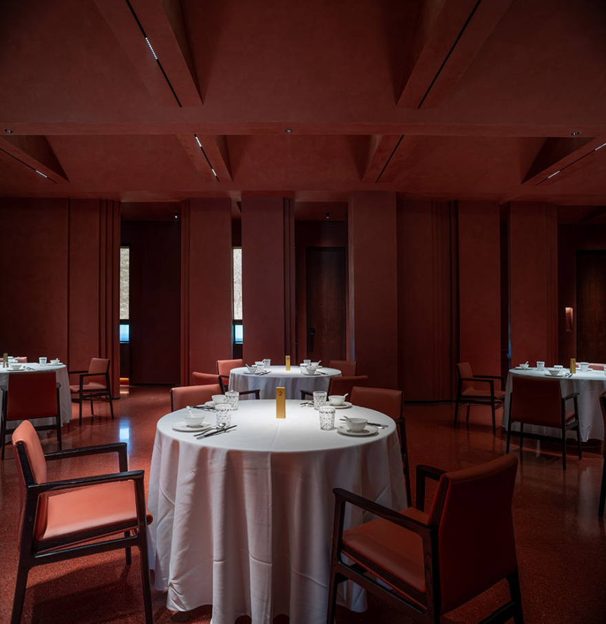
不对称线条感处理的关键在于引发视觉上的变化和惊喜。使用不同长度、形状和方向的线条元素,这些元素在空间中错落有致地布置,引导人们的目光流动。这种视觉动态性使人感到好奇,不断地探索,取“赤”的盛大与显著。
The key to asymmetrical line treatments lies in triggering visual changes and surprises. Using line elements of different lengths, shapes, and directions, these elements are arranged in a staggered manner in the space, guiding the viewer’s gaze. This visual dynamism stirs curiosity, drawing people to explore. This embodies the grandeur and prominence of “Chi.”
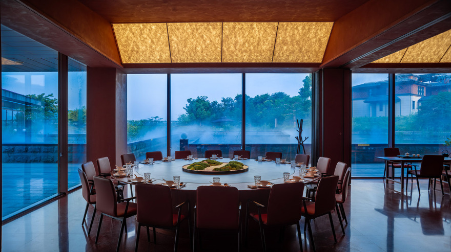
▼餐厅空间, restaurant space©吴辉
丹,五感
Dan – Sensory Experience
“丹”字的外形,像是井或盘一类的容器,中间的一点,则是位于其中的丹药,因道家制炼丹药多用丹砂,所以丹的本义也指红色的丹砂。丹与青都是古代常见的矿物,由两者分别研制成的颜料,时常出现在绘画中,正因如此,被称作丹青,成为了中国绘画的古老代称。以丹和青为主色,兼及五色的绘画十分多见。
The character for “Dan” resembles a container like a well or plate, with a dot in the center representing the elixir (potion) within. In Taoism, elixirs often use cinnabar, so “Dan” originally referred to the red cinnabar. Both “Dan” and “Qing” were common minerals in ancient times, and pigments made from them often appeared in paintings, thus the term “Danqing” emerged, referring to traditional Chinese painting.
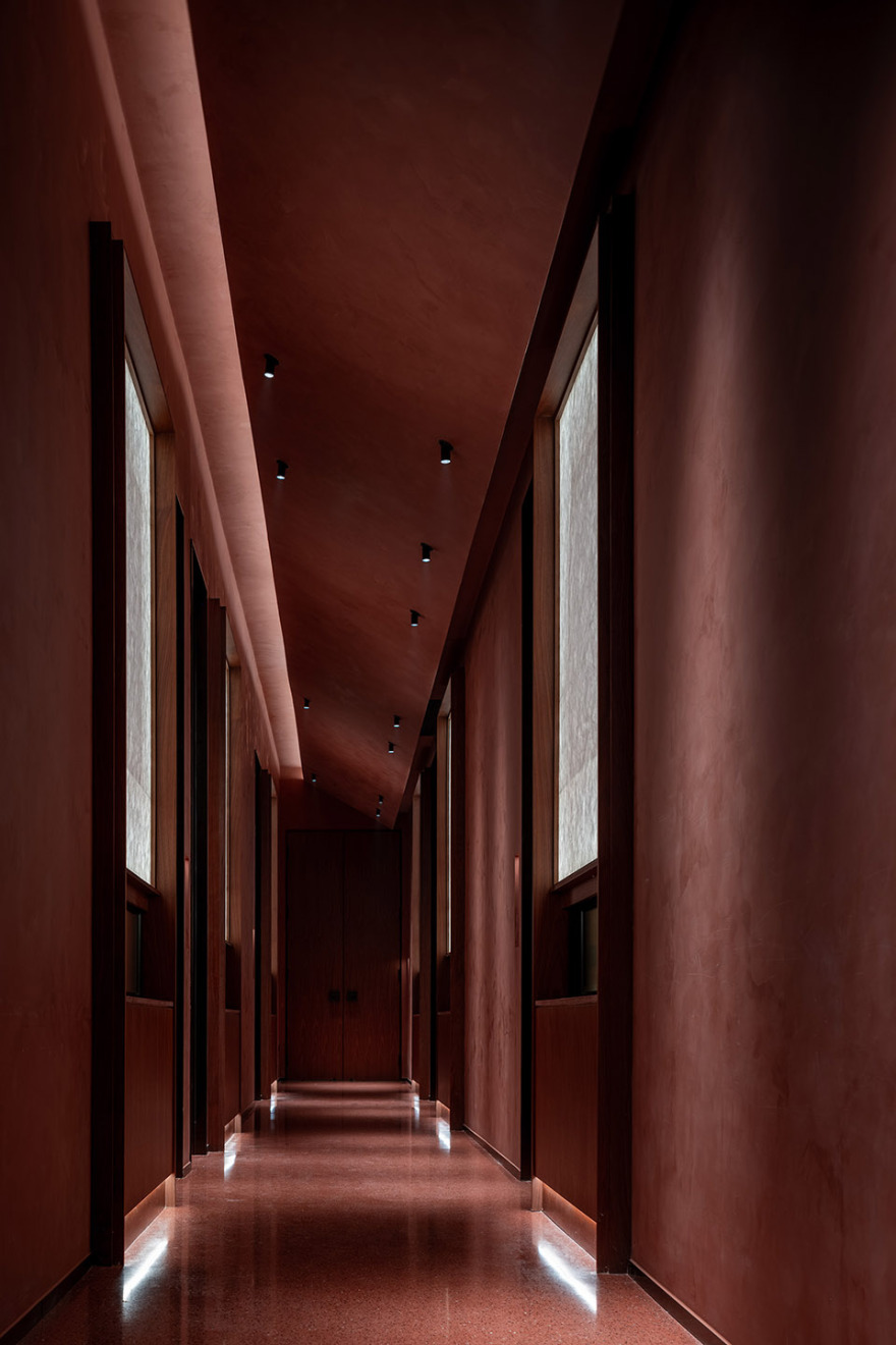
▼走廊空间, corridor space©吴辉
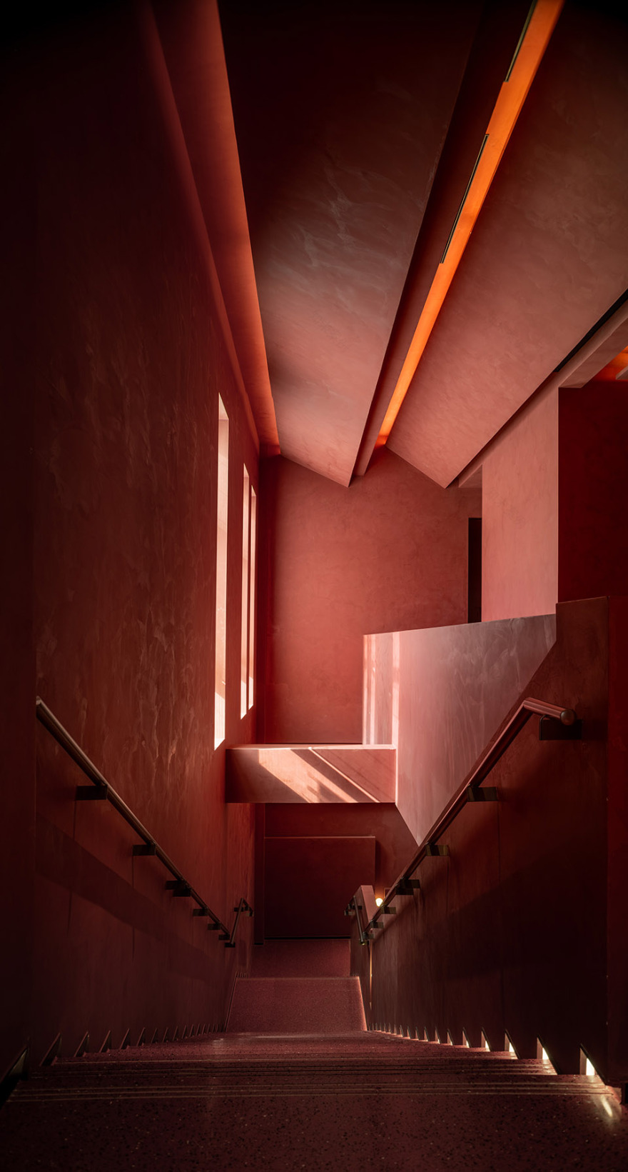
▼楼梯空间, staircase space©吴辉
▼包厢外走廊, corridor outside the private rooms©吴辉
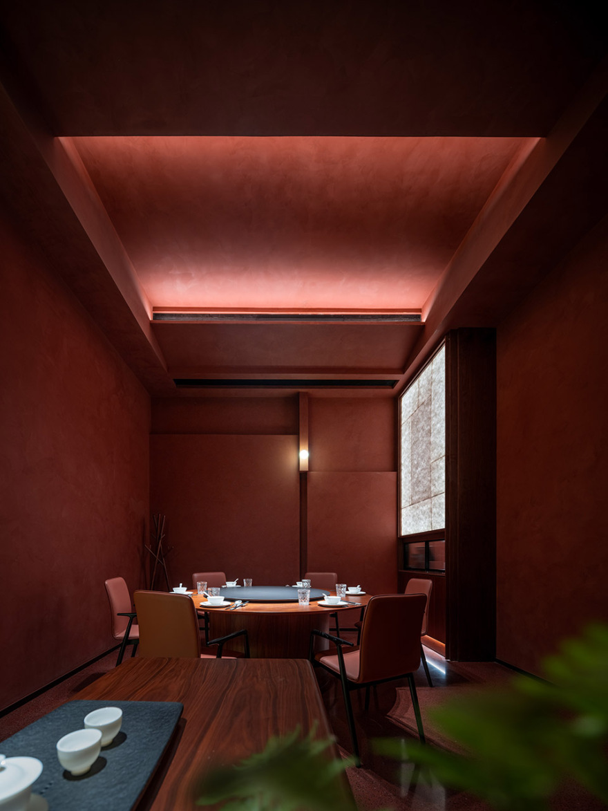
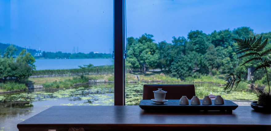
不对称性的视觉体验让人好奇,使人在空间开始不自觉地流动,每走一步似乎永远都不一样。或在烤鸭火炉边驻足、或在鱼缸、或是上下左右视角都会有所不同的楼梯,二十几间包房除了湖景就是天井。“山河水”的听觉体验则呼应了地处花山严西湖的山山水水。桌面这次则贴心加设消声的衬布,充分照顾了就餐礼仪的优雅。还特别设计了“山岩空谷”为公区香氛主题。触觉方面则循自然之道:天然石粉、胡桃木、皮革、磨石,使万物与心灵连接,取“丹”的浑朴状态。
The visual experience of asymmetry invites curiosity, making people unconsciously move through the space. Every step feels different, whether pausing by the roast duck oven, gazing at the fish tank, or walking up or down the stairs, with shifting perspectives. Of the twenty or so private rooms, some offer lake views while others overlook a courtyard. The auditory experience of “Mountain, River, Water” echoes the surrounding landscape of Huashan and Yanxi Lake. To maintain the elegance of dining etiquette, the tables are thoughtfully covered with sound-dampening fabrics. “Echoes in the Mountain Valley” is chosen as the fragrance theme for public areas. Touch follows nature: natural stone powder, walnut wood, leather, and polished stone create a connection between objects and the soul, embodying the simplicity of “Dan.”
▼包厢空间, private rooms©吴辉
▼包厢空间面向天井,private rooms facing patio©吴辉
朱,功能
Zhu – Function
同出现在甲骨文中的朱,是一棵树的象形,一种树心为红色的树。后来,朱泛指大红色,也被引指为朱砂。魏晋文学家傅玄写:近朱者赤,近墨者黑。古文中的朱,即是朱砂,同时,这段文字也隐含着赤、丹和朱的颜色排序:朱为大红,深于赤;“红”字开始出现。
The character “Zhu” also appears in oracle bone script, picturing a tree with a red core. Later, “Zhu” came to represent a bright red color and was associated with cinnabar. The writer Fu Xuan from the Wei and Jin periods wrote, “Those close to vermilion become red, those close to ink become black.” In ancient texts, “Zhu” referred to cinnabar. This passage hints at the ranking of red shades: “Zhu” is the deepest, followed by “Chi,” and “Hong” (红, general red) began to appear.
▼包厢空间, private rooms©吴辉
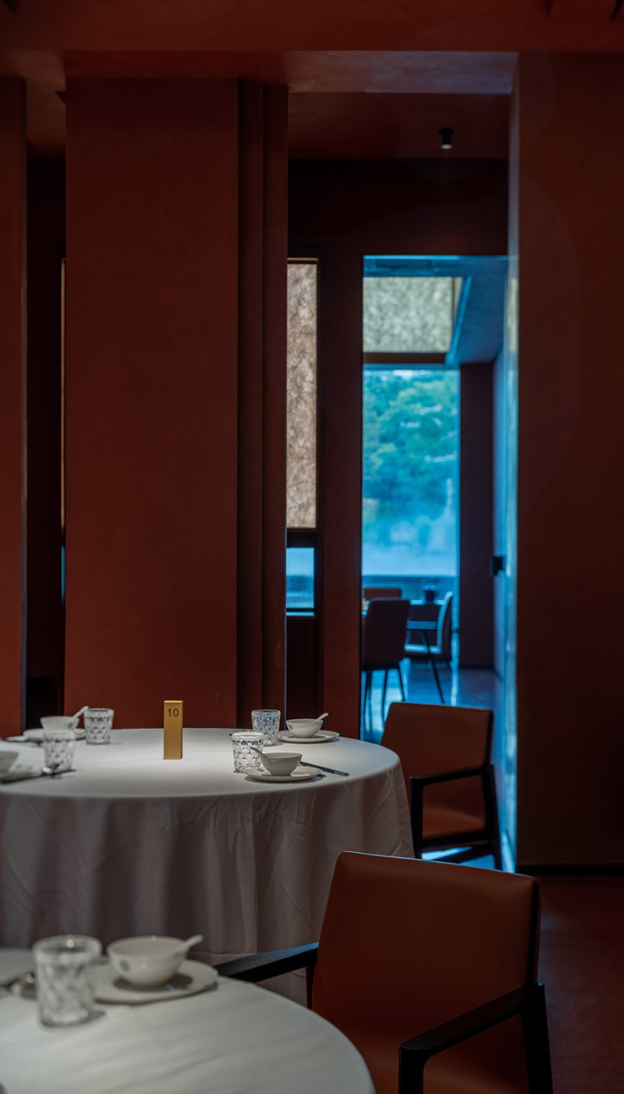
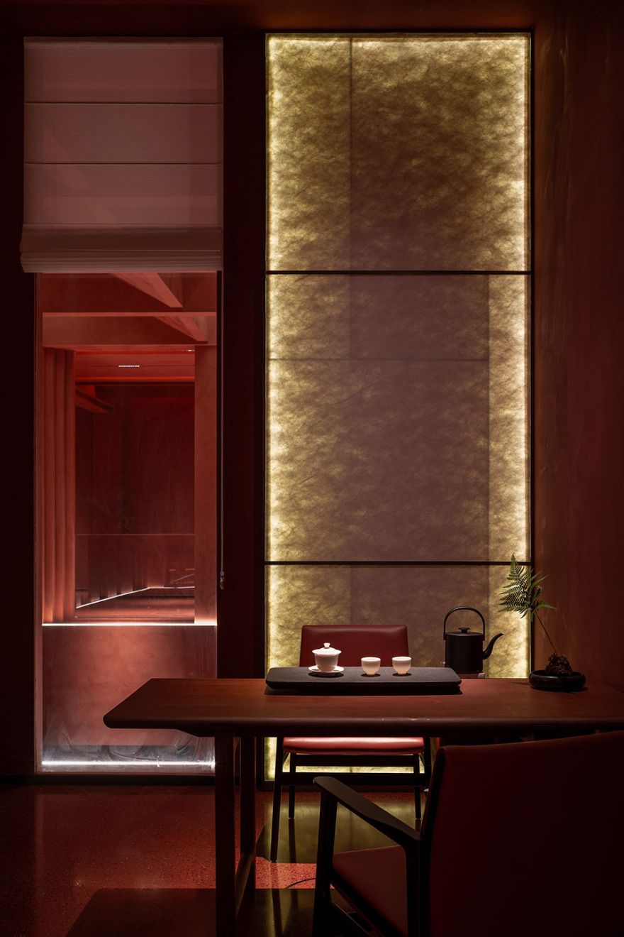
餐厅近三千平米展示和用餐空间,设 28 间包房、十余个散台、20 桌的婚礼堂、4-10 桌宴会厅。展示区设有海鲜河鲜水池、烤鸭明档、品茶区、恒温酒柜,新鲜看得见,所见即所得。设计团队让主动线的热烈、安宁、私密互不干扰,人的流速与空间的气质也能在可控范围内,得以平衡,取“朱”的守正之心。
The restaurant’s nearly 3,000 square meters of space includes 28 private rooms, a dozen open seating areas, a 20-table wedding hall, banquet halls for 4-10 tables, and display areas featuring seafood tanks, roast duck displays, tea-tasting zones, and temperature-controlled wine cabinets. The fresh ingredients are visible to diners. The design team masterfully balances the lively, tranquil, and private areas, maintaining a controlled flow of people and space, embodying the steadfastness of “Zhu.”
▼餐厅空间, restaurant space©吴辉
空间的六面,在幽暖的灯光渲染下,呈现出不同层次的红,隐喻着人们由外向内的关照方式和自我调适的过程。此种过程,多数人都需经历,但遗憾的是,忙碌的现代人,正与其渐行渐远,少有顾及。
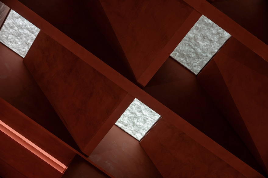
经由格物、正心,进入修身空间,不同层次的红相互对峙、碰撞,构成了多面的“我”及我与空间的亲疏关系。如身处砂岩洞穴的包围感,跨越千年,邀请水墨艺术家编织出一场唐代织锦之梦,用宣纸以晕染“笔法”生成,宛若一件精致的衣裳,它刻意去除掉了唐的艳丽,使之变得淡然,其转化过程,正如心灵净化一般。
其勾画出的千纱般舒适的自在心境,连接着高山、溪水与草亭,无形中,一幅弥漫着朴真气息的画卷慢慢生成。于其中,可感受到天、地与人间的幽微共振,山岩空谷有回音,偶然间,还可闻到山茶花的香气,淡然舒适。古人将水视作与云相近的事物,它们无形无象、任自自由,水与空间的关系,随境而动,纸本如千纱织锦一般,尽显。
The six surfaces of the space, bathed in warm lighting, present varying shades of red. This progression symbolizes a journey of introspection and self-adjustment, a process most people go through, though the demands of modern life often draw us away from it. Through understanding and aligning the heart, one enters a state of self-cultivation.
The contrasting shades of red represent different facets of the self and the relationships between oneself and the space. Surrounded by the feeling of being in a sandstone cave, guests are invited to experience a Tang Dynasty dream of brocade, crafted by ink artists using paper techniques akin to ancient painting methods. The transformation process reflects a purification of the soul, like a finely woven garment, stripping away the opulence of the Tang era to create a calm atmosphere.
The sense of ease and simplicity connects high mountains, flowing water, and rustic pavilions, forming a painting imbued with authenticity. Within it, one can feel the subtle resonance between heaven, earth, and humanity. Occasionally, the fragrance of camellias wafts through, adding to the tranquil comfort.
In ancient times, water was seen as akin to clouds—formless and free. The relationship between water and space shifts with the environment, as delicate as brocade woven from a thousand strands of silk.
▼连接着高山、溪水与草亭, connects high mountains, flowing water, and rustic pavilions©吴辉
▼不同层次的红,present varying shades of red©吴辉
▼不同层次的红相互对峙、碰撞, different levels of red confront and collide with each other©吴辉
▼卫生间, bathroom©吴辉
今时,意为红的颜色,不尽其数。不过,不论哪个时代,红似乎都是与我们最近的颜色之一,它象征着吉祥与热烈,也隐含着幸福与勇敢。上荔晶时代餐厅,严西湖上的一抹红,多彩的红,多彩的 2024,与大家分享。
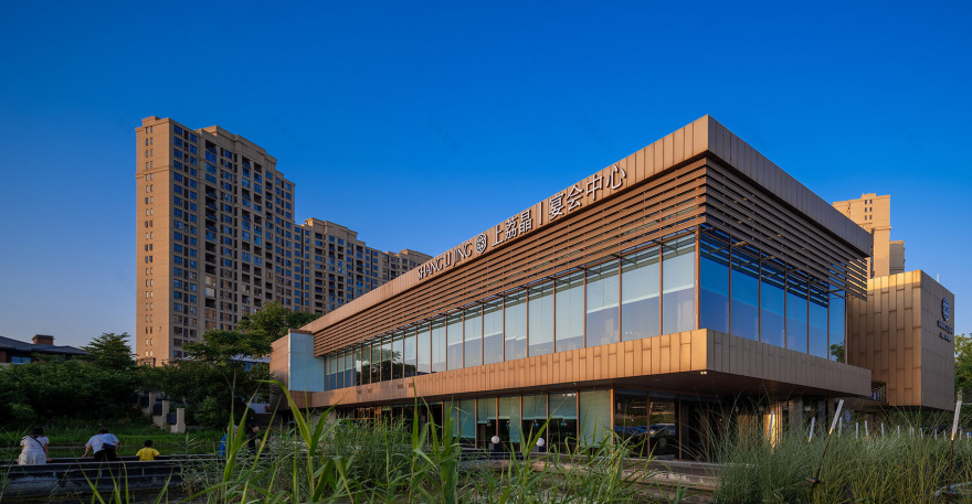
Today, there are countless shades of red, yet throughout history, red has remained one of the closest colors to us. It symbolizes good fortune and intensity and implies happiness and courage. Shang Lijing Era Restaurant, a touch of red over Yanxi Lake, celebrates the vibrant reds and the vibrant 2024 with everyone.
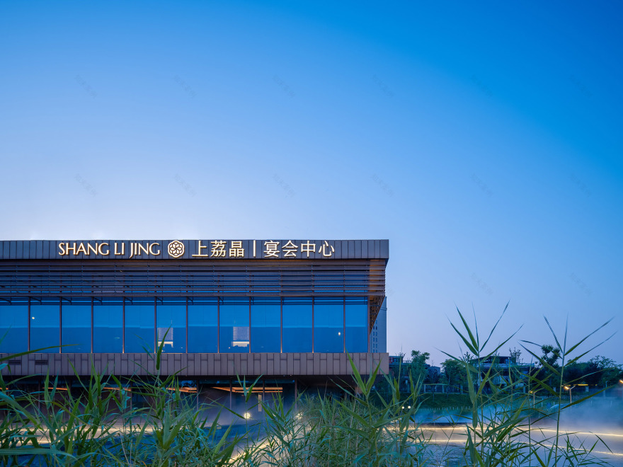
▼酒店周围环境, context©吴辉
▼夜景, night view©吴辉
项目名称:上荔晶时代餐厅(花山)
项目类型:餐厅
设计方:朗荷 STUDIO
项目设计:朗荷 STUDIO
完成年份:2024
设计团队:朗荷 STUDIO
项目地址:湖北省武汉洪山区严西湖路 10 号
建筑面积:1665㎡
摄影版权:吴辉
客服
消息
收藏
下载
最近


