查看完整案例

收藏

下载
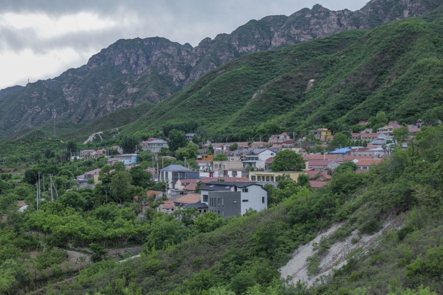
后院·溜石港位于北京市西北方位,昌平区流村镇溜石港村。这里的村落盘山而居,四面被大山环绕,素有“京师之枕”的美称。
The Rareyard · Liushigang is located in Liushihgang Village, Liucun Town, Changping District, northwest of Beijing. The village here is surrounded by mountains on all sides and is known as the “pillow of the capital”.
▼全景,Overall view© 曾荟凡
▼溜石港村庄肌理,Texture of Liushigang Village © 曾荟凡
基地的位置在整个村落的最东侧,其东、西、北侧均有民宅包围,南侧一面作为景观延展面,连绵起伏的山脉一字排开,是北京郊区罕见的壮美风景。整块场地由两块相邻的宅基地构成,宽 33 米,长 28 米,边缘呈不规则形状。
The location of the base is on the easternmost side of the entire village, surrounded by residential houses on the east, west, and north sides. The south side serves as a landscape extension, with rolling mountain ranges arranged in a row, making it a rare and magnificent scenery in the suburbs of Beijing.
The entire site consists of two adjacent homesteads, 33 meters wide and 28 meters long, with irregular edges.
▼项目区位,Texture of Liushigang Village© GW Design
▼村落情况及基地位置,Village situation and base location©GW Design
建筑的形成—顺势而为
ARCHITECTURE — FOLLOW THE LANDFORM
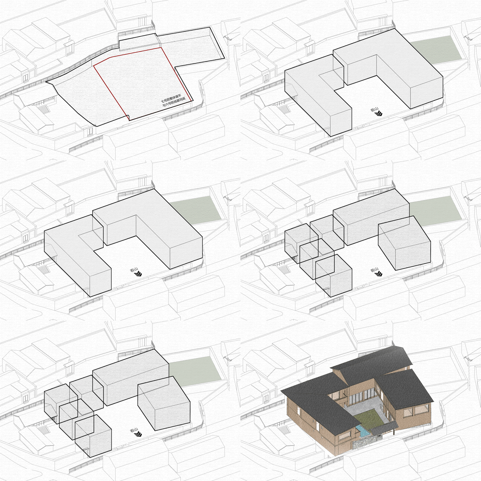
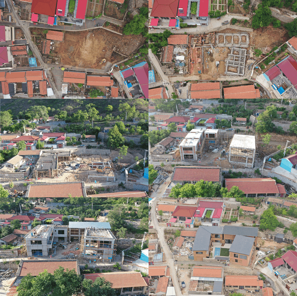
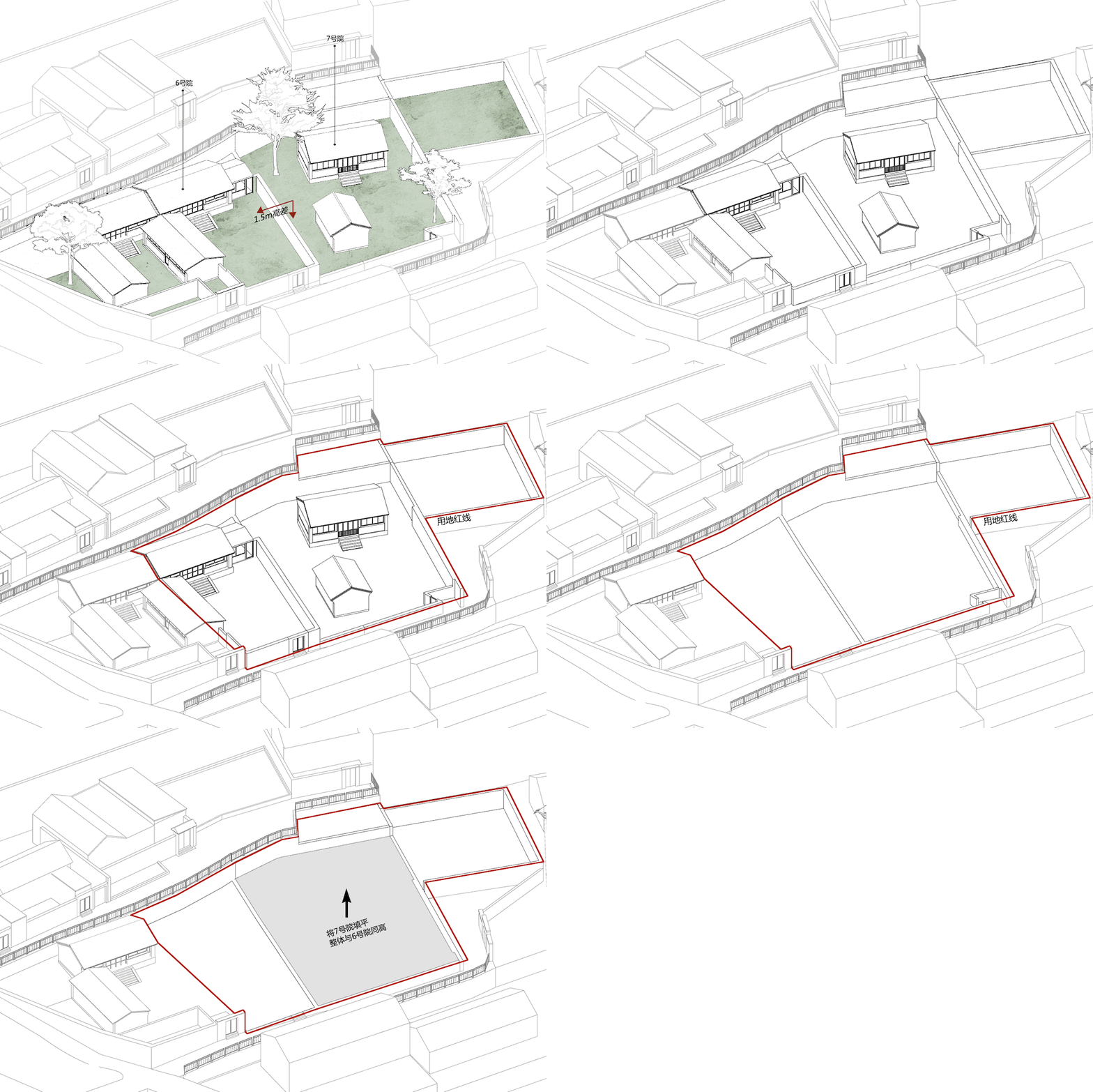
项目原址均为上个世纪 60、70 年代传统的老北京三合院样式,两个地基之间有着 1.5m 的高差。为了保证地块的连贯性,我们摒弃了以往在原有老宅基础上改造的设计模式,改为完全新建。如何最大的利用景观面、填补高差、满足北京宅基地房屋的建设要求以及划分两个宅基地的产权,形成了本案的几个关键要素。
The original site of the project is in the traditional style of an old Beijing courtyard from the 1960s and 1970s, with a height difference of 1.5 meters between the two foundations. In order to ensure the continuity of the plot, we have abandoned the previous design mode of renovating the existing old house foundation and replaced it with a completely new one. How to make the most of the landscape, fill the height difference, meet the construction requirements of Beijing’s homestead houses, and divide the property rights of the two homesteads have formed several key elements of this case.
▼基地原貌,Original appearance of the base ©GW Design
两个地块分别被命名为 6 号院(西侧)和 7 号院(东侧),我们将 7 号院原有的地面进行整体填充,使其与 6 号院地坪等高,也为后来的围合型院落创造了条件。
Two plots were named as Courtyard 6 (west side) and Courtyard 7 (east side) respectively. We filled the original ground of Courtyard 7 as a whole, making it the same height as the floor of Courtyard 6, and creating conditions for the later enclosed courtyard.
▼基地现状,7 号院填补地坪,Current situation of the base, filling the floor of the 7th courtyard ©GW Design
因所有的景观视觉都集中在基地南侧,另外三侧都需要视线遮挡,考虑到每一间客房都能有独特景观营造,在建筑设计的过程中,除了对外最大限度地引入南侧的山景景观,对内则构建中心庭院,依照这样的划分逻辑,最终形成了一个向南开口的凹字型围合建筑空间。
Due to the fact that all landscape visuals are concentrated on the south side of the site, and the other three sides require line of sight obstruction, considering that each guest room can have a unique landscape creation, in the process of architectural design, in addition to maximizing the introduction of the mountain view on the south side to the outside, a central courtyard is constructed internally. According to this division logic, a concave shaped enclosed building space with a south opening is ultimately formed.
▼建筑整体向南看山,The overall building looks south towards the mountains© 曾荟凡、鲁飞
由于土地分割的要求,建筑被大致分为两个体块,其中 7 号院东北侧突出的一角作为后场,用于建设化粪池、存放储水罐、修建设备机房等。随着后勤场地的确定,各区域的功能也就明朗了起来——将 7 号院 L 型的结构从中间断开,留一条后勤通道至后场区,南侧建筑的一层设置入住登记、后勤布草以及厨房,二层最好的观山位置则留给客房。
Due to the requirements of land division, the building is roughly divided into two blocks, with the protruding corner on the northeast side of Courtyard 7 serving as the backyard for the construction of septic tanks, storage tanks, equipment rooms, etc. With the determination of the logistics site, the functions of each area have become clear – the L-shaped structure of Courtyard 7 will be disconnected from the middle, leaving a logistics channel to the back area. The first floor of the south building will be equipped with check-in registration, logistics linens, and a kitchen, while the best mountain view location on the second floor will be reserved for guest rooms.
▼7 号院,东侧建筑,Courtyard 7, East Building © 鲁飞、曾荟凡
北侧体块由于建筑指标的限制无法设置二层,利用其层高优势,我们将可以举办各类活动的多功能空间设置于此,使其同时具备早餐厅、咖啡吧、宴会厅、会议室的功能,超高的层高在室内设计中反而增强了空间的仪式感。
Due to the limitations of building indicators, it is not possible to set up a second floor for the northern block. Taking advantage of its height advantage, we have set up a multifunctional space here that can hold various activities, making it have the functions of a breakfast room, coffee bar, banquet hall, and conference room. The ultra-high height actually enhances the ceremonial sense of the space in the interior design.
▼7 号院,北侧宴会厅,Courtyard 7,North Banquet Hall © 曾荟凡
6 号院整栋均为住宿空间,为了达成更好的居住体验,其被分割为四栋独立的小型单元,用连廊和整体的金属屋面进行连接,在视觉上形成了一个整体,在空间感受上又能相对独立。
The entire building of Courtyard 6 is a residential space. In order to achieve a better living experience, it is divided into four independent small units, connected by corridors and overall metal roofs, forming a visual whole that is relatively independent in spatial perception.
▼6 号院,西侧建筑,Courtyard 6, West Buildingll© 曾荟凡
▼6 号院,西侧建筑,Courtyard 6, West Buildingll© 曾荟凡
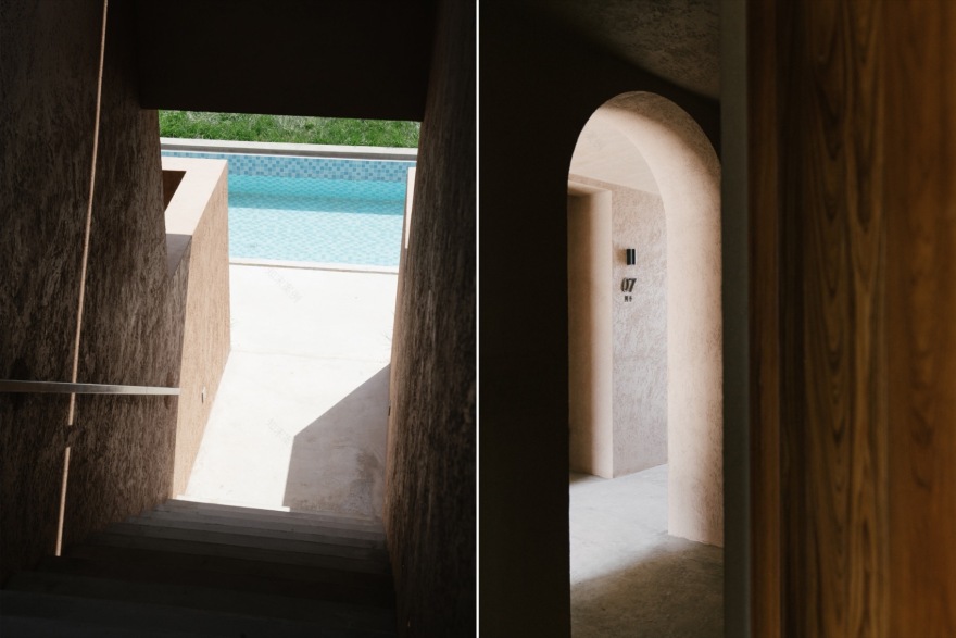
在房间的划分上,为了增加房型的多样性,弥补部分房型在景观视野上的不足,我们在一层的房间设计了入户庭院和泡池,平衡冬季运营需求;二层由连廊进行贯穿,形成空间上串联的同时,在露台上亦能拥有最佳的景观视野;六号楼西北侧的空间由于位置及光线的限制,设置为 LOFT 儿童房,不同的空间类型带来更多的居住选择。
▼客房分类,Room classification ©GW Design
In terms of room division, in order to increase the diversity of room types and compensate for the lack of landscape views in some room types, we have designed an entrance courtyard and a soaking pool in the first floor rooms to balance winter operation needs. The second floor is connected by a corridor, forming a spatial connection while also providing the best landscape view on the terrace. Due to location and lighting limitations, the space on the northwest side of Building 6 is designated as a LOFT children’s room, providing more living options for different types of spaces.
▼二层连廊关系,Second floor corridor relationship © 曾荟凡
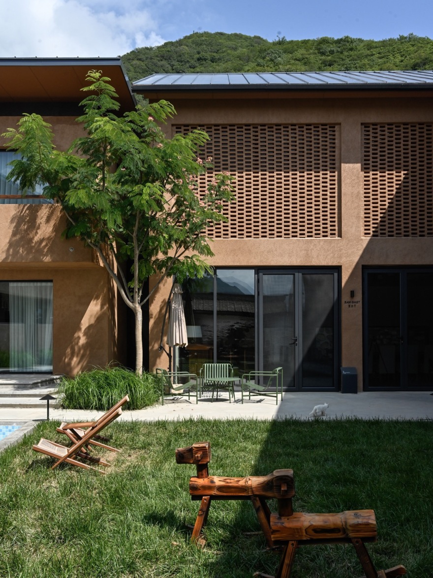
中间围合而成的庭院被划分成泳池及草坪两个区域,可以兼顾露天活动的举办以及孩子夏天戏水的需求,自发的形成聚合效果;泳池上方做移动滑盖,盖子合上后连同草坪一起形成一个完整的平台,可以举办婚礼、手作等公共活动。
▼建筑剖面关系,Architectural section relationship ©GW Design
The courtyard enclosed in the middle is divided into two areas: a swimming pool and a lawn, which can accommodate outdoor activities and children’s summer water play needs, spontaneously forming a cohesive effect. A mobile sliding cover is installed above the swimming pool, and when the cover is closed, it forms a complete platform together with the lawn, which can be used for public events such as weddings and handicrafts.
▼建筑细节,Architectural details © 曾荟凡
由于基地南侧有着良好的看山视野,而其东、西、北侧的视线均需要被遮挡,为了保证每间客房都能最大限度的享有绝佳的风景,面朝南侧及内庭院,我们以窗户作为画框,配合着远处连绵起伏的群山和白云,形成了一幅流动的画卷。
Due to the good mountain view on the south side of the base, while the views on the east, west, and north sides need to be blocked, in order to ensure that each room can enjoy the best possible scenery, facing the south side and the inner courtyard, we use windows as frames, combined with the distant undulating mountains and white clouds, forming a flowing picture.
▼以窗做画框,配合远方山景,形成了一幅流动画卷
Using a window as a frame and complementing the distant mountain scenery
a flowing animation scroll is formed © 曾荟凡
部分墙面花窗的设计,既是为了遮挡视线和白天强烈的阳光,也丰富了建筑的层次。
The design of some wall flower windows is not only to block the line of sight and strong sunlight during the day, but also to enrich the hierarchy of the building.
▼局部用花砖作为建筑语言,Partial use of floral tiles as architectural language © 曾荟凡
入院门头的设计,因项目紧邻村道,为了保证更好的入户体验及私密性,我们将门头做成了一个小小的过廊,从村里收集来的老瓦片,采用北京老房的屋瓦样式进行屋面的铺贴,墙面则选择用玻璃砖和红砖混合砌筑,夜晚的灯光亮起,像素化的拼接方式传达出一种朦胧的美。
The design of the entrance to the hospital, as the project is located adjacent to the village road, has been transformed into a small corridor to ensure a better entrance experience and privacy. The old tiles collected from the village are used to pave the roof in the style of Beijing’s old houses, while the walls are made of a mixture of glass bricks and red bricks. The lights at night light up, and the pixelated splicing method conveys a hazy beauty.
▼门头,玻璃砖作为隔墙,与屋面形成一种新旧对比,© 鲁飞
传统的屋瓦样式、石砌围墙与新的金属屋面、玻璃砖形成一种新旧的对比,而原址老建筑的记忆也通过这一入口得以存留。
The traditional tile style, stone walls, and new metal roofs and glass bricks create a contrast between old and new, and the memories of the old building on the original site are preserved through this entrance.
▼门头,玻璃砖作为隔墙,与屋面形成一种新旧对比,
Door head, glass bricks as partition walls, creating a contrast between old and new with the roof© 曾荟凡
室内——建筑的延伸
INTERIOR —— EXTENTION OF ARCHITECTURE
平面布局中,我们在一层设置入住登记、酒吧、咖啡等公共空间,值得一提的是北侧的宴会厅,由于政府对于宅基地的建设要求,最终形成的是一个超高的二层挑空空间。为了平衡空间视觉感受,增加仪式感,我们在空间中设置互相搭接的三角形钢架,以降低层高带来的尺度上的不匹配。犹如教堂般的多功能空间也为承接不同类型的活动增加了可能性。
▼南北剖面,宴会厅钢梁示意,North South section, schematic diagram of banquet hall steel beams ©GW Design
▼增加三角形钢梁,降低空间视觉,增强仪式感,Add triangular steel beams to reduce spatial visual impact and enhance ceremonial sense © 曾荟凡
In the layout plan, we have set up public spaces such as check-in registration, bar, coffee, etc. on the first floor. It is worth mentioning the banquet hall on the north side. Due to the government’s requirements for the construction of residential land, the final result is a super high second floor elevated space. In order to balance the visual perception of the space and increase the sense of ceremony, we set up overlapping triangular steel frames in the space to reduce the scale mismatch caused by the height difference. The multi-functional space, like a church, also increases the possibility of hosting different types of activities.
▼宴会厅,多功能活动空间,Banquet hall, multifunctional activity space© 曾荟凡
客房整体在延续建筑外部风格的基础上,去装饰化,用简洁的空间语言增强与户外山景的联动性,不喧宾夺主,也使得房间内能够“呆得住”。由于市场运营对房型的要求,我们并没有一味追求客房的同质化,而是通过不同软装、房型将其进行区分,求同存异,也使顾客有更多的选择。
On the basis of continuing the exterior style of the building, the guest rooms are decorated with simple spatial language to enhance the linkage with the outdoor mountain scenery, without overshadowing the guests, and also making the room “livable”. Due to the requirements of market operation for room types, we do not blindly pursue homogenization of guest rooms. Instead, we differentiate them through different soft furnishings and room types, seek common ground while reserving differences, and provide customers with more choices.
▼入住登记,Check-In © 曾荟凡
▼恰茶客房,Tea tasting room © 曾荟凡
▼四季客房,Four Seasons Room© 曾荟凡
其中坐和躺的位置尽量用地台代替床品和沙发,用泡池代替浴缸,在唤醒乡村回忆的同时,也保证空间能够更加高速、方便的运营。
Try to use platforms instead of bedding and sofas for sitting and lying positions, and use sinks instead of bathtubs to awaken rural memories while ensuring faster and more convenient operation of the space.
▼观山客房,Mountain View Room © 曾荟凡
▼四季客房,Four Seasons Room© 曾荟凡
思考——关于不同身份对于设计的影响
DIFFERENT IDENTITY TOWARDS THE DESIGN
在本轮设计中,我们有着投资者、运营者、建设者和设计者等多重身份,因此视角也变得不同。除了能够让项目更好的落地之外,也需要多角度的思考造价、运营、时间周期以及设计四者之间的关系,而这其中往往存在许多的矛盾,但也是因为这四种身份的合一性,设计可以先一步解决许多后期可预测的问题,使得空间的设置更加的合理、后期运营更为流畅。
In this round of design, we have multiple identities such as investors, operators, builders, and designers, so our perspectives have also become different. In addition to better implementing the project, it is also necessary to consider the relationship between cost, operation, time cycle, and design from multiple perspectives. There are often many contradictions among these four identities, but it is also because of the unity of these four identities that design can solve many predictable problems in the later stage, making the space setting more reasonable and the later operation smoother.
▼客房细节,Room details© 曾荟凡
另外值得一提的是,随着后院溜石港民宿的建设,同时带动了溜石港村百亩梯田栈道、林地露营以及村口门头的政府修建工作——我们也希望他不仅仅是一个乡村居所,更能作为乡村振兴的探路者,在不远的未来同更多的人一起,打造更加美好的乡村生活。
Furthermore, it is worth mentioning that with the construction of the backyard Liushigang homestay, it has also driven the construction of a hundred acre terraced road, forest camping, and government building work at the entrance of Liushigang Village. We also hope that it will not only be a rural residence, but also a pioneer in rural revitalization, working with more people in the near future to create a better rural life.
▼总平面图,General layout©GW Design
▼一层平面图,First floor plan ©GW Design
▼二层平面图,First floor plan©GW Design
项目名称:后院·溜石港民宿首开区
项目位置:北京市/昌平区/流村镇/溜石港村
建筑面积:900㎡
设计单位:GW 空间设计
设计/竣工:2022.12-2024.06
酒店管理:后院 Rareyard 精品民宿
项目摄影:曾荟凡、鲁飞、任恩彬
客服
消息
收藏
下载
最近


