查看完整案例

收藏

下载

翻译
With a bold blend of colour, texture, and personality, this Berlin penthouse proves that sometimes the most captivating interiors are born from simple briefs. The project’s inception reads like a design fairy tale. “The clients reached out to me via my website around four months after I founded Studio Bosko,” Kasia Kronberger reveals. “We clicked immediately and started working together soon after.” This serendipitous beginning set the stage for a collaboration to transform a newly built penthouse in a Berlin tenement house into a home bursting with life and individuality.
While many clients come with extensive wish lists, Kronberger’s clients—a young couple who had recently moved from Amsterdam—arrived with an open mind and just one specific request: “as little white as possible”. This unique brief was driven by the couple’s personal circumstances. “She’s an illustrator, he only sees bold colours (a form of Daltonism),” Kasia explains. “This led us to a primary palette-oriented interior design.”
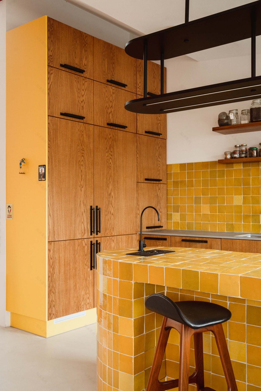
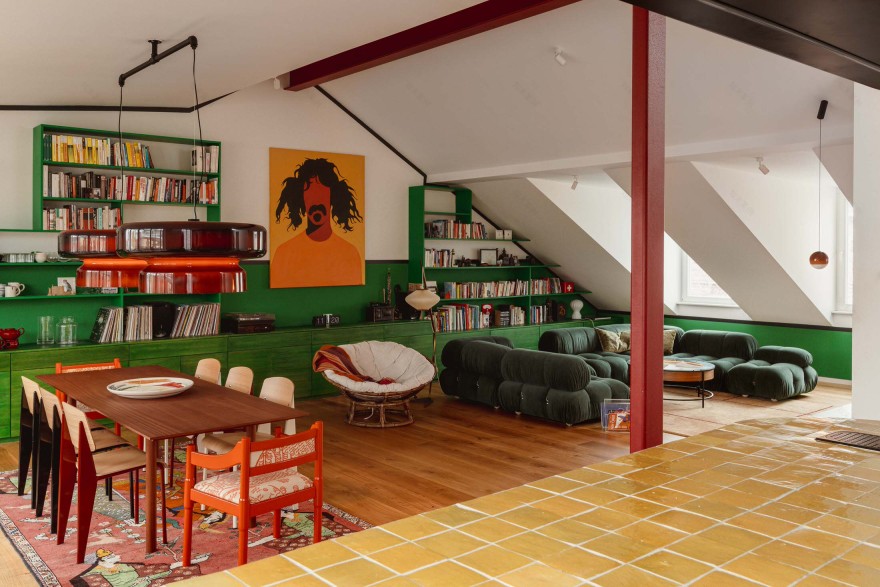
The resulting space uses colour to define and energise living areas. Kasia’s approach was both artistic and functional: “We used the colours to define the open plan space.” The living area is a prime example of this philosophy. A vibrant yellow kitchen anchors the space, the dining area sings in all shades of red, and the living room is drenched in green.
One of the most impressive aspects of this project is how it manages to be both bold and harmonious. Kasia notes, “It’s cosy and inviting yet elevated and characterful. It’s not noisy or busy as one might expect from the high contrast colours used.” The balance is achieved through vigilant curation of furniture and artwork, balancing the old with the new, the classic with the niche, the hallmark of Studio Bosko’s approach. This philosophy is evident in every corner of the home, from the layered lighting fixtures to the materials that are both beautiful and practical.
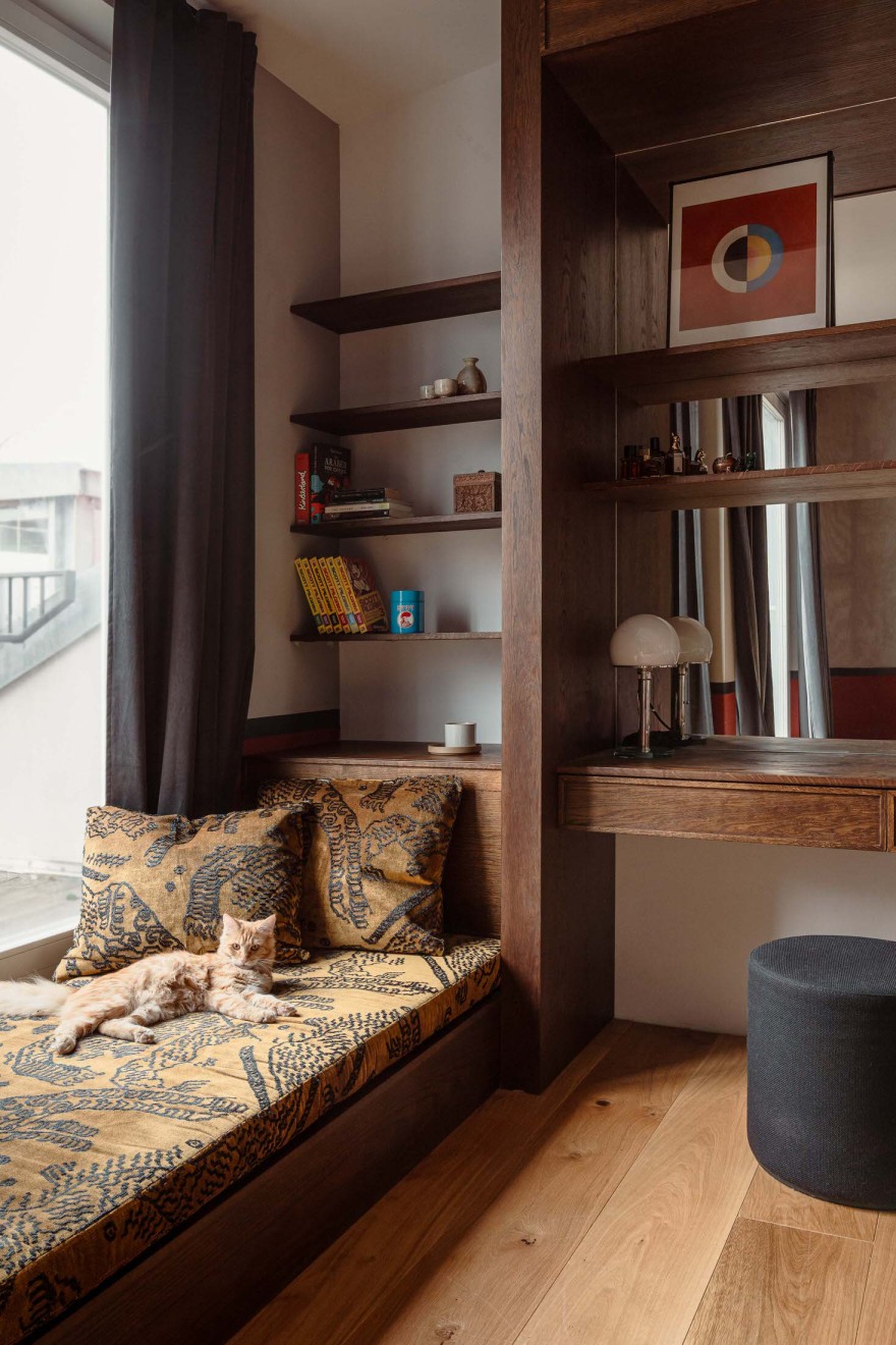
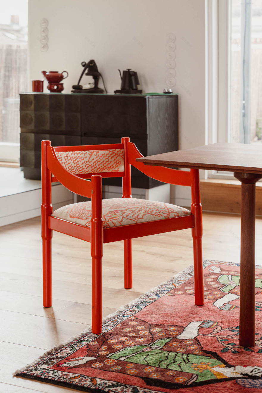
The space presents a mix of design icons, European vintage pieces, and niche modern items. Vintage Vico Magistretti Carimate chairs, upholstered in silk Tiger Mountain fabric from Dedar, sit alongside a Camaleonda corner sofa in pine green alpaca mohair. A striking Frank Zappa artwork by Coco Dave adds tension and visual interest, hanging opposite the kitchen.
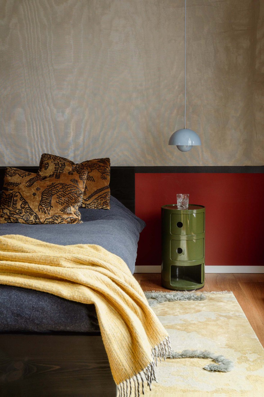
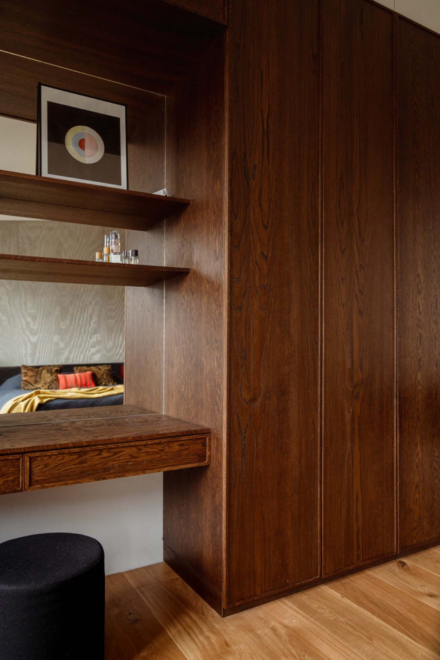
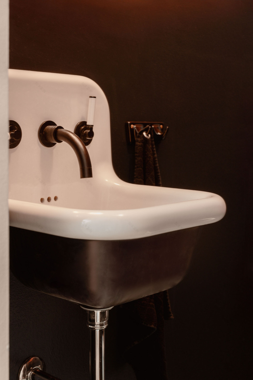
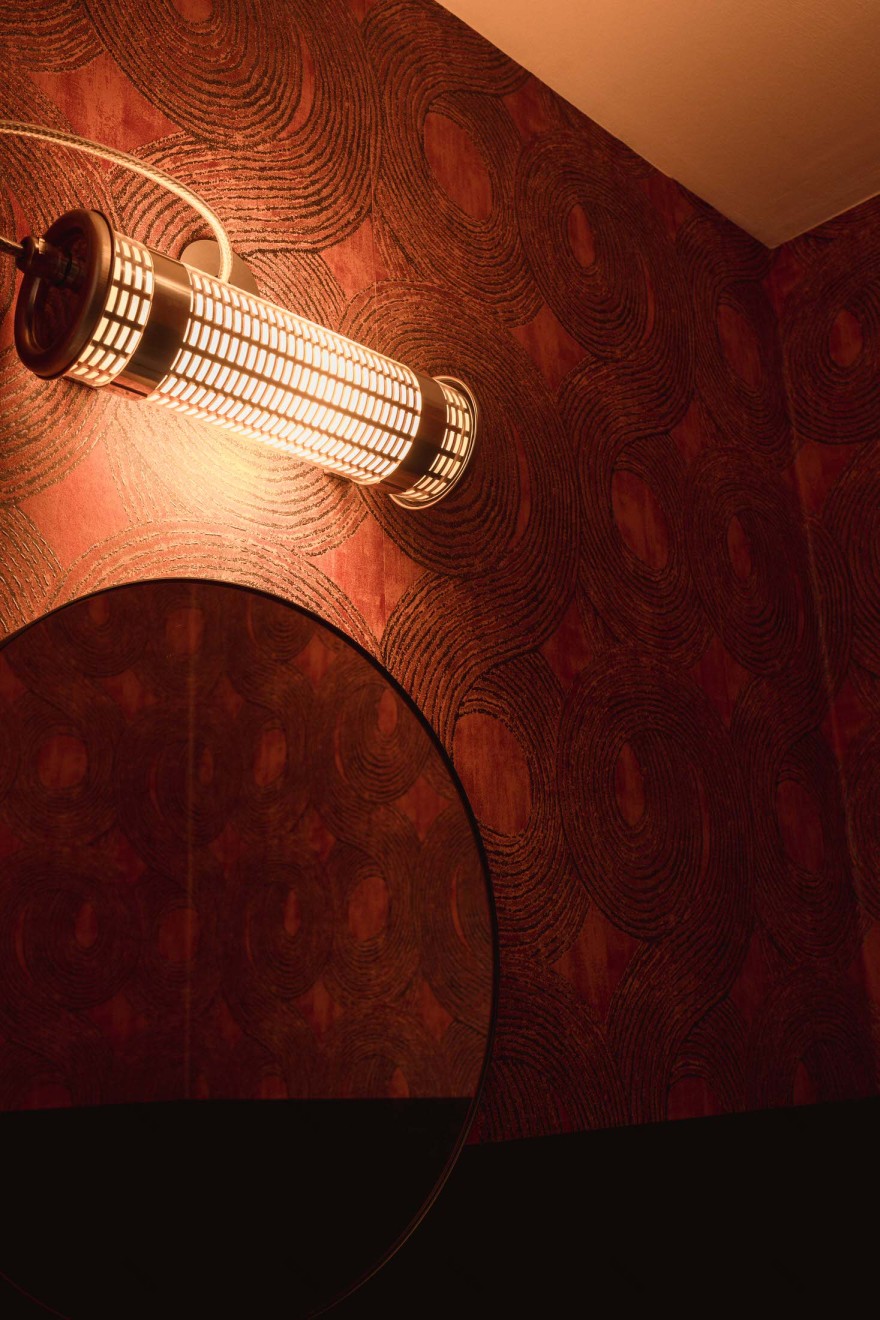
While the main living areas explode with primary colours, Kasia took a different approach to the private spaces. “A more atmospheric, nuanced design was chosen for the private area,” she reveals. This shift in palette creates a sense of calm and intimacy in the bedroom and bathroom, providing a restful counterpoint to the vibrant social spaces.
No great design comes without its challenges. For Kasia, one of the most daunting tasks was tiling the rounded kitchen island with handmade zellige tiles. “Expanding the colour onto the cabinetry was a risk,” she admits. “At first, the clients weren’t sure about the tone of timber but I’m glad I convinced them of this direction.” This commitment to bold design decisions is what gives the space its unique character. As Kasia puts it, “Each design decision in this project was taken with a full commitment—there are no half-measures here.”
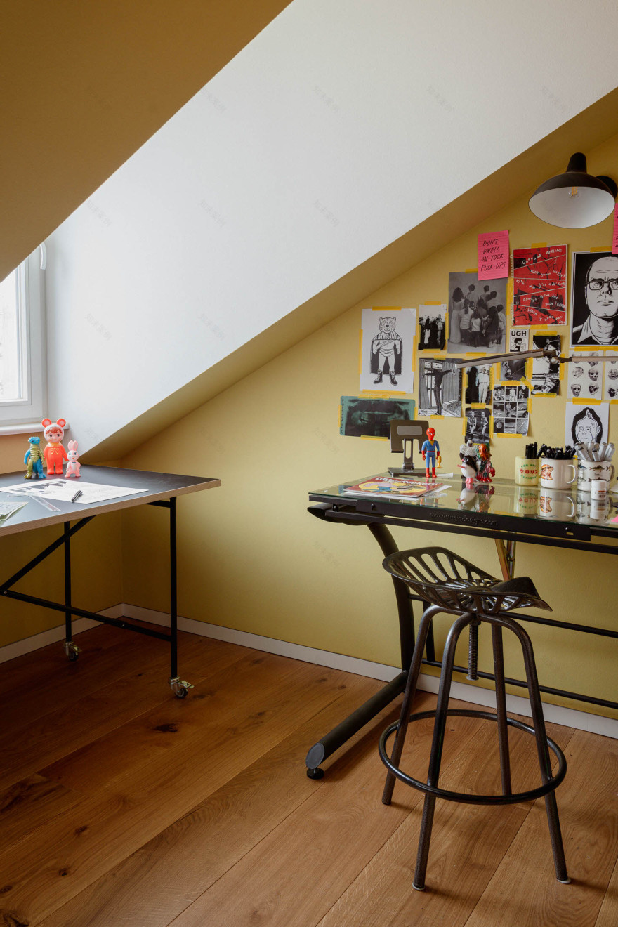
Perhaps the most charming aspect of this project is how it reflects the personalities of its owners. The client’s creative studio, bathed in citronella yellow, is a perfect example. “There are her collections and she fully curated the wall galleries and the bookcase by herself,” Kasia shares, highlighting the personal touches that make this house a home.
In the end, Kasia’s pride in the project is palpable. “It reflects the personalities of the homeowners which makes it a successful project in my point of view,” she says. And isn’t that the true measure of great design—a space that not only looks beautiful but feels like a perfect fit for those who call it home?
[Images courtesy of Studio Bosko. Photography by Giulia Maretti Studio.]
客服
消息
收藏
下载
最近


