查看完整案例

收藏

下载
YANXU 致力于为享受生活的女性带来高品质的穿搭体验,品牌店铺原址为上下两层不连通的独立空间,业主希望能够将两层空间打通重建,创造一个空间场所来满足日常的穿搭场景。
YANXU is dedicated to provide high-quality dressing experiences for women. The original store location is consisted of two separate, non-connecting levels, and the owner hopes to integrate these two floors to create an unified space that caters to daily dressing scenarios.
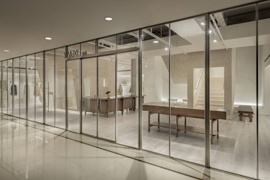
▼下层门面,lower floor storefront© 穆彪
▼上层门面,upper floor storefront© 穆彪
通透橱窗
Transparent Facade
面向商场中庭的两层外立面以模数化的排列方式将视线全部打开,旨在将两层独立的外立面打造成一个整体的形象展示面。透过橱窗,可在商场中庭直接看到店铺内部陈列的产品以及贯穿两层空间的垂直体块,打造统一界面的同时形成带有冲击力的视觉体验。
▼轴测图,axon© 本所设计
The two-story facade facing the mall atrium features a modular arrangement that maximizes visibility, intending to unify the two independent levels into a cohesive architectural surface. Through the transparent facade, the interior merchandise and the vertical volumes that connect the two levels are fully visible from the public area outside. This approach not only establishes a cohesive facade but also creates a dynamic and impactful visual experience.
▼室内概览,interior overview© 穆彪
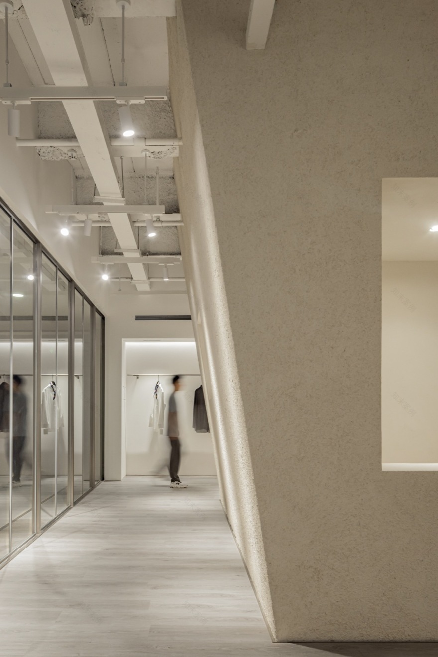
▼垂直体块,vertical block© 穆彪
垂直缝合 Vertical Stitch Basistudio 从服装制作流程中的“缝制”吸取灵感,希望打破传统空间布局,将上下两层空间垂直“缝合”起来。
Basistudio drew the inspiration from “sewing” in the process of clothing manufacturing, aiming to break traditional spatial layouts by vertically stitching the upper and lower floors together.
▼零售区,sale area© 穆彪
▼窗口,window© 穆彪
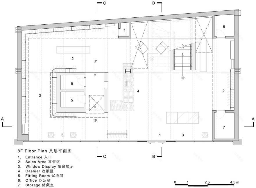
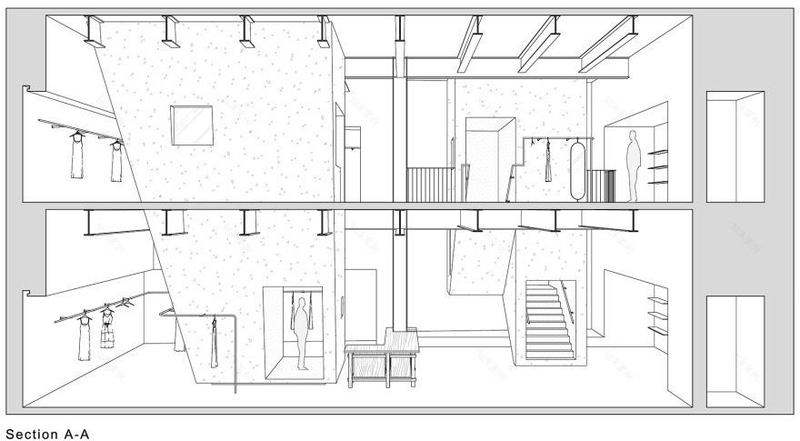
设计师根据梁柱之间的模数规律,在结构梁之间插入两个不同功能的垂直体块。通过对这两个垂直体块的内外雕刻和开洞,挖掘出不同的功能空间,一个包含试衣和办公功能,另一个包含楼梯和储物功能。利用其和原始楼板之间脱开的间隙创造出空间里上与下,内与外的视线联系。
Based on the modular logic between beams and columns, designer inserted two vertical volumes with different functions between the structural beams. Functions and different openings are carved out from the two vertical volumes—one containing fitting and office spaces, and the other incorporating stairs and storage. The gaps between these volumes and the original slab create visual connections between the upper and lower floors, as well as between the inside and outside.
▼楼梯和储物,stairs and storage © 穆彪
在连接 8 楼 9 楼的垂直体块里,不同大小的开洞望向不同的空间,带来更多的探索体验。
In the vertical volumes connecting the 8th and 9th floor, openings of various sizes face different directions in space, offering a rich explorative experience.
▼楼梯体块内部,staircase inside© 穆彪
细节考量
Details
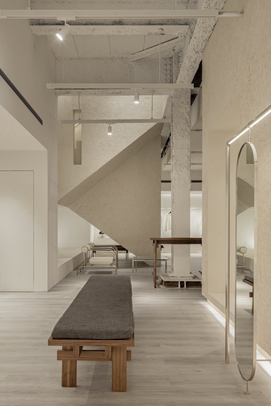
店铺内四周以白色作为空间底色,暖灰色的垂直体块被衬托出来。垂直体块有着光滑和粗糙两种截然不同的质感对比,在简洁柔和的基调上增添了一份力量感。
The store’s interior walls around are pure white as a background, bringing a sense of softness to the space. The warm gray vertical volumes contain two different textures—smooth and rough—adding a sense of strength to the overall space.
▼上层概览,upper floor overview© 穆彪
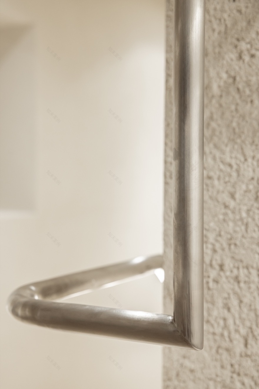
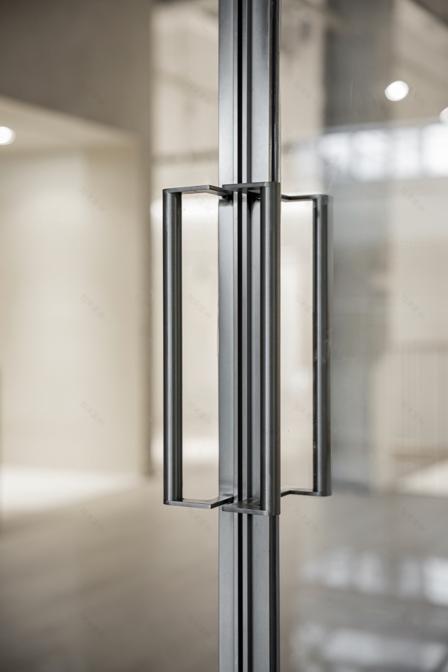
不锈钢作为空间中轻盈流动的设计语言,不仅承载着挂衣和展示功能,也丰富了空间层次。带有光泽感的不锈钢元素也反复运用在了移动挂衣杆、扶手以及橱窗把手上。
Stainless steel serves as a light and fluid design element within the space, not only supporting the function of hanging clothes and displaying items but also enriching the spatial layers. The glossy stainless steel elements are also repeatedly used in the mobile clothes hanging rails, handrails and door handles.
▼不锈钢扶手,glossy stainless steelhandrails © 穆彪
▼休憩区,recreation area© 穆彪
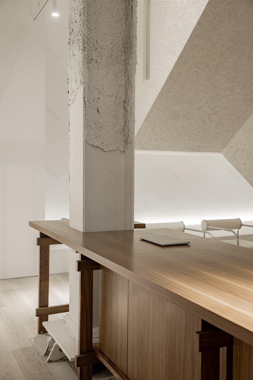
空间中定制的收银台、展示柜以及休息长凳作为统一的木构语言反复出现在展示区和休憩区,木头的质感充满了生命力,温暖的木色调柔化了空间氛围。
The customized furniture including cashier table, display cabinets and benches in the space use a cohesive wooden language throughout the space. The texture of the wood is full of vitality, while the warm wood tones softened the overall atmosphere of the space.
▼木头的质感细部,wooden details© 穆彪
▼八层平面,8F plan
© 本所设计
▼九层平面,9Fplan© 本所设计
▼剖面图,sections© 本所设计
项目名称:YANXU 妍叙买手店
建成年份:2024
项目面积:300m²
项目地址:武汉
设计机构:Basistudio 本所设计
主持设计:笪文博
设计团队:宋美华,陈俊宇,陈津津
项目摄影:穆彪
客服
消息
收藏
下载
最近


