查看完整案例

收藏

下载
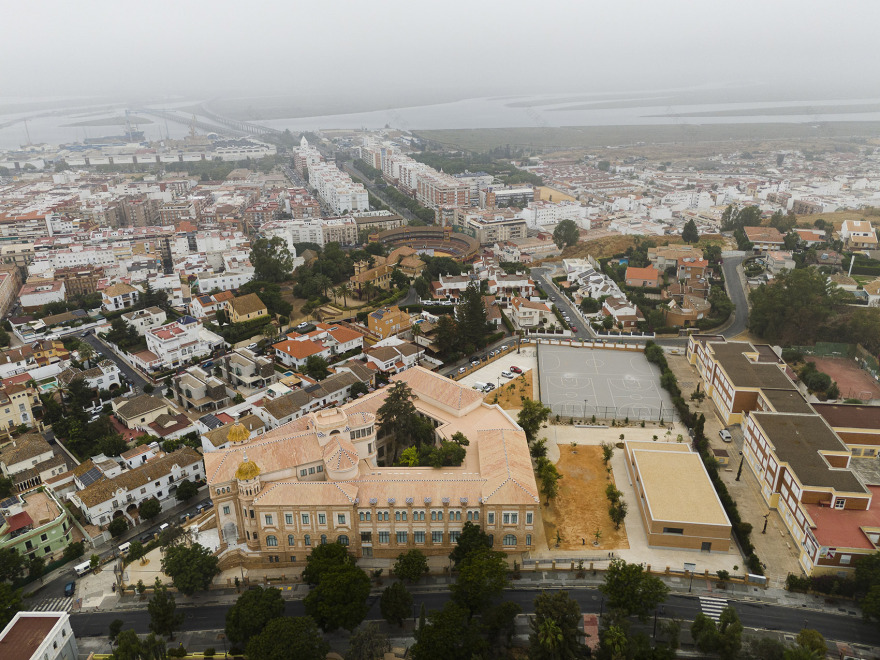
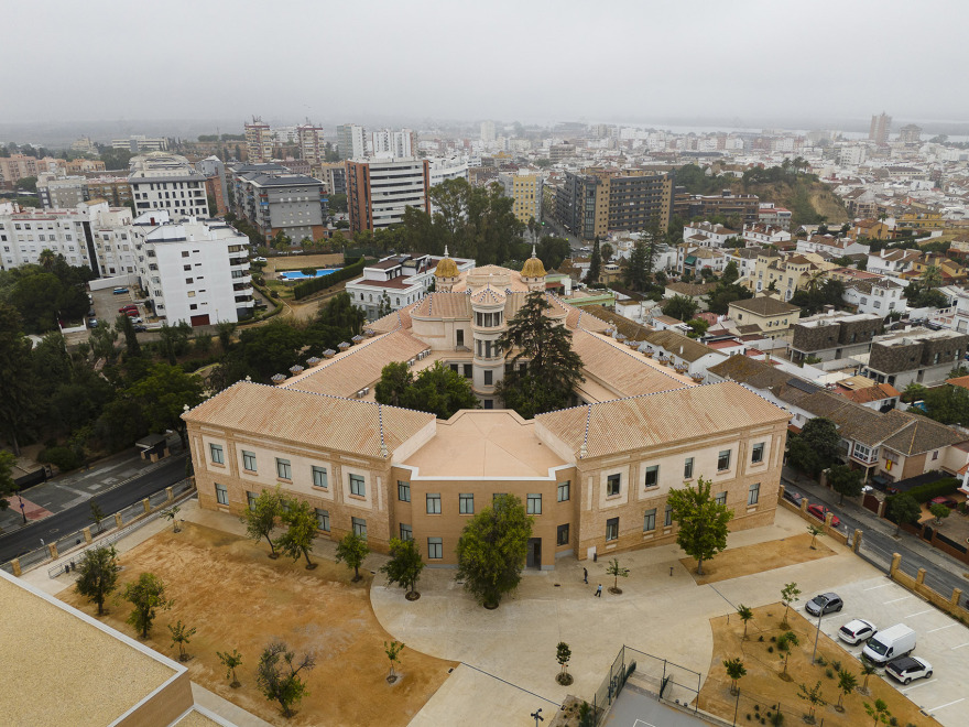
由建筑师José María Pérez Carasa于1932年设计的La Rábida学院自成立以来经历了一系列局部的、互不关联的改革,导致其内部结构失去了清晰性和连贯性。为了扭转这种局面,该项目从现在开始对其原有布局的特征(类型和空间)进行了重新诠释,在此过程中既避免了对新设计介入的断代性解读,也避免了模仿性的、不合时宜的粗略估算。
The La Rábida Institute (1932), designed by architect José María Pérez Carasa, has been subjected to a long list of partial, unconnected reforms since its inception, which have led to the loss of clarity and coherence of its internal structure. To reverse this situation, the project interprets from a present time those attributes (typological and spatial) that characterized its original layout, avoiding in the process both a stratigraphic reading of the new intervention and mimetic, anachronistic approximations.
▼项目鸟瞰,Ariel view of the project ©Fernando Alda
▼周围环境,surroundings ©Fernando Alda
▼项目鸟瞰,Ariel view of the project ©Fernando Alda
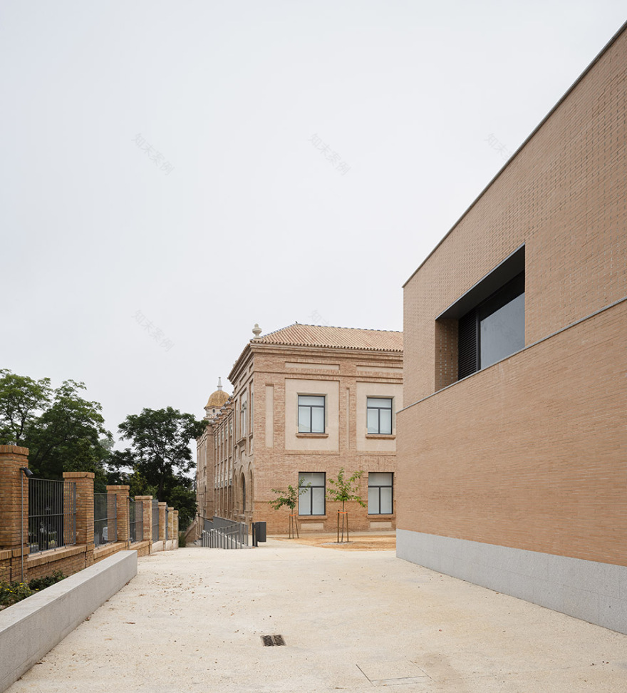
▼项目街景,street view of the project ©Fernando Alda
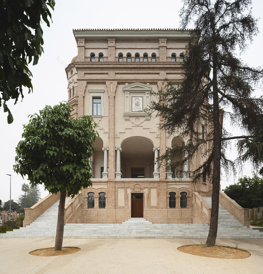
▼项目外观,exterior of the project ©Fernando Alda
建筑包括一系列并置的体量——根据功能的不同——沿着中轴对称分布。在其原始状态,这一布局在严格意义上的教育用途和非教育用途之间存在着明显的空间差异,面对宽敞的室内中庭,公共设施例如主厅、礼堂、小教堂、图书馆和行政楼,集中在头部。后续的设计介入渐渐偏离了这一逻辑,导致中心的功能布局日益混乱。因此该项目的第一个决定就是恢复在空间和功能结构上的连续性。另一个关键性的因素是改善教学楼和室外空间的关系。
The building is composed of a series of juxtaposed volumes – which vary according to the program they were intended to house – arranged around a powerful axis of symmetry. In its original state, this fact resulted in a clear spatial differentiation between the strictly educational use, facing the large interior courtyard, and those of a more public nature (main hall, auditorium, chapel, library and administration), concentrated in the head. Subsequent interventions would deviate from this logic, making the functioning of the centre increasingly confusing, so one of the first project decisions will be to recover the coherence between spatial and functional structure. Another fundamental issue has been to improve the relationship between the classroom building and the outside spaces.
▼学院室外环境,outdoor environment ©Fernando Alda
▼体育馆外观,gym exterior ©Fernando Alda
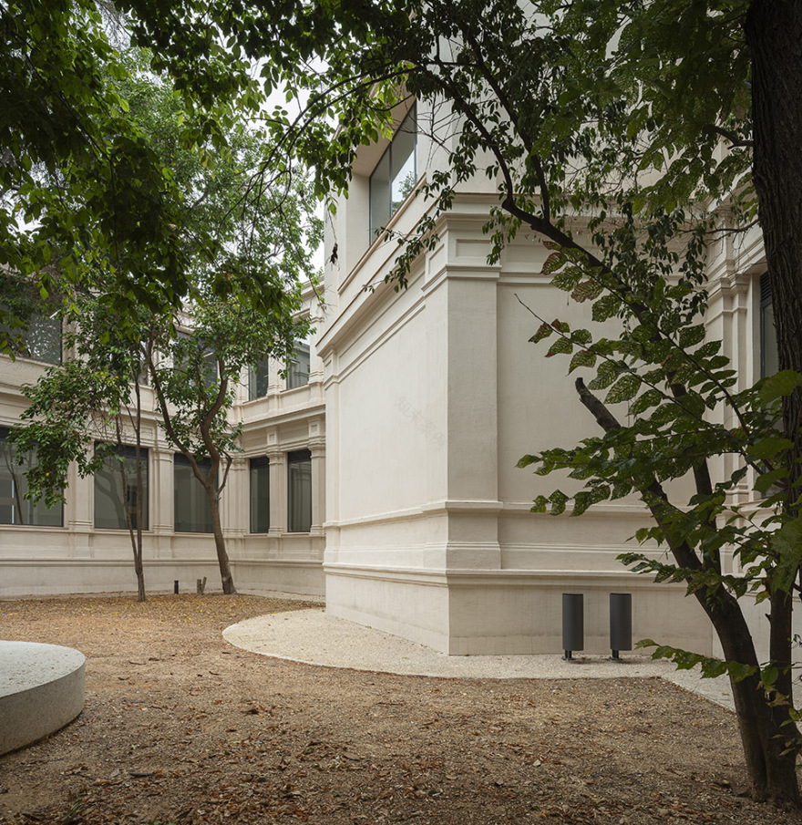
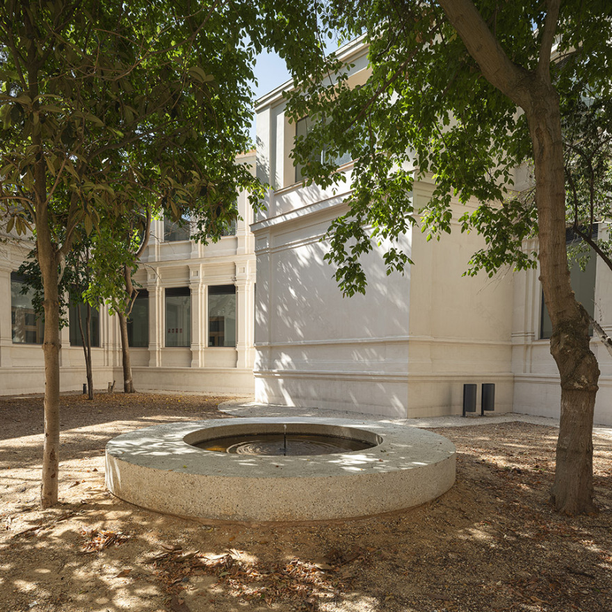
▼庭院,courtyard ©Fernando Alda
▼庭院,courtyard ©Fernando Alda
70年代的设计介入堵塞了走廊和原始出口,迫使人们绕远路才能到达操场。针对这一情况,建筑师提出了两个补充方案:在扩建的建筑中增加一条通道或在(本被洗手间占用的空间)前建造新楼梯来连接中庭。这一举措也为之前一直处于废弃状态的走廊引入采光和自然通风,强调了其连续性。
The intervention carried out in the seventies blocked the gallery and blocked the existing exit, forcing long and tortuous routes to access the playground. In response to this situation, two complementary operations are proposed: to generate an access in the extension building and to build a new staircase in front of it (in the volume previously occupied by the toilets) linked to the central courtyard. This action also allows light and ventilation to be introduced into a section of the gallery that until now was residual, reinforcing its continuity.
▼入口柱廊,colonnade at entrance ©Fernando Alda
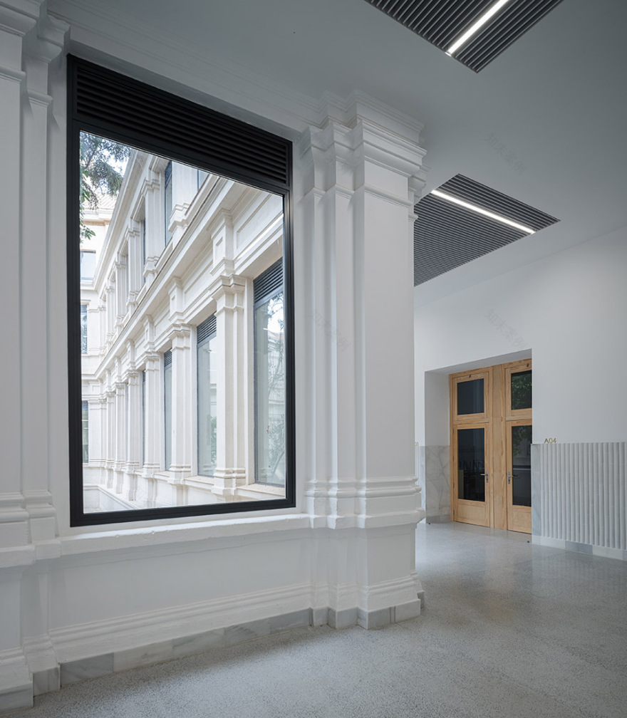
▼入口大厅,entrance hall ©Fernando Alda
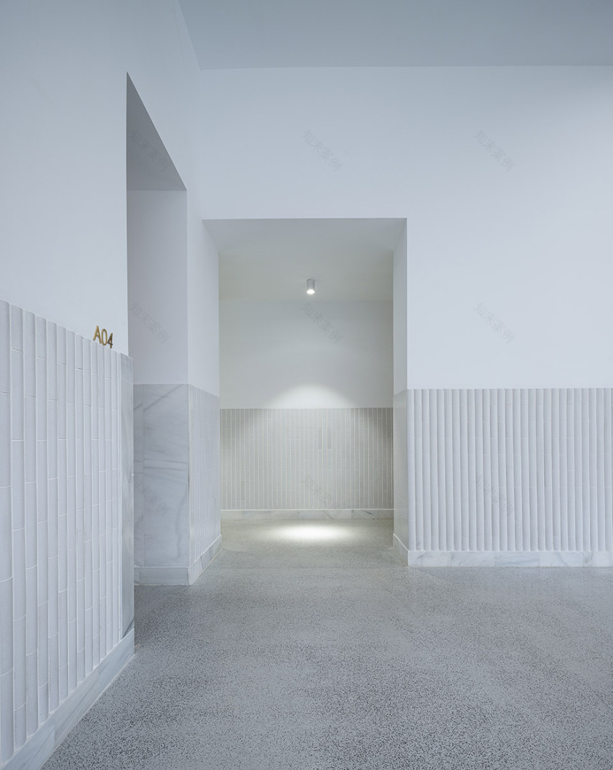
▼走廊,corridor ©Fernando Alda
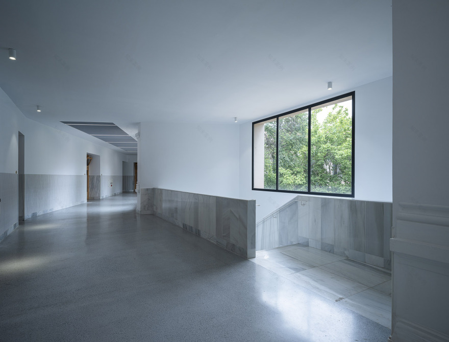
▼走廊通往楼梯间,corridor towards the staircase ©Fernando Alda
▼走廊,corridor ©Fernando Alda
中庭作为教学楼的主心骨,它的严重老化意味着这里不再是学生们的活动休闲场所。对中庭的修复被视为开拓其使用可能性的机会,使其可以完全通行并在植被最茂密的地方修建了一个喷泉长凳。另一方面,有证据表明,外围长廊最初并不是封闭的,因而新建木结构的存在被降到最低,以凸显回廊式的结构,即花园和教室之间的过渡空间。通过上层的百叶系统解决了通风问题,因此也引入了植被和温泉来控制室内湿度和温度。半地下层昏暗且如迷宫般毫无章法,也是近年来多次局部干预的结果。
The high degree of deterioration of the central courtyard, the backbone of the classroom building, meant that it was no longer used as a recreational area for students. Its recovery is proposed as an opportunity to expand its possibilities of use, making it entirely passable and incorporating a fountain-bench in the most densely wooded area. On the other hand, there is evidence to suggest that the perimeter gallery was not originally closed, which has led to reducing the presence of the new carpentry to a minimum in order to enhance its cloister-like condition, an intermediate space between the garden and the classrooms. Ventilation is resolved by means of a system of slats in the upper area, thus allowing the vegetation and the fountain to collaborate in controlling the humidity and temperature conditions inside. The semi-basement floor, labyrinthine and dark, was the result of numerous partial interventions developed over the years.
▼修复后楼梯,staircase after renovation ©Fernando Alda
▼修复后楼梯,staircase after renovation ©Fernando Alda
▼茶水间,cafetaria ©Fernando Alda
▼走廊,corridor ©Fernando Alda
▼走廊,corridor ©Fernando Alda
新的布局对其进行了彻底重组,坚持了其余楼层的轴向布局。两侧的入口(Siurot and Terrades)通过一条内部街道连接,一条缓坡解决了两者之间的地差。以这种方式确保了建筑的通透和可达性。建筑被重新修复,占地约7,500平方米的施工场地将容纳各种各样的功能,尽可能自然的适应多种空间特质和构造异常。为了避免设计介入变成一连串不连续的场景,建筑师界定了清晰的建设手法:一旦确定了一个精简的材料调色板,就会制定一系列规则,决定不同元素之间的融合,这使他们能够在一种连续性的关系中,以特定的方式应对各种(和不可预见的)情况。
The new layout reorganises it completely, insisting on the axial layout of the rest of the floors. The two side entrances (Siurot and Terrades) are connected through an internal street, resolving the difference in height between them through gentle ramps. In this way, the permeability and accessibility of the building is guaranteed. The building to be rehabilitated, with a constructed area of approximately 7,500 m2, houses a heterogeneous programme that must adapt as naturally as possible to countless spatial and constructive singularities. To prevent the intervention from becoming a succession of unconnected episodes, we defined a clear constructive syntax: once a reduced palette of materials has been established, a series of rules are set that determine how to articulate the encounter between the different elements, which allows us to respond to diverse (and unforeseen) situations in a specific way within a relationship of continuity.
▼弧形转角,curved corner ©Fernando Alda
▼直角转角,straight corner ©Fernando Alda
▼礼堂,auditorium ©Fernando Alda
▼教室,classroom ©Fernando Alda
这一选择不仅是需要用务实的方式满足环境和功能上的需求(持久性、维护、透光性、声学等),也是先要使改造后的室内可以呼应建筑的材料记忆:立面采用的模块化砖块,立柱的造型,天然石材和水磨石,庭院中的树等。新体育馆有助于组织外部空间,成为la Rábida国际教育学院、邻近的Diego Guzmán国际教育学院和操场不同区域之间的衔接。立面的材料和构成方法在宣称其当代性和自主性的同时建立了和原建筑的对话。新开发的布局重现了清晰界定学院的轴线,利用弧形几何学(建筑多个时期的组成元素:主庭院的花床,楼梯,塔楼)来强调室内与室外,新旧之间的连续性。通过这种方式,还可以将组成花园的各个区域统一起来,使整个花园具有以前所缺乏的凝聚力。
This choice is dictated both by the need to attend to environmental and functional requirements (resistance, maintenance, luminosity, acoustics, etc.) in a pragmatic way, and by the desire to make the renovated interior resonate with the material memory of the building: with the templated bricks of the façade, the mouldings of the pillars, the natural stone and terrazzo, as well as the imposing trees in the courtyard. The new gym helps to organise the exterior spaces, acting as an articulation between the IES la Rábida, the neighbouring IES Diego Guzmán de Quesada, and the different areas of the playground. The material and compositional solution of the façades establishes a dialogue with the existing building while claiming autonomy from the contemporaneity of its language. The layout of the new development recognises the axis that articulates the institute, using curved geometries (a compositional resource present in various episodes of the building: flowerbeds in the main courtyard, stairs, tower) to enhance the continuity between interior and exterior, between the old and the new. In this way, it is also possible to achieve to unify the various areas that make up the garden, providing the whole with a cohesion that it had previously lacked.
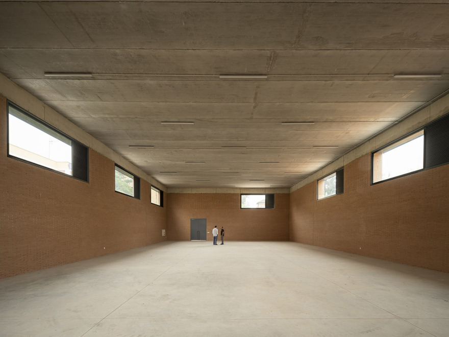
▼体育馆,gym ©Fernando Alda
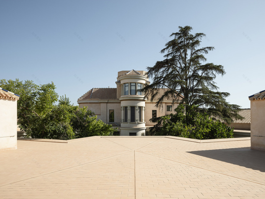
▼屋顶空间,roof space ©Fernando Alda
▼内庭院,inner courtyard ©Fernando Alda
▼内庭院景观,inner courtyard landscape ©Fernando Alda
▼细部,detail ©Fernando Alda
Architect: Marqués Vilaplana, Francisco
Location: Huelva
Typology: Center of Education
Date: 22-09-2024
客服
消息
收藏
下载
最近


