查看完整案例

收藏

下载

翻译
Designer:Burdifilek
Location:Toronto, ON, Canada; | ;View Map
Project Year:2024
Category:Shops
Andrew and Jamie Metrick, fourth-generation owners of the Toronto-based design store ELTE, approached the creative team at BURDIFILEK to reimagine the new home for their luxury bath and kitchen brand, Ginger’s. Having a long-standing relationship designing for the Metrick family, it was a natural step to partner on this new project. Committed to considered design, the owners have a passion for detail and timeless elegance, a common denominator with the design sensibility of BURDIFILEK.
Bringing a vision to life
The client’s vision was to move Gingers’ existing showroom to the second floor of their ELTE store in the Toronto Design District. By consolidating everything under the same umbrella, it would create a more streamlined shopping experience and ultimately become a one stop destination, and the “go to” benchmark flagship for all things home in one of North America’s largest cities. The new space would introduce an extensive array of luxury branded products, reinforce their reputation for their curated collections alongside their excellent customer service.
“Each product at Ginger’s is carefully curated with our clients in mind, so in working with Burdifilek, we focused on creating a space that highlights the beauty of each piece, allowing clients to effortlessly create something that feels uniquely personal,” explains Andrew Metrick, Co-Owner of ELTE. Part of the request was to create stronger customer experience by having a more functional and organized environment for the sales associates, as well as showcasing more products while highlighting the uniqueness of their various collections of bath and kitchen hardware. “It was important to represent the family ‘s DNA in the design by showcasing their desire for quality and innovation while speaking to the sensibility of their luxury brands,” says Diego Burdi, Co-Founder and Creative Partner at BURDIFILEK.
A broad canvas
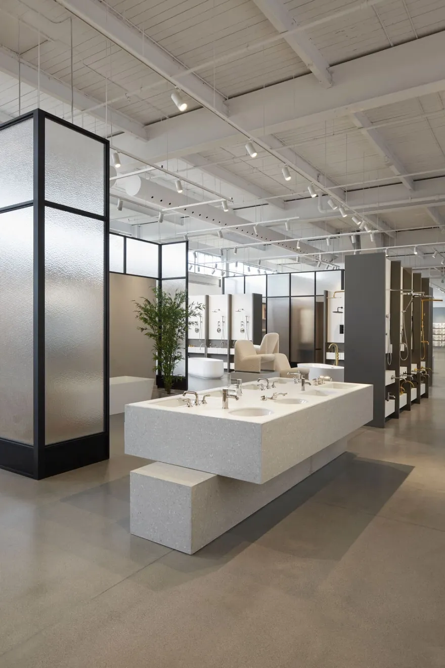
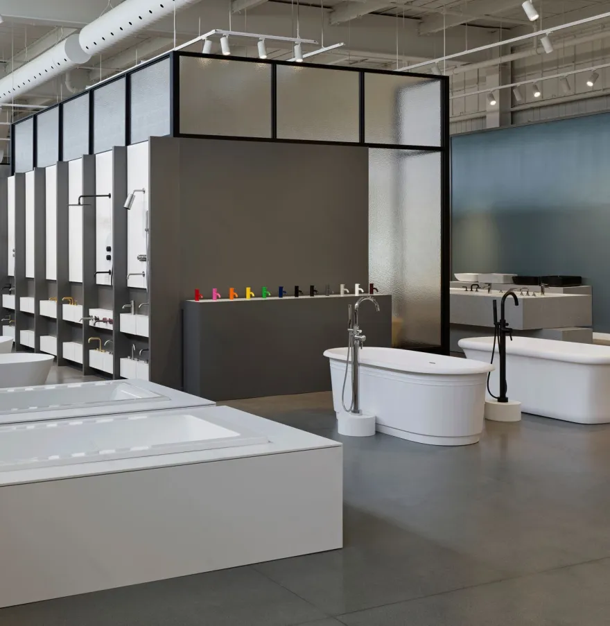
When the team at BURDIFILEK first walked through the raw space, they were faced with a large volume of approximately 20,000 square feet. The first impression was as if walking into a large art gallery within an industrial warehouse. The uniqueness of the architectural envelope incited the designers to keep the integrity of the building and play with the concept of the art gallery. In the end, much of the design detailing took its cues from the existing quality of the industrial warehouse. To break the large linear space, the designers used compartmentalization by creating pavilions. This helped define a primary circulation path and made it more human in scale. An attractive feature of the warehouse was the upper clerestory windows flooding the space with light. BURDIFILEK took inspiration from those windows to design the larger-than-life black metal and frosted glass frames of the pavilions. The idea behind the semi-translucent glass allows for kinetic movement, creating a sense of curiosity for what is beyond, thus eliminating any static environment but instead enticing customers to further browsing.
The important aesthetic design decision to leave the perimeter of the building intact, with its high industrial ceiling and rawness, (except for a coat of white paint and concrete floors) against the modern, classic design and polished products is part of the design dialogue. Each pavilion highlights a different department, from a bath and shower zone to sinks and faucets, to consultation spaces.
An infusion of artistic design elements
As a nod to the art gallery concept, the designers created monolithic sculptural displays and pedestals, at times brutalist in form and shape, casting an industrial feel with a functional and modern sensibility. The calculated simplicity in the design allows the client flexibility to create vignettes, as well as showcase more products without overwhelming the shoppers. Most importantly it gives customers a place to pause, admire, or be wowed by the products on display.To enhance the aesthetic and functionality of the spaces, all materiality was purposely chosen to be matte, from wood, paint, metal, to the frosted glass. Since most of the products are polished metals and high gloss porcelains, the resulting effect allows the collections to shine against the matte surfaces. Instead of signage, colors, shapes, and forms guide customers through the various spaces. The palette is rich with touches of brick, French blue, white, and natural wood. The pop of colors on accent walls, act as a backdrop for the visual merchandising team and functions as canvases for seasonal displays and storytelling.
Finishing touches
One of the client’s requests was to ensure that the store would have very functional consultation areas, workstations, and cash points. In these areas, all custom design tables, fixtures and working areas are created of warm wood with complementary stone accents, fostering a welcoming feeling. To complement the natural light coming from the clerestory’s windows, BURDIFILEK used focusable lighting to highlight the individual pavilions, making the spaces warm, inviting and inspiring. An important aspect was to ensure customers would have an intuitive shopping experience, where one can walk through the spaces and understand the product instinctively. The solution was to strategically place complementary zones adjacent to one another for a seamless shopping experience. For example, the kitchen sinks are showcased next to the kitchen faucets displays.
A design rooted in originality
The success of the BURDIFILEK design is embedded in the originality, innovative and creative solutions the designers found to break the large volume of space while keeping the historical quality of the building, all within an exciting and unique concept that is highly functional, approachable, and beautiful. The result is a space that instills consumer confidence, where clients can enjoy a memorable experience, leaving one to encounter moments of contemplation and excitement while shopping for something as essential as a kitchen faucet or bath accessory. All in the hope of creating an enduring environment that will stand the test of time and where customers will continue to come back.
“BURDIFILEK’s global design approach clearly resonates with this new Ginger’s branded environment. The showroom could be anywhere in the world and is a true reflection of the quality of design commitment that Ginger’s represents and brings to the Toronto design landscape,” says Paul Filek, Managing Partner
Team
:
Designers: Burdifilek
Design Team: John Seo- Designer, Michael Del Priore- Designer, Daniel Mei- CAD technical, Anna Jurkiewicz- CAD technical, Anna Nomerovsky- CAD technical , Tina Entwistle- Project Manager/ CAD technical, Rene Ng- Project Manager
Millwork: Mar-tec Woodworking Ltd.
Lighting Consultant: Marcel Dion Lighting Design
Photographer: A-Frame Studio
Client: Elte
Founder and Creative Director: Diego Burdi
Founder and Managing Partner: Paul Filek
Project Manager / Studio Director: Tom Yip
▼项目更多图片
客服
消息
收藏
下载
最近


