查看完整案例

收藏

下载
▲项目概览, General view ©高含之
开放的盒子
Open Boxes
/
这是一篇没有感情,纯粹以客观陈述为什么这么设计的设计说明。设计本身没有那么多为什么,也并非基于什么宏大理论或者抽象概念,而是针对场地现状与项目背景提出的问题,通过合理的形式与方法解决实际需求,最终达成设计的预期效果。
This is a design statement without emotion, purely objective to state why the design is so. The design itself does not have so many whys, nor is it based on any grand theories or abstract concepts. Instead, it addresses the issues raised by the current situation of the site and the background of the project, and solves the actual needs through reasonable forms and methods, and ultimately achieves the desired effect of the design.
▲项目概览, General view ©高含之
为什么是个开放式的空间?
Why an open space?
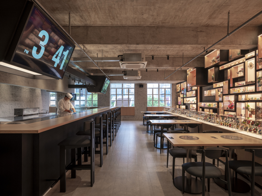
一开始是甲方想要的业态决定了空间设计的方向。开放是个关键词,且不可改动。开放式的厨房,开放式的酒吧台,开放式的展示空间,这些元素共同定义了这是一个开放式的空间。
In the beginning it was the business that the client wanted that determined the direction of the space design. Open is the key word and unalterable. The open kitchen, the open bar counter, the open display space, all these elements together define this as an open space.
整个空间完全打开的布局,可以有效促进社交互动,让顾客不仅仅能感受到食物的香气以及烹饪的温度,还能和厨师及调酒师进行直接的互动,让客人可以直接的看到食物准备的全过程,让烹饪和用餐无缝衔接。
The completely open layout of the entire space effectively promotes social interaction, allowing customers to not only feel the aroma of the food as well as the temperature of the cooking, but also allows for direct interaction with the chef and bartender so that guests can directly see the entire process of food preparation, allowing for a seamless transition between cooking and dining.
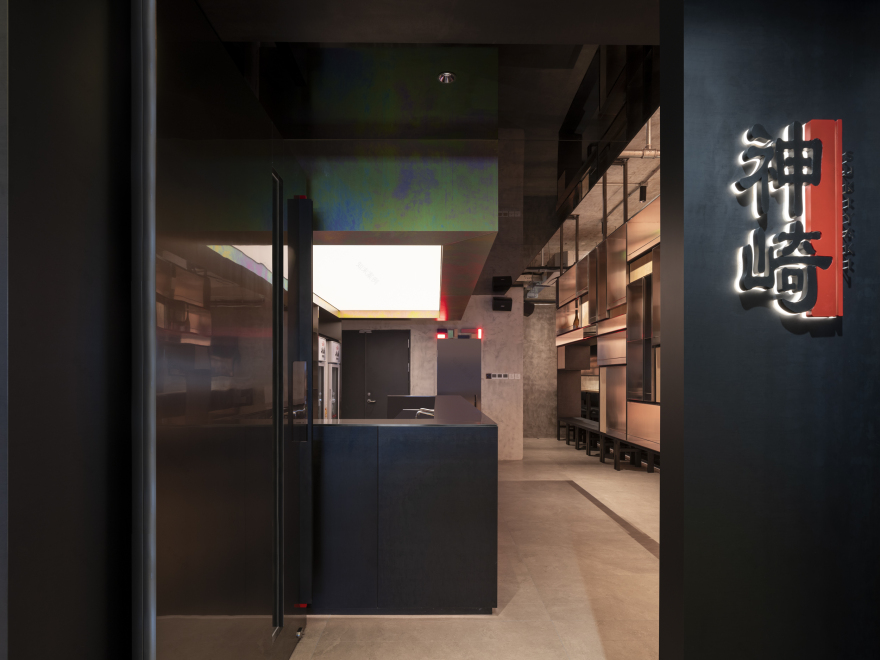
▲入口, Entrance ©高含之
▲开放式空间, Open space ©高含之
▲轴测图, Axonometric ©弹性工作室
为什么设计一整面的玩偶展示墙?
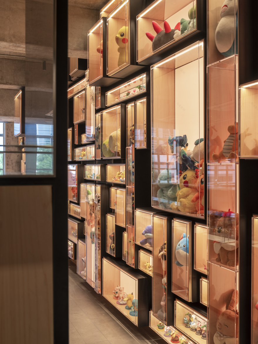
Why design an entire wall of doll displays? 甲方原本的业务是做二次元盲盒,手握众多二次元 IP 形象资源,并且希望设计可以体现出这一元素,玩偶墙需要一定的灵活性,支持定期更换 IP 形象,并且展示墙是需要成为整个设计的核心元素,要让玩偶墙占据店铺最好的位置且最大化的展示,以强化餐厅的辨识度,体现与其他餐厅差异化之处。
The client’s original business is to sell ACG blind boxes, holding a lot of ACG resources, and hopes that the design can reflect this element. The doll wall needs to be flexible to support the regular replacement of the IP image, and the display wall needs to be the core element of the whole design, so that the wall of dolls can occupy the best position in the store and maximize the display, in order to strengthen the restaurant’s recognition, reflecting the differentiation with other restaurants.
▲玩偶墙分析图, Doll Display Wall Analysis ©弹性工作室
▲单个盒子分解图, Individual Box Analysis ©弹性工作室
▲玩偶展示墙, Doll Display Wall ©高含之
▲层层叠叠, Layer Upon Layer ©高含之
为什么采用所谓“工业风”的设计?这个省钱嘛?
Why the “industrial style” design? Does this cost less?
一整墙的玩偶展示墙,随著每个季度不同 IP 的转换,会呈现出五颜六色的氛围,所以整个硬装空间的色调无论是甲方还是我们设计方都倾向于中性无颜色的色调氛围。
The display wall, along with the different IP theme of each season, will present a colorful atmosphere, so the entire hardcover space, whether it is the A side or our designers tend to neutral colorless tone atmosphere.
当然相较于昂贵材料堆砌或依赖精细施工细节的设计,裸露处理确实可以在一定程度上的控制成本,但并不像多数甲方想象的那样低廉。裸露的设计不仅仅是简单的取消吊顶或取消墙面饰面,还需要系统的考虑消防管道的排布、空调设备的布置、桥架的规划,以及水电明管的走向等多项因素,必须经过系统的设计与协调,还需要多方供应商的配合,才能实现视觉上干净利落、整洁有序的空间效果。
Of course, compared to the expensive materials or rely on fine construction details of the design, bare treatment can indeed control the cost to a certain extent, but not as cheap as most of the client imagined. Naked design is not simply cancel the ceiling or cancel the wall finishes, but also need to systematically consider the arrangement of fire piping, air conditioning equipment, bridge planning, as well as the direction of the water and electricity piping and other factors, must be systematically designed and coordinated, but also need to cooperate with a variety of suppliers in order to achieve a visually clean, neat and orderly space effect.
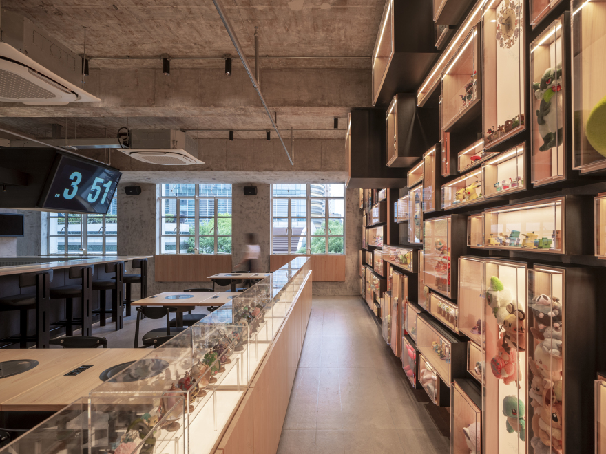
▲望向酒吧区视角, View towards the bar area ©高含之
▲过道, Corridor ©高含之
▲透过吊柜望向吧台, Looking through the hanging cabinets to the bar ©高含之
现场整个施工环节面临了什么样的问题?
What kind of problems were faced throughout the construction process on site? / 场地原先是个中式养生按摩店,空间内被划分成多个独立的小房间,每个房间均做了吊顶处理。整个空间拆除完后,露出了错综复杂的管线及斑驳的混凝土面,且层高相对较矮。考虑到开放式的布局空间可能会进一步压缩视觉高度,我们和甲方一致决定采用裸顶结构,不再设计吊顶。为了适应开放式的天花设计,除了消防是不可做改动外,我们重新调整了空调设备的位置,包括天花的强弱电系统也都做了严格的规划。
The site was originally a Chinese health massage parlor, and the space was divided into several small, independent rooms, each with suspended ceilings. After the demolition of the entire space, the intricate piping and mottled concrete surfaces were exposed, and the floor height was relatively short. Considering that the open layout space might further compress the visual height, we and the client unanimously decided to adopt a bare ceiling structure and not to design a suspended ceiling. In order to adapt to the open ceiling design, except for the fire protection which is not to be altered, we readjusted the position of the air-conditioning equipment, including the strong and weak electrical systems in the ceiling, and also made strict planning.
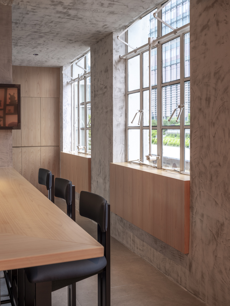
为了强化空间的质感,我们用到的材料也相对较少。剥离天花和墙面饰面后,我们让施工方通过水洗加打磨来呈现混凝土本身的原始肌理。我们还用了深色锈板这一未作任何表面处理的金属材料,作为大部分固定家具的装饰材料。以及近人尺度的部位,则选用了浅色桧木作为桌面材料,来增强触感上的舒适性。
In order to enhance the texture of the space, we used relatively few materials. After stripping the ceiling and wall finishes, we had the contractor wash and polish the concrete to reveal the original texture of the concrete itself, and we also used dark rust plate, an unfinished metal material, as the decorative material for most of the fixed furniture. We also used a light-colored hinoki wood as the tabletop material for the near-human scale areas to enhance the comfort of touch.
由于工期的原因,地面并未选择常用的现浇水泥自流平来处理,而是选择暖色系仿混凝土的地砖,切割成 200*1200 的长条,视觉上延伸空间的尺度,提升空间的整体性和连续性。
Due to the reason of the construction period, the floor did not choose the commonly used cast-in-place cement self-leveling to deal with, but chose warm-colored imitation concrete floor tiles, cut into 200*1200 long strips, visually extending the scale of the space, and enhancing the wholeness and continuity of the space.
▲局部视角, Partial ©高含之
▲将空间所有用到的材料做了一个装饰, Made a decoration of all the materials used in the space ©YUI
▲空间细节, Details ©高含之
▲平面图, Layout ©弹性工作室
项目信息
Project Info
/
项目名称:神崎餐厅
项目类型:餐饮
项目地点:中国 上海
项目面积:190㎡
设计公司:弹性工作室
设计总监:谭晨、牧之
设计团队:郭艳琴、李正志
完成年份:2024.06
摄影版权:高含之
主要材料:混凝土、黑色锈板、拉丝不锈钢、桧木、水泥色地砖
Project Name: Kanzaki Restaurant
Project Type: F&B
Location: Shanghai, China
Area: 190㎡
Spatial Design: Tens Atelier
Design Lead:Tan Chen, YUI
Design Team:Guo Ankey, Li Zhengzhi
Completion Time: Jun 2024
Photography: Gao Hanzhi
Materials: Concrete, Rusty Black Plate, Stainless Steel, Hinoki Wood, Cement Colored Tiles
客服
消息
收藏
下载
最近


