查看完整案例

收藏

下载
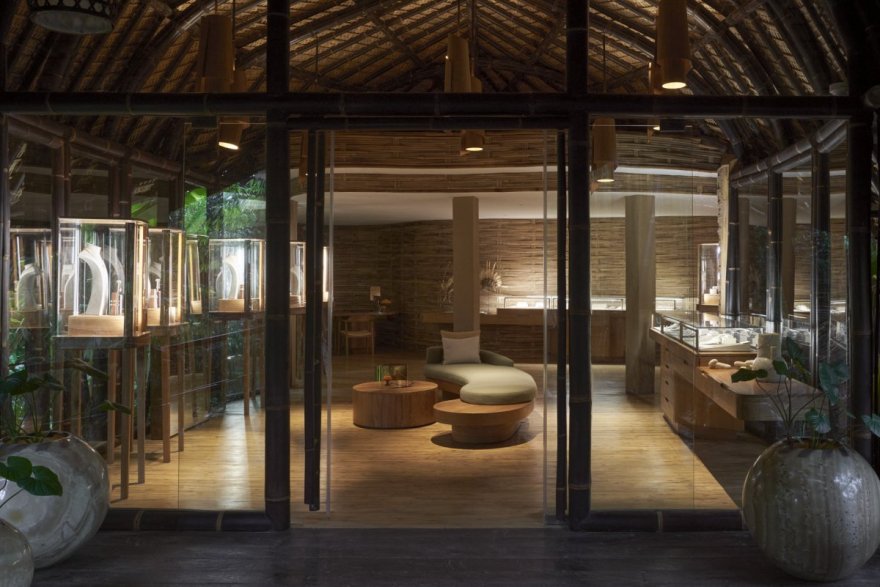
由Blanco工作室设计,Kalpa Taru制作,John Hardy精品店在巴厘岛曼巴尔(Mambal)的室内设计。是现代设计和传统工艺的有力融合,提升了约翰·哈迪在竹结构下展示的珠宝收藏。
Designed by Blanco Studio & crafted by Kalpa Taru, interior design at John Hardy's workshop in Mambal, Bali. John Hardy Boutique is a powerful blend between modern design and heritage craftsmanship that elevates John Hardy's jewelry collection displayed under the bamboo structure.
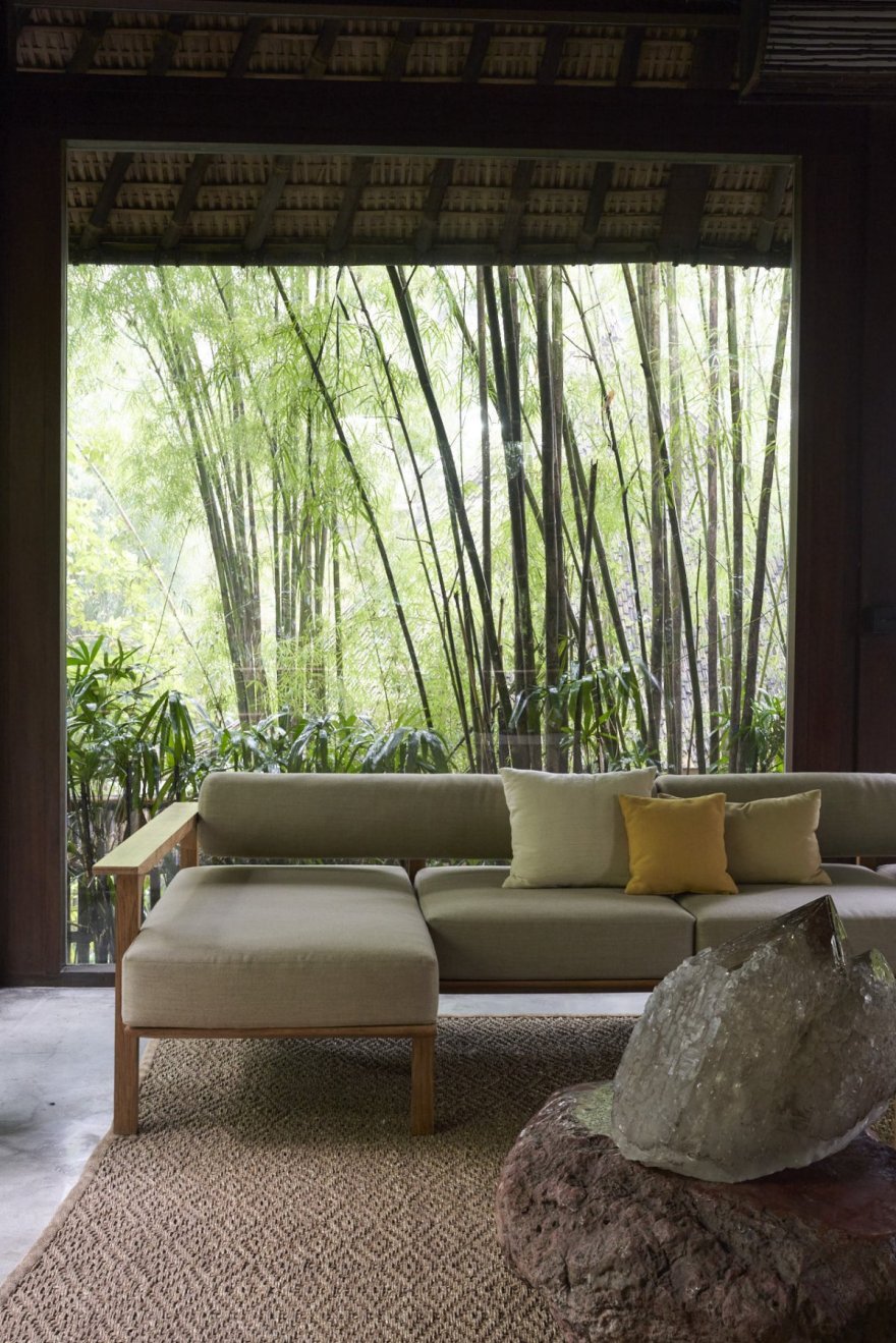
作为受稻田纹理、形状和高度启发的原始建筑,Conchita Blanco强烈认为室内设计需要从树木的密度中脱颖而出,作为建筑本身的一部分。Blanco Studio和Kalpa Taru的合作在工作室中有两个区域;主楼的接待大厅和珠宝廊。
Being the original architecture inspired by the rice paddy textures,shapes and heights, Conchita Blanco felt strongly about the interior design needing to emerge from the density of the woods, as part of the building itself. The collaboration between Blanco Studio and Kalpa Taru features two areas in the workshop; the reception hall and the jewelry gallery in the main building.
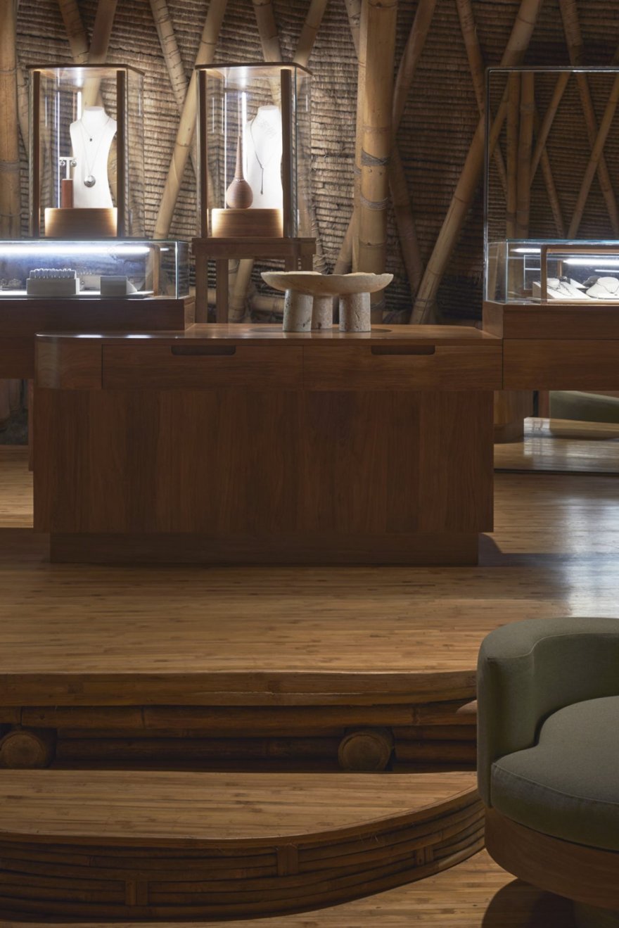
越过木层;橱窗、陈列柜、车厢、书桌和灯具都浮在水面上。由Kalpa Taru制作的展示柜位于中央木柱上,也是一个抽屉,使台面延伸到空中。此外,玻璃橱窗和陈列柜拥有自己的灯光,精心设计将珠宝从背景中分离出来,将其带到顾客的眼前,并消除周围不存在的电缆的干扰。
Over the wooden layers; vitrines,showcases, coaches desks and lamps float. Crafted by Kalpa Taru show cases stand on a central wooden column, also a drawer, that enables the counter tops extend over the air. In addition,vitrines and showcases hold their own lights, carefully thought to separate jewelry from the background bringing it in front the customers eye and dissipating any distraction from non existing cables around.
作为对稻田原始建筑设计的致敬,Conchita Blanco & Avalon Carpenter将玻璃橱窗设计为稻田上方的浮动元素。接待大厅体现了为空间定制的宽阔的教练,圆形和悬浮的靠背座椅。在展厅的下层,当你从入口大厅穿过木桥时,珠宝就会显露出来。在展厅的上层,玻璃橱窗和陈列柜被设计成高度分层,以便沿着空间看到珠宝。
As a tribute to the original architecture design inspired in the rice paddies, Conchita Blanco & Avalon Carpenter conceived the vitrines as floating elements above the rice fields. The reception hall embodies broad coaches custom designed for the space with round shaped and levitating backs sits. In the lower level of the showroom, jewelry reveals itself as you walk from the entrance hall through the wooden bridge. In the showroom’s upper floor vitrines and showcases were planned with height hierarchies in order for the jewelry to be seen along the space.
Architect:BlancoStudio
Photos:IkerZuñiga/Pempki
客服
消息
收藏
下载
最近


