查看完整案例

收藏

下载

翻译
Architect:Studio Ikshha
Location:Vadodara, Gujarat, India; | ;View Map
Project Year:2024
Category:Apartments
Project details: 4bhk flat, residential interior design
Total carpet area: 2100 sq. ft
Project location: Vadodara, Gujarat
Design lead: Ar. Rishika Davda
Design firm: Studio Ikshha
Photography: 26:13 apertures
Inspired by earthy tones and hints of contemporary elements, this flat interior is a perfect amalgamation of simplicity and elegance.
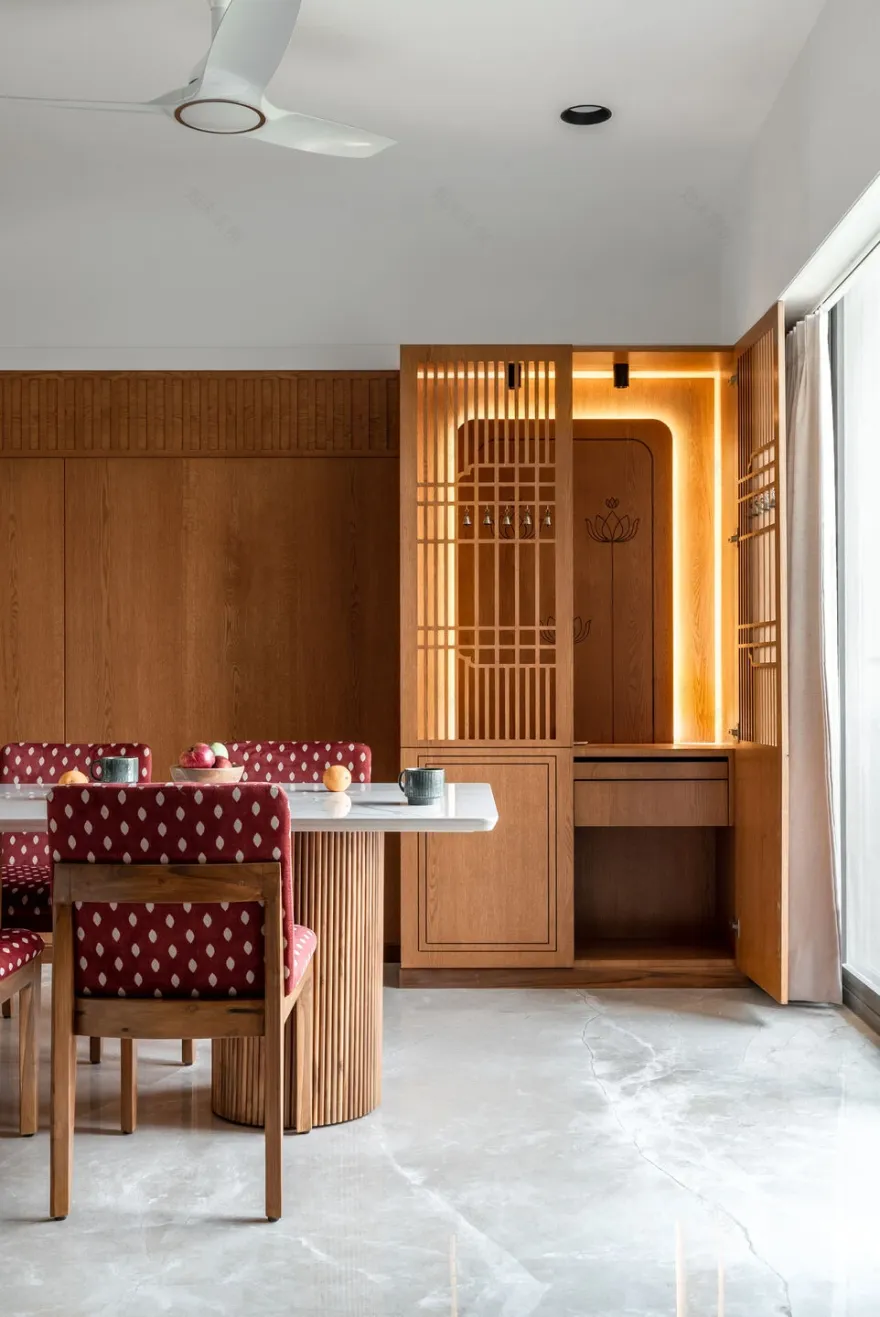
As one enters, into the massive living room, a feeling of warmth is radiated through the brown undertones of the wooden veneer panel. Through the living, one comes into the dinning space, that is in turn connected to the kitchen. In the rest white and brown dinning space, a pop of colour is added through the use of vibrant red polka dot dining chairs. Adjoining the dinning table, is a small wooden intricate pooja unit, inspired by the backdrop wooden panel. The green themed modular kitchen is divided from the living room, with a cane and glass wooden partition, hence creating a barrier yet keeping the whole space visually connected.
Moving from the living into the passage, gives way to the four-bedroom spaces. Each bedroom specifically designed to cater the user’s needs and personal design requirements.
The first bedroom, that one approaches is the guest bedroom. The idea was to keep the design extremely simple, earthy yet new, hence the idea of inverting colour from walls onto the ceiling. To balance the bright green ceiling, wood and cane were selected as the remaining materials.
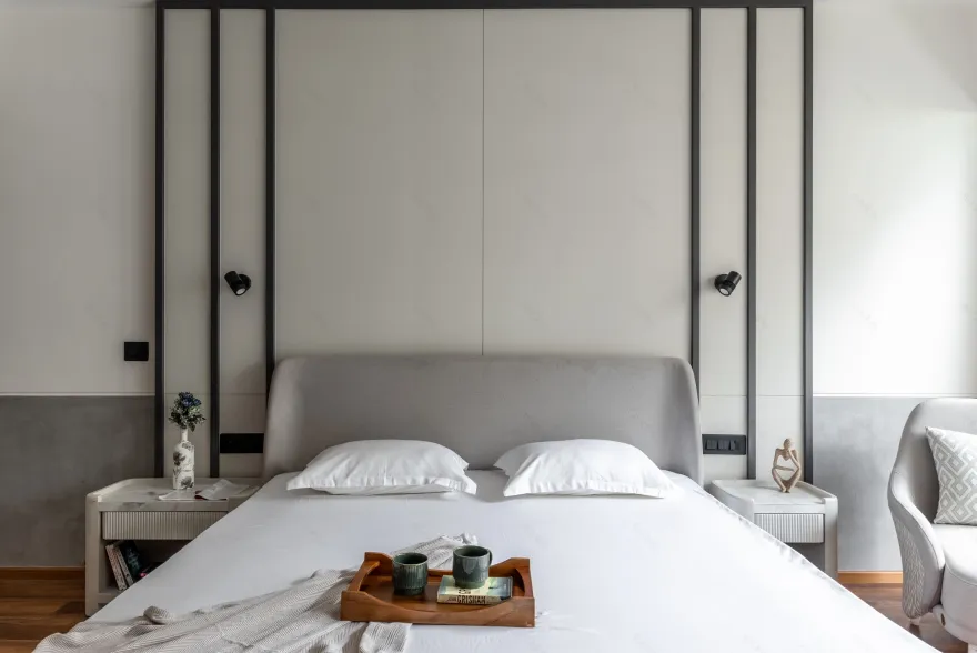
Next comes, the daughter’s bedroom, who wanted a very mature yet bright space. To take this idea ahead, we stuck to lighter tones of wood and grey, while keeping white as the central element, hence the bed back texture was also retained in a plain white colour.
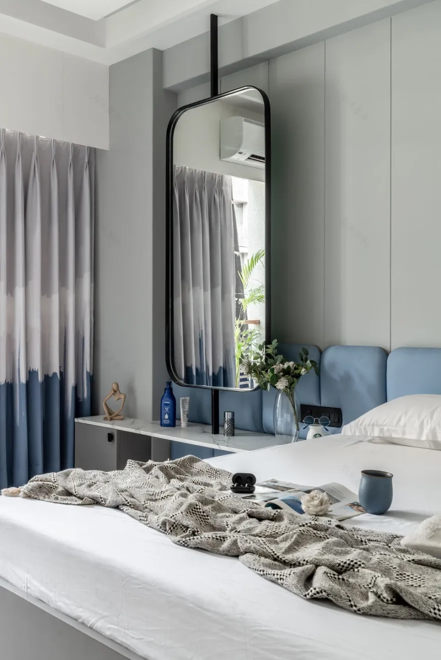
While the design of the son’s bedroom was a taken ahead with a completely different approach of an extremely modern and colourful design. The whole bedroom is uplifted through the use of light blue, bed back panel against the backdrop of a light grey wall. While, we experimented with a suspended mirror for the dressing area beside the bed.
At the end of the passage comes the master bedroom. With a colour theme of beige, brown and grey, we divided the whole room into three areas. The wardrobe and dressing are connected through a grey textured panel with the central portion remaining open to accommodate the TV. While the bed back wall and panel were designed such, to compliment the wooden flooring and the rest grey furniture.
The core idea was to design a homely yet classic space that not only catered to the client’s functional requirements but would also portray the family’s individual personalities. And this candid and timeless design is a testament to the same.
▼项目更多图片
客服
消息
收藏
下载
最近


