查看完整案例

收藏

下载

翻译
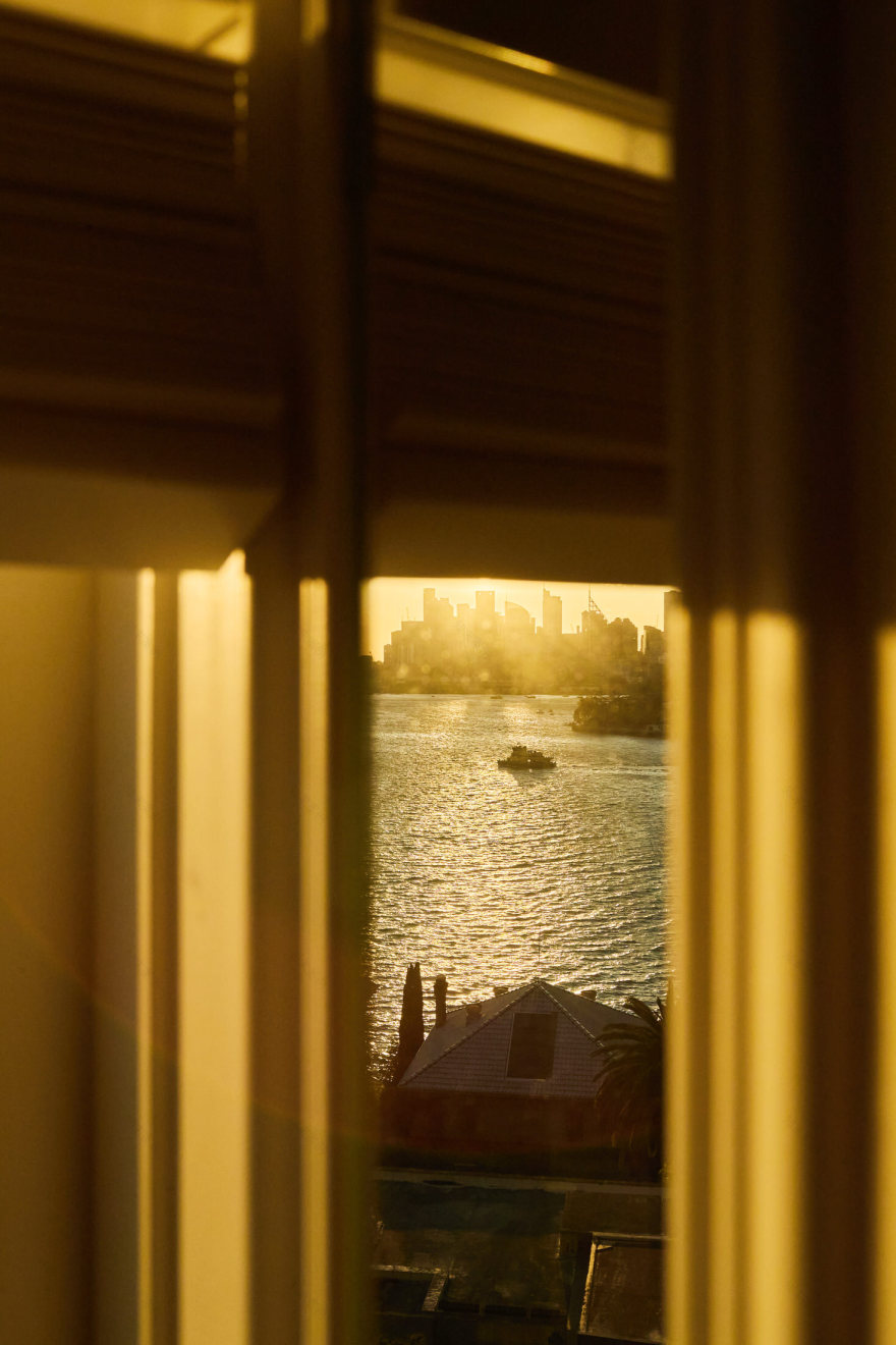
Studio Williams has transformed a 1930s top-floor apartment in Sydney‘s dress circle into a refined residence. Located in Chatsworth House on Point Piper’s Wolseley Road, this thoughtful renovation creates fluid spaces that capture spectacular harbour views.
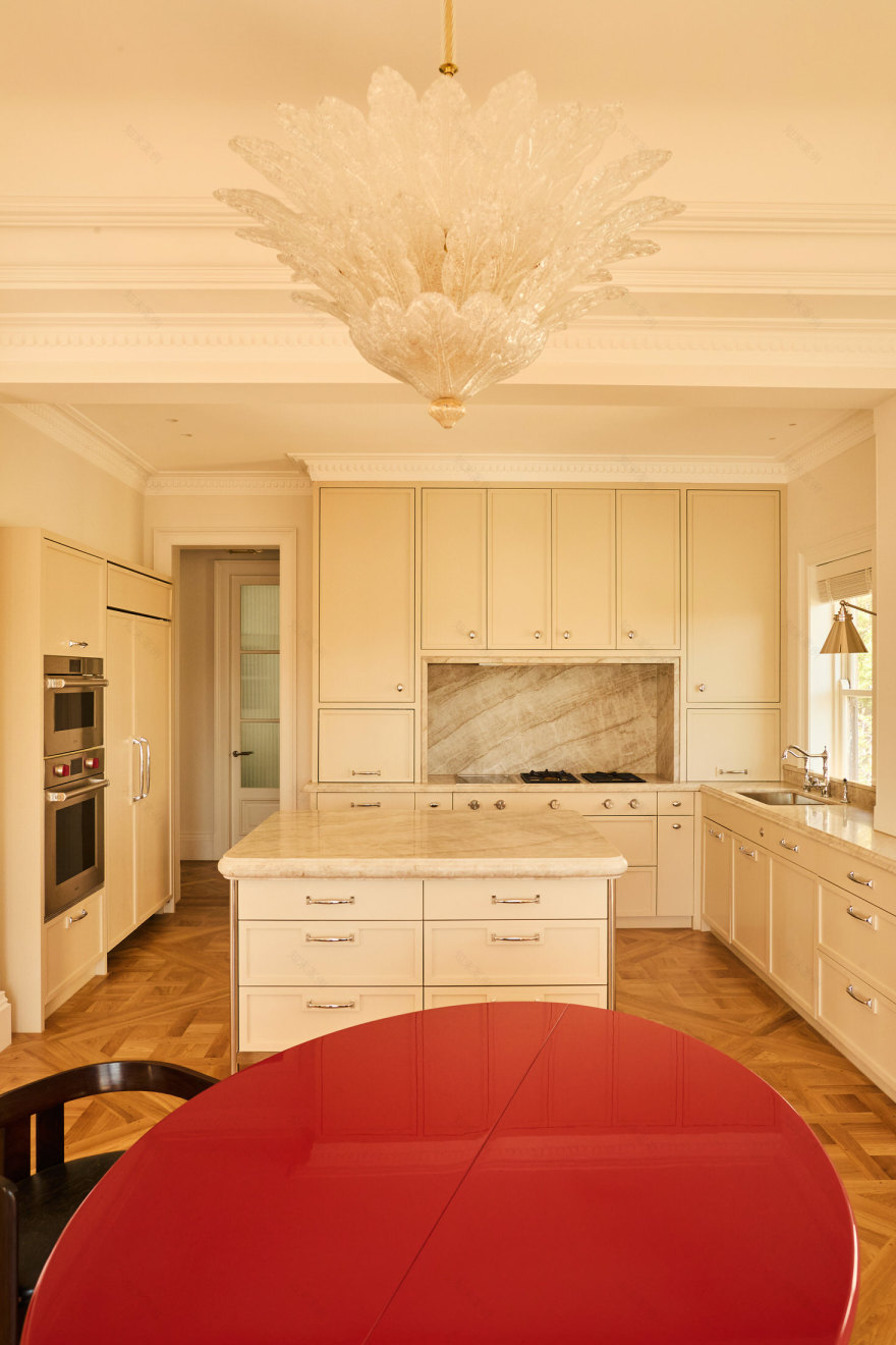
“The client loved the apartment as it was, but it needed updating,” explain Adam Williams and Erin Field. “The kitchen and bathrooms were small and oddly planned, and the kitchen was disconnected from the dining room and views.” The design team responded by completely reimagining the spatial flow, positioning the kitchen to connect seamlessly with the dining area while maximising those coveted harbour vistas.
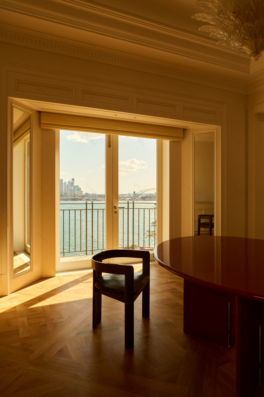
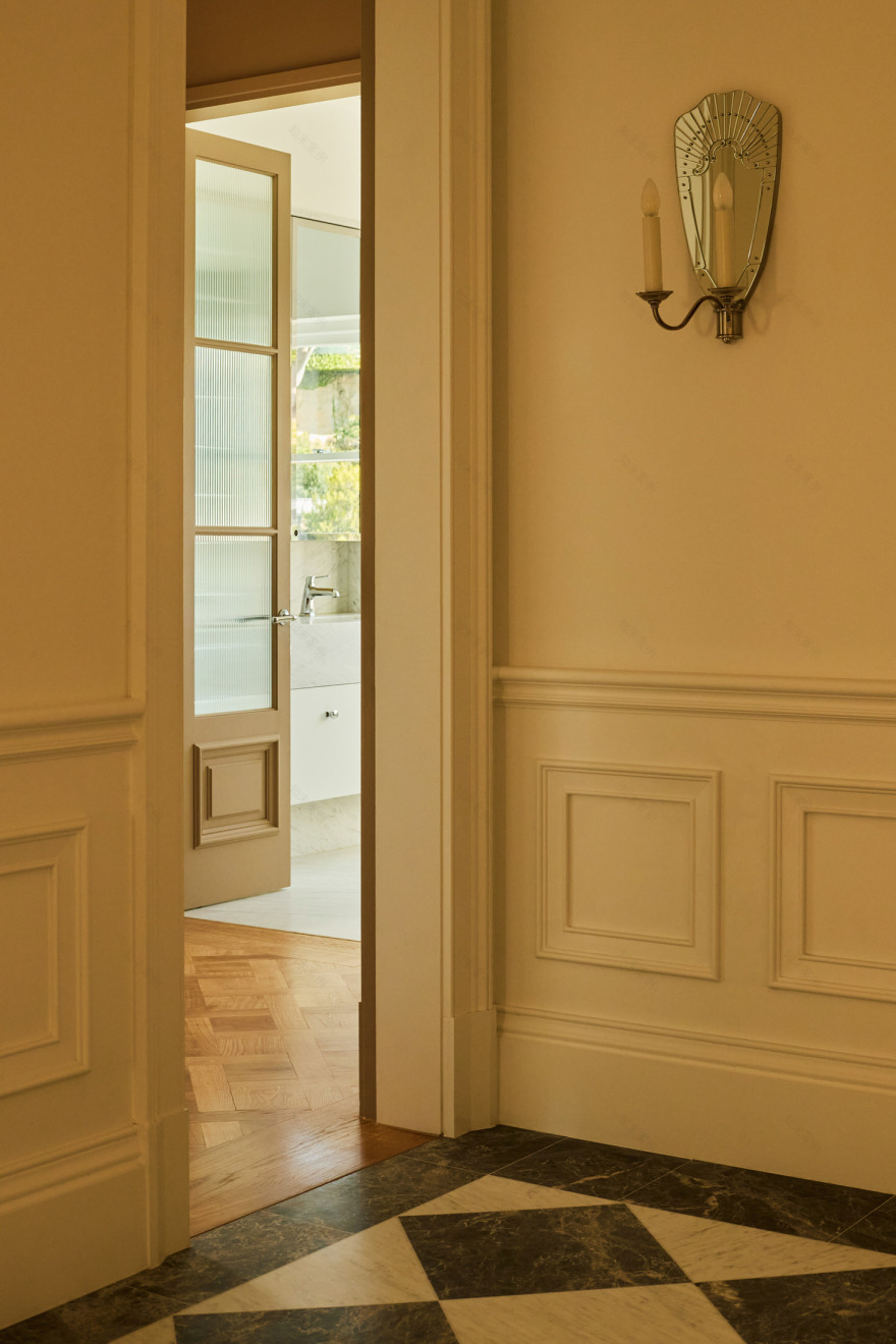
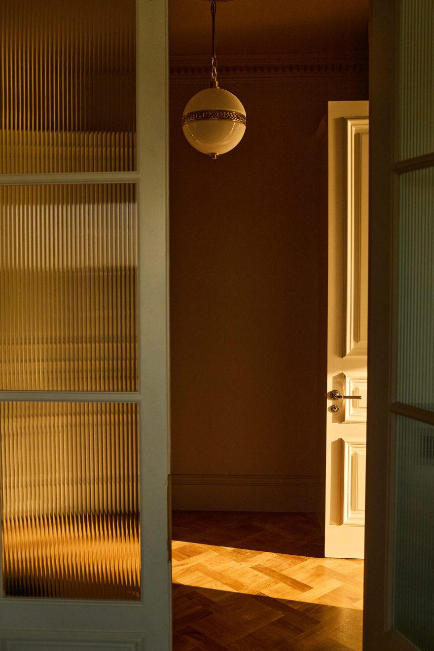
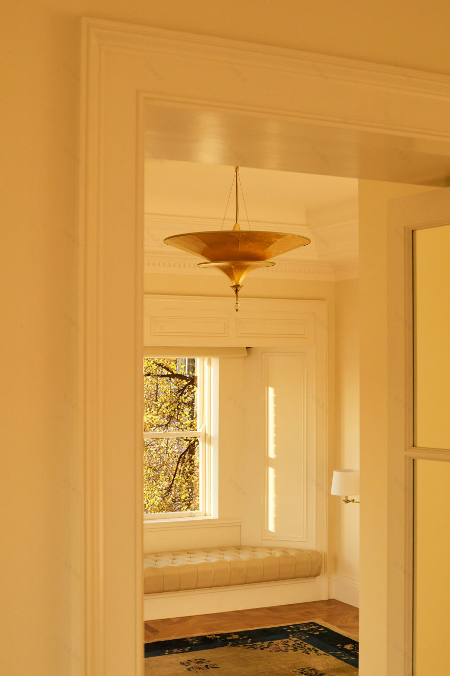
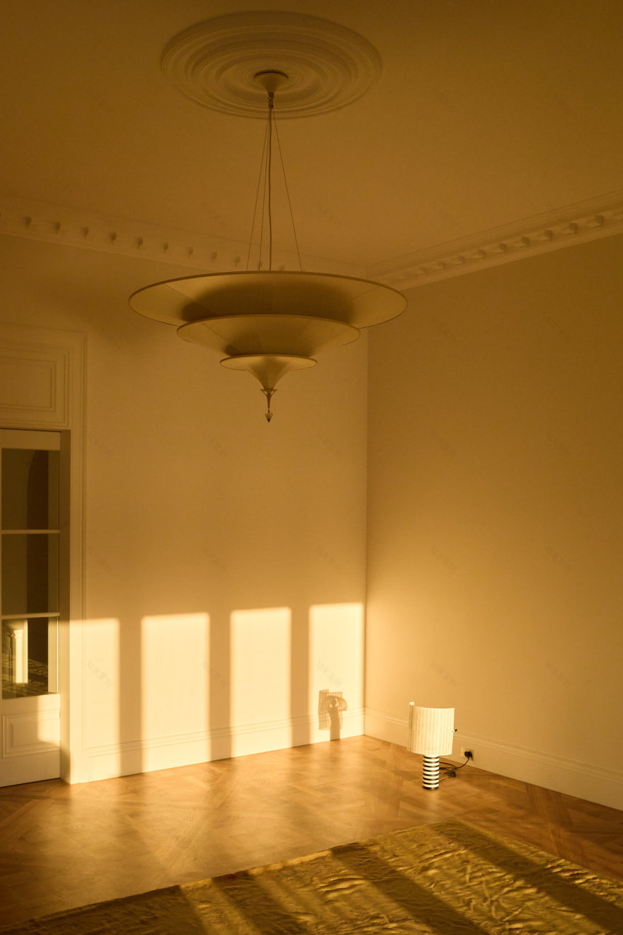
A series of strategic interventions elevate the apartment’s proportions and light quality. New openings along the western glazing line established extended sight lines, while mirrors on splayed bay windows draw harbour views deeper into the interior. The team utilised unused roof space to enhance ceiling heights, creating a stepped effect with multiple ornate cornices. Raised door openings improve the overall scale, while new finishes, mouldings, doors and joinery were designed to appear original to the apartment’s era.
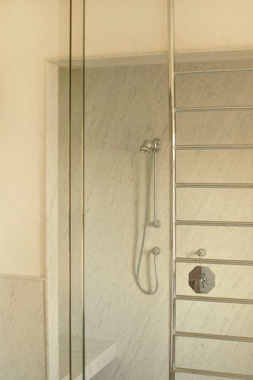
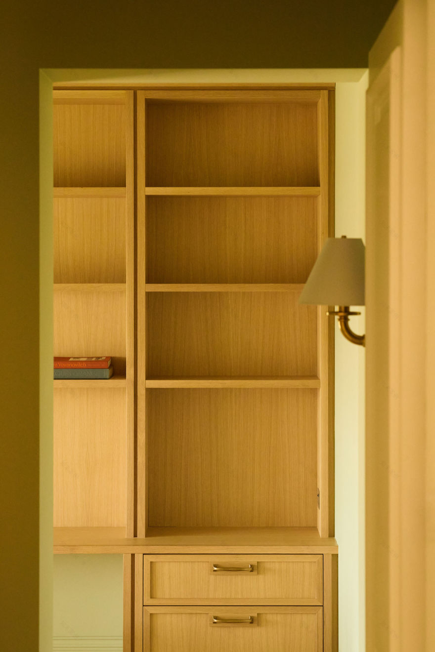
The material selections showcase exceptional attention to detail. The client personally visited numerous Sydney stone wholesalers to select the perfect Carrara marble for the bathrooms. The walls and joinery feature hand-painted soft neutral whites and creams, while smaller spaces received bold treatments—the study in dusky pink/brown and the walk-in robe in vibrant green.
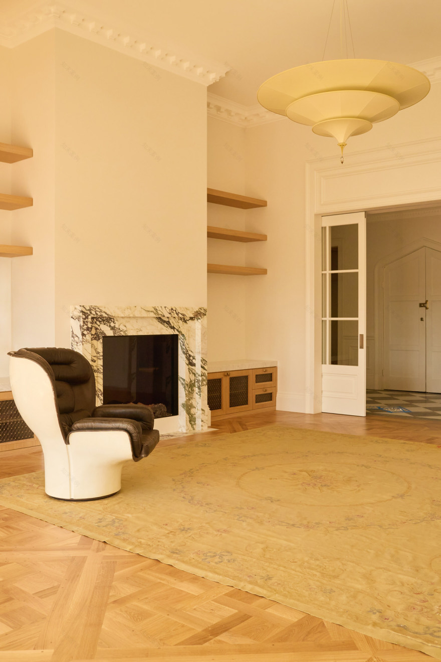
Traditional elements mingle with modernist pieces throughout the interior. Pigreco chairs by Afra and Tobia Scarpa sit alongside a glossy red lacquer Antella table by Kazuhide Takahama and Joe Colombo’s distinctive Elda chair. A vintage Aubusson rug anchors the living room, while an early 19th-century Chinese rug graces the bedroom floor.
The lighting scheme combines Viabizzuno architectural lighting with decorative pieces from Ralph Lauren and Fortuny. A vintage Murano chandelier creates a striking focal point in the dining room. The flooring—traditional Versailles parquetry—was sourced from a Romanian manufacturer who maintains historic production methods using timber nails and European oak.
The renovation creates multiple entry points to each room and incorporates smaller interstitial spaces instead of narrow corridors. “The rooms unfold from one to the next, much like an old European apartment,” note Williams and Field. The design drew inspiration from contemporary designers Joseph Dirand and Jacques Grange, as well as the understated elegance of Parisian living spaces and Jean-Michel Frank’s early modernist work.
The result is what Williams and Field describe as “a timeless and quite romantic” living space, where afternoon sunlight streams through windows, and classical architectural details harmonise with contemporary comforts.
It’s a sign of exciting things to come from a practice that was awarded the project as a “relatively new firm, with a lot of experience, but not much presence—we hadn’t even yet launched a website,” explain Williams and Field. “The client was interviewing a number of well-known firms for the project. We were very passionate and enthusiastic about the project, which ultimately won us the job.” We will be sure to keep a close eye on their future projects.
[Images courtesy of Studio Williams. Photography by Traianos Pakioufakis.]
客服
消息
收藏
下载
最近


