查看完整案例

收藏

下载
品牌定位
Brand Positioning
堺町16面包屋是重庆一家专注于贝果的特色面包品牌。本项目位于重庆九龙坡的商业临街铺面,居民社区多。这一独特的城市脉络,为我们的设计提供了别样的灵感和挑战。
Jieding16 Breads is a specialty bread brand in Chongqing that focuses on bagels. This project is located in a street-front shop in Jiulongpo, Chongqing, in a community with many residents. This unique urban context provided inspiration and challenges for our design
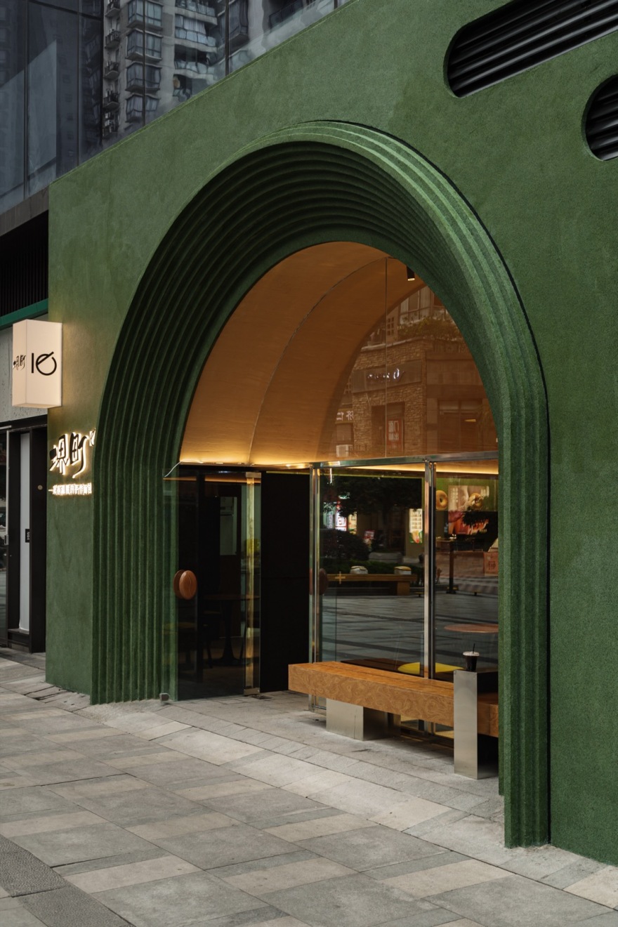
▼店面,storefront © 贰方设计
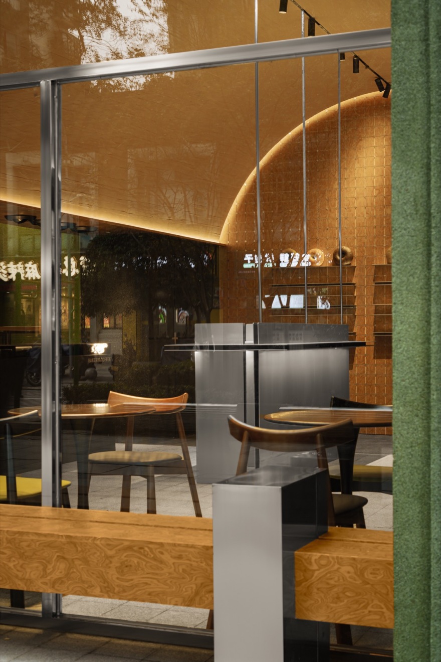
▼室内外界限模糊,blur the boundaries between indoors and outdoors © 贰方设计
设计思路
Design concept
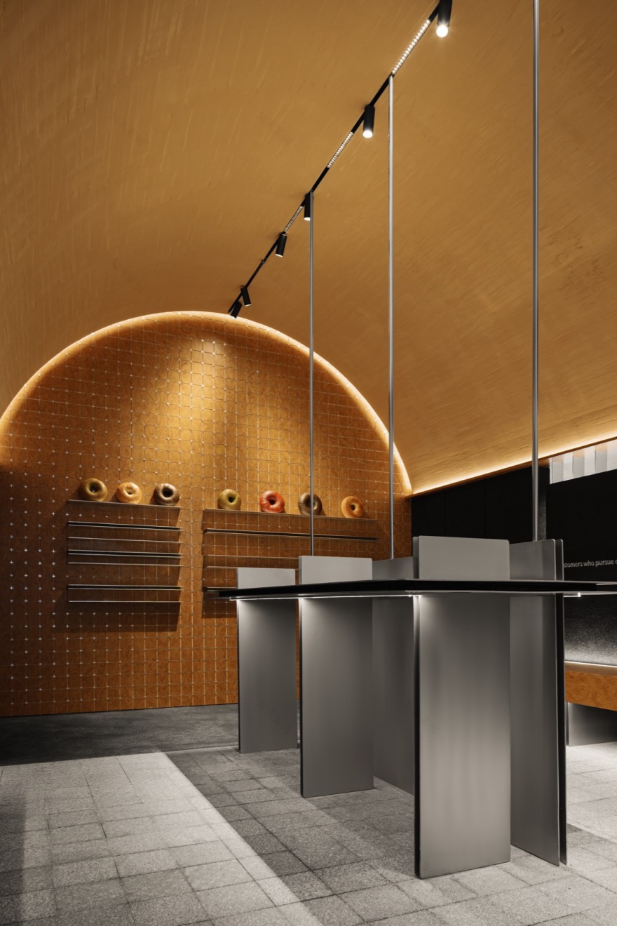
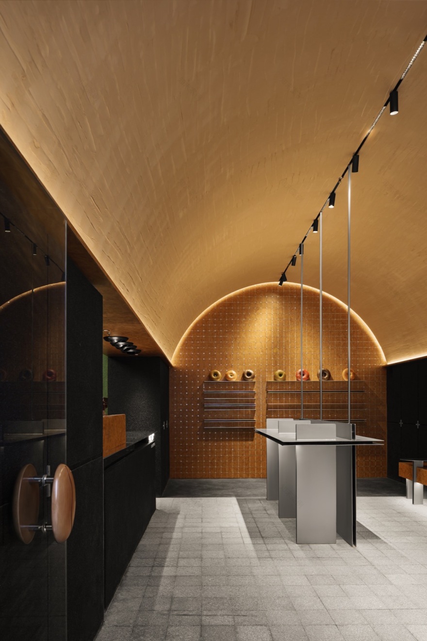
品牌方希望延续总店的设计理念,我们在调研后发现,项目所在地的建筑风貌及社区氛围相对平淡,适合通过设计反差来营造独特体验。因此,我们采用了室内外界限模糊的设计方式,以建筑的开放性与材料的连贯性为核心,重新定义空间与街区的关系。
The brand owner wishes to carry on the design concept of the headquarter. Our research found that the architectural style and community atmosphere of the project location are neutral, making it suitable for creating unique experiences through design contrast. Therefore, we adopted a design approach that blurs the boundaries between indoors and outdoors, with the of the building and the continuity of materials as the core, redefining the relationship between space and the street.
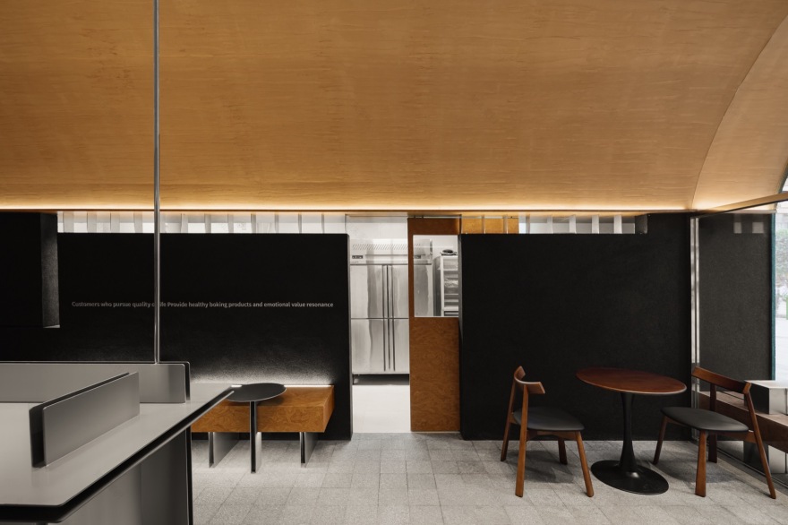
▼室内概览,interior overview © 贰方设计
空间布局与设计细节
Spatial Layout and Design Details
由于建筑结构错乱且不规则,我们采取“填充与抽离”的方法进行功能分区,优先满足营业区的使用需求。通过将地面铺设与街区一致的花岗石材质,我们模糊了室内与室外的边界,并在玻璃幕墙设计上内收网格,为街道留出更多的外摆空间。整体外立面设计简约,通过解决空调出风口及店招位置,强化了功能性。 为了打破单调,我们在外立面的圆拱元素上设计了延展线条的跌级层次,为外观增添细腻的立体感。
Due to the chaotic and irregular architectural structure, we adopted the method of “filling and subtraction” for functional zoning, prioritizing the needs of business area. By laying the ground with the same granite material as the street, we blurred the boundaries between indoors and outdoors. Meanwhile, we designed the glass curtain with an inward recessed grid to leave more outdoor space for the street. The overall facade design is simple, and by solving the location of the air conditioning outlets signs, we enhanced its functionality. To break the monotony, we designed the facade with extended lines and stepped layers on the round arch elements, adding delicate threeimensionality to the appearance.
▼金属材质与其他自然材料形成对比,metal contrasts with other natural materials © 贰方设计
材质与色彩运用
The Use of Materials and Colors
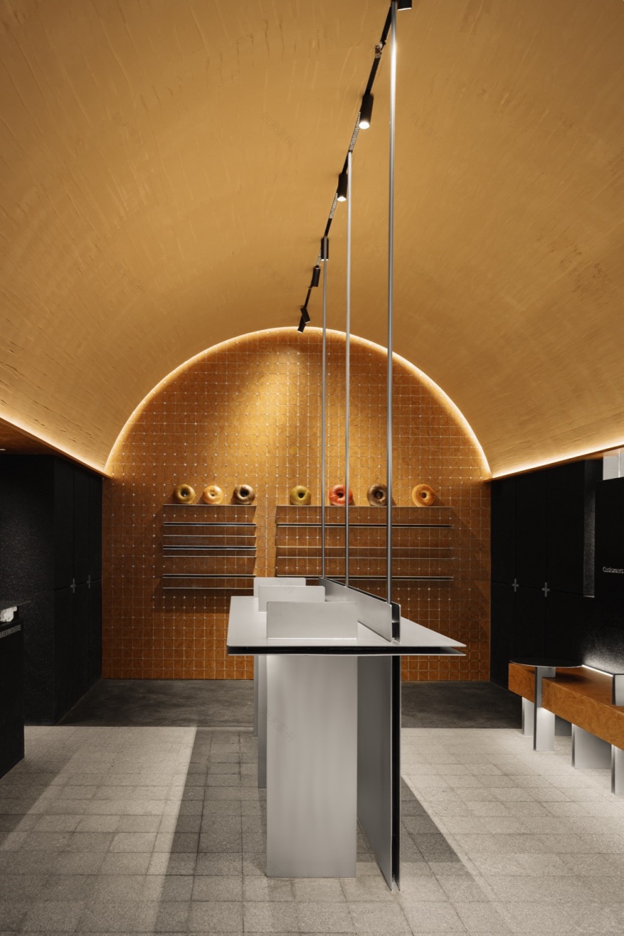
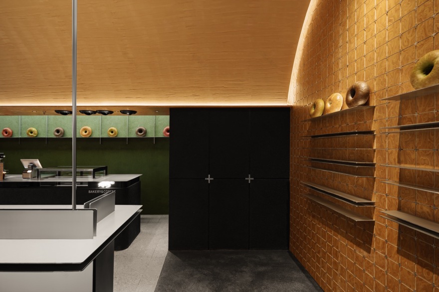
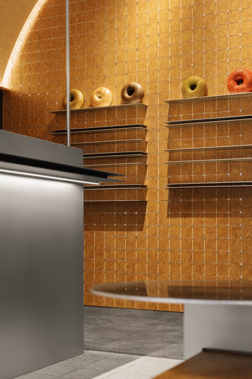
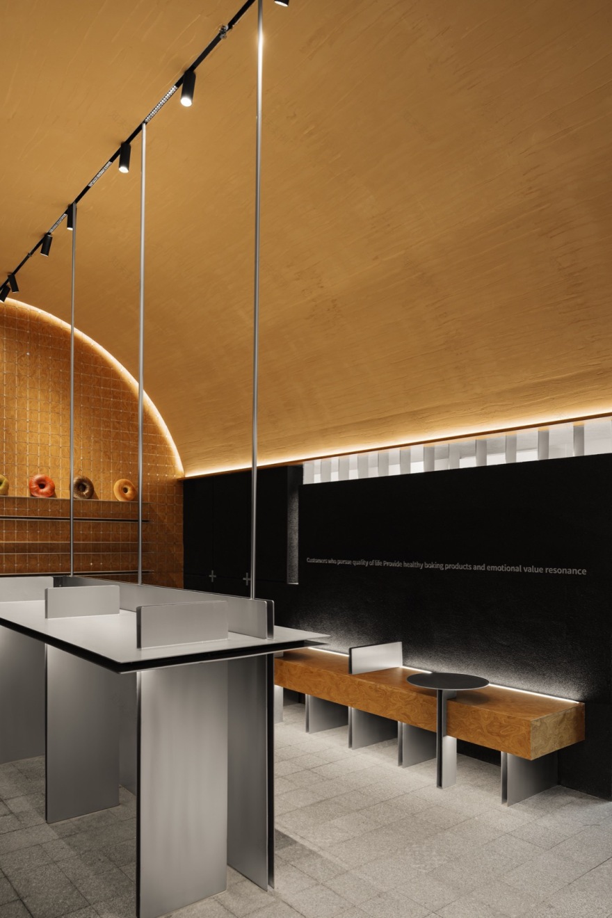
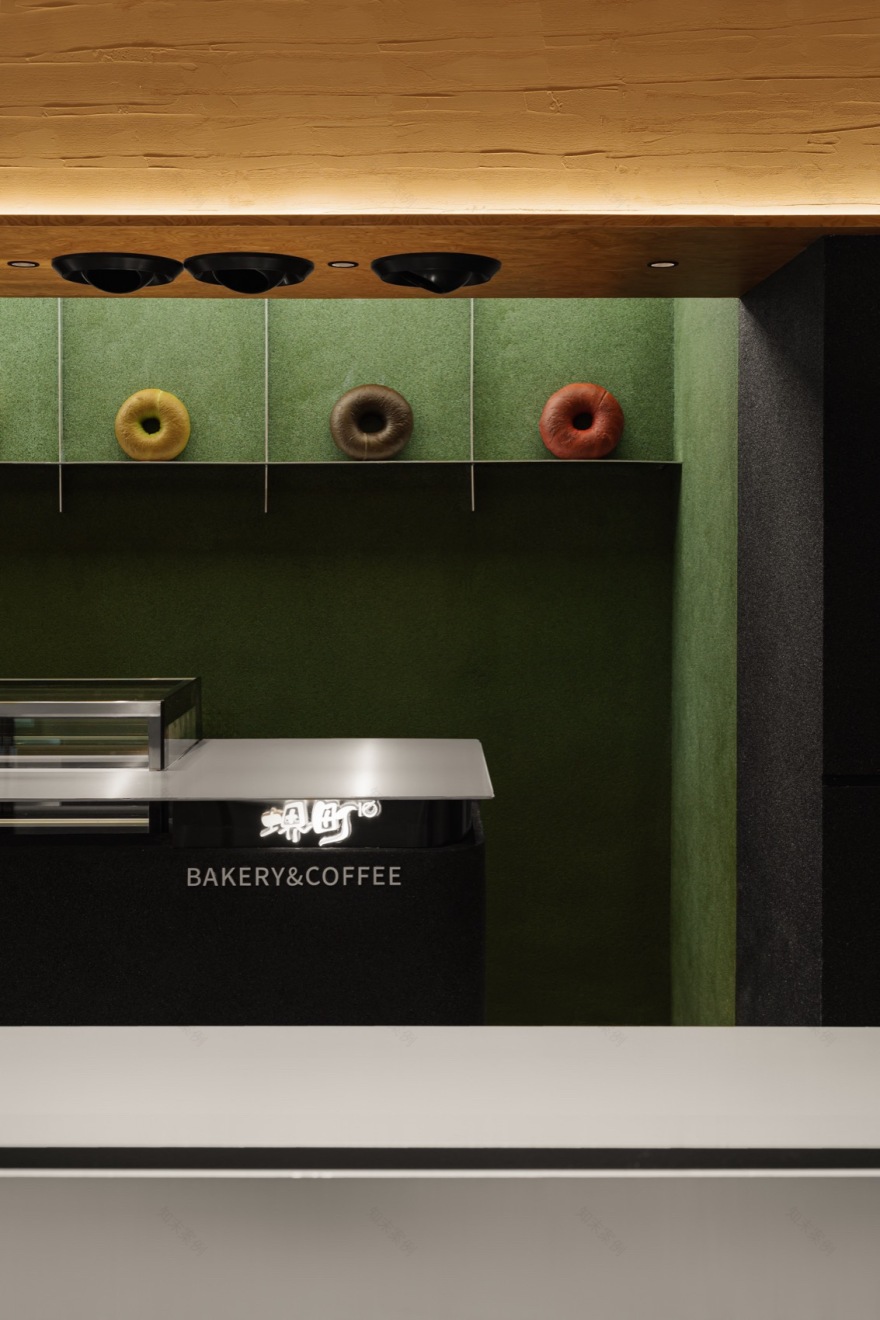
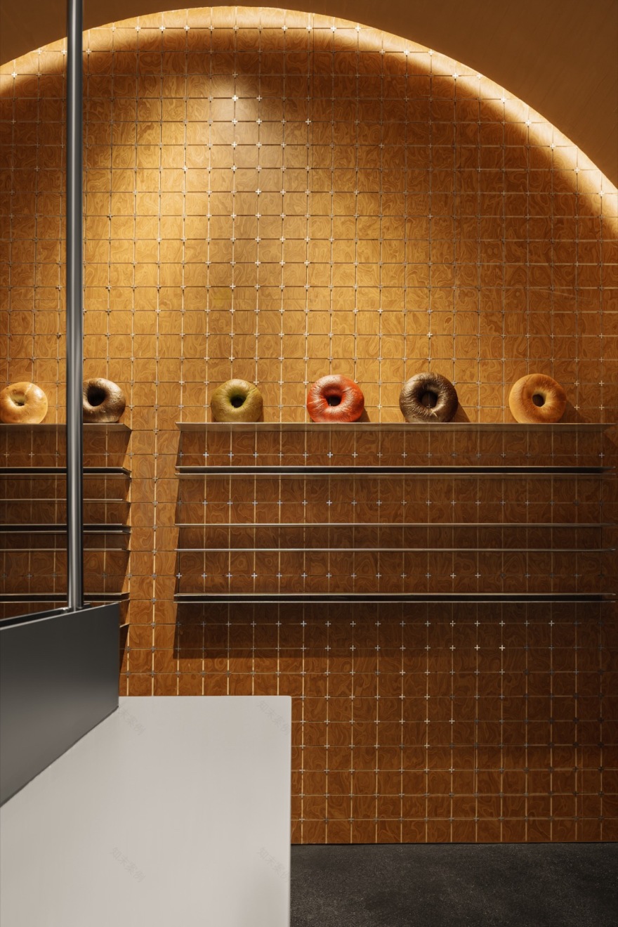
室内设计延续了外立面绿色水洗石材质,吧台区成为空间的视觉焦点。同时,墙面底部以 100×100mm 的树瘤板方块代替传统平面墙体,形成碎片化肌理,增加空间层次感。岛台、收银台和隔板则采用金属材质,与其他自然材料形成对比,使整个空间在材料单一的前提下,通过细节设计体现丰富的层次感。
The interior design continues the green washed stone material from the facade, with the bar area becoming the visual focal point of the space. Meanwhile, the bottom the walls is made up of 100×100mm squares of burl wood instead of traditional flat walls, creating a fragmented texture and adding to the space. The island, cash register, and partitions are made of metal, contrasting with other natural materials, allowing the entire space to maintain a singular material while showcasing rich layers through detailed design.
▼丰富的层次感,rich layers © 贰方设计
▼座位,seatings © 贰方设计
▼吧台与墙面,bar and wall © 贰方设计
设计特色
Design Features
室内外统一性:通过一致的花岗石与水洗石,模糊空间边界;外立面延展性:圆拱线条跌级处理,提升视觉层次;材质细腻感:树瘤板方块与金属材质对比,细节彰显品质。
Indoor-Outdoor Continuity: The use of consistent granite and washed stone blurs the boundaries between spaces. Facade Extension: The stepped treatment of theched lines enhances the visual layers. Material Refinement: The contrast between the wooden board squares and metal materials highlights the details and showcases the quality.
▼中央金属岛台,central metal island © 贰方设计
▼搁板展示,shelf display © 贰方设计
结语
Conclusion
堺町16面包屋在设计上,不仅延续了品牌的核心理念,也通过对周边环境的深入理解和巧妙应对,为这一社区注入了新的空间活力。项目从材料到细节,无一不体现出设计的精致与创新。
The design of the 16th bakery in Sakai not only continues the brand’s core concept, but also injects new spatial vitality into the by deeply understanding and cleverly responding to the surrounding environment. From materials to details, the project fully demonstrates the precision and innovation of the design.
▼细部,details © 贰方设计
▼平面图,plan © 贰方设计
项目名称:堺町16面包屋
项目类型:工装设计
设计方:贰方设计
项目设计:重庆·九龙坡
完成年份:2024.12
设计团队:重庆贰方设计
项目地址:重庆·九龙坡
建筑面积:70㎡
摄影版权:贰方设计
客服
消息
收藏
下载
最近


