

创作上传
VIP
收藏下载
登录 | 注册有礼
查看完整案例

收藏

下载

分享
This 2,200-square-foot colourful home in Mumbai refuses to stick to any one design style
Karan Shandilya of The Last Goldfish pieces together a one-of-a-kind home that eschews labels, bridging the classical, the maximalist, and the quirky.

Is it limiting if a space tries to fit the pre-set mould of a particular design style? With this home in Mumbai, Karan Shandilya and partner Rushil Bhatia, principal designers at The Last Goldfish, set out to answer this question—curating a bold aesthetic that skips across diverse design genres with deceptive ease. Vibrant primary colours meet architectural forms incorporated within interior design, while classic details juxtapose against quirky elements to craft a design brimming with so much personality that it can be tricky to put any sort of label on it—exactly as Shandilya wanted it.

Having always been intrigued by a spectrum of art and architecture movements, Shandilya brings a studied flair to the space—through arched motifs and a palette of primary hues among others—attempting to integrate elements with layered stories into the art of interior design. The flooring from Glitorium and carpet from Jaipur Rugs, however, capture his usual penchant for brutalism.
When asked if this style feels like home to him, his answer was surprising. “Principally, our studio focusses on more subtly curated palettes with a
brutalist flair
. While we retain this core, we wanted to bring in touches of a maximalist aesthetic and experiment with our style,” begins Shandilya, a move encouraged by his wife and stylist Pragati Negi, who recently joined his design firm. The entire design process that followed was nothing short of an adventure, as redesigns and multiple discussions over the bold details and unique colour combinations took place.

Right as one steps inside, a kaleidoscope of colour bursts engulfs the living room, underscored by a vibrant carpet from Jaipur Rugs and patterned cushion covers from Cotton and Satins. To elevate an oft-overlooked element, Shadilya places lamps of striking proportions and hues in the rooms, allowing them to draw the eye.
It all began with a vibrant red-coloured door—not only was the homeowner keen on this integration but it was a touch that brought to mind the mysteries and stories of red-light districts of Amsterdam for the designer. The journey that unfolds inside hides storied details hidden in plain sight, as even the smallest element underwent immense thought. Eventually, the home took on a one-of-a-kind flavour that is quite difficult to replicate.

A bright red, arched door welcomes visitors into the home, setting the tone for the bold design. A niche, with its geometry offering an ode to Charles Correa's Kala Academy, grabs attention. Hinting at wabi-sabi and embracing imperfections, a vase from The White Teak Company adds to the curated frame.
Originally a pair of 3BHK apartments, this 2,200-square-foot space now hosts five bedrooms, with a curated narrative presented in each space. Structural changes were involved—such as restructuring the kitchen at one end of the linear layout to carve out a den and combining two baths to make a grand master bath. “We wanted to guide, not force a movement narrative,” says Shandilya about the corridors, originally narrow but now designed with pockets of pause. A space that allowed entertaining was important to the homeowner, and thus, an open-plan living, dining and bar area forms the first step of the narrative.

“I wanted to create elements that look curated for this design, that cannot be found easily,” says Shandilya about his custom-made pieces. Salvaged from an old container, a 10-year-old black stone was repurposed, cured and lacquered for the dining tabletop. The base consists of a 7-foot-long piece of teakwood. The striking red dot evokes Suprematism, an abstract art movement founded in Russia, while establishing cohesion with the colour red.
The dialogue of colours is both extravagant and restrained at once, to bring harmony not despite, but because of the drama. “Unlike most of our projects before, where earthy tones and pastel hues dominate, we went bold here with primary colours,” reveals Shandilya, when asked about what is arguably the most noticeable feature of the design. Just in the living room, for example, the red door, a sage-green bar nook, a rust ottoman, patterned cushions, and dramatic wallpapers all collide with antique fans, art on lime-washed walls, flutings and mouldings. “Before this project, it would have been challenging for me to envision all these elements in one space,” admits Shandilya, now satisfied with the new direction he can explore in his design practice.
For him, inspiration also lay in the art movements—
Impressionism
, Bauhaus, and more—to incorporate the right saturation of colours. “We referred to a lot of Dali, Ando, and impressionist art by the likes of Monet for our colour palette,” he says.
Architectural flair also peppers the interiors—apparent in motifs such as arches, altered walls that flow into the roof, waffled ceilings and designed niches—ensuring the spaces are not just superficially styled.
“With the design, we wanted to create a living space that resonated with the homeowner and our growing ideologies as a design studio,” divulges Shandilya. An amalgamation of brutalist, minimalist and
maximalist
ideologies—with a curated flair in each frame—and a thoughtful saturation of colour, this home in Mumbai explores a mish-mash of styles to embrace a boundless, free-flowing design.

In the bar, forest green comes to the fore and a 30-year-old piece of wood is salvaged and repurposed for the bar top, while the curated wooden bar stools are Shandilya’s design. “These elements, with recycled materials and wood sourced from markets in Powai, add richness with their past lives, breaking away from an entirely contemporary space,” elaborates Shandilya. The terracotta flooring, antique mirror with a golden wash and the intricate chandelier all lend this nook a vintage appeal.

Featuring the lotus in a pastoral format with its gentle hues, the wallpaper from Nilaya in the living room reminds Shandilya of the Japanese take on Art Deco. The hues of the wallpaper echoes in the colour palette of the setting.

Flutings on lime-washed walls and a framed bay window carving out a cosy nook characterize the master bedroom.

A red dresser door, the designer’s favourite design element, finds a home in the master bedroom, echoing the characteristic red front door. The addition spotlights a beaten metal sheet, while limewash and micro-concrete finishes lend it an arresting form. The mirror’s geometry evokes the melting forms of Dali’s The Persistence of Memory.

The daughter’s room features a playful yet subdued palette of turquoise and pink.
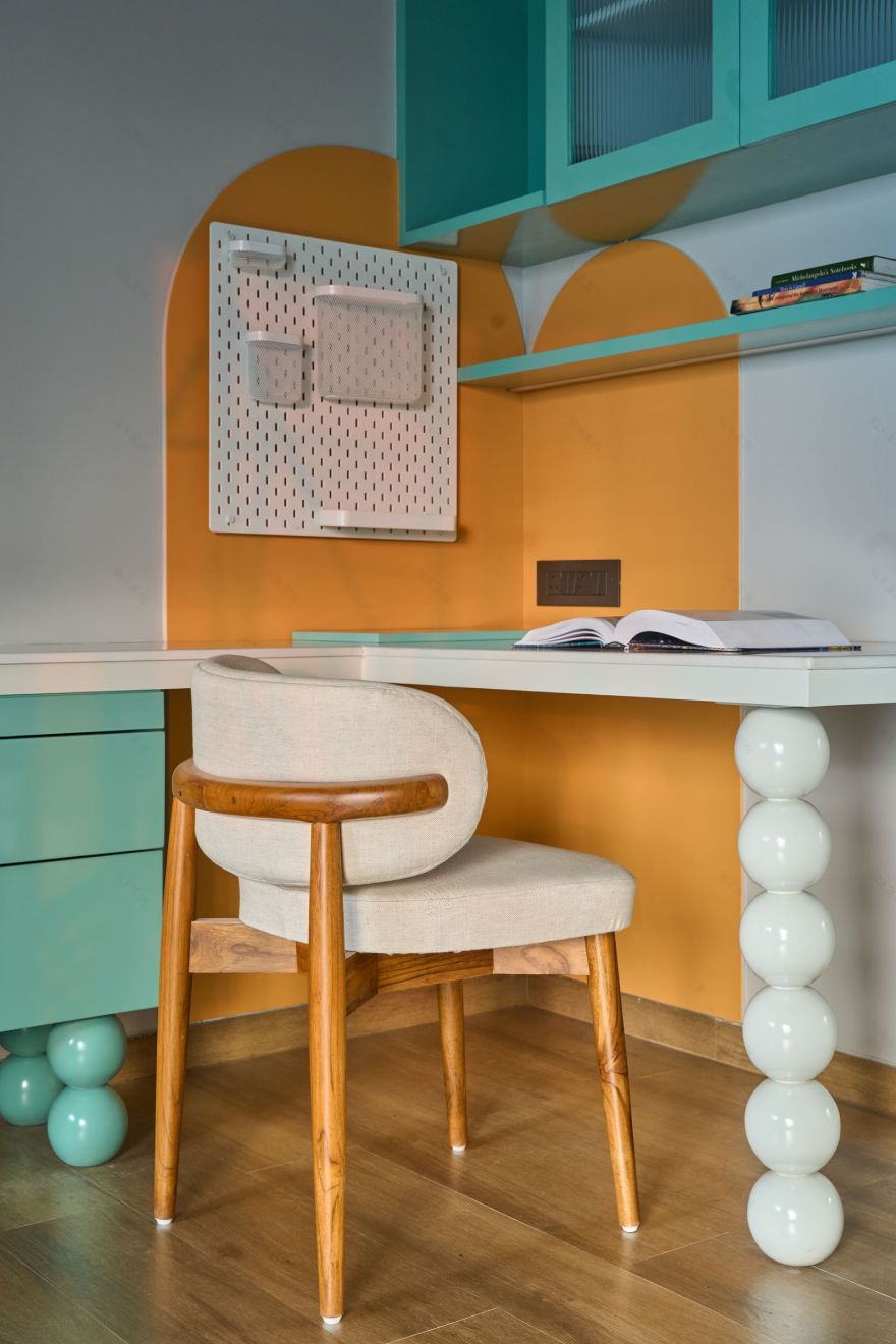
The custom-made study draws from the arched motifs peppered around the design while bringing in an element of whimsy with the globes.

南京喵熊网络科技有限公司 苏ICP备18050492号-4知末 © 2018—2020 . All photos and trademark graphics are copyrighted by their owners.增值电信业务经营许可证(ICP)苏B2-20201444 苏公网安备 32011302321234号
苏公网安备 32011302321234号客服
消息
收藏
下载
最近