

创作上传
VIP
收藏下载
登录 | 注册有礼
查看完整案例

收藏

下载

分享
“色彩之家”致力于打破传统的住宅空间等级,以空间实验与色彩运用为手段,倡导体验导向、灵活性与多功能性。
Chromatic Home seeks to break with traditional domestic hierarchies in a space designed through spatial experimentation and the use of color, advocating for experience, flexibility, and multifunctionality.
▼室内概览,overview of the indoor space ©Hiperfocal

该提案通过“对比性并置”的方式,在新旧之间建立和谐关系:强调新旧层次之间的衔接;通过增添而非改造现有内部构件来引入变化;将新增元素视为家具而非建筑构件,并通过其非传统的布置方式加以强调。项目始于一个初始问题:如何在不破坏现有条件的前提下介入住宅空间,并进一步提升其原有品质?
▼轴测图,axonometric ©JOTAJOTA ESTUDIO

The proposal’s approach aims to create harmony between the old and the new through contrasting juxtapositions*: emphasizing the junction between old and new layers, creating changes by adding rather than modifying existing interior elements; considering the new elements as furniture rather than architecture, and highlighting them through their unconventional placement. The proposal begins with an initial question: how can a home be intervened to enhance its preexisting condition?
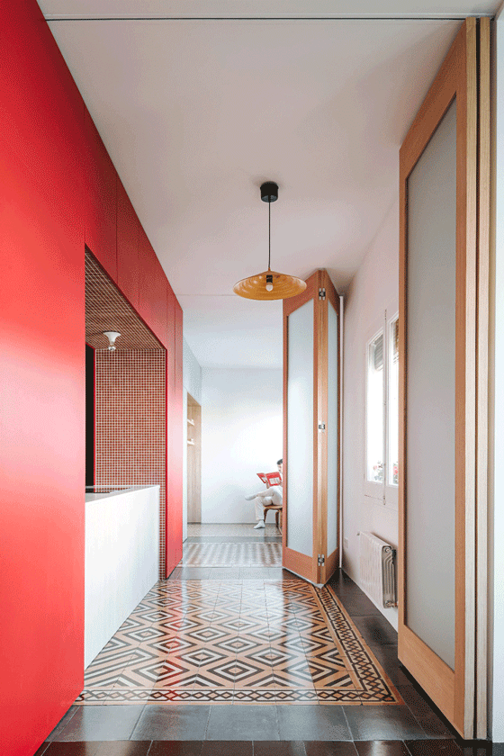
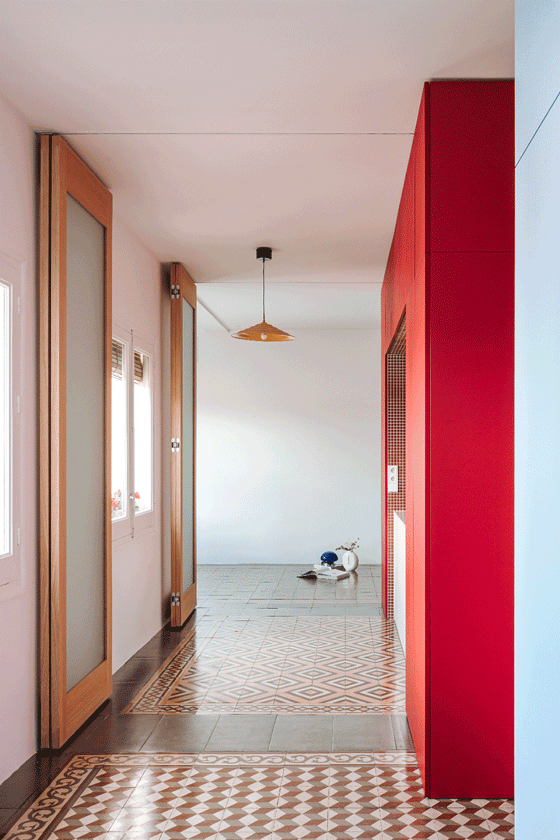
▼灵活的隔断门,flexible partition wall ©Hiperfocal
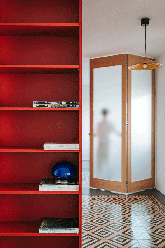
在拆除现有地板的过程中,设计团队发现了原建筑遗留下来的水泥花砖地面。对此的回应是:修复并保留这层原始地坪,并辅以同材质、深色调的边框,使整个地面呈现为一幅统一连续的画布,从而突出既有元素的美学价值。
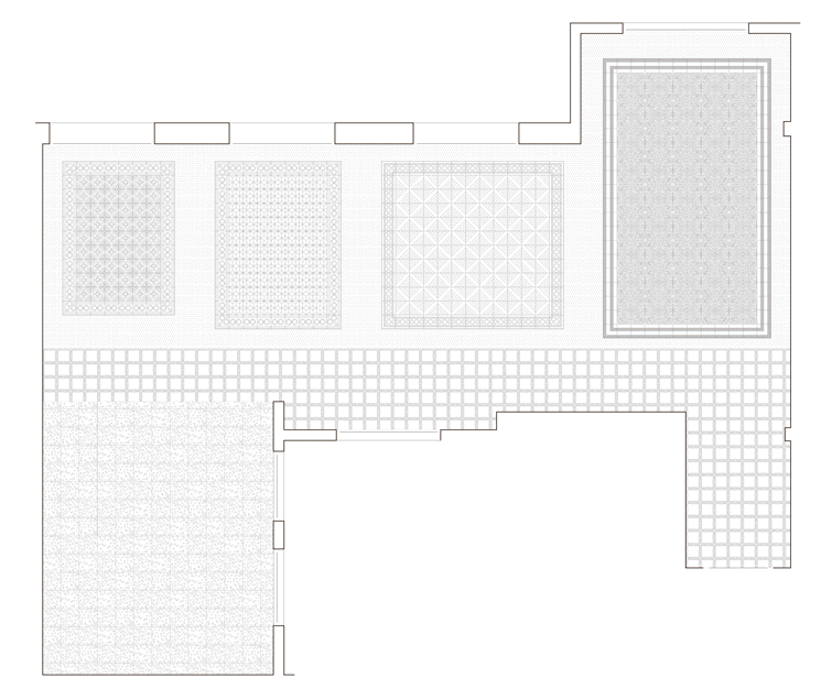
▼平面图,plan ©JOTAJOTA ESTUDIO
Beneath the current flooring of the house, we discovered an original hydraulic tile floor from the building. The response to the question was then to treat and recover this floor, as well as to incorporate a dark border of the same material with the intention of reading the whole as a continuous canvas that enhances the preexisting elements.
▼修复并保留原始水泥花砖地坪,preserve the original hydraulic tile floor ©Hiperfocal


▼水泥花砖地坪细部,the original hydraulic tile floor detail ©Hiperfocal


整个设计介入围绕这张“大画布”展开:三个色彩体块构成空间的组织核心,并服务于周边的不同功能区域。这三组体块作为服务单元而存在,并根据所服务空间的不同,采用不同材质进行呈现:
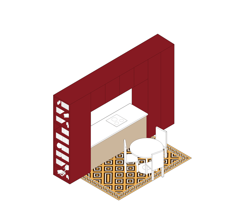
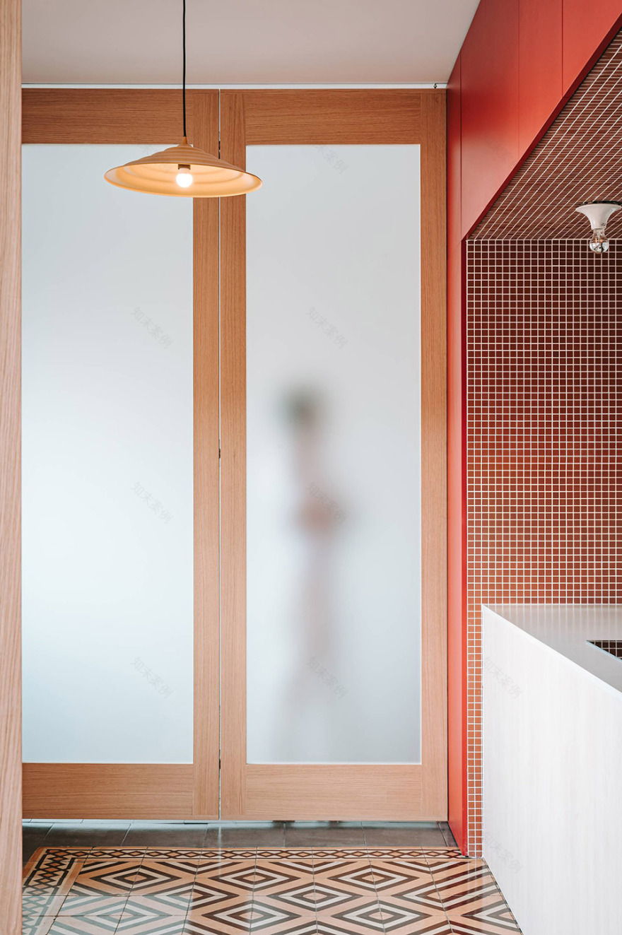
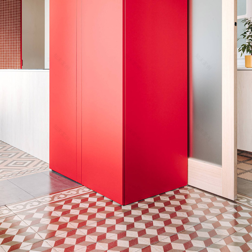
红色体块是住宅的社交核心。它如同一座“岛屿”,同时又是厨房、餐区与客厅之间的联结点。其内部以哑光马赛克瓷砖包裹的大开口构建出一个具有“舞台感”的空间装置,使这些功能在保持整体联系的同时,也各自具备独立的表达。
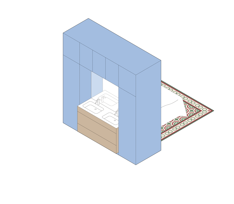
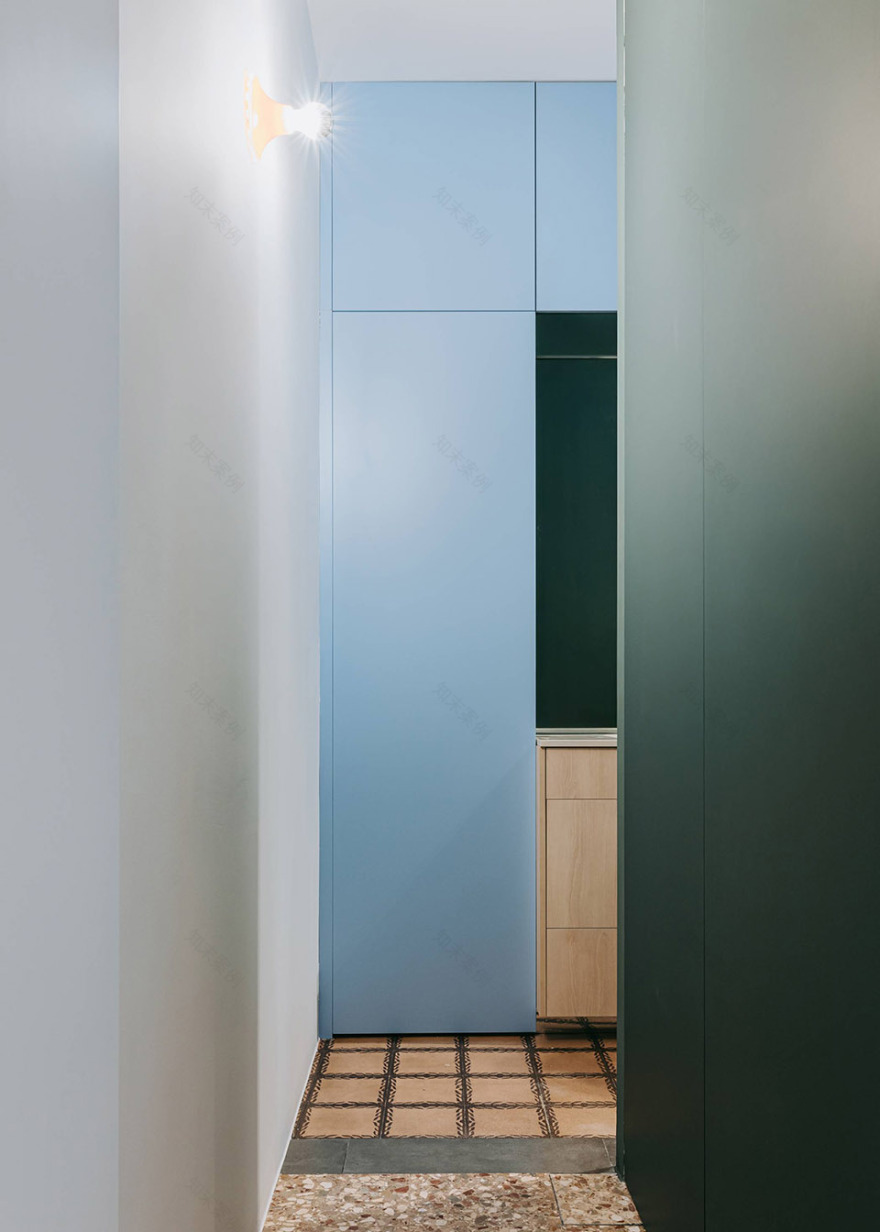
蓝色体块服务于阅读区和浴室。其一侧采用木饰面,用于收纳书籍与私人物品;另一侧则设置了镜面包裹的开口,内部设有两个洗手台。
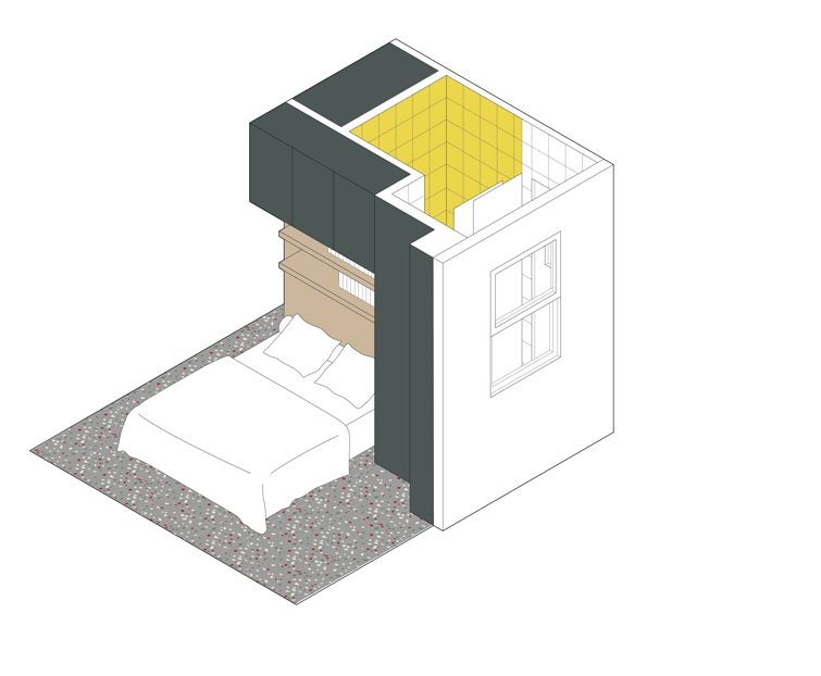
绿色体块引导来访者进入主卧室。其内部设置的储物模块,既满足功能需求,又在不破坏空间连续性的前提下,形成卧室与外部区域之间的“过滤层”,营造出一个更为私密、包容的休憩氛围。
▼色彩体块轴测,three chromatic volumes axonometric ©JOTAJOTA ESTUDIO
The intervention is structured upon this large canvas: three chromatic volumes that organize and serve the surrounding spaces. These three volumes function as service devices and are materialized according to the space they serve:
The red volume is the social core of the house. This piece functions as an island, yet acts as a nexus between the kitchen, dining area, and living room. Like a scenic element, a large opening finished in matte mosaic tile frames these uses without separating them from the whole.
The blue volume serves the reading area and the bathroom. On one side, finished in wood, it accommodates storage, books, and personal items. On the other side, an opening clad in mirror houses the two sinks.
The green volume guides the visitor to the main bedroom. A storage module acts as a filter between the resting area and the rest of the home, fulfilling storage needs and generating a contained atmosphere without breaking the continuity of the space.
▼红色体块是住宅的社交核心,the red volume is the social core of the house ©Hiperfocal

▼红色体块是厨房、餐区与客厅之间的联结点,
a nexus between the kitchen, dining area, and living room ©Hiperfocal


▼红色体块是厨房、餐区与客厅之间的联结点,
a nexus between the kitchen, dining area, and living room ©Hiperfocal


在绿色体块内部,以黄色瓷砖完成对空间氛围的色彩反差,同时构成浴室中最为私密的区域。这三个色彩体块共同组织起空间的功能布局,摒弃等级结构,形成自由流动、未被割裂的空间动线,并进一步激活了原有地砖所构成的“织锦般”空间肌理。为了在保持空间连续感的同时引入必要的分隔,设计使用了全高的可移动隔断(包括铰链门、滑动门与旋转门)作为分区装置,避免破坏整体空间感与色彩体块的力量表达。
Inside the green volume, a yellow tile provides an environmental contrast to complete the domestic program with the most intimate area of the bathroom. The volumes organize the space without hierarchies, promoting a fluid and unfragmented circulation, enhancing the interpretation of the tapestry formed by the preexisting floors. The elements that allow the fragmentation of space into smaller capsules are materialized through floor-to-ceiling mobile partitions (hinged, sliding, and pivoting), with the intent of not breaking the perception of continuous space nor the strength of the chromatic volumes.
▼三个色彩体块之间的过渡区域,the transition between three colors volume ©Hiperfocal

▼蓝色体块与绿色体块,blue block with green block ©Hiperfocal

“色彩之家”致力于打破传统住宅空间中的功能等级,通过空间构成与色彩语言的实验性探索,创造出强调体验、倡导灵活与兼容多种用途的居住环境。该设计以“对比性并置”策略在新旧之间建立对话关系:明确地揭示新旧层之间的接点;通过“加法”策略而非破坏性改造引入变化;将新增内容看作家具而非建筑本体,并以不拘一格的布局方式突显其存在感。
Chromatic Home seeks to break with traditional domestic hierarchies in a space designed through spatial experimentation and the use of color, advocating for experience, flexibility, and multifunctionality. The proposal’s approach aims to create harmony between the old and the new through contrasting juxtapositions*: emphasizing the junction between old and new layers, creating changes by adding rather than modifying existing interior elements; considering the new elements as furniture rather than architecture, and highlighting them through their unconventional placement.
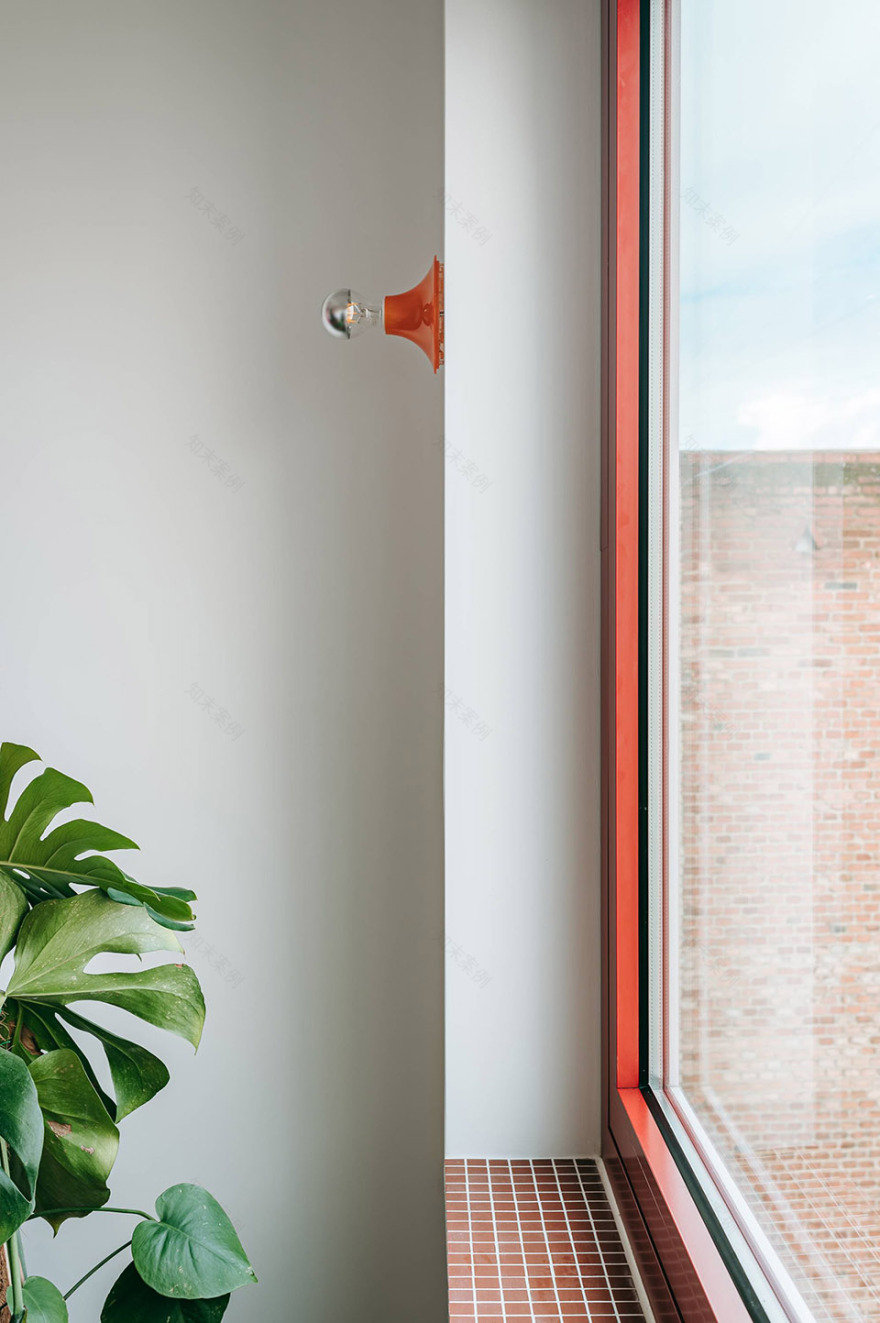
▼细部,detail ©Hiperfocal

▼细部,detail ©Hiperfocal

Title Chromatic Home
Category Renovation
Location Madrid
Year 2024-2025
Client Privado
Partners JOTAJOTA+ Luis Gil, Diego Sacristán
Photography Hiperfocal


南京喵熊网络科技有限公司 苏ICP备18050492号-4知末 © 2018—2020 . All photos and trademark graphics are copyrighted by their owners.增值电信业务经营许可证(ICP)苏B2-20201444 苏公网安备 32011302321234号
苏公网安备 32011302321234号客服
消息
收藏
下载
最近