

创作上传
VIP
收藏下载
登录 | 注册有礼
查看完整案例

收藏

下载

分享
翻译
CAMPER SHOE STORE RENOVATIONWHERE PLAYFUL FUNCTION MEETS BRAND IDENTITY
Project: Camper Shoe Store Location: Barcelona, Spain Area: 48m² Designer: Nini Vacharadze
ABOUT | CONCEPT | CURRENT STATE | DISPLAY SYSTEM | PLANS | ISOMETRIC | RENDERS

ABOUT
This interior design project involved the transformation of an existing shoe store into a dedicated Camper brand retail space. The goal was to create a more immersive, brand-specific shopping experience by reshaping not just the layout but also the visual and material identity of the store. Main point was to use different material which would be the main focus of the store.
The result is a bold and functional interior that reflects Camper’s signature playfulness and simplicity. The space now offers an engaging and memorable customer journey that highlights the individuality of each shoe, while remaining true to the brand’s Mediterranean roots and experimental design approach.
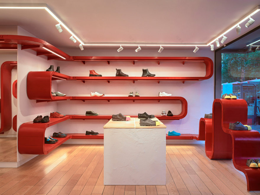
Below pictures represent Camper store´s different locations.


CONCEPT
The main concept for the store is “organized spontaneity”, a design approach that celebrates both structure and play. Camper’s shoes are known for their quirky character and comfort, and this duality is echoed in the spatial design.
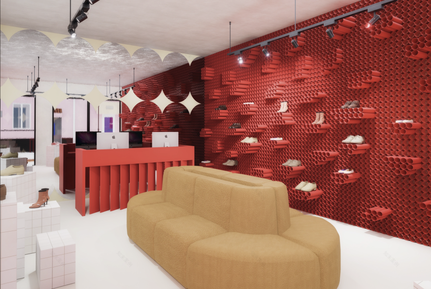
After research I also found some shoe models which use rubber kind of material to give the shoes some playful personality. This was my main ispiration and I started looking for materials that were close to rubber. Finally, I decided to use the tubes which are also not usual in shoe interior, especially as a display part. The tube wall was reflecting the Camper brand identity.
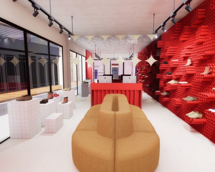
A key feature of the space is a custom tube wall display a sculptural grid of cylindrical forms that hold individual shoes. This display acts both as a practical shelving unit and a bold architectural statement. Inspired by modularity and rhythm, the tube system creates a visual language that turns footwear into an evolving art installation.
The store as a whole reflects Camper’s fusion of innovation and heritage, inviting visitors to engage with the brand not just through its products, but through a unique, playful environment.

CURRENT STATE & INTERVENTION
The original space was a standard retail shell white walls, linear shelving, and a disconnected flow. It lacked a cohesive identity and did not reflect the brand’s design ethos.
The intervention focused on reconfiguring the layout to guide movement organically while introducing brand-specific elements. Circulation was improved by opening the floor plan, reducing visual clutter, and introducing central display features. Materials and lighting were redesigned to enhance warmth, visibility, and interaction.
Minimal demolition was done, retaining the core structure to remain budget-conscious and environmentally considerate. The upgrade lies in surface treatments, lighting strategy, and strategic focal points like the custom displays.

DISPLAY SYSTEM
The custom tube wall display defines the store’s identity. Made of evenly spaced vertical cylinders, this element adds visual texture, depth, and a sense of play.
Each tube acts as a miniature stage, spotlighting individual shoes and encouraging focused interaction. The display is scalable, modular, and can be reconfigured seasonally. Its graphic repetition also strengthens the visual branding from street view, drawing customers in.
FINAL PLAN PROPOSAL
The layout is open and intuitive. Upon entry, visitors are immediately drawn toward the vibrant shoe display wall, while side walls and secondary zones host accessories and alternate footwear lines.
The seating is integrated into the display zones, encouraging comfort and slowing down the shopping rhythm. Material transitions are subtle yet intentional warm wood, soft textiles, and matte finishes replace the cold, sterile palette of the previous store.
The final design is bold, modular, and brand-specific, creating a showroom where product storytelling and spatial experience merge.


南京喵熊网络科技有限公司 苏ICP备18050492号-4知末 © 2018—2020 . All photos and trademark graphics are copyrighted by their owners.增值电信业务经营许可证(ICP)苏B2-20201444 苏公网安备 32011302321234号
苏公网安备 32011302321234号客服
消息
收藏
下载
最近