

创作上传
VIP
收藏下载
登录 | 注册有礼
查看完整案例

收藏

下载

分享
背景
Background
项目为处于大型服装批发市场多年的个体经营者的档口空间改造。这类空间,往往是城市经济脉络中效率至上、成本敏感的“毛细血管”。它们通常被效率化的“通用模版”填满——廉价的装修、趋同的视觉、以及几乎被忽视的环境体验。委托方希望在新的改造中,能在熟悉的市场氛围里,为其小店建立独特的视觉识别度与更为舒适的空间体验,同时确保成本可控、便于维护。这实质上是探讨:在有限的投入,为店主和顾客创造出既具辨识度又能提升日常体验与品牌感知的空间?这不仅是美学问题,更是关于小商户如何在高度同质化竞争中找到自身立足点的务实探索。
©冉丽菁
This project involves the renovation of a stall space for an individual proprietor long operating within a large-scale clothing wholesale market. Such spaces often function as efficiency-driven, cost-sensitive “capillaries” within the urban economic system. They are typically filled with utilitarian “generic templates” – cheap finishes, homogeneous visuals, and an environmental experience that is largely overlooked. The client desired that the new renovation, while remaining familiar within the market context, establish unique visual recognition and a more comfortable spatial experience for their small shop, all while ensuring cost control and ease of maintenance. This initiative essentially explores: how to create, with limited investment, a space that provides both distinct identity and an enhanced daily experience and brand perception for the owner and customers?
▼项目实景,Project scene ©周梓怡

设计理念
Design concept
面对批发市场特有的喧嚣、杂乱与预算约束,大刀阔斧的颠覆或高昂的形式主义都非良策。我们采取的策略核心是:清晰梳理空间逻辑以提升效率,深度挖掘普通材质的潜能以营造质感,并尊重原有的商业生活痕迹以建立情感联结。
Given the wholesale market’s inherent clamor, clutter, and budget constraints, radical upheaval or costly formalism are not viable solutions. Our core strategy is threefold: clearly rationalizing the spatial logic to enhance efficiency; deeply tapping into the potential of ordinary materials to create texture; and respecting existing traces of commercial activity to foster an emotional connection.
▼入户,Entrance ©周梓怡

重构秩序
Reconstruct order
市场内部往往是视觉信息的“噪音场”。我们的回应是回归根本:通过精确的吊顶压低与地台抬高,构建清晰的三段式递进序列(入口-展示-洽谈)。这不是炫技,而是为店主的高效经营和顾客的空间认知建立基础秩序,同样是为了在有限空间内优化动线与商品展示效率,减少无效拥挤,让选品、交易、交流都能在更从容的节奏中进行。这种逻辑优先的“减法”,是在喧嚣环境中为效率与体验铺设的基石。
Market interiors are often a cacophony of visual noise. Our response is a return to fundamentals: through precisely lowered ceiling planes and raised floor platforms, we established a clear, tripartite spatial sequence (Entry – Display – Discussion). This is not about spectacle, but about laying a foundational order for the proprietor’s efficient operation and the customer’s spatial understanding. It equally serves to optimize circulation and merchandise display efficiency within the confined space, reducing chaotic crowding, allowing selection, transactions, and interaction to unfold in a more deliberate rhythm. This logic-driven “subtraction” forms the bedrock for both efficiency and experience within the bustling environment.
▼平面分析图,Spatial Analysis ©向生设计事务所

▼吧台,Bar ©周梓怡


空间纵向均匀切分为三等分:两侧设置吧台/展陈区,中央留作开放通道。这种几何化矩阵结构确保了动线流畅无阻碍,商品分区清晰,最大化利用有限面积满足批发市场高效运营的基本需求。
The space is divided vertically into three equal sections: service counters/display zones are placed on the two sides, with an open central passageway left between. This geometric, matrix-like structure ensures unimpeded circulation, clear merchandise zoning, and maximizes the utilization of the limited area to meet the fundamental need for high-efficiency operation in a wholesale market.
▼中心洽谈区,Central Negotiation Area ©周梓怡

▼黑花岗岩台面,Black granite countertop ©周梓怡


定制的黑色花岗岩陈列台置于玄关,其原生粗粝与打磨光润的对比成为空间质感触点。花岗岩边角精细处理,晶莹透亮,台边像是潋滟的湖面上,泛起一片波光,水波荡漾,即将低落。使用石材与植物造景完美的呼应空间矩阵逻辑。
A custom black granite display plinth sits at the entry foyer. The contrast between its inherent roughness and polished smoothness creates a tangible textural focal point. Its edges are meticulously crafted to a crystal-clear finish, reminiscent of shimmering waves forming on the glistening surface of a rippling lake, seemingly about to spill over. The use of stone and botanical landscaping subtly echoes the underlying spatial matrix logic.
▼核心展示区,Wall hanging rack ©周梓怡


▼墙面挂架,Wall hanging rack ©周梓怡


整个空间十分通透,完全保留原始建筑高度,营造开敞明亮的主展示环境。
The entire space feels exceptionally open, with the original building height meticulously preserved to create a spacious and bright main display environment.
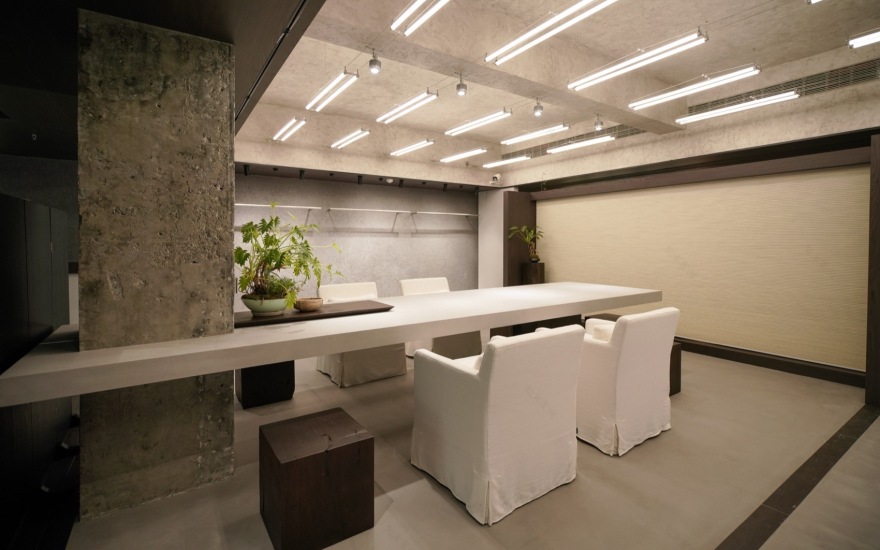
▼内部洽谈区,Internal negotiation area ©周梓怡


再次局部压低顶面并结合一步抬高的地台,形成物理和心理上的领域感与相对独立性。
The ceiling plane is lowered again locally, combined with a raised floor platform defined by a single step. This introduces physical and psychological senses of territoriality and relative separation.
▼可开合布帘,Openable fabric curtain ©周梓怡


亚麻质感蜂巢帘作为空间软分隔的核心元素。其温和透光的特性及可升降的灵活性,能以最低成本和最轻盈的方式,在需要时有效柔化环境、屏蔽过量视觉干扰,形成较为私密的会谈区域。
Linen-textured honeycomb blinds act as the key element for soft spatial division. Their mild light-filtering properties and adjustable height flexibility allow for the effective softening of the environment and screening of excessive visual clutter when needed, forming semi-private discussion areas – all achieved at minimal cost and with the utmost visual lightness.
▼软装道具,Soft furnishing props ©周梓怡


▼光影细节,Details of light and shadow ©周梓怡


基于空间需求和尺度感,定制了一组家具及道具。细节上,通过对体块进行精心推敲的斜角切削,赋予厚实材料以轻盈的视觉观感。
A suite of furniture and functional props was custom-designed based on spatial requirements and scale perception. Regarding detail: thoughtfully angled cuts were introduced to the masses, giving substantial materials a surprisingly lightened visual presence.
▼平面图,Floor plan ©向生设计事务所

项目名称:九果子服装店
项目类型:商业空间 / 零售空间
设计公司:向生设计事务所
主创设计:张静、杨繁繁
设计团队:王心彤
灯光设计:郝剑
完成年份:2025.07
项目地址:中国·湖北省武汉市硚口区汉正街第一大道蓝宝石
建筑面积:105㎡
主要材料:水泥质感涂料、灰色微水泥、罗非岩、深咖饰面板、麻布地毯
项目摄影:周梓怡
设计图纸版权所有:©向生设计事务所
Project Name:JIUGUOZI
Project Type:Commercial space/retail space
Design Company:Reborn Design
Leader Design:Takiyah,Yang Fanfan
Design Team:Wang Xintong
Lighting Design:Hao Jian
Year Finished:2025.07
Project Address:Sapphire, First Avenue, Hanzheng Street, Qiaokou District, Wuhan City, Hubei Province, China
Project Area:105㎡
Main Material:Cement-textured coating, grey micro cement, rofei rock, deep coffee decorative panel, linen carpet
Photography:Zhou Ziyi
Video:Ran Lijing
Photo & Video Copyright:©Zhou Ziyi|©Ran Lijing
Design Drawings Copyright:©Reborn Design
Company Website:
南京喵熊网络科技有限公司 苏ICP备18050492号-4知末 © 2018—2020 . All photos and trademark graphics are copyrighted by their owners.增值电信业务经营许可证(ICP)苏B2-20201444 苏公网安备 32011302321234号
苏公网安备 32011302321234号客服
消息
收藏
下载
最近