查看完整案例


收藏

下载

翻译
Hong Kong, 23 September 2020 -When the granddaughter of arguably one of the most famous restauranteurs in Hong Kong wanted to introduce a new culinary experience to Hong Kong’s diners, she tasked Lim + Lu to design her new restaurant, Yung’s Bistro, a contemporary take of the family restaurant, sitting across the harbour from each other.
For this project, the client’s brief is rather abstract; remembering their roots while paving the path for the future. it was important that the design draws inspiration from the flagship restaurant and allows customers to recognize that this new restaurant is born of the same meticulous DNA towards food preparation and detail-oriented customer service.
The predecessor, Yung Kee, has become the golden standard for Cantonese cuisine in today’s culinary world. However, it began in 1942 as a humble street food stall tucked away in an alley. To this day, food stalls known as “Dai Pai Dongs” are still very much part of Hong Kong’s culinary vernacular. Yung’s Bistro, although decades removed from their Dai Pai Dong beginning still embodies many design elements that pay homage to it.
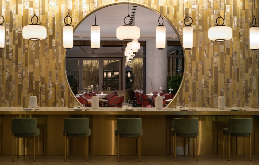
The restaurant is organized into two areas, the front area is designed for a more casual dining experience and designed to encourage social interactions amongst patrons. It takes design cues from casual western eateries with the objective of making traditional and authentic Cantonese cuisine more approachable and welcoming to the younger generation. The communal table which sits in the middle of the space with a contemporary take on a Chinese moon gate motif as a backdrop represents a core value of the brand - creating a sense of community. Furthermore, the large brass trimmed terrazzo communal table pays homage to the restaurant group’s food stall days, where customers would have to share a table due to the lack of space in the alley.
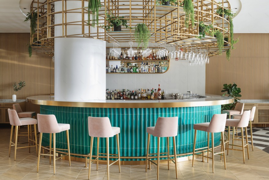
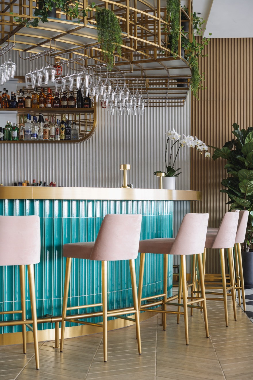
The shop front features a brass lattice that blurs the boundaries between the restaurant and the mall’s outdoor garden, allowing customers to flow seamlessly into the many pockets of space within the restaurant. The brass lattice is a reoccurring design element in the restaurant, drawing inspiration from the bamboo scaffolding that scatters throughout the city. This brass framework repeats itself above the bar as a visual feature that houses bottles of liquor, wine glasses, and potted plants.
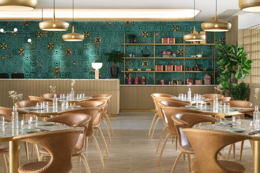
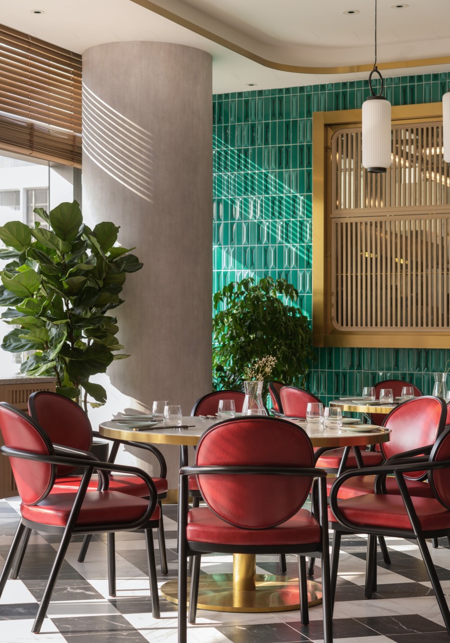
The bar located in the middle of the space takes centre stage and is symbolic of a new direction for the brand of restaurants. Clad in traditionally Asiatic tiles contrasted by a clean brass lattice overhead, the bar is representative of the core design values of the Bistro, a mix of old materials in new forms to create something truly refreshing.When drawing inspiration from the flagship restaurant, Lim + Lu decided to recast the existing tiles that were put in place from the original renovation in 1978. To give the tiles a contemporary and refreshing take appropriate for the new restaurant, Lim + Lu opted to use a jade green with detail accents finished in a metallic gold glaze. These tiles adorned the feature wall behind the cashier and display shelves.
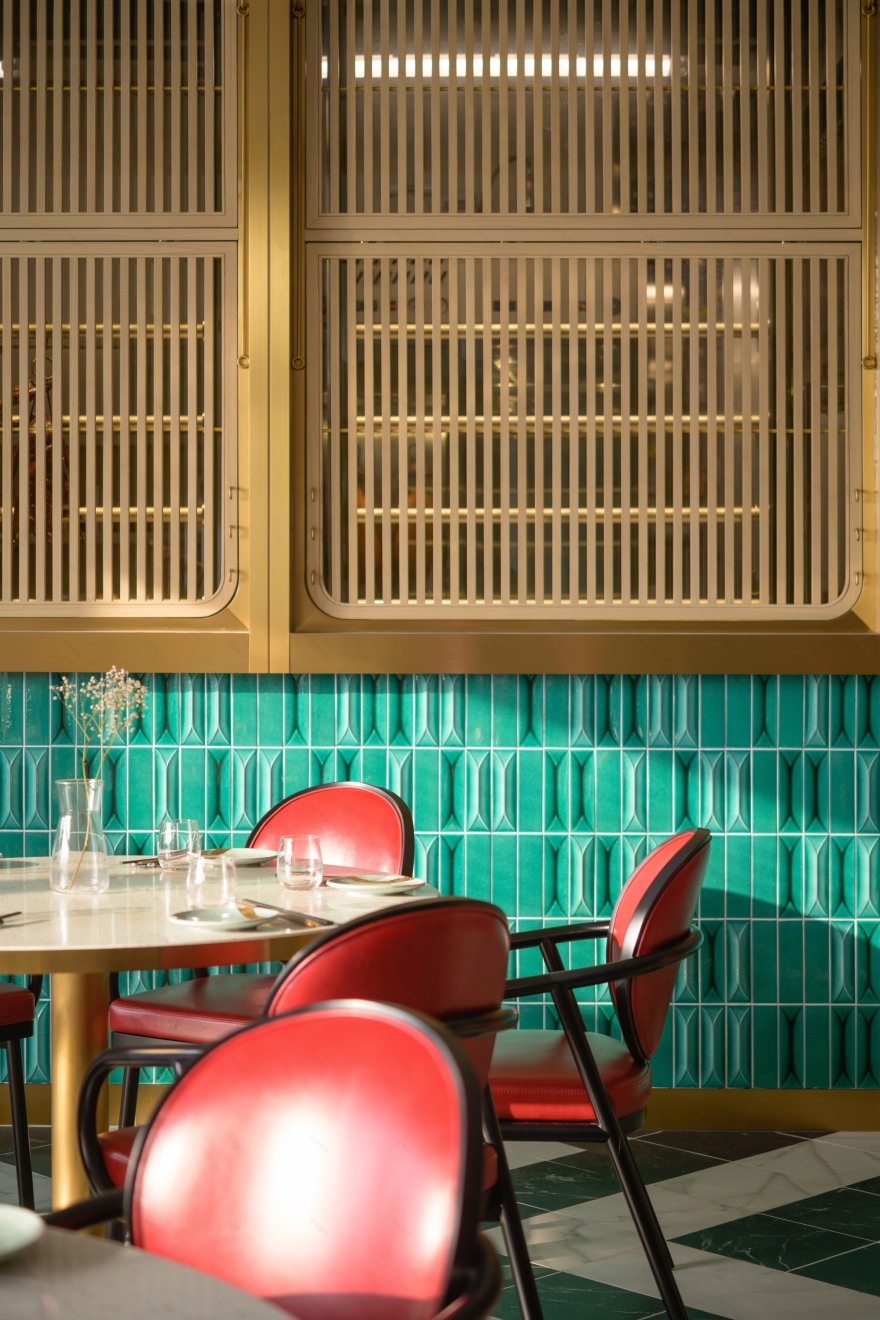
The back portion of the restaurant is the more formal dining area, housing larger round tables that are more conventional to Chinese dining. The formal dining room is flanked by brass windows that have direct sightlines into the kitchen. This view of the kitchen is atypical of Chinese cuisine. However, when the kitchen prepares the goose that made its predecessor one of the most famous restaurants in town, it is a true attraction.
Lim + Lu added wooden slatted screens in front of the kitchen windows to provide flexibility of privacy for the kitchen. The wooden screens are adjustable and can be fully opened to reveal the roast goose station and at the same time create an awning that spans over the dining tables. The operable screen is a subtle nod to their street stall days, where an up awning means you are open for business.
As the motif of East meets West was prevalent in the project, Lim + Lu decided to highlight the communal table, formal dining room, and VIP dining room with Moonbeam, the lantern light pendants that they designed for Danish product and lighting brand, Lucie Kaas.
Yung’s Bistro serves as a quintessential bridge between old and new, a traditional cultural cuisine of Hong Kong meeting more western and contemporary values. It emphasizes the importance of one’s heritage while trying to offer a new perspective into a cuisine that the family has been preparing traditionally for almost 80 years. It is a lesson in respecting what has come before, but also the courage for innovation.
客服
消息
收藏
下载
最近


