查看完整案例


收藏

下载

翻译
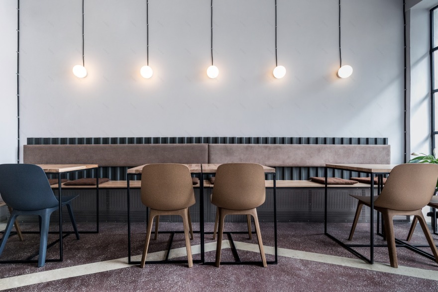
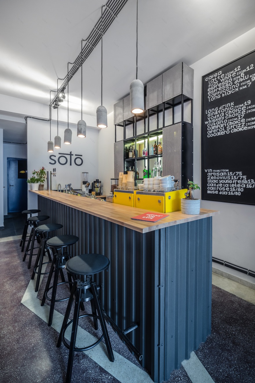
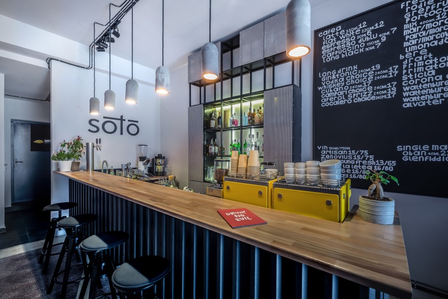
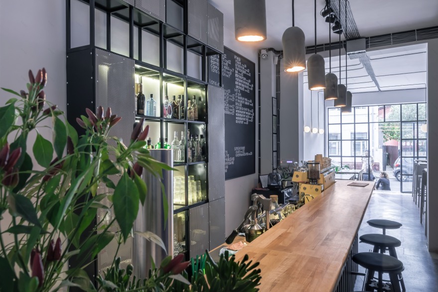
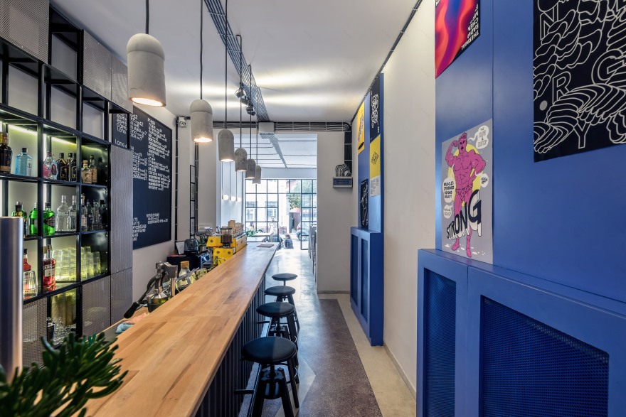
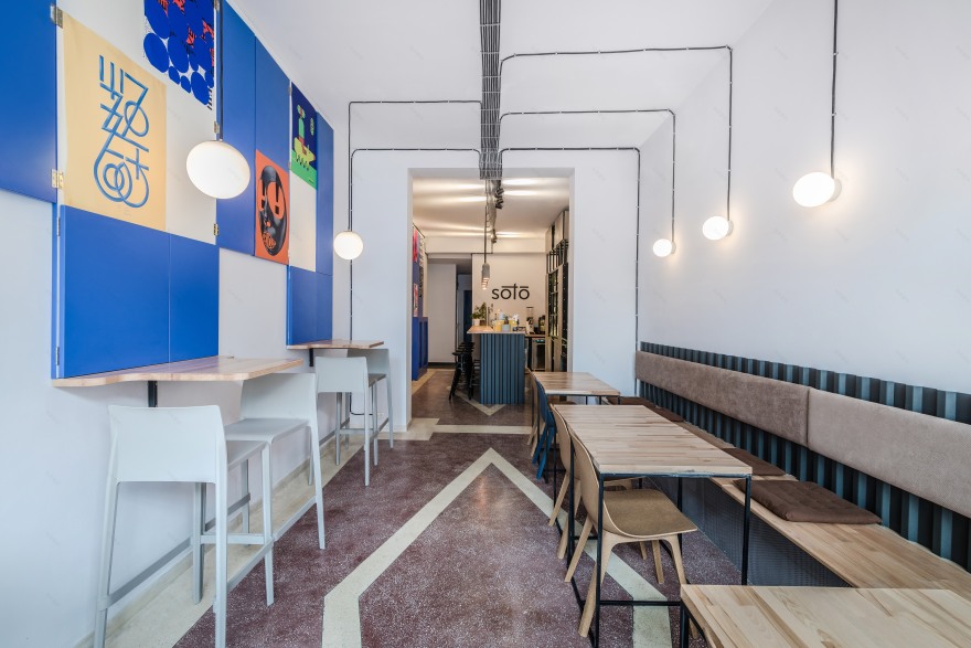
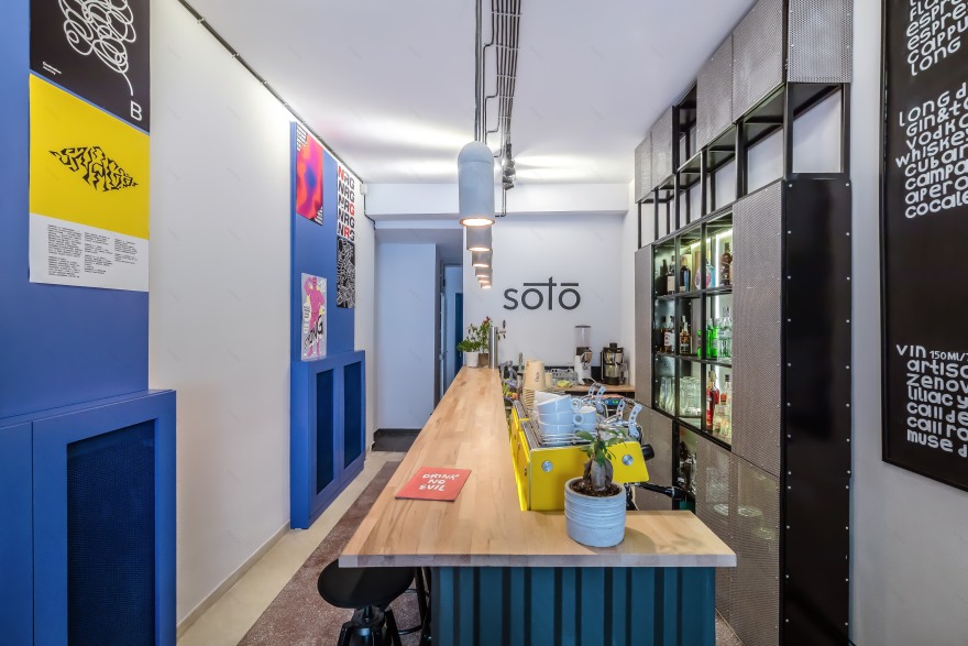
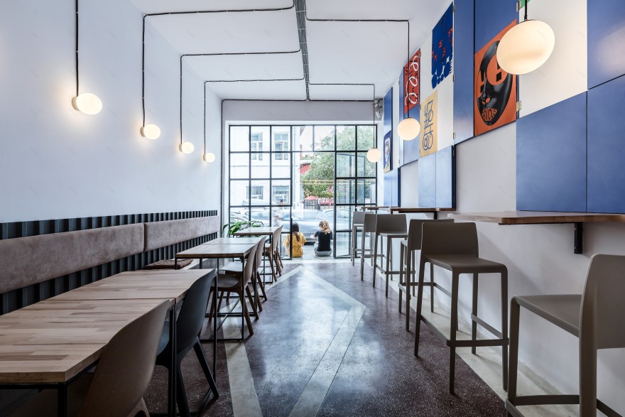
Serving coffee and special long drinks made by the Soto’s passionate bartender, the venue welcomes visitors in a daylight-filled space designed by 441 Design Studio in close collaboration with its owners. The studio found inspiration in combining an austere, industrial aesthetic with a touch of Wes Anderson deep blue that embodies the establishment’s bold and positive attitude towards art. Located in the heart of the Creative Neighborhood frequented by locals and tourists alike, Soto wants to be a place where artists can find support, being more like a cafe-bar-gallery, an unusual mix that can bring people towards art.
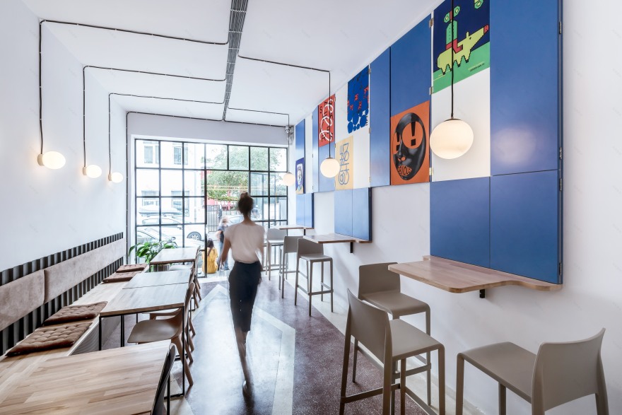
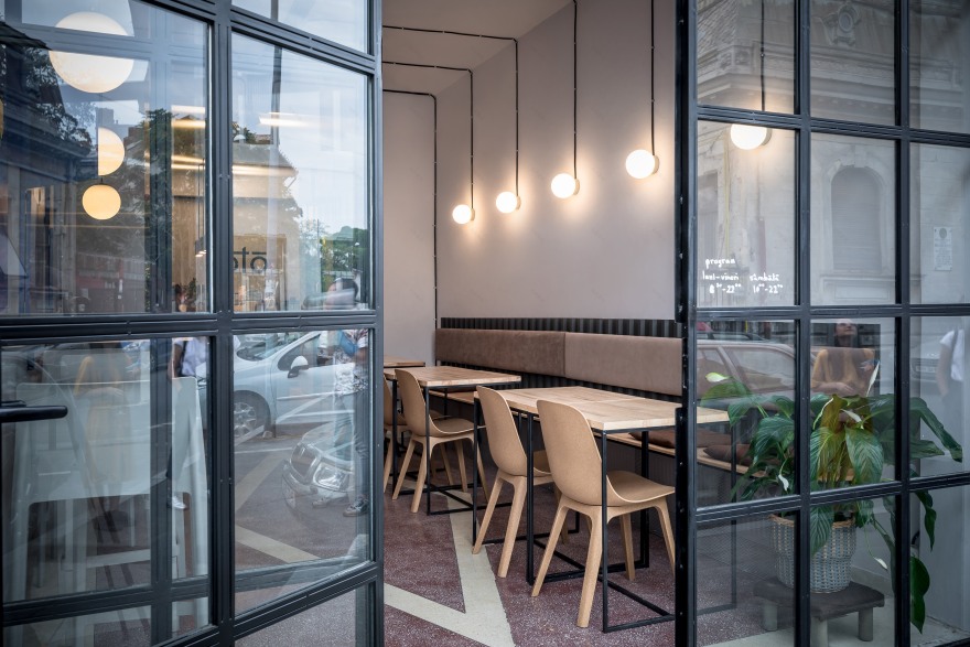
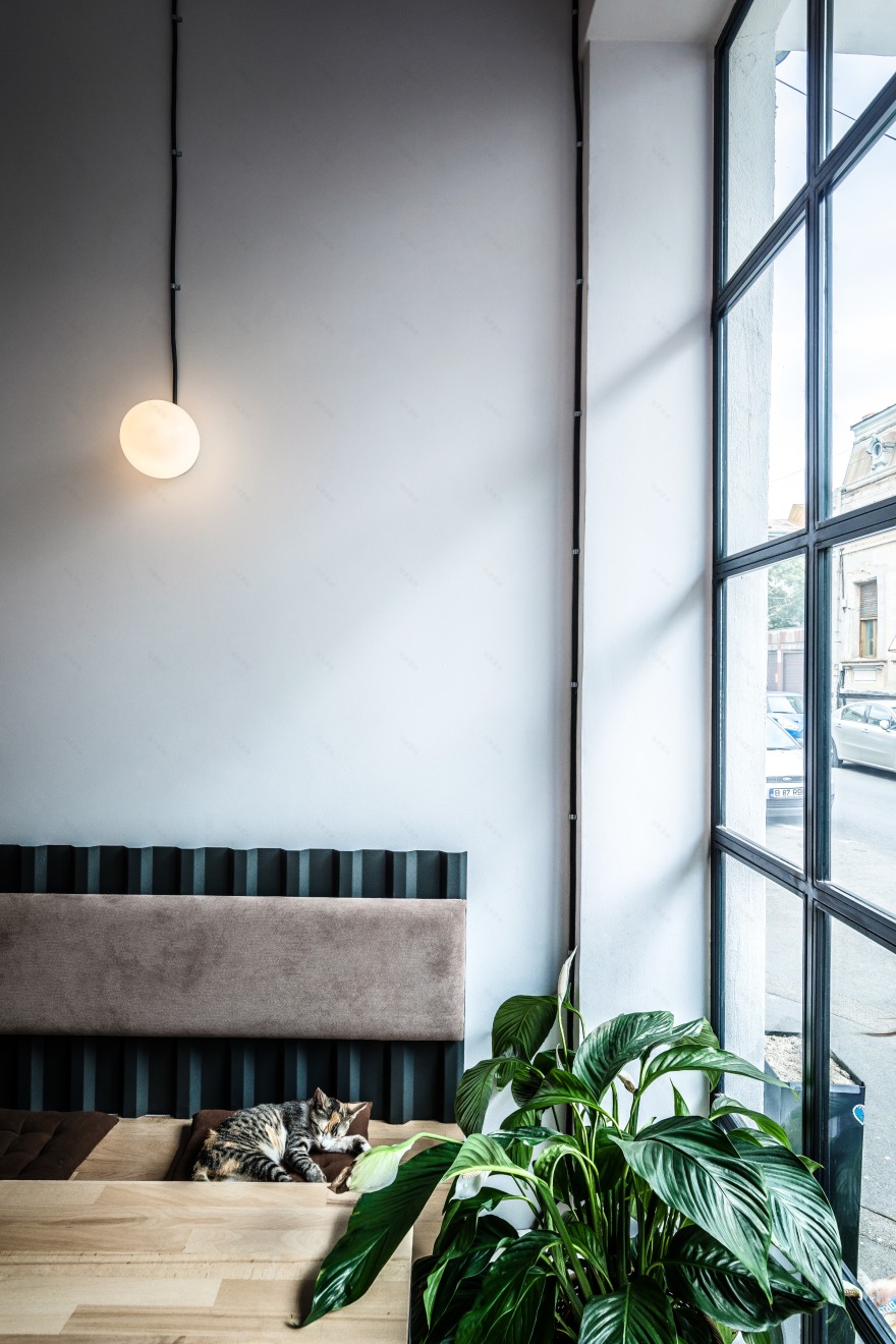
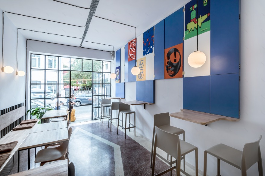
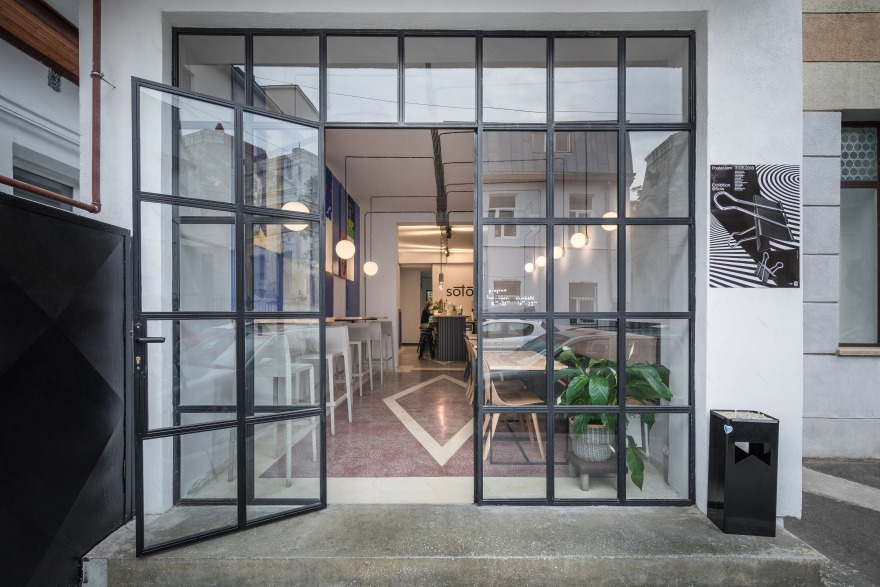
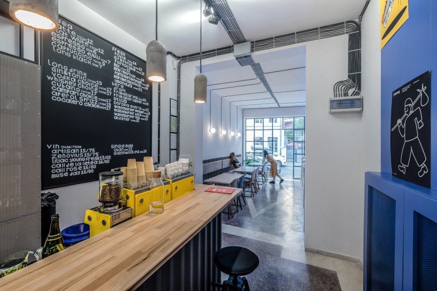
Soto is the kind of project where space dictated 60% of the design proposal. Being a wagon type space, the designers had quite a lot of constraints. They kept and restored the terrazzo mosaic floor, a typical feature of Romanian 70’s architecture, harmoniously blending together the industrial and the modern minimalist design. This dual aesthetic is further enhanced by the black-painted metallic window frames, the visible electrical wires on the ceiling and the retro round glass wall lamps.
Starting from this material we chose to play more with textures than with colours in a style with industrial influences. Hence the desire to have all the electric cables in sight that is also an easy to implement solution when you are pressed for time.
The owners had the desire to host creative events and curate exhibitions in the venue, designers thought of the possibility of changing the space constantly. This led to the deep blue "shutters" that can be closed or opened, creating a different colour game on the wall and an art display system.
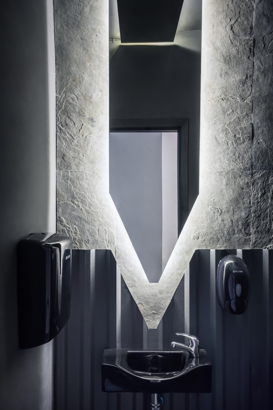
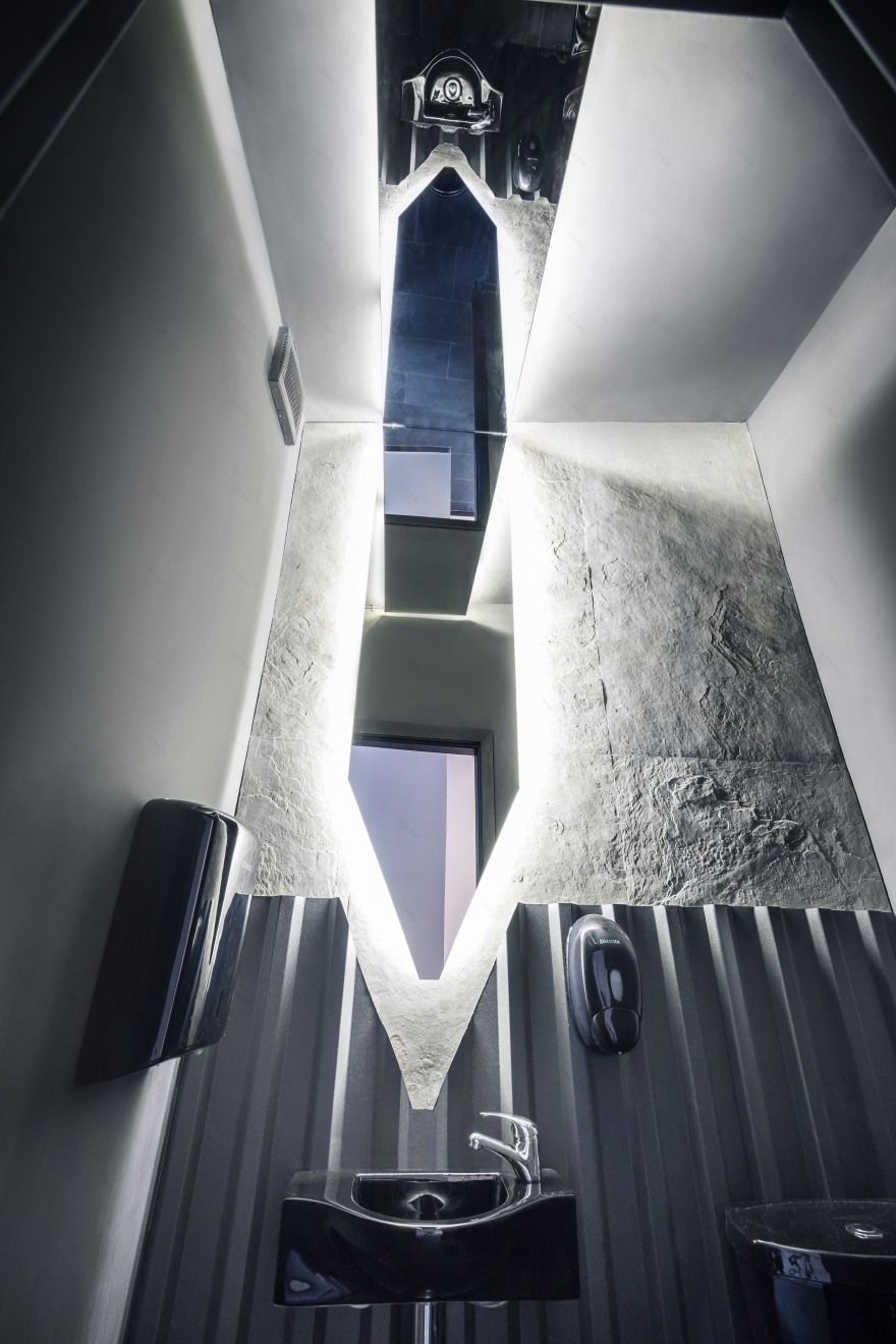
Although the predominant colour palette is neutral, an eclectic selection of contrasting materials and textures was used to further animate the design. Construction metal slate was used for the cafe’s walls and for the bathroom as well in order to create interesting sculptural patterns.
Undoubtedly, the 441 Design Studio’s most playful elements can be found in the bathroom that was inspired by a space capsule. The mirror that continues on the ceiling helps to open the space and creates an exciting reflection game.
The venue is completed by the sensibility given by the function of the space and the unusual amalgamation of elements that make it’s laid back, casual and artistic character.
Design by 441 Design Studio
Team- Arh Anca Dumitrescu, Arh Octavian Cazacu, Arh Cristiana Moisanu
客服
消息
收藏
下载
最近


