查看完整案例


收藏

下载

翻译
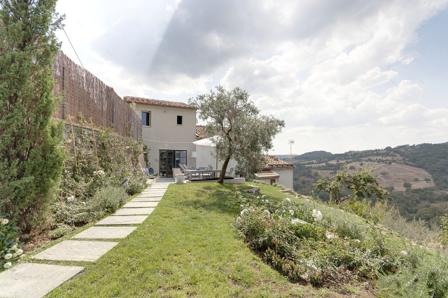
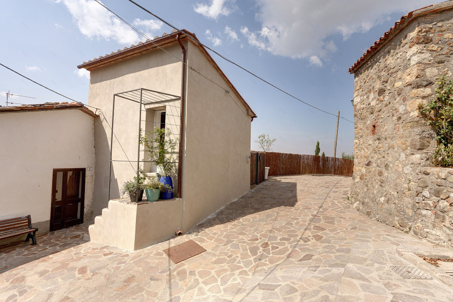
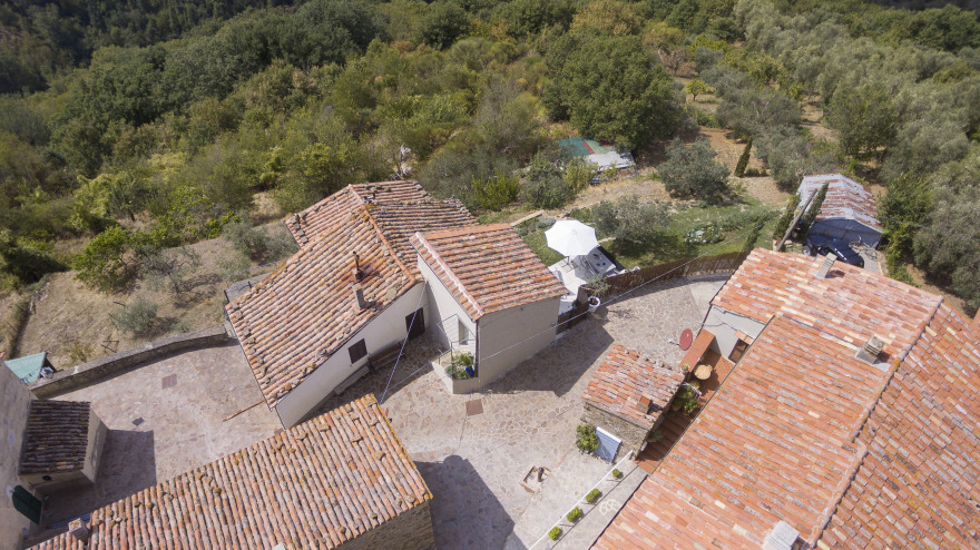
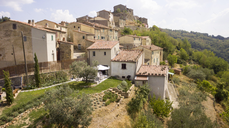
I fell in love, at first sight, of this small medieval village, Cana, perched on a steep hill a few kilometres from Grosseto and the sea, in the south of Tuscany. I found a small house, plus a warehouse that an house; It was composed by two small rooms, not in communication between them, engaged on clearing and cellar, for a total of 24 square meters!!!! As we would say in London, a 'Tiny house'! But the reason why I fell in love right away was the presence of a garden (very large), the possibility of arriving by car to the house (very rare in Cana) and, more than anything else, the wonderful and exciting view of the sea, around the Gulf of Grosseto with Castiglione della Pescaia and the Uccellina Mountains and, when the weather is nice, Elba and Corsica islands.
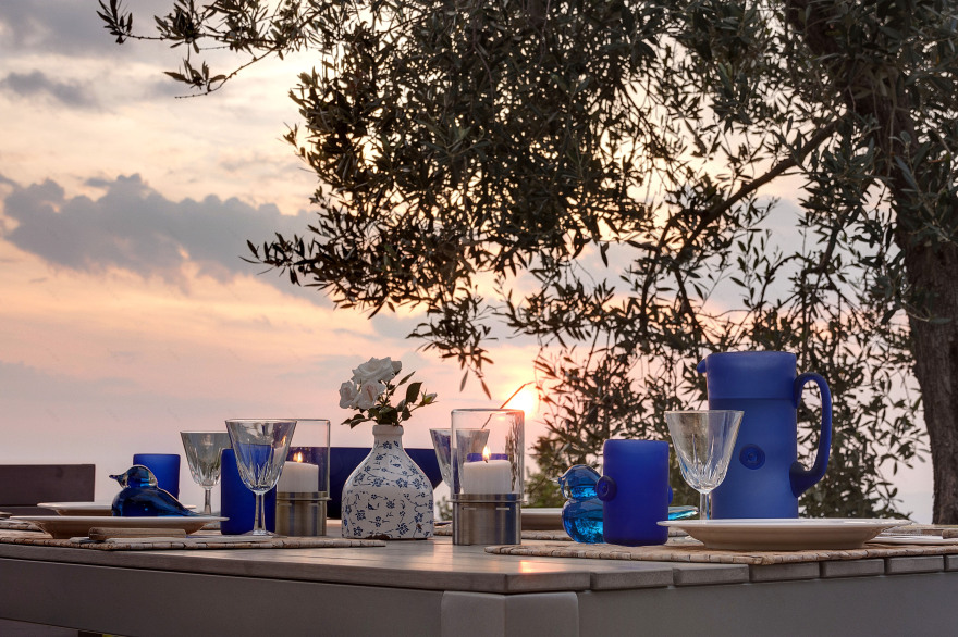
The house is on the extreme edge of the village, facing south-west; exposure I love the most, because the light of the sun illuminates the house and garden until the last second of the day. And the sunsets are marvellous! So relaxing and romantic to have a glass of wine in front of such poetry of Nature, always different every day!
PROJECT DESCRIPTION
It not has been easy to organize a comfortable living space in this small sized volume of just 24 square meters. Divided into two floors, 12 + 12. The cellar, the ground floor, at garden level, was in poor condition, with a height not enough to make it habitable. The floor (clay) was lowered by about 60 cm to make the living room and to create the necessary rehabilitation works. In fact, the project foresaw its use for the kitchen.
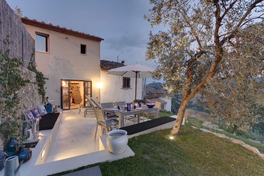
The first floor, with an original access from the upper end, it was not in communication with the basement, future kitchen, so there was the added problem of carving out a space for internal communication stairs. Roof and walls have all been rehabilitated and put back in again, even with anti-seismic countermeasures and energy saving. At the end of works the entire volume was so organized: On the ground floor, the kitchen and the stairway to the upper floor. On the first floor, the master bedroom and the bathroom. Outside, I created a large terrace, the actual dwelling living, liveable most of the spring / summer period in Maremma due to its very sunny and warm weather.
THE STYLE
Perhaps, the influence of living for most of the year in London influenced me in deciding the style to apply to this tiny house. But also its initial features have strengthened me the idea of applying an 'Urban Industrial' style although filtered by 'romantic elements'. In fact, already in the old cellar were present iron beam, exposed, already rusted from years; and also the grand opening of the cellar to the garden reminded me of the workshop doors, in metal. And so I decided this particular style for the home.
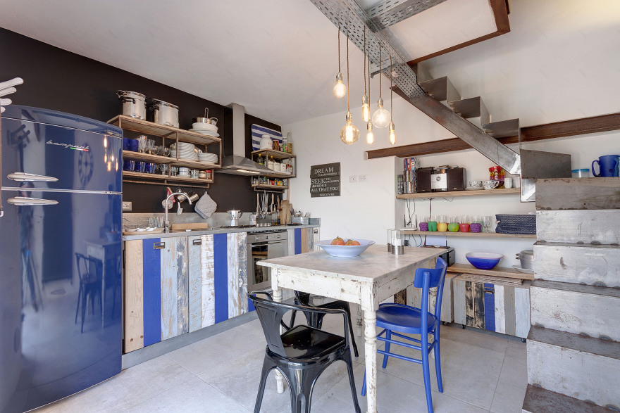
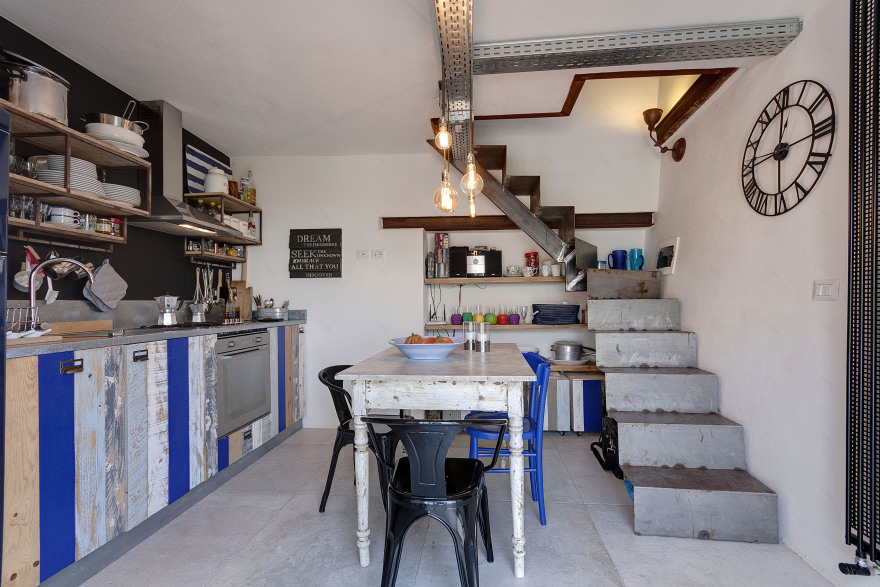
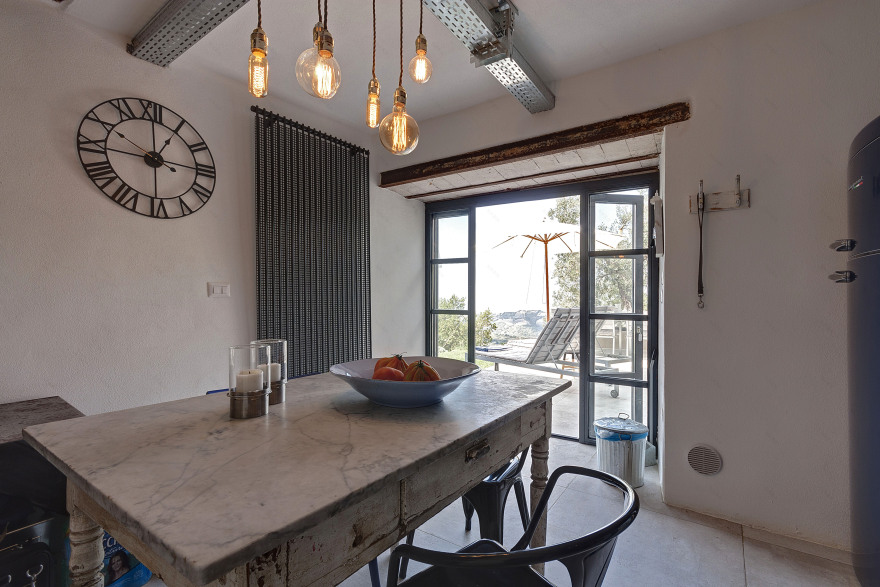
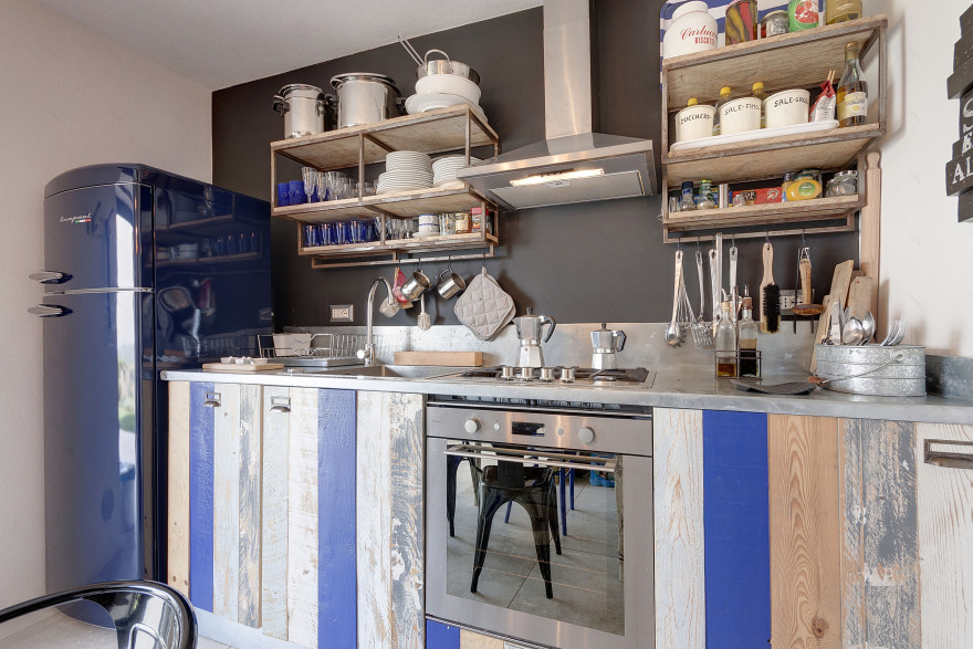
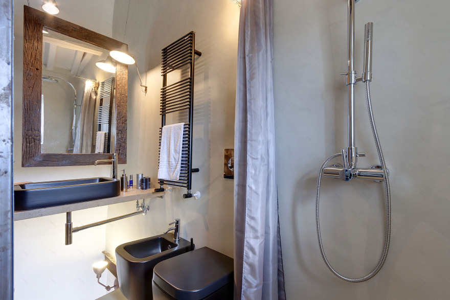
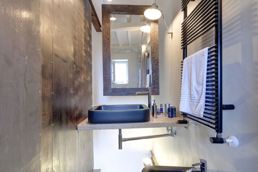
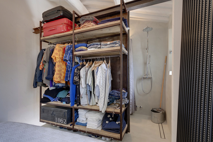
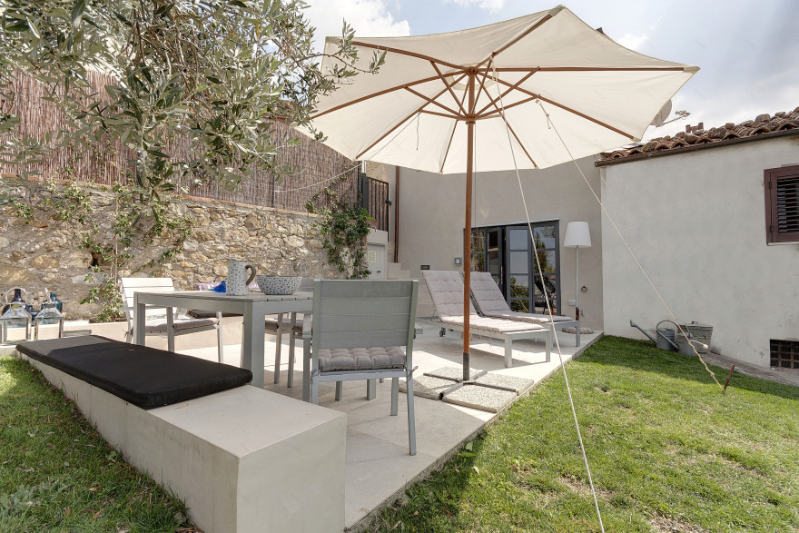
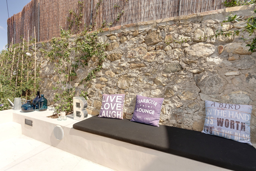
The house is in the so-called ‘village below' of Cana. It is one of the last houses of the village facing the south/west valley. It 'a privileged position for both the presence of the garden and access road (unique opportunity in the village), both for the wonderful view that stretches to the sea, to the whole of Grosseto Gulf, with the island d' Elba and sometimes Corsica in the background. Access to the house is from the parking lot and a small pedestrian gate that I created from the small access road, called 'via Giardino'. From both the accesses you get to the large outdoor space where we live all summer. This space houses the solarium and the living dining area. External furnishings are by IKEA, very elegant in a grey satin pearl. The porcelain tile floor, with a concrete effect, is produced by RES ceramics. All around, I created a bench covered in a light dove-colored resin with inserted plants, music diffusers and above pillows tailored in a black waterproof fabric. I also created a corner for an outdoor shower that we use regularly during the summer. All colours of the house are played on white, black, dove grey (in its shades), grey and ultramarine blue (almost a blue Klein). The materials range from etched iron to recycled raw wood (planks of the scaffolding), the resin (Microtopping) in grey cement and the porcelain white/cement. From the large outdoor space we have access to the kitchen from an anthracite grey steel door, workshop style. The kitchen, though small, has everything you need. It is completely tailored to my design; features furniture doors basic play of vertical slats of recycled wood in different thicknesses and different pickled colours except blue which is' 'full'. It is a full kitchen with dishwasher, washing machine, oven, and a large fridge by Bompani, in dark blue. Even the wall units are bespoke, designed by me, have a squared iron structure and planks in rough wooden, recycled from builders’ scaffolding. To optimize the use of space, in the bottom of the niche, I realized more shelves with planks of scaffolding and below some boxes on wheels with hinged cover, very useful as a small storage; even those with the same aspect of the front doors of the kitchen. And the stairs was not easy to study, to 'steal' least possible space in the kitchen area. Iron material, width 60 cm, raised cm. 22! The biggest problem was having to fit upstairs bathroom just above the staircase. To overcome the fact of beating my head going up, I placed the basin of the bath over the above stairs, disrupting the floor of the bathroom in his correspondence. So it goes up in the room 'passing' literally under the shelf cantilever that supports the basin. Bathroom clearly all open, without walls, and 'separated from the bedroom by a wood/iron wardrobe and an iron sliding door, which when closed, acts as a wall of the shower.
But continuing the trip ...
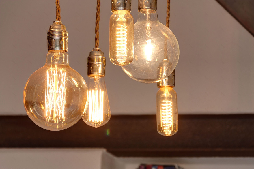
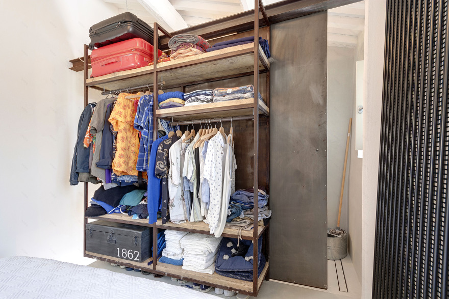
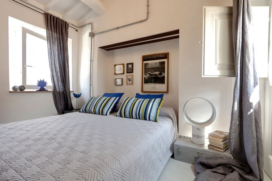
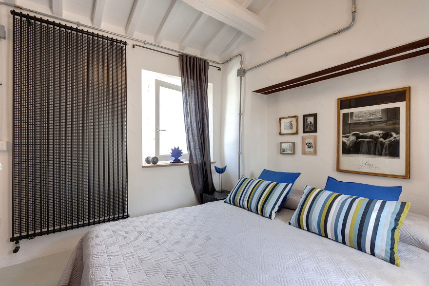
Going up the stairs you come to the bedroom. Whitewashed walls, grey concrete resin floor, exposed subsystems distribution. To better accommodate the bed I have created a niche in the wall with a beautiful header raw support girder. The bed is by IKEA, the iron bedside table and chest by Maison Du Monde, the chandelier in rusted iron was found at the vintage market of Lucca. A blue accent on the bedside table: a bird by Bitossi Ceramics, idea by Aldo Londi ceramist. And for the hottest nights, the Dyson fan. From the opposite side of the bed is the open wardrobe made to measure; with metal structure, shelves in recycled planks, all suspended, attached to a girder that runs through the entire room and also supports the sliding door of the bathroom. The radiators, blacks, industrial style are by Tubes. In the bathroom, the resin (Microtopping) covers both floor and walls. I thought so to create a waterproof and completely hygienic surface for walk-through shower and suspended toilet and bidè. In fact the shower box is created by closing the door, separating the bedroom, and on the other side, a curtain separating the rest of the bathroom. I found special toilet/bide with a depth of only cm. 45, produced by Ceramics Globus! Perfect for a so tiny bathroom. The wall lights are all vintage from UK, found in the London markets. The sink is supported by a corbel cantilevered on the stairs and is in recycled raw wood. A mirror above the sink has an Indian old frame, hanging from the rafters.
客服
消息
收藏
下载
最近


