查看完整案例

收藏

下载

翻译
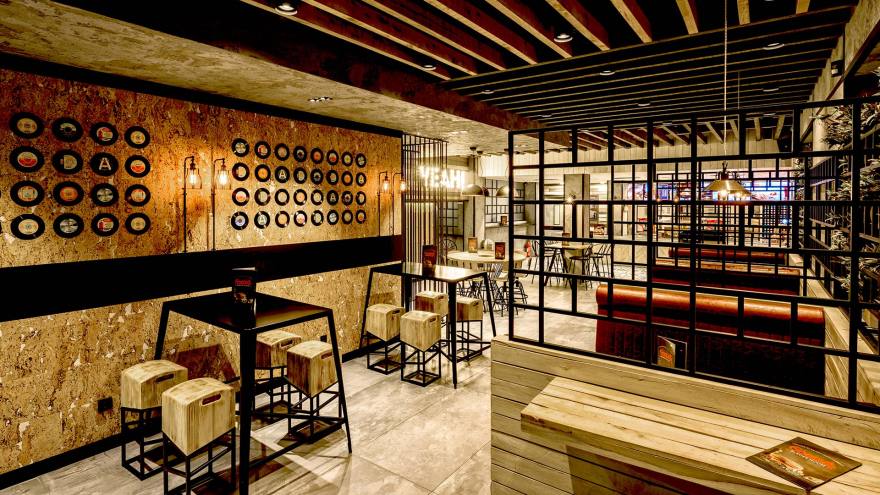
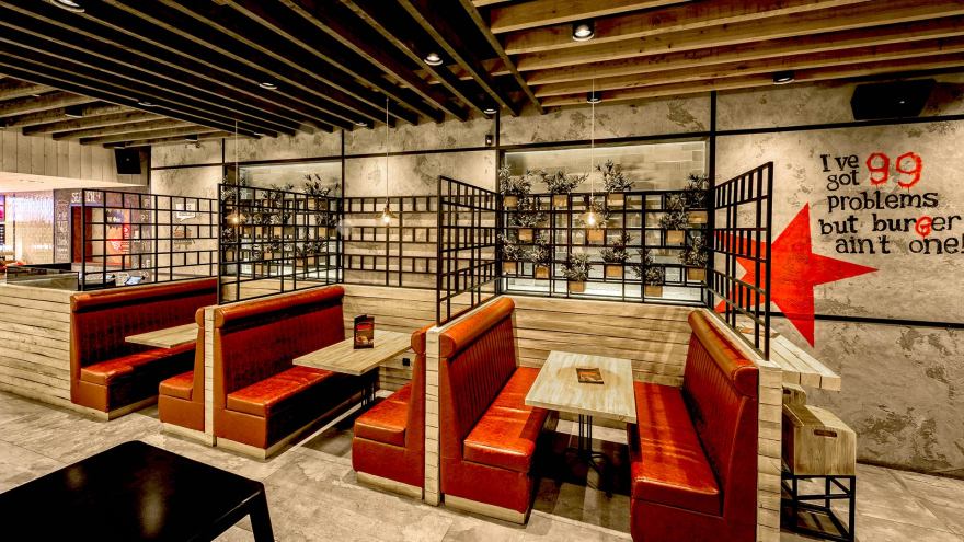
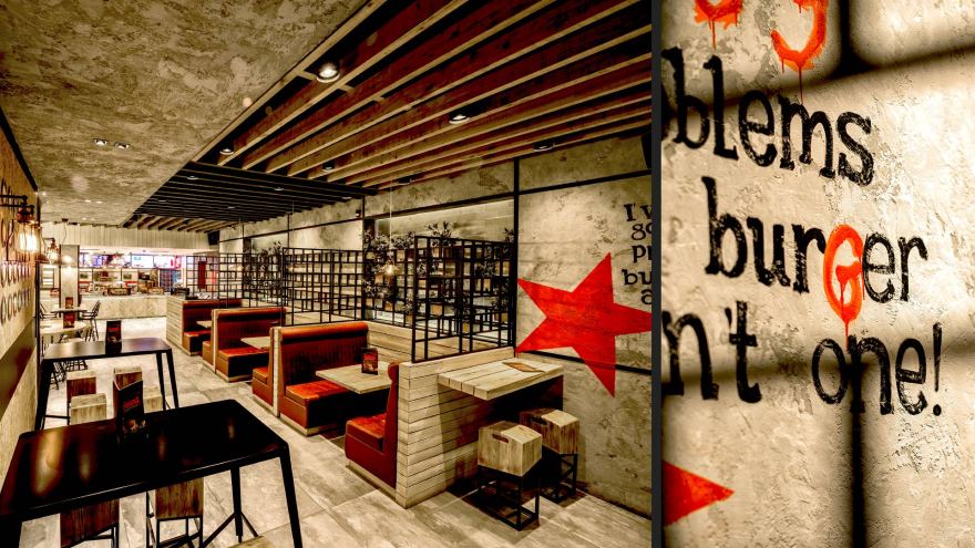
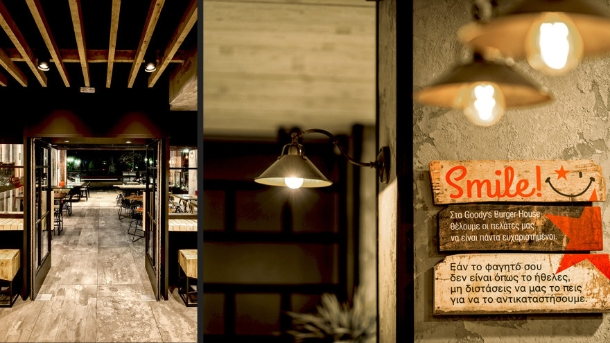
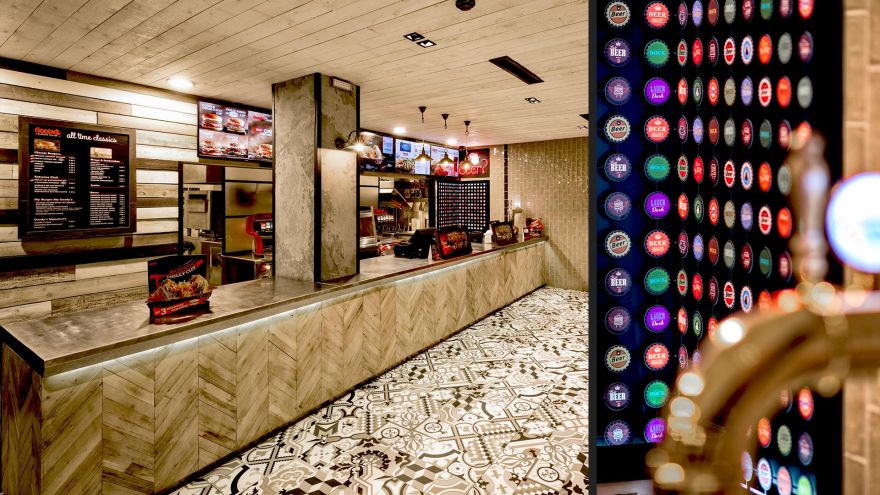
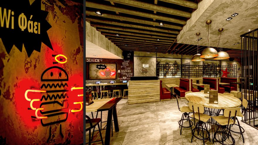
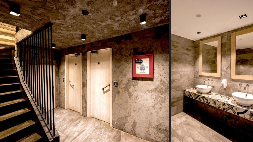
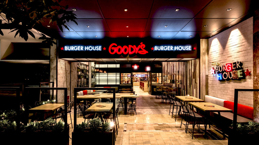
A key element of differentiation in this most recent venue of the brand was the decision to push inwards the boundary of the interior space. Thus, the existing gallery, destined to house the roofed outdoor sitting area, doubles in size, giving an enhanced public character to the store. Particular emphasis is given to the design of the roof in this area where a luminous zone with perforated metal sheets is created. It defines the space while simultaneously signaling the shop. Furthermore, the Goody’s Burger House Concept is enriched with the addition of certain new cladding materials, as well as decorative elements that combine graphics with neon lighting and incandescent lamps, giving them a three-dimensional and vibrant effect. Custom designed furniture, such as red booths reminiscent of American diners, create interesting relaxing corners for small or larger parties. The restaurant gets a more youthful and contemporary vibe while maintaining the warm and friendly atmosphere that characterizes the new identity of Goody’s restaurants.
客服
消息
收藏
下载
最近


