

创作上传
VIP
收藏下载
登录 | 注册有礼
查看完整案例

收藏

下载

分享

Diario de Espana: Church de Santa Monica
In 1993, my mother took me to Osaka, to see the Church of Light. It was cold and I refused to walk. I cried for bubble gum and candy.
In 2010, I took my mother to Rivas, Spain, to see the Churde of Santa Monica. It was hot and she refused to walk. She cried for water and a rest.
We have agreed to call it quits.
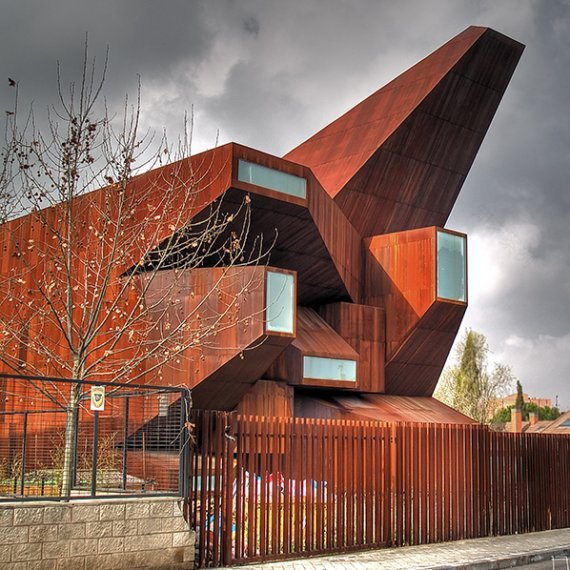
Two train rides away from Madrid is the small deserted town of Rivas. On looking up architectural interests in Madrid, appeared the Church de Santa Monica. Just looking at the first image, of the apertured facade in beautiful rusted crimson coreten steel, I knew I had to see the interiors and convinced my mother and stubborn sister to let me take them there.
The town of Rivas, is quite and motionless. Souless. The only life seemed to be within the manicured vegetation, and the never ending rows of almond trees, a burned shade of brown. Maybe that was why the architects
Vicens + Ramos
chose to build the exteriors in steel, that would rust and bleed into the wooden jungle that surrounded it. Which brings to mind another way of addressing context. Through the simple use of color. The design of the building otherwise shares no physical or visual connection with the vernacular architecture of its neighborhood residencies.
On approaching the building what seized my eye was one of the trapezoidal apertures looming overhead, towering towards the sun. When I faced the facade a few things came to mind. The notion of the facade had been reinterpreted. Ornamentation, which has lost its prominence to extreme minimalism for several years now, had manifested itself in this steel ‘sand crawler’ (as one fervent blogger humourously put) in a very different way. Instead of minute detail and craft that is attributed to classical facades, this facade exhibited ornamentation through awkward composition, dynamicism and proportion. I call it a facade, because no other exterior surface of the building is treated in this way, but is rather suttle in comparision. The design of the facade this way, kneeling to the authority of light has significance since gothic times. Gothic architecture as Otto von Simson proposes, was the architecture of light, lauding the heavens and skies. The overall design bears many resemblances to gothic design I felt. Even the sharp terminus on the opposite side of the facade, reminds one of the pointed architecture as Pugin calls it. The other sides of the building are treated with invisible openings which welcome light into the interiors.
However, as exciting the exterior was the detailing and spatial experience of the interior was a sort of let down (which aggrevated my mother even more). The apertures on the outside did a brilliant job of fishing in the light. But the architects, for some reason, decided to play with a golden color. Had they simply let the interiors remain white and bathe in the light, the quality of light would have been soothing. The use of gold added a nauseating feeling to the whole thing. Yet, the treatment of the altar and interior facade in terms of composition was interesting.
Even the Confessional was a simple planar structure, very Van de Rohe.
Beyond this, the architectural language seemed to deteriorate. The openings on the side walls seemed to be out of place. The main apertures should have been the only source of light. The upper balcony seating was not treated with any attention. It seems as though in following through with their main idea of the facade, the architects left out the interior spatial qualities which make the building, on the whole a disappointment.
This probably could serve as an example of the treatment of light and composition, two of the main themes this semester, if not the reassesment of religious building type.
– anarchytect
For more info check out:


南京喵熊网络科技有限公司 苏ICP备18050492号-4知末 © 2018—2020 . All photos and trademark graphics are copyrighted by their owners.增值电信业务经营许可证(ICP)苏B2-20201444 苏公网安备 32011302321234号
苏公网安备 32011302321234号客服
消息
收藏
下载
最近