

创作上传
VIP
收藏下载
登录 | 注册有礼
查看完整案例

收藏

下载

分享
Aktiv Sports – Eastwood

storefront

"all great artists sign their work" - steve jobs
A few months ago, we were comissioned by the Relzbach Group to do a re-vamp of their store. Aptly called AKTIV, its a brand they developed that carries multiple brands under their wing such as Gola, New Era, Hunter, and Buff, among others.
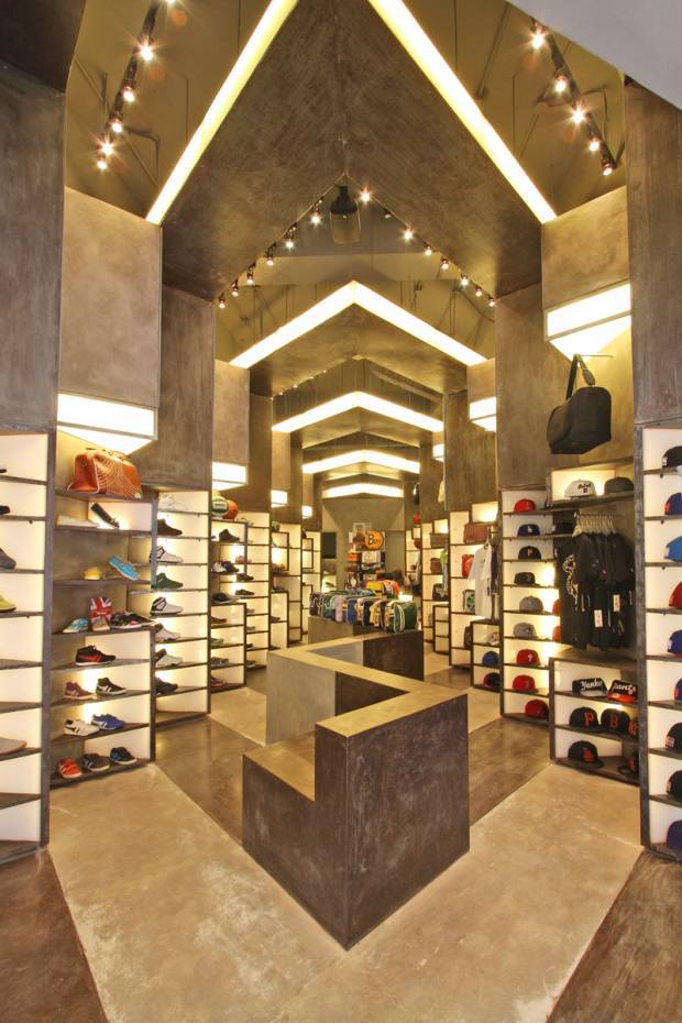
Given all of these multiple brands with identities of their own, the real challenge was how to make the store look harmonious with all of these brands that have their own identities. Our solution was simple – to develop a module that could function in multiple ways as well, so that it could adapt to the specific need of each product. We started with a display shelf whose dimension was based on a shoe – this box is stackable to display multiple shoes, or be adjusted in dimension, to display products with differnet sizes such as bags and shirts. These boxes were also used as light shelves, to illuminate products that are far from the source of light in stores which is usually the ceiling. The boxes could also be used as signage bands – and with this, a certain visual organization was achieved as even if their logos and signages looked different from each other, the similarity of the module size and configuration that houses these logos are the same.
These modules were then rotated in such a way that it faces the storefront for premium visibility, stacked on each other, to form these “toblerone” shaped display modules (as the client fondly called it), that create an even bigger module collectively formed by the boxes. Sort of like an picture (toblerone) formed by pixels (boxes).
Being a store that focuses on an active lifestyle, we wanted to simulate the spirit of movement. By stamping these toblerone shaped modules throughout the perimeter of the store, a certain rhythm was achieved thru repetition, creating a visually appealing and dynamic atmosphere.
The choice of materials presented much difficulty during construction because of the absence of veneers. Concrete is seen as concrete. Metal is presented as metal. We wanted to achieve a certain kind of rawness in the interiors – the same kind of rawness people feel when they’re active. Call it visual honesty.
the space upon entry


the sales counter
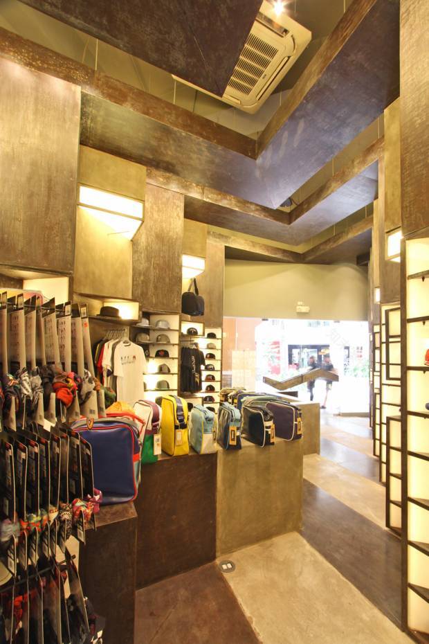
view from the interiors, looking towards the storefront

bench / display

ceiling details - the shape is similar to the AKTIV identity
ABOUT BUENSALIDO+ARCHITECTS
Buensalido Architects is an architectural, interior, and urban design laboratory solely committed to creating original, avant-garde, innovative, and progressive solutions.
We started in 2006, with the commitment to introduce fresh, bold, and innovative concepts to Philippine design setting.
南京喵熊网络科技有限公司 苏ICP备18050492号-4知末 © 2018—2020 . All photos and trademark graphics are copyrighted by their owners.增值电信业务经营许可证(ICP)苏B2-20201444 苏公网安备 32011302321234号
苏公网安备 32011302321234号客服
消息
收藏
下载
最近