

创作上传
VIP
收藏下载
登录 | 注册有礼
查看完整案例

收藏

下载

分享
翻译
Idoodle eLearning App | UX Research to Final UI

Idoodle is an eLearning platform designed to deliver online and offline courses through interactive lessons, assignments, and quizzes.This case study showcases the complete UX process followed to design a scalable, user-friendly learning experience for students and educators.
Project Overview
Project Name: Idoodle
Platform: Mobile Application (Concept)
Domain: Education / eLearning
My Role: UX Researcher & UI Designer
Tools Used: Figma, Canva
Project Duration: 5 Weeks

Step 1: Defining the Problem
The goal of this project was to design an intuitive eLearning platform that: Simplifies access to online and offline courses, Encourages active learning through assignments and quizzes, Supports both students and teachers with clear workflows.
Target Audience
School students (Class 9–12)
Design & Architecture entrance exam aspirants (NATA, NID, NIFT, UCEED)
College students pursuing skill-based courses
Teachers and mentors delivering online and offline education
Project Timeline
User Research: 1 Week
Information Architecture & User Flow: 1 Week
Wireframing & UI Design: 2 Weeks
Usability Testing & Iterations: 1 Week

Step 2: User Research & Insights
To understand user needs and pain points, both qualitative and quantitative research methods were used.
User Interviews
Interviews were conducted with students and educators to understand: Learning habits, Difficulties in existing eLearning platforms, Expectations from online and offline learning.
Key Insights: Students struggle with tracking assignments and progress. Navigation in most learning apps feels overwhelming. Teachers need simple tools to upload and manage content.
User Surveys
Surveys were conducted to validate interview findings and gather broader insights.
Survey Highlights: Users prefer clean and simple navigation. Clear lesson structure improves learning experience. Easy access to quizzes and results is highly valued.
Competitor Analysis
Popular eLearning platforms were analyzed to identify gaps and opportunities.
Key Observations: Feature-heavy interfaces often confuse users. Limited support for offline learning. Lack of personalization in course structure.
This analysis helped identify areas where Idoodle could improve usability and clarity.
Affinity Mapping
Research findings were organized using affinity mapping to identify recurring themes.
Major Pain Points Identified: Complex navigation. Poor content organization. Difficulty in tracking progress and assignments.


Step 3: Information Architecture & User Flow
Based on research insights, a clear information architecture was designed to ensure: Logical content grouping, Smooth navigation, Reduced cognitive load for users
User Flow
Student Flow:Login → Browse Courses → Select Course → View Lessons → Attempt Quiz → Track Progress
Teacher Flow:Login → Create Course → Upload Lessons → Assign Quizzes → Monitor Student Progress
These flows ensured a structured and intuitive learning journey.

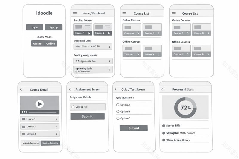
Step 4: Low-Fidelity Wireframes
Low-fidelity wireframes were created to focus on: Screen layout, Content hierarchy, Core functionality without visual distractions.
Wireframes helped validate early ideas before moving into visual design.
Visual Design Direction
The visual design follows Idoodle’s brand identity: Primary colors: Red & White, Clean and minimal interface, Clear typography and strong call-to-action buttons.
The design emphasizes clarity and accessibility for students of all age groups.
Step 5: Usability Testing & Iterations
Usability testing was conducted to evaluate how easily users could complete key tasks.
Usability Testing Sessions
Users were asked to perform tasks such as: Enrolling in a course, Watching a lesson, Attempting a quiz.
Observations helped identify friction points in navigation and layout.
Task Completion Analysis
Task flows were analyzed to measure: Time taken to complete tasks, Errors faced by users, Points of confusion.
Design Improvements (Before vs After)
Based on testing feedback: Navigation was simplified, CTAs were made more prominent, Content spacing and hierarchy were improved.
These changes resulted in a smoother and more intuitive user experience.

The final design delivers:
A structured and user-friendly eLearning experience
Clear separation of student and teacher workflows
Scalable design for both online and offline education


Thank you for taking the time to explore this case study.Feedback and collaboration opportunities are always welcome.
南京喵熊网络科技有限公司 苏ICP备18050492号-4知末 © 2018—2020 . All photos and trademark graphics are copyrighted by their owners.增值电信业务经营许可证(ICP)苏B2-20201444 苏公网安备 32011302321234号
苏公网安备 32011302321234号客服
消息
收藏
下载
最近