

创作上传
VIP
收藏下载
登录 | 注册有礼
查看完整案例

收藏

下载

分享
旗舰店的设计目标是营造一种充满活力、适合家庭、可复制且令人难忘的用餐体验。色彩、材料、肌理、定制家具与灯光共同构建出清晰而鲜明的品牌空间识别,使顾客在记忆中将这一空间与高品质汉堡的体验联系在一起。
The flagship store of the hamburger restaurant is intended to be upbeat, family-friendly, repeatable – and memorable. Colors, materials, textures, bespoke furnishings, and lighting all combine to create a branded spatial identity that customers would remember and associate with the experience of a quality burger.
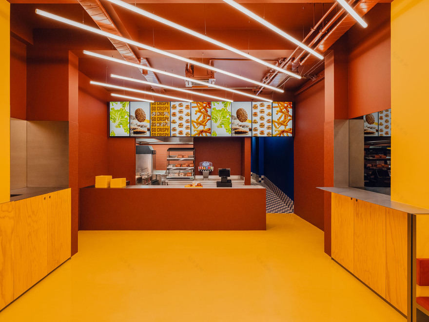
▼室内空间概览,Interior overall view © Pionstudio

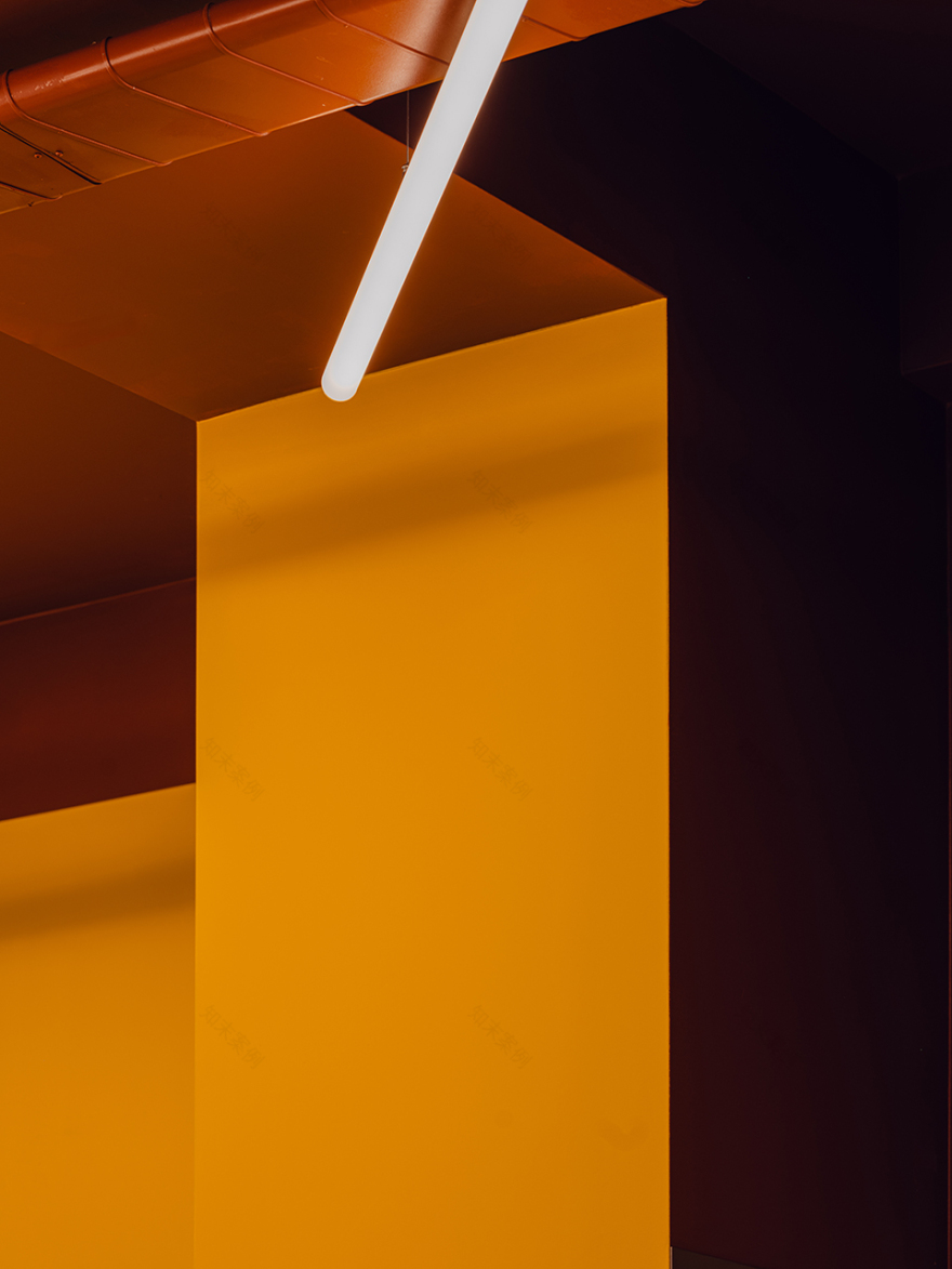
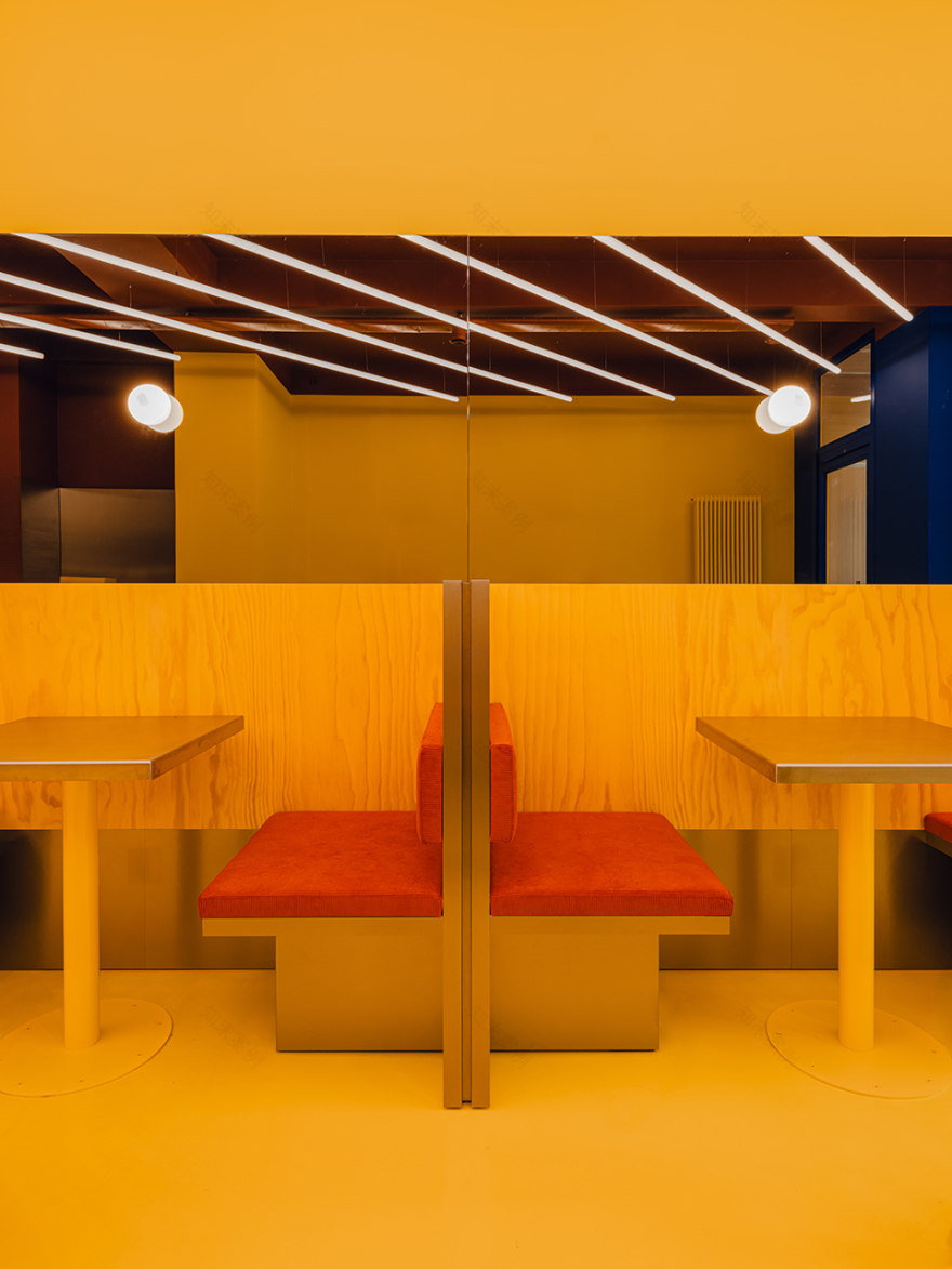
最核心的特征在于色彩。空间分区通过大面积的色块进行界定:点餐区与主要用餐区采用黄色;取餐区与厨房采用陶土色。陶土色天花贯通前后两个功能区,将原本属于同一空间的不同区域统一起来。对比鲜明的蓝色用于界定室内外的过渡边界,同时也标示出凸窗内的一张特色餐桌。后勤区域,包括卫生间,则位于空间后部,以蓝色与白色为主。整个空间通过一条不锈钢基准线实现统一。
Above all, the place is colorful. The zoning of the space is defined by color blocking. The area where customers order the food and the main dining area are yellow; the food pickup area and the kitchen are terra-cotta. A terracotta ceiling unites the front and back of these zones – which are otherwise part of a single room. A contrasting blue color designates the threshold between outside and interior, and also demarcates a special table in the bay window. The back-of-house area which includes the WCs are in blue and white at the rear. The whole is unified by a stainless steel datum line.
▼室内空间概览,Interior overall view © Architecture_in_a_blink

轴测图清晰展示了色块如何定义整体设计:它指引了室内流线,区分了不同功能用途,同时也明确了室内外的过渡界面。顾客首先透过放大的外立面窗洞看到室内的色彩与光线;进入之后,点餐与用餐区呈现为黄色空间,并配以陶土色天花,而厨房则位于陶土色区域内。卫生间位于后部,以蓝白配色完成。整个设计通过一条不锈钢基准线统一,该基准线将服务台顶部与内嵌家具上方的金属收边对齐。
▼轴测图,Axonometric diagram © Bruzkus Greenberg

The axonometric view shows how color blocking defines the design: it indicates interior flow, different functional uses, as well as the threshold between outside and interior. Guests first see the colors and light of the interior through the expanded exterior windows; upon entry, the ordering and dining area is yellow with a terra-cotta ceiling and the kitchen is in the terra-cotta zone. WCs are finished in blue and white at the rear. ‘The whole design is unified by a stainless steel datum line that aligns the top of the service counter with the trim on top of the built-in furniture.
▼主要用餐区,Main dining area © Pionstudio

▼点餐区,Ordering area © Pionstudio
场地与改造: 餐厅在规划阶段作出的首要决策之一,是重新启用侧向的历史入口,以建立更合理的动线组织。餐厅位于一栋受保护的柏林地标建筑的一层商业空间内,这类建筑典型地呈现为20世纪初期的形态特征:狭长、进深大,除街道一侧外几乎没有自然采光。此前曾作为入口使用的凸窗,被重新定义为家庭就座区,配置了一张独立餐桌与专属吊灯。窗户的玻璃面积被扩大,以尽可能增强室内外之间的视觉联系。
Site and replanning: One of the first planning decisions for the restaurant was to re-establish the historic entrance to the side to make sensible paths of flow. The restaurant occupies the ground floor retail space of a landmarked Berlin building that is typical of its turn-of-the-twentieth century period: long and thin and deep with no natural light except from the street. A bay window which had been previously used as an entryway was reconstituted as a family seating area with a freestanding table and dedicated light pendant. The glazing of the windows was expanded to make the connection between inside and out as transparent as possible.
▼家庭就座区,Family seating area © Pionstudio

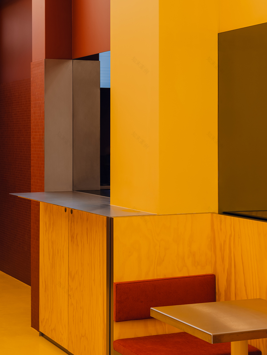
▼卡座区,Banquette seating area © Pionstudio

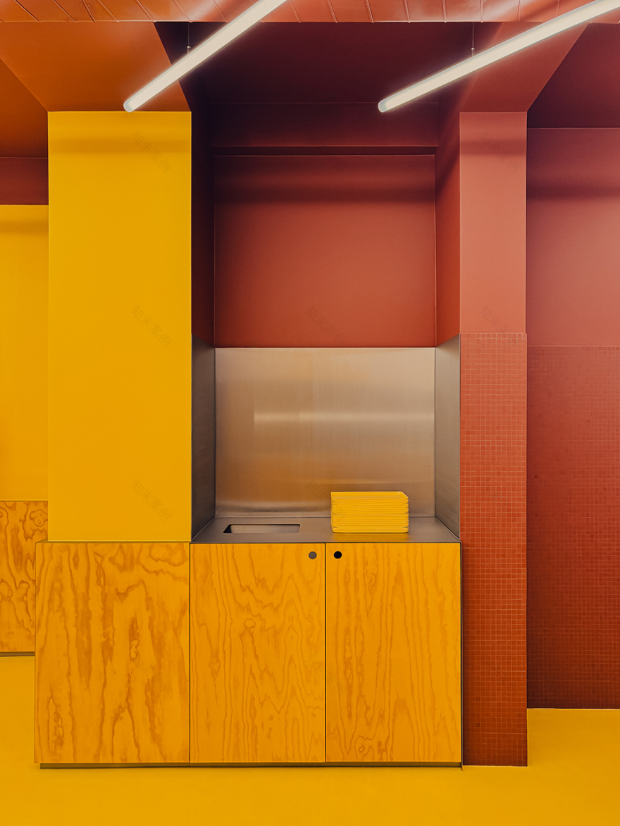
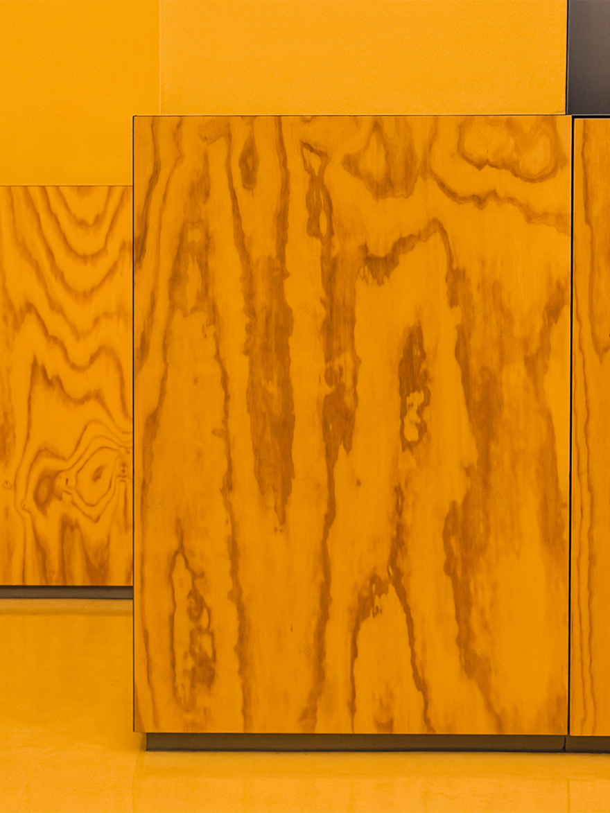
肌理: 建筑空间的设计与品牌的平面视觉体系同步发展,但实体餐厅的建筑表达方式有别于市场推广物料。空间并未采用单一色调的涂刷处理,而是通过凸显不同材料自身的肌理特征,强调它们之间的差异。木饰面采用黄色染色而非油漆覆盖,使木材天然的纹理清晰可见;地面为高光环氧树脂地坪,反射出灯光的图案;红褐色的服务台及周围墙面由马赛克瓷砖构成,为大片色彩增添了材料尺度;不锈钢收边则以低调的哑光光泽将整体串联起来。合伙人Ester Bruzkus表示:“不仅仅是颜色,更是肌理。”
Texture: The architectural space was developed at the same time as the graphic palette for the branding – but the architecture of the physical restaurant is treated differently from the marketing materials. Rather than monotone painted surfaces, the textures of the different materials are featured to emphasize their differences. Wood panels are stained yellow, not painted, so that the natural pattern of wood grain is notably present. The floor is a glossy epoxy, reflecting the light pattern. The terracotta service counter and surrounding walls are made from mosaic tiles, adding a material scale to the sea of color. Stainless steel trim has a dull shininess that brings it all together. Partner Ester Bruzkus explains: “It’s not just the colors, it’s the textures.”
▼染色木饰面保留木纹表达,
Stained wood panels revealing natural grain © Pionstudio

▼服务台成为前后场色彩与材质的交汇界面,
Service counter where front & back-of-house palettes meet © Architecture_in_a_blink

▼不锈钢基准线贯穿空间,Stainless steel datum line unifies zones © Pionstudio
▼材质细部,Materials detail © Pionstudio & Architecture_in_a_blink


灯光: 顶部灯光营造出一种统一的图案效果,可从街道透过凸窗清晰可见。灯光设计具有鲜明、图形化且简洁的特征。灯具的几何形态本身形成方向性与秩序感,将下方不同功能区域整合为整体。空间明亮而友好,这种极具识别度的灯光语言也成为品牌未来门店的重要标志。
Lighting: The overhead lighting creates a unifying pattern that can be seen from the street through the bay window. The lighting is distinctive and graphic and simple. The geometry of the light fixtures has its own pattern and direction to unify the programmed parts underneath. The space is friendly and bright and the distinctive lighting is brand -defining for future locations.
▼灯光引导通往后场,Lighting leading to back-of-house © Pionstudio

▼卫生间灯光,WC lighting © Pionstudio

▼灯光细部,Lighting detail © Pionstudio
家具: 定制的内嵌家具组织了空间,定义了直观的流线,并营造出鲜明的氛围。卡座座椅由不锈钢、染色木饰面(保留富有表现力的木纹)以及柔软织物共同构成,形成硬与软、哑光与光泽之间的对比。不锈钢基准线环绕整个空间,将内嵌座椅统一起来,并延展为服务台与独立取餐台的表面。
Furniture: Bespoke built-in furniture structures the space, defines an intuitive flow, and creates a distinctive atmosphere. The banquette seating is made from stainless steel, dyed wood veneer with an expressive grain pattern, and soft fabric – a combination of hard and soft, matte and glossy. A stainless steel datum line surrounds the room and unifies the built-in seating, expands into service counters, and becomes the surface for the freestanding food pickup counter.
▼内嵌式卡座,Built-in banquette seating © Pionstudio
▼卡座近景,Banquette seating close view © Pionstudio

通过不同区域之间强烈对比的色彩分区,餐厅呈现出鲜明、易于记忆且高度可复制的形象——并希望为顾客带来轻松、有趣且美味的体验。这家汉堡连锁品牌旗舰店的多彩室内空间,旨在营造一种独特、适合家庭且令人难忘的用餐体验。设计通过控制色彩总数,同时强化其饱和度与对比度。
Zones of different contrasting colors make the restaurant distinctive, memorable, and repeatable – and hopefully fun and delicious for the guests. The colorful interior of the flagship store of the hamburger restaurant chain is intended to create a dining experience that is distinctive, family-friendly, and memorable. The design limits the total number of colors but enhances their saturation and contrast.
▼黄色、红褐色与白色灯光构成主色体系,
Yellow, terracotta and white light defining the interior palette
© Architecture_in_a_blink

Bruzkus Greenberg
Mollstrasse 1
10178 Berlin
+49 30 235 979 40
Team: Ester Bruzkus, Peter Greenberg, Anna Kopeina, Sina Hartmann, Leonie Stier
Lighting: Studio DeSchutter – Lichtplanung
Completion: 2025
Area: 120 m2
Scope of work: LPH 1-8
Photographer: Pion Studio
Press Inquiries:
Katja Silbermann
南京喵熊网络科技有限公司 苏ICP备18050492号-4知末 © 2018—2020 . All photos and trademark graphics are copyrighted by their owners.增值电信业务经营许可证(ICP)苏B2-20201444 苏公网安备 32011302321234号
苏公网安备 32011302321234号客服
消息
收藏
下载
最近