

创作上传
VIP
收藏下载
登录 | 注册有礼
查看完整案例

收藏

下载

分享

商业空间设计的核心逻辑,始终源于对“商业目标”的深度理解与系统倒推。“泰曼如”是一个专业的泰式手法推拿品牌,在承接该项目后,设计团队首先从品牌基因与消费场景出发,进行空间策略定位。
The core logic of commercial space design is always rooted in a deep understanding and systematic analysis of commercial goals. For "Thai Man Ru," a professional Thai massage brand, the design team first focused on the brand's DNA and consumer scenarios to formulate the spatial strategy.

门厅区域打破传统接待模式,将休闲等候与品牌产品展示有机结合,使顾客在踏入瞬间即沉浸于品牌氛围之中,实现自然的产品认知与消费引导。
The lobby area breaks away from the traditional reception model by integrating leisure waiting and brand product display. This allows customers to become immersed in the brand atmosphere upon entry, facilitating natural product awareness and consumption guidance.

外观上摒弃了传统东南亚风格的具象符号,转而运用具有地域识别性的色彩语言——以温暖浓郁的陶土橙、静谧柔和的香草白作为主调,在视觉上即时传递出热带独有的热烈与松弛感。
The exterior design deliberately avoids literal symbols of traditional Southeast Asian style, opting instead for a regionally evocative color language. A palette centered on warm, earthy terracotta orange and serene vanilla white instantly conveys the distinctive tropical atmosphere—both vibrant and relaxed—through visual immediacy.

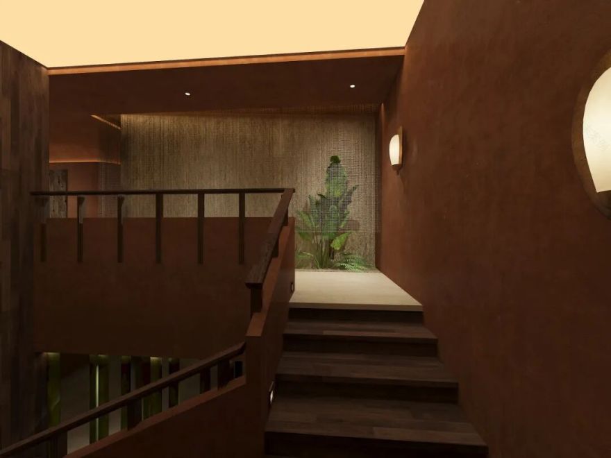
廊道设计则注重情绪过渡的节奏控制——从喧嚣街市经由门厅缓冲,再步入渐次收窄、光线柔和的廊道,借由空间序列的层层递进,巧妙引导访客逐步卸下外部纷扰,在身体与心理上同步进入舒缓宁静的准备状态。
The corridor design focuses on rhythmically orchestrating an emotional transition—guiding visitors from the bustling streets through the buffer of the lobby, then into a gradually narrowing, softly lit passage. Through this layered spatial sequence, it skillfully leads guests to shed external distractions, allowing both body and mind to synchronously enter a state of calm readiness.


材质与灯光进一步强化此过程:天然微水泥墙面、手工陶砖与局部木质穿插,配合间接光源与重点照明,共同营造出触觉温润、视觉柔和的沉浸场域。
Materials and lighting further enhance this experience: natural micro-cement walls, handcrafted ceramic tiles, and interspersed wood accents, combined with indirect and accent lighting, collectively create an immersive environment that is tactilely warm and visually soft.
建筑结构融合现代极简的硬朗线条与曼妙舒缓的弧形轮廓,形成力量与柔美并存的视觉张力,既呈现出现代商业空间的清晰气质,亦承载了泰式文化中特有的厚重与温度。
The architectural structure integrates the clean, rigorous lines of modern minimalism with graceful, flowing curves, creating a visual tension where strength and softness coexist. This approach not only presents the clear, contemporary character of a modern commercial space but also carries the distinctive depth and warmth inherent in Thai culture.


整体而言,该设计不仅完成了从商业目标到空间体验的逻辑闭环,更在品牌表达、用户行为引导与长效运营维度上,建立起一套完整而可持续的空间叙事体系。
Overall, the design not only completes a logical cycle from commercial objectives to spatial experience but also establishes a comprehensive and sustainable spatial narrative system across the dimensions of brand expression, user behavior guidance, and long-term operation.
项目信息
PROJECT INFORMATION
项目名称:泰曼如
项目地址:河南洛阳
项目面积:260m²
设计主创:雷爱君
设计单位:上舍空间设计事务所
主要材料:石材、原木、艺术涂料
一层平面图 ▼

二层平面图 ▼

设计主创
MAJOR DESIGNER

雷爱君
上舍空间设计
设计总监
/荣获奖项/
2025年『城市筑梦家·设计合伙人计划』-城市筑梦合伙人
2024城市设计名片荣誉证书
2023年度 ICS色彩空间设计奖·最佳色彩空间设计奖
2023年度「iS智能空间设计奖·城市智能豪宅新势力人物」
2022年度“设计千人计划·入选设计师”
2021金住奖 - 中国(洛阳) 十大居住空间设计师
2020广州设计周“她设计”优秀空间设计
2019广州设计周“她设计”优秀空间设计
2018中国设计力量 - 一城十杰
2018第八届中国国际空间设计大赛 - 银奖
2017 第五届“艾舍奖”商业空间 金奖
2017 40under40中国(河南)设计杰出青年
2016中国设计年鉴 - 金奖、银奖
2015广州设计周住宅空间 - 设计新锐奖
她曾多次参与斯里兰卡、日本等国外游学项目 ,在设计领域拥有长达25年的深厚从业经历。
一家具有人文精神的精品型设计工作室,倾心于营造有感觉的空间。坚持以人为本的原则进行室内设计,强调文化、品质的完美融合,倡导更优质的设计生活态度。
南京喵熊网络科技有限公司 苏ICP备18050492号-4知末 © 2018—2020 . All photos and trademark graphics are copyrighted by their owners.增值电信业务经营许可证(ICP)苏B2-20201444 苏公网安备 32011302321234号
苏公网安备 32011302321234号客服
消息
收藏
下载
最近