

创作上传
VIP
收藏下载
登录 | 注册有礼
查看完整案例

收藏

下载

分享
翻译


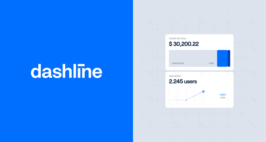
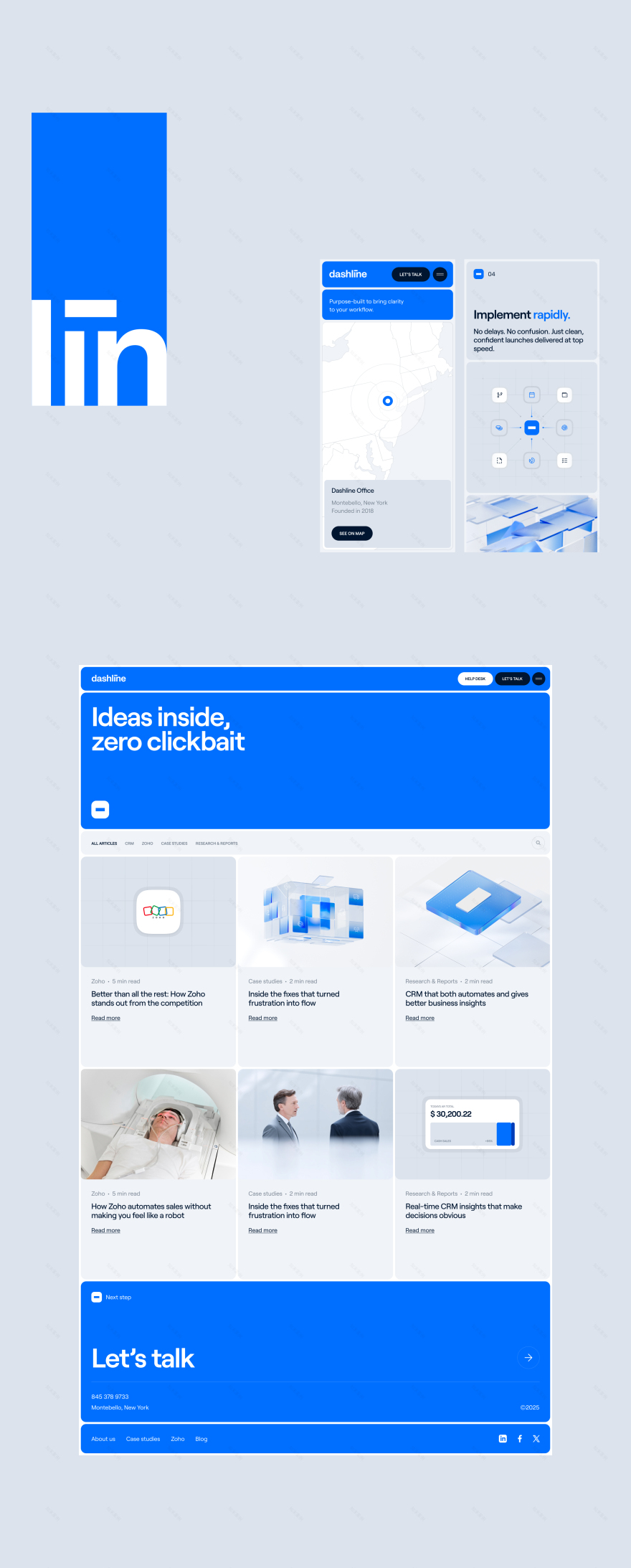
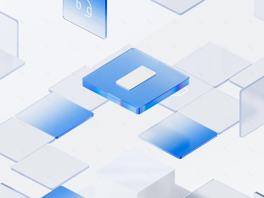
Dashline came to us for a rebranding. We started by designing a new logo. That led naturally to a full redesign of their website. The goal was clear. Create a landing experience that instantly grabs attention.The challenge was that Dashline simplifies internal company processes. This is hard to visualize. We decided to combine 2D explainer elements with a main 3D animation. At the center is a glowing core based on the new logo symbol. It manages and organizes everything around it. This core represents how Dashline helps companies run better by removing complexity.


We built a scroll-based storytelling sequence. Each step shows a business challenge Dashline solves. Things like operations, finance, or automation. The 3D animation became the visual foundation. We reused its elements across subpages for consistency.
The site is responsive and optimized for mobile. Animations stay smooth even on small screens. Dashline’s new visual identity reflects what they offer. Clear, simple, effective systems.


南京喵熊网络科技有限公司 苏ICP备18050492号-4知末 © 2018—2020 . All photos and trademark graphics are copyrighted by their owners.增值电信业务经营许可证(ICP)苏B2-20201444 苏公网安备 32011302321234号
苏公网安备 32011302321234号客服
消息
收藏
下载
最近