

创作上传
VIP
收藏下载
登录 | 注册有礼
查看完整案例

收藏

下载

分享
翻译

ABOUTlocaton: Dolgoprudny | Russiatype: Fast food cafe
area: 138m2completion: november 2025
TEAM
Ostroukhov Konstantinn
Arpy Abgaryan
photo: Inna Kablukova

MOODBOARD


CONCEPT
ZAP is a project defined by the energy of the city. We understand that the modern tempo dictates its own terms; therefore, our objective was not to shelter the guest from the city’s bustle, but to channel this drive by clearing the space of unnecessary visual noise. This is a place for those who value the rhythm of the metropolis.
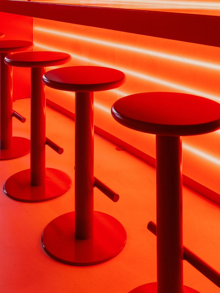
The entire project is built on the sensation of being in the city, in motion, on the go—not in chaos, but within a distinct rhythm. The project's visual dominant is light, referencing evening traffic. Dynamic light lines pierce the space, creating an intuitive path toward the ordering zone.


CONCEPT
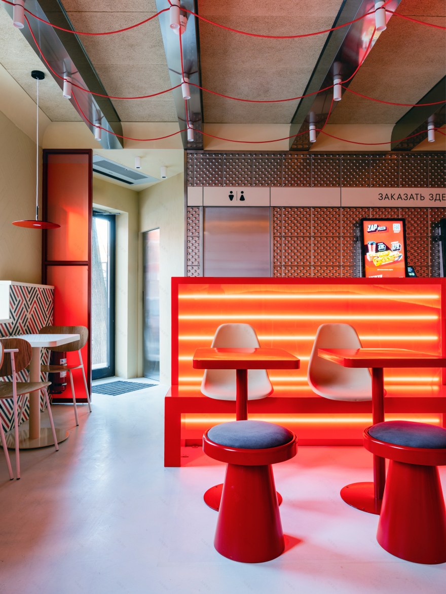
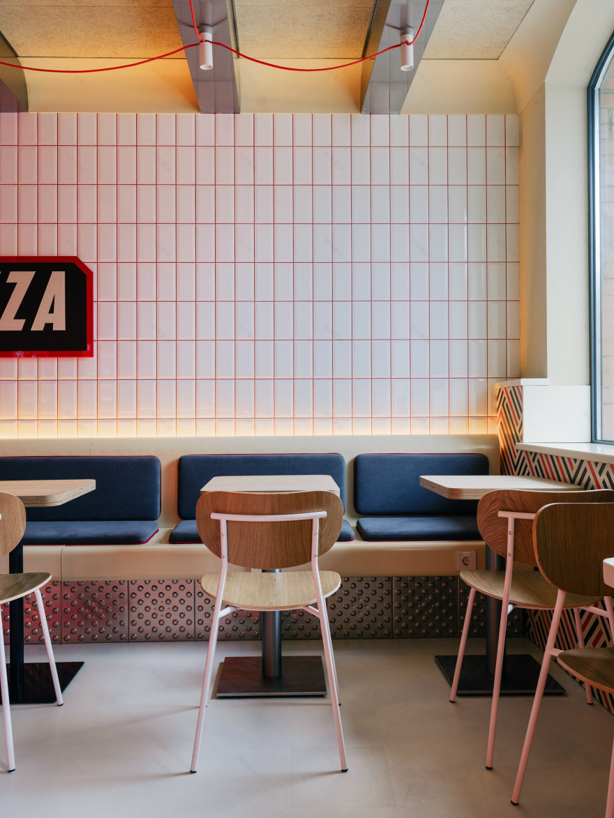
At the center of this dynamic is the "Red Core." Our communal bar table, which transitions into regular seating, acts as a gravity point, bringing people together. It offers various scenarios: from a quick bite to a comfortable waiting area for delivery couriers. The area is clad in classic subway tiles. This is a conscious homage to the aesthetics of the first New York subway stations (1904), where this material was first applied. Glossy, utilitarian, and timeless, the tiles expand the space and reflect the city’s rhythms.

CONSTRUCTION

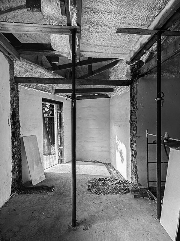


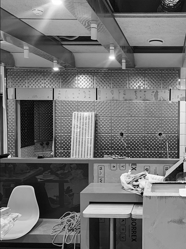
NOW

CONCEPT
In our search for a visual language, we drew inspiration from the subway systems of Berlin, New York, and Paris, studying their navigation and utilitarian nature.
Clad in classic subway tiles. This is a conscious homage to the aesthetics of the first New York subway stations (1904), where this material was used for the first time. Glossy, utilitarian, and timeless, the tiles expand the space and reflect the rhythms of the city.
One of the key solutions was the use of tactile tiles. This feature underscores the urban-café concept and connects the interior with the street.


CONCEPT
Identity: We integrated the brand identity by making it an intrinsic part of the architecture. The pattern on the bar and radiator screens binds the interior and the brand together, creating a single, cohesive product.
Engineering: In the radiator screens, we transformed a technical necessity (ventilation) into a graphic feature by integrating the perforation into the black lines of the pattern.
Connections: Red cables draped between the beams mimic a map of subway lines, tying the ceiling structure into a unified network.


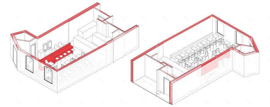
PLANS


南京喵熊网络科技有限公司 苏ICP备18050492号-4知末 © 2018—2020 . All photos and trademark graphics are copyrighted by their owners.增值电信业务经营许可证(ICP)苏B2-20201444 苏公网安备 32011302321234号
苏公网安备 32011302321234号客服
消息
收藏
下载
最近