

创作上传
VIP
收藏下载
登录 | 注册有礼
查看完整案例

收藏

下载

分享
翻译

KENTO is a domestic Vietnamese footwear brand with over 25 years of experience in manufacturing and distribution. With the mission of "Accompanying children into adulthood," Kento aspires to become the most trusted footwear brand among parents.
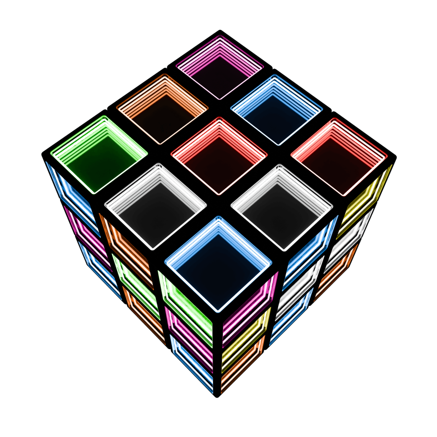
THE RUBIK CONCEPT
Inseparable Connection - The Rubik's Cube symbolizes the symbiotic bond between KENTO and its partners. Each piece represents a distributor, when interlocked perfectly can they form a complete and successful whole.
Intellect, Flexibility, and Solutions - The act of solving a Rubik's Cube serves as a metaphor for logical thinking and strategic flexibility. It highlights the collaborative spirit between KENTO and its partners in solving complex market challenges together.
Rubik Cube Drafts


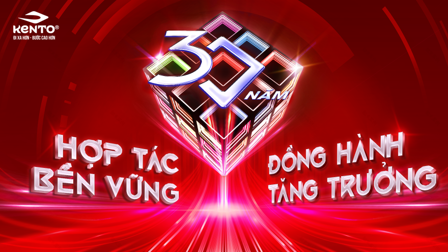
KEY VISUAL
The Stylized "30-Year" Rubik's Cube - represents the inseparable, symbiotic connection between KENTO and its partners. It symbolizes the collective intellect and flexibility required to solve complex market "puzzles". The integrated "30" affirms that this three-decade history is the solid foundation for future success.
"Sustainable Partnership – Growth Together"
"Sustainable Partnership" is reflected in the cube’s solid, unbreakable 3D structure. "Growth Together" is visualized through dynamic upward speed lines, signifying momentum and a flourishing future aligned with the brand's slogan: "Go Further - Step Higher".
Color Palette & Lighting - The dominant red tone is selected to strictly match KENTO’s brand guidelines, representing its core identity and to symbolize passion and prosperity. Futuristic neon accents modernize the heritage brand, signaling that Kento remains innovative and ready for the next era.
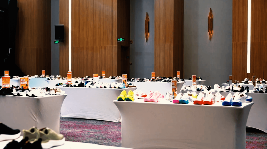
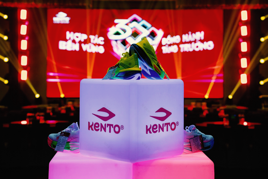
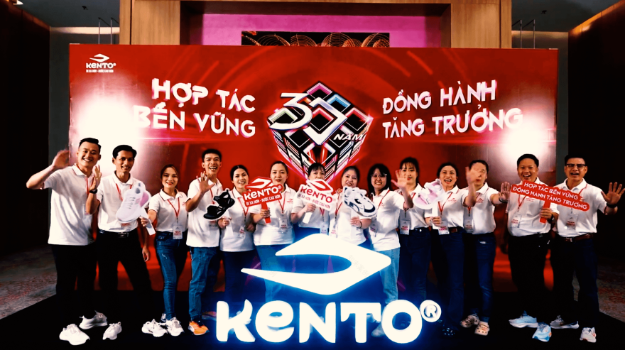
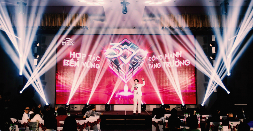
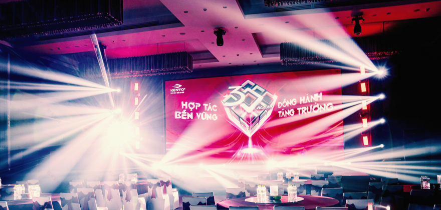
THE EVENT IMAGES
TEAM CREDIT
CLIENT - KENTO
AGENCY - BS GROUP
Account Manager - Phuc Le, Phuong Anh
Event Planner - To To
ART TEAM
Art Director - Chris Huynh
2D Design - Leon Ha, Thach Tan, ndd K
3D Design - Huyen Pham
THE END.
THANKS FOR WATCHING!
南京喵熊网络科技有限公司 苏ICP备18050492号-4知末 © 2018—2020 . All photos and trademark graphics are copyrighted by their owners.增值电信业务经营许可证(ICP)苏B2-20201444 苏公网安备 32011302321234号
苏公网安备 32011302321234号客服
消息
收藏
下载
最近