

创作上传
VIP
收藏下载
登录 | 注册有礼
查看完整案例

收藏

下载

分享
翻译

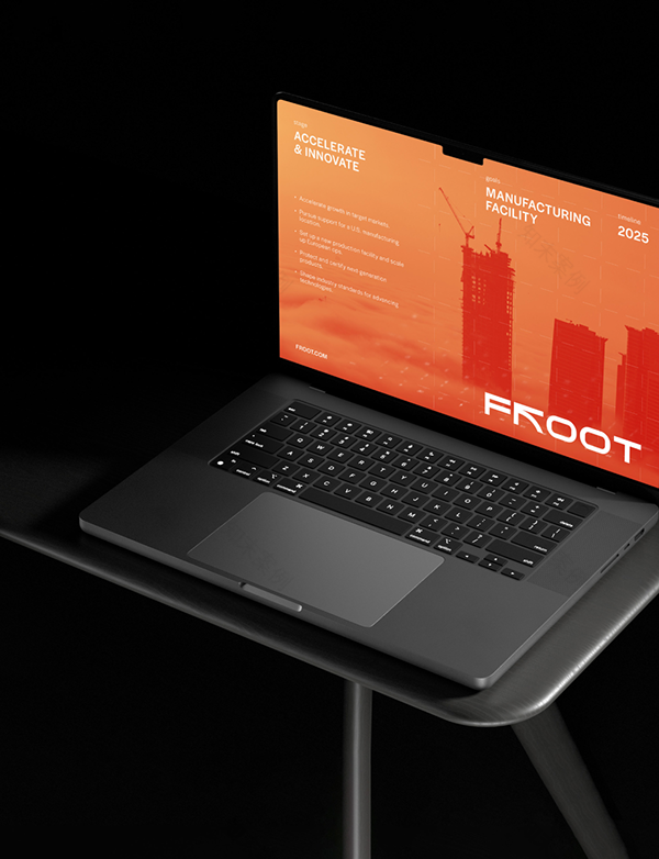
FROOT is a cutting-edge rebar manufacturer that produces products engineered for superior durability, strength, and sustainability, making them the ideal choice for a wide range of construction applications.


Objective: To develop a visual identity that helps the brand stand out in the construction industry, the challenge was to create a design that is both inclusive and easy to understand for its target audience, primarily corporate businesses. At the same time, it needed to reflect the company’s young, modern approach and the innovation behind its product in the market.

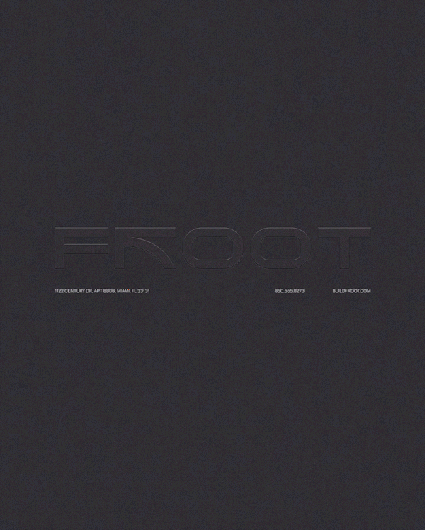
Solution: We approached the creation of this visual identity by analyzing the market and the essence of rebar materials. We chose orange, a color widely recognized in the industry, but refined its shade to create a more distinctive and fresh look. At the same time, we introduced a grey-blue hue, reflecting the color of stainless steel to reinforce the industrial nature of the business.For the logo, we stylized the letter "R" and combined it with an arrow, symbolizing force in physics to enhance the brand's strength. Despite its bold appearance, the design incorporates a curved line, representing the product’s flexibility. Additionally, the two "O"s in "FROOT" are shaped to resemble a cross-section of rebar, further reinforcing the brand’s connection to the product.


南京喵熊网络科技有限公司 苏ICP备18050492号-4知末 © 2018—2020 . All photos and trademark graphics are copyrighted by their owners.增值电信业务经营许可证(ICP)苏B2-20201444 苏公网安备 32011302321234号
苏公网安备 32011302321234号客服
消息
收藏
下载
最近