

创作上传
VIP
收藏下载
登录 | 注册有礼
查看完整案例

收藏

下载

分享
Pretty Patty本身已经拥有明确的品牌身份。它的色彩、图形语言与表达语调并不缺席,真正尚未被解决的,是这些既有特征与其空间呈现之间的距离。项目的出发点因此不是重新发明品牌,而是让品牌在空间中变得完整、连贯并具有说服力。HOXAR STUDIO以“转译而非重造”来界定这项工作。这里的“转译”并不意味着机械复制,而是将原本以平面、标识或表层传播存在的内容,转入建筑与室内的另一种媒介之中。一个标识可以继续只是标识,也可以开始组织房间;一种颜色可以继续只是代码,也可以成为气氛;一个服务台可以继续只是设备,也可以成为空间的主构件。
Pretty Patty already possessed a strong identity. Its colours and graphic language were clear. What remained unresolved was the distance between that identity and its spatial translation. The brand was already there. The challenge was to turn those existing elements into a space that felt complete and coherent. We approached the project through transposition rather than reinvention. The question was how to carry into architecture what defines Pretty Patty more precisely: a mode of hospitality that stays light, welcoming, slightly displaced, and fully inhabited.
▼首层整体空间与服务动线,Ground floor layout and service flow © HOXAR STUDIO
因此,项目需要的不只是配色调整,而是一种层级转换。原本作为附加信息存在的要素,被重新处理为空间装置。最清晰的例子是顶面的logo系统:它不再被固定在墙面作为单一宣告,而是被分散到天花之中,通过光、重复与位置进入空间感知本身。品牌由此不再只是被看见,而是被处于其中。
This required more than an adjustment of palette. It called for a shift of register. Elements that had previously functioned as applied signs were reworked as spatial devices. The clearest example lies in the treatment of the lettering. Rather than remaining fixed to the walls as explicit markers, the brand logo is scattered across the ceiling and converted into a defining element. What had been graphic enters the space differently, through light, repetition, and placement.
▼顶面logo与光的整合,
Ceiling logo integrated with lighting © HOXAR STUDIO


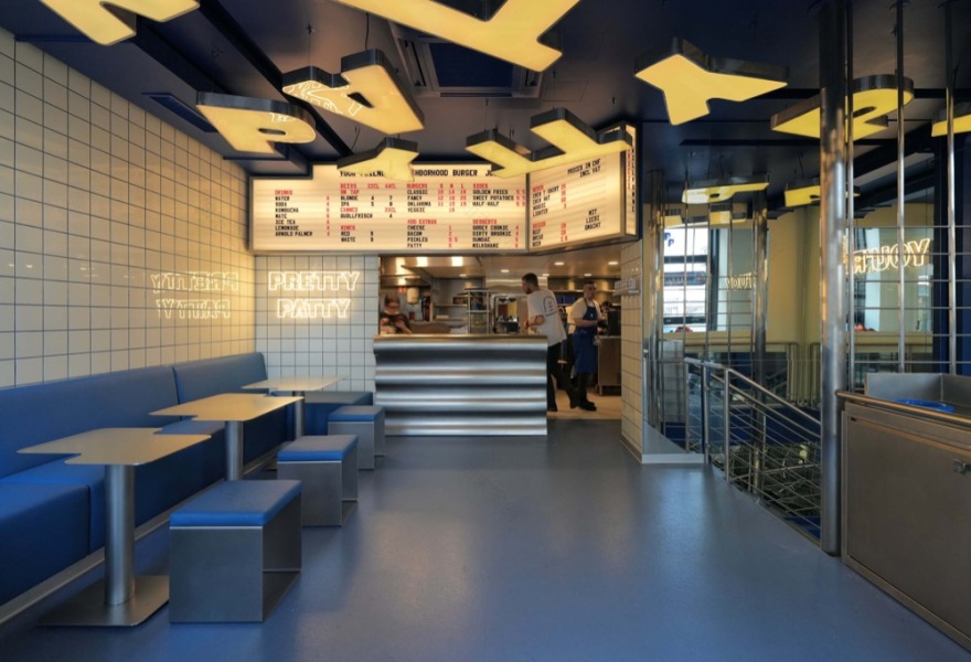
首层的任务是建立可见性与即时识别。面向街道的开敞界面、高度条件与直接的可读性,为项目提供了第一层空间效应。但工作室并未仅以“更暖”的色调来完成转变。更重要的是,品牌内部原有的轻松、幽默与接待气质,如何通过材质、灯光、使用方式和空间序列被重新激活。日常构件因此不是简单被选取,而是经过调整后才进入整体。其中,不锈钢吧台承担了关键作用。它虽然保持了服务所要求的清晰度与耐用性,却通过曲线、圆角与更柔和的体量关系,改变了人与物之间的接触方式。它不是纯粹的展示,也不是单纯的工具,而是在效率与吸引力之间建立平衡,进而稳定整个房间的重心。
The frontage is open and highly visible. The ground floor benefits from height, exposure, and immediate legibility. Earlier locations had developed a colder, more clinical language; here, the move towards a warmer register became evident early in the design process. Yet colour alone could not carry that shift. The project worked instead through activation: bringing the brand’s internal tone into relation with material, light, use, and spatial sequence. Everyday elements were therefore not simply selected, but reworked until they could participate in a more coherent whole. The counter plays a central role in that recalibration. Positioned as the primary figure of the room, it departs from the hard linearity often associated with service furniture. Curves and a softened profile introduce a more tactile relation to the object, while stainless steel preserves the clarity and directness required by use. What emerges is neither pure utility nor pure display, but an element that stabilises the room while carrying an almost affective charge. It is an object of use, but also one of attraction.
▼曲线吧台与空间关系,Curved counter within the space © HOXAR STUDIO


▼享用美食的顾客,Customers enjoying the food © HOXAR STUDIO

如果说首层解决了呈现问题,那么下行过程则检验项目能否持续维持注意力。地下层汇集了场地最不利的条件:低层高、无自然光、方向关系不理想,以及容易被视为附属空间的风险。HOXAR没有将楼梯视为中性过渡,而是将其纳入项目序列,使向下移动不再意味着损失,而成为空间经验的一部分。镜面在此承担了双重作用:一方面扩大侧向视线并叠加反射,另一方面将感知提前引向下层。到达地下后,顶面被处理为均匀发光的平面,以回应缺乏日照的事实;墙面转为深蓝色,标识的出现也更为密集与分散。空间在此并未与首层切断,而是在保持连续性的前提下改变了密度与节奏,使其更集中、更亲密,也更适合通过灯光调节形成不同状态。
If the ground floor establishes visibility, the descent tests the project’s capacity to hold attention. The lower level brought together all the difficult conditions at once: low ceiling, no natural light, awkward orientation, and the risk of being read as secondary. The stair was therefore treated as a device of attraction. Mirrors open oblique views, multiply reflections, and extend perception toward the level below. The movement downward becomes part of the project’s spatial sequence, carrying the visitor further into the interior rather than away from it. Downstairs, the atmosphere tightens. The ceiling becomes a luminous plane, countering the absence of daylight through an even field of light. Walls shift into deep blue. Signs reappear across the walls in a denser and more distributed manner, recalling repetition rather than isolated display. We intended to create an atmosphere that changes register without breaking continuity. The lower level was conceived as a continuation of the first floor under different conditions: more intimate, more concentrated, and more open to variation through dimming. Rather than separating the two floors, the project uses the descent to deepen the experience of the same world.
▼楼梯空间的反射效果,Reflective surfaces in stair space © HOXAR STUDIO

▼底层就餐空间,Basement dining space © HOXAR STUDIO


这一逻辑进一步延续到卫生间前室。镜面、球体与轻微的光学错位并不是为了制造孤立的戏剧效果,而是作为阈值装置,再次改变人的知觉方式。工作室希望空间能够容纳一定程度的夸张,却不因此变得沉重;具有冲击力,但保留自我意识。
That logic continues into the restrooms. Their antechamber works as a threshold, using mirrors, spheres, and optical effects to displace perception once again. We wanted the space to allow itself exaggeration, but not weight. We designed the toilets to be impactful, but with self-irony.
▼夜晚的Pretty Patty Zurich,Pretty Patty Zurich at night © HOXAR STUDIO

▼趣味餐桌,Fun Dining Table © HOXAR STUDIO

从这一意义上说,Pretty Patty Zurich并不是一个将品牌“放进”空间的项目,而是一个将品牌的一组品质翻译为建筑与室内关系的项目。光、材质、序列、服务与氛围在此被重新校准,并被组织为同一套可被体验的环境系统。作为旗舰店,它当然承担城市中的识别功能;但更准确地说,它是品牌世界的一次集中化空间表达。
The project therefore treats branding less as an image to be applied than as a set of qualities to be translated, adjusted, and made operative in space. Through that process, light, material, sequence, and hospitality are brought into closer alignment. Pretty Patty Zurich takes the form of a flagship, but the project operates more precisely as a concentrated version of the brand’s world, carried by the transformation of everyday elements into a more continuous interior language.
▼不锈钢吧台细部,Stainless steel counter detail © HOXAR STUDIO

▼其余细节,The rest of the details © HOXAR STUDIO


PROJECT:
PRETTY PATTY ZURICH
LOCATION:
USTERISTRASSE 21, ZURICH
TYPE:
FLAGSHIP / HOSPITALITY INTERIOR
0764903606
@hoxar.studio
alexander@hoxar.studio
南京喵熊网络科技有限公司 苏ICP备18050492号-4知末 © 2018—2020 . All photos and trademark graphics are copyrighted by their owners.增值电信业务经营许可证(ICP)苏B2-20201444 苏公网安备 32011302321234号
苏公网安备 32011302321234号客服
消息
收藏
下载
最近