

创作上传
VIP
收藏下载
登录 | 注册有礼
查看完整案例

收藏

下载

分享
翻译

Polish Book Institute
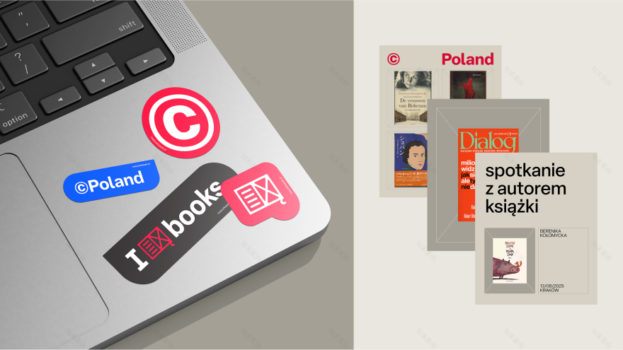
The previous logo of the Polish Book Institute – Instytut Książki – was created even before the Institute itself was established. It was designed by the outstanding Polish designer Jan Bokiewicz for Poland’s presence at the Frankfurt Book Fair in 2000. For the fair, the slogan ©POLAND was also created – and after a few years, both elements were adopted into the logo of the Book Institute, which was established in 2004.

The logo served very well for 20 years; however, when a thorough refresh of the entire visual language was decided upon, it turned out that the logo also needed modification because its previous hand-drawn style imposed too strong a personal character. The hand-drawn line was replaced by a simplified, rectangular design, and instead of the national white-and-red color scheme, another Polish accent appeared in the mark: a bookmark in the shape of the “ogonek” diacritical mark from the Polish letters Ą and Ę. Thanks to this, the mark still stands out but no longer dominates so strongly. The typographic layout was also redesigned, but in a way that keeps the slogan ©POLAND prominent.
As a result, it was possible to preserve a compelling history, maintain the logo’s recognizability, and above all – achieve a smooth, natural transition to a more contemporary style. The new logo is accompanied by a new visual language: refreshed colors, typography, and unified compositional layouts – a starting point for the graphic design of the Book Institute’s new projects.


2025
SCOPE OF WORK:
logo redesign, key visual & layout design
AUTHORS:
Marcin Wolny – visual strategy, creative & art directing, logo design
Karolina Pamuła – key visual & layout design
ON CLIENT SIDE:
Marta Gawin, Urszula Chwalba
南京喵熊网络科技有限公司 苏ICP备18050492号-4知末 © 2018—2020 . All photos and trademark graphics are copyrighted by their owners.增值电信业务经营许可证(ICP)苏B2-20201444 苏公网安备 32011302321234号
苏公网安备 32011302321234号客服
消息
收藏
下载
最近