

创作上传
VIP
收藏下载
登录 | 注册有礼
查看完整案例

收藏

下载

分享
“让每一个连锁门店空间都成为有温度的文化商业载体” – 水木言设计机构
“Turn every chain store space into a warm cultural and commercial carrier.” – Shuimuyan Design Studio

“小妹,你家乳鸽今天口味有点不对,但我还是想充个值”——还原一段真实场景
“今天这份乳鸽,没你们其他店的出品好。”
庆记鲍鱼鸡梅溪湖店里,一位老客放下筷子。服务员连忙询问,是否可帮客人更换。客人却摆摆手:“不用了,我再充个值吧。”服务员一愣。客人笑笑:“我在这家店呆着很舒服。”
当环境本身成了复购的理由。
在餐饮业拼命卷产品、卷性价比的今天,一家130平米的小店用设计,悄悄解决了核心问题。
“Miss, the pigeon isn’t quite right today, but I still want to top up my membership.” – A real-scene quote
“The pigeon today isn’t as good as in your other stores.”
At Qingji Abalone Chicken Meixihu Store, a regular customer put down his chopsticks. The server quickly asked if she could replace it for him. The customer waved his hand: “No need. I’ll recharge my card anyway.” The server was stunned. The customer smiled: “I just feel comfortable staying here.”
When the environment itself becomes a reason for repurchase.
In today’s catering industry, where everyone fiercely competes on products and cost - performance, a 130 - square - meter shop quietly solves the core problem through design.
▼门头,storefront©Nantu南图

▼入口细部,details of the entrance©Nantu南图

“空间感,挤一挤总是有的”——从极致效率到精准场景,重新定义餐饮小铺设计
“Space can always be squeezed out” – Redefining small catering shop design from extreme efficiency to precise scenarios
当下的餐饮业,正从“大而全”转向“小而美”。
据2025年行业数据,小而精门店的存活率,比传统大店高出35%。原因简单:铺租、人力、食材成本高企,大店模式扛不住了。老板们纷纷盯上了100 - 200平的小店型。
但小空间,有大麻烦。为了控成本,多数门店为压缩成本选择放弃设计或仅做标准化简单装修,最终陷入无风格、无记忆点、体验感弱的同质化困境,最终陷入低价竞争与门店短周期的恶性循环。
庆记鲍鱼鸡梅溪湖店,铺面只有130平米,我们的命题是:如何在螺蛳壳里做道场,兼顾翻台率和品牌溢价?
我们就项目落位条件总结了三大核心问题:
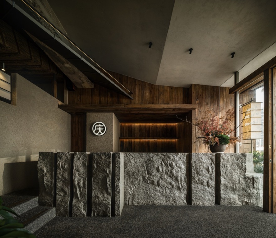
一、商业建筑横向厚重门头,对小店空间的压制感如何消解?
二、临街商业产权铺面规整分隔带来的各个铺面同质化问题。
三、有限面积的坪效和场景营造如何平衡?
最终,在保障坪效出桌率的基础上,我们做了个大胆而创新的设计。
▼空间改造前,before interior renovation©水木言设计机构

The current catering industry is shifting from “large and comprehensive” to “small and beautiful”.
According to 2025 industry data, small and refined stores have a 35% higher survival rate than traditional large stores. The reason is simple: rent, labor and ingredient costs remain high, and the large-store model is no longer sustainable. Owners are turning to 100–200 sqm small formats.
Yet small spaces bring big troubles.
To control costs, most stores abandon design or only adopt standardized simple decoration, eventually falling into homogenization with no style, no memorable features and weak experience, trapping themselves in a vicious cycle of low-price competition and short store lifespans.
Qingji Abalone Chicken Meixihu Store covers only 130 square meters. Our question was: How to create miracles in a tiny space, balancing turnover rate and brand premium
We summarized three core issues based on the project’s location conditions:
1. How to resolve the oppressive feeling imposed on the small store by the horizontally heavy commercial building facade?
2. How to break homogenization caused by the regular division of street-front commercial properties?
3. How to balance per-square-meter efficiency and scene creation within a limited area?
Ultimately, while guaranteeing table occupancy efficiency, we delivered a bold and innovative design.
▼平面方案,floor plan©水木言设计机构

“把山海,塞进130余平米”——空间大挪移的盗梦空间,给客户一片山海
“Putting mountains and seas into just over 130 square meters” – A spatial Inception of relocation, offering customers a landscape of mountains and seas

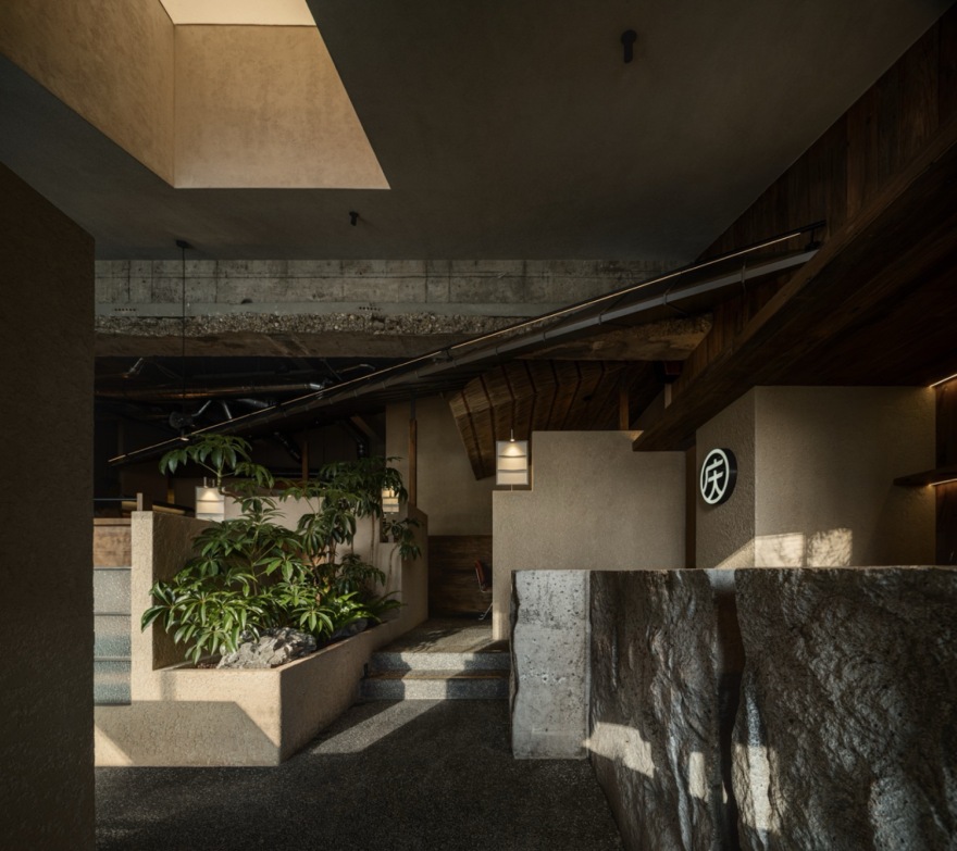
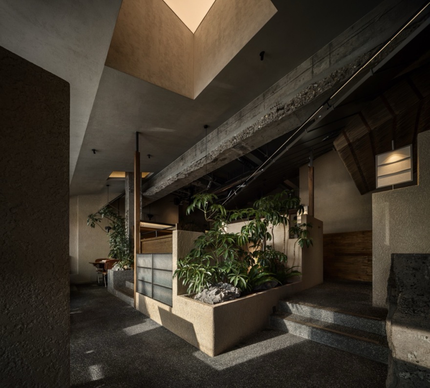
走近这家店,你会觉得不对劲——这层高、这纵深,不会真只有130㎡吧?秘诀在于“偷面积”。设计用了最朴素的一招:“做台地”。从入口的石阶造景撑起空间,到室内的地面被巧妙抬高或下沉,形成几个错落的就餐区。海边渡假的山地建筑台地感就出来了。
入口左侧的台地,以粗粝厚重的力度承载了建筑原有门头造成的的“重”,并与门口的造景灵活生动了入口的趣味性,同时,临街的台地也为室内的临窗坐区,创造了能观景,但私密的空间领域感。
Approaching the store, you sense something is different – could the ceiling height and depth really be only 130 sqm?
The secret lies in “stealing space”. The design uses the most straightforward trick: creating terraces.
Starting with stone-step landscaping at the entrance to elevate the space, the indoor floor is subtly raised or sunken to form several staggered dining areas, evoking the terrace feeling of mountain-side buildings by the seaside.
The terrace on the left of the entrance bears the “weight” of the original building facade with rough and solid momentum, and together with the entrance landscaping, enriches the playful appeal of the entry. Meanwhile, the street-side terrace creates a viewable yet private spatial domain for the indoor window seats.
▼门头设计,storefront©Nantu南图

▼门口的造景,entrance landscaping ©Nantu南图


▼细部,details©Nantu南图

“不砌一堵墙,靠高差,玩出就餐独享感”——以高差为笔,绘空间层次;少一堵墙,多一片天
“Without building a single wall, using height differences to create exclusive dining feelings” – Drawing spatial layers with elevation; fewer walls, more openness
在室内,顾客坐在不同高度,视线自然有了层次——有的平视绿植,有的仰望茅草屋檐,有的对望粗粝的礁石墙面。空间在视觉上被“撑开”了。这就是“山为台”,用高差替代墙体,省钱,且高级。墙面有着海风侵蚀的礁石质感,用的是最朴素的肌理涂料。但配上暖光,粗粝变成了温暖,痕迹变成了故事。▼轴测图,axonometric drawing©水木言设计机构

Indoors, customers seated at different heights naturally enjoy layered views – some eye-level with green plants, some looking up at thatched eaves, some facing rough rock walls. The space is visually “stretched open”.
This is “mountains as terraces”.
Using height differences instead of walls saves cost and achieves sophistication.
Walls feature the texture of reefs eroded by sea breeze, finished with plain texture paint. Yet paired with warm light, roughness turns warm, and traces become stories.
▼室内概览,overall of interior©Nantu南图

▼室内的地面被巧妙抬高或下沉,the indoor floor was ingeniously raised or lowered©Nantu南图

“檐下藏海,在室内造一座可触摸的海岸建筑群”——海为檐的巧思,在头顶
“Hiding the sea under eaves, building a touchable coastal architectural complex indoors” – The ingenuity of sea as eaves, overhead
空间组团,以金属勾勒骨架,搭配天然茅草,虚实相生,一笔画出海边小屋的温柔轮廓。没有夸张高耸的造型,却用最质朴的材料对撞,瞬间抽离都市商业街区的同质化喧嚣,把海岸线的松弛与海风感搬进室内。刚与柔的材质彼此成就,视觉记忆点强烈,空间体验却浑然统一。
项目名称:中梁青岛拾光映象营销中心
业主单位:中梁地产集团青岛直属区域公司
text 内容为:
1. 项目概述
1.1 项目背景
本项目旨在
开发一款
创新型软件
,以满足
市场对高效
数据处理
的需求。
1.2 项目目标
项目的主要
目标是在
规定时间内
完成软件
的开发与
测试,并
确保其
性能稳定
、易于使用。
2. 项目团队
2.1 核心成员
团队的核心
成员包括
经验丰富的
软件开发
工程师、
测试人员
和项目经理。
2.2 职责分工
软件开发
工程师负责
软件的设计
和编码;
测试人员
负责对
软件进行
全面测试;
项目经理
负责项目的
整体规划
和协调。
3. 项目进度
3.1 阶段划分
项目分为
需求分析
、设计、
开发、
测试和
上线五个
阶段。
3.1.1 需求分析
阶段
该阶段
主要任务
是与客户
沟通,
明确软件
的功能
和需求。
3.1.2 设计
阶段
此阶段
重点是
设计软件
的架构
3.1.3 开发
阶段
开发阶段
是实际
编写
3.1.4 测试
阶段
测试阶段
3.1.5 3.1.5 3.1.5 3.1.5 3.1.5 3.1.5 3.1.5 3.1.5 3.1.5 3.1.5 3.1.5 3.1.5 3.1.5 3.1.5 3.1.5 3.1.5 3.1.5 3.1.5 3.1.5 3.1.5 3.1.5 3.1.5 3.1.5 3.1.5 3.1.5 3.1.5 3.1.5 3.1.5 3.1.5 3.1.5 3.1.5 3.1.5 3.1.5 3.1.5 3.1.5 3.1.5 3.1.5 3.1.5 3.1.5 3.1.5 3.1.5 3.1.5 3.1.5 3.1.5 3.1.5 3.1.5 3.1.5 3.1.5 3.1.5 3.1.5 3.1.5 3.1.5 3.1.5 3.1.5 3.1.5 3.1.5 3.1.5 3.1.5 3.1.5 3.1.5 3.1.5 3.1.5 3.1.5 3.1.5 3.1.5 3.1.5 3.1.5 3.1.5 3.1.5 3.1.5 3.1.5 3.1.5 3.1.5 3.1.5 3.1.5 3.1.5 3.1.5 3.1.5 3.1.5 3.1.5 3.1.5 3.1.5 3.1.5 3.1.5 3.1.5 3.1.5 3.1.5 3.1.5 3.1.5 3.1.5 3.1.5 3.1.5 3.1.5 3.1.5 3.1.5 3.1.5 3.1.5 3.1.5 3.1.5 3.1.5 3.1.5 3.1.5 3.1.5 3.1.5 3.1.5 3.1.5 3.1.5 3.1.5 3.1.5 3.1.5 3.1.5 3.1.5 3.1.5 3.1.5 3.1.5 3.1.5 3.1.5 3.1.5 3.1.5 3.1.5 3.1.5 3.1.5 3.1.5 3.1.5 3.1.5 3.1.5 3.1.5 3.1.5 3.1.5 3.1.5 3.1.5 3.1.5 3.1.5 3.1.5 3.1.5 3.1.5 3.1.5 3.1.5 3.1.5 3.1.5 3.1.5 3.1.5 3.1.5 3.1.5 3.1.5 3.1.5 3.1.5 3.1.5 3.1.5 3.1.5 3.1.5 3.1.5 3.1.5 3.1.5 3.1.5 3.1.5 3.1.5 3.1.5 3.1.5 3.1.5 3.1.5 3.1.5 3.1.5 3.1.5 3.1.5 3.1.5 3.1.5 3.1.5 3.1.5 3.1.5 3.1.5 3.1.5 3.1.5 3.1.5 3.1.5 3.1.5 3.1.5 3.1.5 3.1.5 3.1.5 3.1.5 3.1.5 3.1.5 3.1.5 3.1.5 3.1.5 3.1.5 3.1.5 3.1.5 3.1.5 3.1.5 3.1.5 3.1.5 3.1.5 3.1.5 3.1.5 3.1.5 3.1.5 3.1.5 3.1.5 3.1.5 3.1.5 3.1.5 3.1.5 3.1.5 3.1.5 3.1.5 3.1.5 3.1.5 3.1.5 3.1.5 3.1.5 3.1.5 3.1.5 3.1.5 3.1.5 3.1.5 3.1.5 3.1.5 3.1.5 3.1.5 3.1.5 3.1.5 3.1.5 3.1.5 3.1.5 3.1.5 3.1.5 3.1.5 3.1.5 3.1.5 3.1.5 3.1.5 3.1.5 3.1.5 3.1.5 3.1.5 3.1.5 3.1.5 3.1.5 3.1.5 3.1.5 3.1.5 3.1.5 3.1.5 3.1.5 3.1.5 3.1.5 3.1.5 3.1.5 3.1.5 3.1.5 3.1.5 3.1.5 3.1.5 3.1.5 3.1.5 3.1.5 3.1.5 3.1.5 3.1.5 3.1.5 3.1.5 3.1.5 3.1.5 3.1.5 3.1.5 3.1.5 3.1.5 3.1.5 3.1.5 3.1.5 3.1.5 3.1.5 3.1.5 3.1.5 3.1.5 3.1.5 3.1.5 3.1.5 3.1.5 3.1.5 3.1.5 3.1.5 3.1.5 3.1.5 3.1.5 3.1.5 3.1.5 3.1.5 3.1.5 3.1.5 3.1.5 3.1.5 3.1.5 3.1.5 3.1.5 3.1.5 3.1.5 3.1.5 3.1.5 3.1.5 3.1.5 3.1.5 3.1.5 3.1.5 3.1.5 3.1.5 3.1.5 3.1.5 3.1.5 3.1.5 3.1.5 3.1.5 3.1.5 3.1.5 3.1.5 3.1.5 3.1.5 3.1.5 3.1.5 3.1.5 3.1.5 3.1.5 3.1.5 3.1.5 3.1.5 3.1.5 3.1.5 3.1.5 3.1.5 3.1.5 3.1.5 3.1.5 3.1.5 3.1.5 3.1.5 3.1.5 3.1.5 3.1.5 3.1.5 3.1.5 3.1.5 3.1.5 3.1.5 3.1.5 3.1.5 3.1.5 3.1.5 3.1.5 3.1.5 3.1.5 3.1.5 3.1.5 3.1.5 3.1.5 3.1.5 3.1.5 3.1.5 3.1.5 3.1.5 3.1.5 3.1.5 3.1.5 3.1.5 3.1.5 3.1.5 3.1.5 3.1.5 3.1.5 3.1.5 3.1.5 3.1.5 3.1.5 3.1.5 3.1.5 3.1.5 3.1.5 3.1.5 3.1.5 3.1.5 3.1.5 3.1.5 3.1.5 3.1.5 3.1.5 3.1.5 3.1.5 3.1.5 3.1.5 3.1.5 3.1.5 3.1.5 3.1.5 3.1.5 3.1.5 3.1.5 3.1.5 3.1.5 3.1.5 3.1.5 3.1.5 3.1.5 3.1.5 3.1.5 3.1.5 3.1.5 3.1.5 3.1.5 3.1.5 3.1.5 3.1.5 3.1.5 3.1.5 3.1.5 3.1.5 3.1.5 3.1.5 3.1.5 3.1.5 3.1.5 3.1.5 3.1.5 3.1.5 3.1.5 3.1.5 3.1.5 3.1.5 3.1.5 3.1.5 3.1.5 3.1.5 3.1.5 3.1.5 3.1.5 3.1.5 3.1.5 3.1.5 3.1.5 3.1.5 3.1.5 3.1.5 3.1.5 3.1.5 3.1.5 3.1.5 3.1.5 3.1.5 3.1.5 3.1.5 3.1.5 3.1.5 3.1.5 3.1.5 3.1.5 3.1.5 3.1.5 3.1.5 3.1.5 3.1.5 3.1.5 3.1.5 3.1.5 3.1.5 3.1.5 3.1.5 3.1.5 3.1.5 3.1.5 3.1.5 3.1.5 3.1.5 3.1.5 3.1.5 3.1.5 3.1.5 3.1.5 3.1.5 3.1.5 3.1.5 3.1.5 3.1.5 3.1.5 3.1.5 3.1.5 3.1.5 3.1.5 3.1.5 3.1.5 3.1.5 3.1.5 3.1.5 3.1.5 3.1.5 3.1.5 3.1.5 3.1.5 3.1.5 3.1.5 3.1.5 3.1.5 3.1.5 3.1.5 3.1.5 3.1.5 3.1.5 3.1.5 3.1.5 3.1.5 3.1.5 3.1.5 3.1.5 3.1.5 3.1.5 3.1.5 3.1.5 3.1.5 3.1.5 3.1.5 3.1.5 3.1.5 3.1.5 3.1.5 3.1.5 3.1.5 3.1.5 3.1.5 3.1.5 3.1.5 3.1.5 3.1.5 3.1.5 3.1.5 3.1.5 3.1.5 3.1.5 3.1.5 3.1.5 3.1.5 3.1.5 3.1.5 3.1.5 3.1.5 3.1.5 3.1.5 3.1.5 3.1.5 3.1.5 3.1.5 3.1.5 3.1.5 3.1.5 3.1.5 3.1.5 3.1.5 3.1.5 3.1.5 3.1.5 3.1.5 3.1.5 3.1.5 3.1.5 3.1.5 3.1.5 3.1.5 3.1.5 3.1.5 3.1.5 3.1.5 3.1.5 3.1.5 3.1.5 3.1.5 3.1.5 3.1.5 3.1.5 3.1.5 3.1.5 3.1.5 3.1.5 3.1.5 3.1.5 3.1.5 3.1.5 3.1.5 3.1.5 3.1.5 3.1.5 3.1.5 3.1.5 3.1.5 3.1.5 3.1.5 3.1.5 3.1.5 3.1.5 3.1.5 3.1.5 3.1.5 3.1.5 3.1.5 3.1.5 3.1.5 3.1.5 3.1.5 3.1.5 3.1.5 3.1.5 3.1.5 3.1.5 3.1.5 3.1.5 3.1.5 3.1.5 3.1.5 3.1.5 3.1.5 3.1.5 3.1.5 3.1.5 3.1.5 3.1.5 3.1.5 3.1.5 3.1.5 3.1.5 3.1.5 3.1.5 3.1.5
▼空间组团,以金属勾勒骨架,搭配天然茅草,虚实相生,spatial clusters are framed with metal skeletons and matched with natural thatch, combining void and solid ©Nantu南图
▼质朴的材料对撞,the collision of the most rustic materials ©Nantu南图


“以绿为意,最柔的设计,最戳人心”——给商业留一口自在的呼吸
“Taking green as mood – the gentlest design touches the heart most deeply” – Leaving a breath of freedom for commerce
风为息,从软化环境营造渡假感的角度出发,设计在硬朗粗粝的岩石缝隙间,特意种进鲜活绿植,让生机从坚硬的缝隙里悄然钻出来,刚与柔在此悄然和解。灯具如同海边的风帆,营造编织质感,暖光漫射而下,墙面与地面则留下粗粝斑驳错落的光影,恰似海风轻轻拂过留下的细碎痕迹,让整个空间都有了流动的呼吸节奏与细碎摩挲的质感。
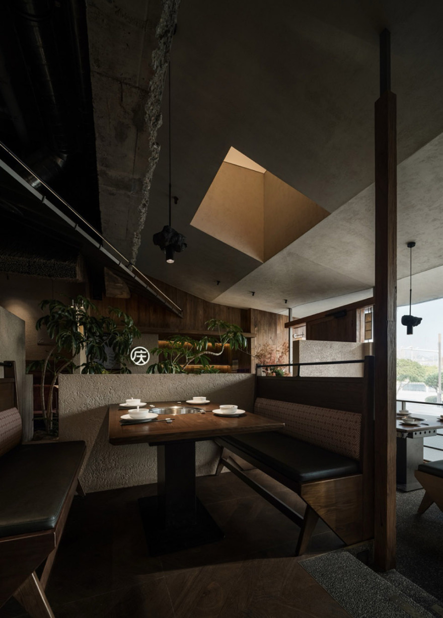
整个餐厅设计根据130平米的极致面积条件,顺势而为,以三进为递进格局,辅助以多层高度分区台地,借茅草屋檐框海居之景,以绿植与编织承风之柔。鲍鱼鸡的鲜活之魅,在山、海、风的起承转合里,成为一场可被感知的小而精的“漂亮店”。既保证每一寸空间的运营效率,又让设计主题自然落地,形成独有的品牌空间记忆。
With wind as breath, from the perspective of softening the environment to create a vacation vibe, the design deliberately plants vivid greenery among the hard and rough rock crevices, letting vitality quietly emerge from firm cracks, where rigidity and softness reconcile. Lamps resemble sails by the sea, woven in texture, with warm light diffusing downward, leaving rough, mottled and scattered light and shadow on walls and floors, just like fine traces brushed by the sea breeze, endowing the entire space with flowing rhythm and delicate tactile quality.
Based on the extreme 130-square-meter area, the restaurant design follows the natural layout with a three-progressional structure, assisted by multi-level terraced zones. Framing seaside scenery with thatched eaves, and carrying the softness of wind with green plants and weavings, the lively charm of abalone chicken becomes a perceptible, small yet exquisite “beautiful store” amid the rhythm of mountains, seas and wind. It ensures operational efficiency of every inch of space while naturally realizing the design theme, forming a unique brand spatial memory.
▼室内绿植,indoor plants©Nantu南图


▼灯具细部,lighting feature©Nantu南图

“为什么是山、海、风”——山为台、海为檐,风为衣,庆记的主打是鲍鱼鸡。鲍鱼生于海,附着于山石。“山、海、风”正是食材的来处,也是味道的底色。
为庆记鲍鱼鸡定制的山·海·风核心设计主题,以台地形成餐区分隔、以檐口营造海居惬意氛围,以风拂体感软化场景,既贴合品牌鲍鱼鸡的山海食材属性,又具备丰富且低成本的可落地设计元素,且满足现代消费者对场景情绪价值的需要,成为贯穿门店的设计主线。
从山海间提取水波纹、礁石、老船木、夯土肌理、帆布等自然元素,营造山海自然地貌肌理形态为基,风拂软性体感为辅的立体空间表情。空间搭配火山石、水洗石、老木板、清水混凝土、肌理涂料、钢板等实用型材质,摈弃高昂装饰材料,却能通过常见材料、通过造型、布局的巧思,让小空间拥有鲜明的风格与丰富的场景感,真正实现小空间出大背书的设计逻辑:小投入美学炸场,高坪效品牌称王。
▼裸露的清水混凝土结构,exposed concrete structure©Nantu南图


“Why mountains, seas and wind” – Mountains as terraces, seas as eaves, wind as garments. Qingji’s signature dish is abalone chicken. Abalone lives in the sea, attached to rocks. “Mountains, seas and wind” are exactly where the ingredients come from and the foundation of the flavor.
The core design theme of Mountains · Seas · Wind customized for Qingji Abalone Chicken uses terraces to divide dining areas, eaves to create a cozy seaside living atmosphere, and wind-like sensory experience to soften the scene. It aligns with the brand’s seaside ingredient attribute, provides rich yet low-cost implementable design elements, and meets modern consumers’ demand for emotional scene value, becoming the consistent design thread throughout the store.
Extracting natural elements such as water ripples, reefs, old boat wood, rammed earth texture and canvas from mountains and seas, the design builds a three-dimensional spatial expression based on natural landscape textures, supplemented by wind-brushed soft sensory experience. Matching practical materials such as volcanic stone, washed stone, old wood planks, fair-faced concrete, texture paint and steel plates, the design abandons expensive decorative materials. Yet through ingenuity in modeling and layout with common materials, the small space gains distinct style and rich scene sense, truly realizing the design logic of small space delivering strong endorsement: small investment for stunning aesthetics, high per-square-meter efficiency for brand dominance.
▼空间搭配火山石、水洗石、老木板等,the space is decorated with volcanic stones, washed stones and old wooden boards. ©Nantu南图


▼用餐空间,seating area©Nantu南图


山为台——层峦为界 | 质感立基
Mountains as Terraces – Layered Peaks as Boundaries | Texture as Foundation

面对有限尺度,设计以台地高差之形向内挖掘纵深,摒弃单一平面布局,通过地面的抬升与下沉,构建出错落的 “等高线” 就餐区。不同高度的分区围合如同层叠的山坡,既实现了餐区的清晰划分,更赋予每一席位专属的视线风景 —— 或对望礁石造型,或平视绿植景观,或捕捉屋檐轮廓,让层次变化成为空间体验的核心脉络,在方寸之间营造出开阔深远的海山意境。这也是提取山海间的松弛感与原生感,转化成的空间语言。
于是,顾客吃到的不仅是鲜活的食材,更是一种身在旷野的意境与场景。这就解释了文章开篇的场景——为何出品稍有不稳,客人仍愿意充值。
Facing limited dimensions, the design digs inward for depth through terrace height differences, abandoning a single-plane layout. By raising and sinking the floor, staggered “contour-line” dining areas are constructed. The layered height divisions resemble overlapping hills, not only clearly zoning dining areas but also endowing each seat with exclusive views – facing reef modeling, eye-level with green landscapes, or catching eave outlines. Layered changes become the core context of spatial experience, creating a broad and profound sea-mountain mood within a tiny space. This is also the spatial language transformed from the relaxation and rawness extracted from mountains and seas. Thus, customers taste not only fresh ingredients but also a mood and scene of being in the wilderness. This explains the opening scene – why customers still choose to recharge even when the dish is slightly inconsistent.
▼座位细部,details of the seating area©Nantu南图

▼天花板细部,details of the ceiling©Nantu南图
▼细部,details©Nantu南图

到海边,就是一顿饭的距离。
Reaching the seaside is only a meal away. – “This design has a rebellious spirit.”
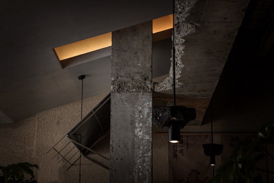
铺面交付后留下的拆改粗粝痕迹,带给设计以思考。一般的想法就是遮盖其生怕不精致,我们以反骨对待,反而将他拟定为山为骨的基底。
由此手法,设计反而筑牢了空间的厚重基底,跳脱轻装修小店的单薄流于表面。设计摒弃常规修饰遮蔽的思路,将拆改现场原生裸露的水泥柱体、粗粝肌理视作空间馈赠,提取鲍鱼赖以栖身的礁石质感为设计语汇,把施工遗留的 “瑕疵” 转化为空间独有的硬质表情。
让未经雕琢的风化水泥墙面成为视觉锚点,留存建造本真痕迹,于粗粝之中沉淀时光淬炼的沉稳气质,化空间缺憾为独一无二的设计记忆。
▼未经雕琢的风化水泥墙,the unpolished weathered cement wall©Nantu南图

While the world takes covering up as delicacy, we take rebellion as attitude;
While the world sees residual marks as flaws, we take authenticity as foundation;
While the world pursues the thinness of light decoration, we prefer the integrity of heaviness.
The rough traces of demolition left after handover inspired the design. Conventional thinking would be to cover them up for the sake of delicacy; with a rebellious approach, we defined them as the foundation where mountains become the backbone.
Through this method, the design instead consolidates a heavy spatial foundation, breaking away from the superficial thinness of lightly decorated small shops. Abandoning the conventional idea of covering up, the design treats the original exposed concrete columns and rough textures left on-site as a spatial gift, extracting the reef texture where abalone inhabit as design vocabulary, transforming construction “flaws” into a unique hard expression of the space.
The unpolished weathered concrete walls become visual anchors, retaining authentic construction traces, precipitating a calm temperament tempered by time within roughness, turning spatial regrets into a one-of-a-kind design memory.
▼细部,details©Nantu南图


海为檐——肌理为韵,时空共生
Sea as Eaves – Texture as Rhyme, Symbiosis of Time and Space
以“海”为底,复刻海边小屋的场景意境,编织现代与原始的微妙张力。设计萃取海边建筑的经典符号,将海边小屋的屋檐人文形态与金属板的冷冽质感并置,打造出“室内空间室外化”的视觉层次,让工业感的与原生的茅草形成对话,重构海边小屋的当代表达。
而这种屋檐下的分区感,则保障的坪效与美学的双平衡:
好空间的设计判断标准是什么?能赚钱,还特别耐看。
所有餐饮设计的终极考题,都是坪效。庆记鲍鱼鸡梅溪湖餐厅的设计,首先保证的是每一个角落都能摆上餐桌,动线流畅,方便服务。而后,才在格局之上,叠加“海为檐”的场景归属感与美学体验。最终的呈现证明了一点:控制成本与做出风格,从不矛盾。关键在于放弃装饰思维,转向场景思维。
用高差、檐口、材质与光影这些基础元素,组合出独特的海边情绪价值。这让小店摆脱了廉价感,也拥有了让人记住、并愿意传播的颜值,于是:顾客拍得开心,老板数钱舒心。
设计延续了海边建筑裸露本质的特征,保留肌理的墙面、简化的构造形式,如同海边经海风冲刷后留下的自然印记,无需过度修饰,在近人尺度赋予人们亲和松弛的情绪滋润。材质的碰撞与肌理的叠加,让空间跳出具象复刻的桎梏,形成兼具原生野趣与现代精致的场景,让海的意象藏于每一处材质的细节之中,呼应鲍鱼生于山海的自然本源。
▼屋檐下的分区感,the sense of zoning under eaves©Nantu南图


▼兼具原生野趣与现代精致的场景,a scene that combines the original wild charm with modern elegance ©Nantu南图

Taking “sea” as the base, the design reproduces the scene mood of seaside cottages, weaving a subtle tension between modernity and rawness. Extracting classic symbols of seaside architecture, the design juxtaposes the humanistic form of seaside cottage eaves with the cold texture of metal panels, creating a visual hierarchy of “indoor space outdoorization”, letting industrial materials converse with natural thatch and reconstructing a contemporary expression of seaside cottages.
This sense of zoning under eaves balances both per-square-meter efficiency and aesthetics:
What is the criterion for judging a good space design?It makes money and remains exceptionally attractive.
The ultimate test of all catering design is per-square-meter efficiency. The design of Qingji Abalone Chicken Meixihu Store first ensures every corner can accommodate tables, with smooth circulation and convenient service. Only then does it overlay the scene belongingness and aesthetic experience of “sea as eaves” upon the layout. The final result proves one thing: cost control and stylistic expression are never contradictory. The key lies in abandoning decorative thinking and shifting to scene thinking.
Using basic elements such as height differences, eaves, materials and light and shadow to combine unique seaside emotional value frees the small store from cheapness and grants it an appearance people remember and are willing to share. Thus: customers enjoy photographing, owners enjoy profiting.
The design continues the exposed nature of seaside architecture, retaining textured walls and simplified structural forms, just like natural marks left by sea breeze washing the shore. Without excessive decoration, it provides intimate and relaxed emotional nourishment at a human scale.
The collision of materials and superposition of textures free the space from the shackles of realistic reproduction, forming a scene combining raw wildness and modern sophistication, letting the imagery of the sea hide in every material detail, echoing the natural origin of abalone living in mountains and seas.
▼高差、檐口、材质与光影,elevation difference, cornice, material and light and shadow ©Nantu南图

▼用餐区,seating areas©Nantu南图

▼细部,details©Nantu南图

风为衣——柔绿轻覆,轻裹暖意
Wind as Garment – Soft Green Lightly Covered, Gently Wrapped in Warmth
以“风”为韵,串联起空间的灵动气息,软化硬质界面的冷峻感。设计将风的流动转化为可感知的视觉与触觉体验,以蓬勃生机为核心媒介,让草木从礁石造型的缝隙中自然生长,顺着空间动线肆意延伸,如同海风裹挟着生机穿梭于小屋,打破了建筑与自然的边界。在130来平的空间里,营造出了一个气韵生机盎然的“山海之间”。
一家餐馆的竞争力,取决于后厨的炉火;而更取决于,能否让顾客在进门那一刻,就发自内心地说一句:“我在这儿呆着,很舒服。”
设计选用麻面编织质感饰面与装饰灯具,细腻的纹理如同风拂过的痕迹,在光影与触感中消解金属、水泥的硬朗。让风从意象落地为真实的体感。草木的柔、编织的暖相互呼应,共同勾勒出风的慵懒形态,让空间在厚重与精致之外,多了一份温柔的烟火气,实现小中见大的空间体验。

Taking “wind” as rhyme, the design connects the agile spirit of the space and softens the coldness of hard interfaces. Transforming the flow of wind into perceptible visual and tactile experiences, the design takes vigorous vitality as the core medium, letting vegetation grow naturally from crevices of reef modeling and extend wantonly along the spatial circulation, as if sea breeze carries vitality through the cottages, breaking the boundary between architecture and nature. Within around 130 square meters, a lively “between mountains and seas” is created.
A restaurant’s competitiveness depends on the fire in the kitchen; even more so, it depends on whether customers can sincerely say the moment they enter: “I feel comfortable staying here.”
The design selects matte woven finishes and decorative lamps, whose delicate textures resemble traces brushed by wind, dissolving the hardness of metal and concrete through light, shadow and touch. Wind lands from imagery to real bodily sensation. The softness of vegetation and warmth of weaving echo each other, jointly sketching the lazy form of wind, adding gentle smoke and fire to the space beyond heaviness and sophistication, achieving a spatial experience of seeing greatness in smallness.
▼室内空间,interior space©Nantu南图

小空间,亦能承载大格局,轻投入,亦可打造强品牌。
Small space can also carry great pattern.
以山造境,小空间亦有厚重底气;以海立韵,简铺面亦可自成风骨;以风润心,轻投入同样自带气场。
Light investment can also build a strong brand.
Creating mood with mountains, small space gains heavy confidence;
Establishing rhyme with seas, simple store forms independent character;
Nourishing hearts with wind, light investment naturally possesses aura.
▼座位区,seating area©Nantu南图


▼灯具细部,details of the lighting feature©Nantu南图

项目名称:庆记鲍鱼鸡梅溪湖餐厅
项目类型:餐饮
设计方:水木言设计机构
项目设计:水木言设计机构
完成年份:2025
设计团队:水木言设计机构
项目地址:长沙·梅溪湖·梅澜坊商业街16栋
建筑面积:130㎡
摄影版权:Nantu南图
客户:庆吉餐饮
材料:艺术涂料、老木板、混凝土、水洗石、金属板
Project name: Qingji Abalone Chicken Meixi Lake Restaurant
Project type:Catering
Design:SMY Design Studio
Design year:2025
Completion Year:2025
Leader designer & Team:SMY Design Studio
Project location:Building 16, Meilanfang Commercial Street, Meixi Lake, Changsha
Gross built area:130 ㎡
Photo credit: Nantu
Clients:Qingji Catering
Materials:Art paint, aged wood, concrete, washed stone, metal panels
南京喵熊网络科技有限公司 苏ICP备18050492号-4知末 © 2018—2020 . All photos and trademark graphics are copyrighted by their owners.增值电信业务经营许可证(ICP)苏B2-20201444 苏公网安备 32011302321234号
苏公网安备 32011302321234号客服
消息
收藏
下载
最近