

创作上传
VIP
收藏下载
登录 | 注册有礼
查看完整案例

收藏

下载

分享
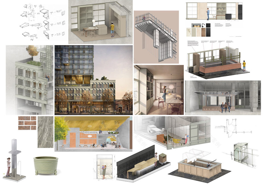
Kaye是一座位于西雅图Belltown社区的全新31层建筑,包含324套公寓,并在首层、第七层与第三十二层设置了具备酒店品质的公共配套空间,夹层设有联合办公空间,底层同时配置商业功能。Grzywinski + Pons为开发商Skanska完成了从建筑到室内的整体设计,并参与了大部分家具的设计。
Kaye is a new thirty-one-story building in Seattle’s Belltown neighborhood comprising 324 apartments, hospitality-grade amenities on the ground, seventh, and thirty-second floors, a co-working space on the mezzanine, and commercial space at grade. Grzywinski+Pons designed both the building and all of the interiors, as well as much of the furniture, for our client, Skanska.
▼项目概览,overall of the project© Nicholas Worley
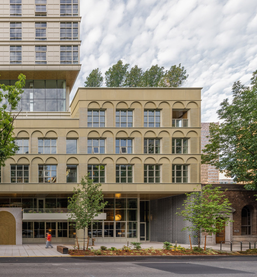
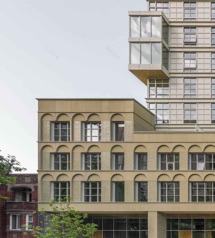
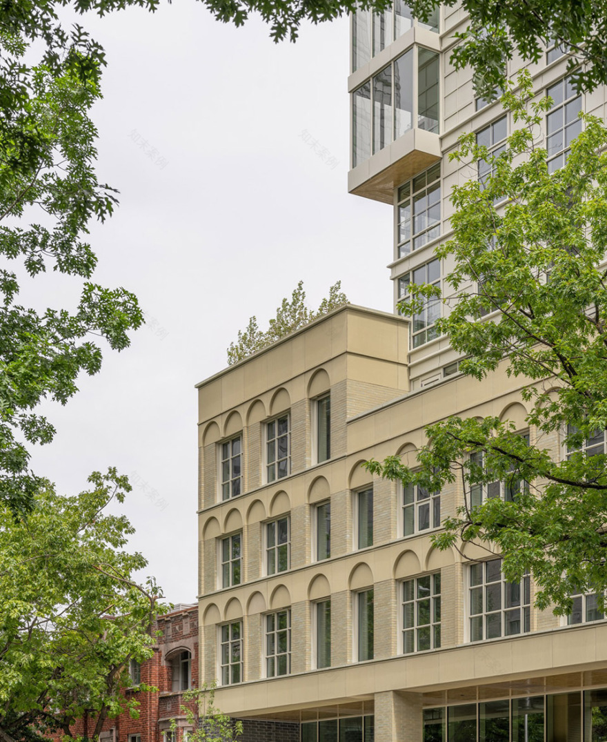
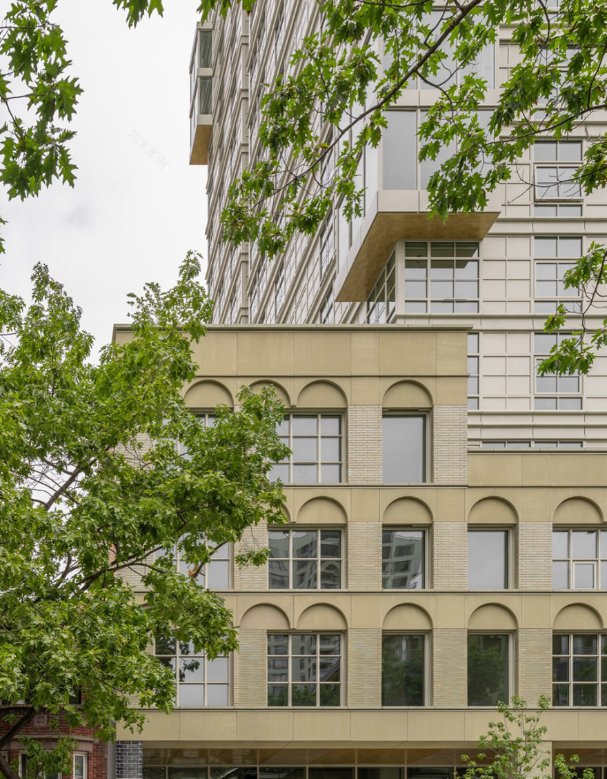
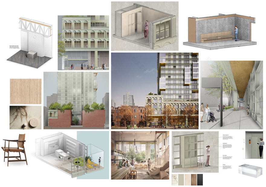
Belltown是西雅图最为高密度的城市社区,体现了这座“翡翠之城”在过去与未来之间的张力:新的高层建筑与该地区海事与轻工业遗存的历史建筑并置。项目希望在延续20世纪初邻里建筑优质特征的同时,为面向西雅图未来生活方式的人群创造新的居所。基地与一座三层的都铎复兴风格多户住宅及一座单层乔治亚复兴风格建筑相邻,这两者均建于20世纪20年代,并采用砌体与人造石外饰。Kaye被设计为“塔楼+基座”的组合形式——这一策略使基座在尺度与材质上与周边砖砌建筑形成呼应,同时支撑上方拔地而起的塔楼。▼分析图,analysis diagram© Grzywinski + Pons
Belltown is Seattle’s densest urban neighborhood and embodies the tension of the Emerald City’s past and future, where new high-rises sit alongside architectural remnants of the area’s maritime and light-industrial heritage. We wanted to design a building that celebrated the best qualities of its early-twentieth-century neighbors while creating new homes for those experiencing Seattle’s exciting future.
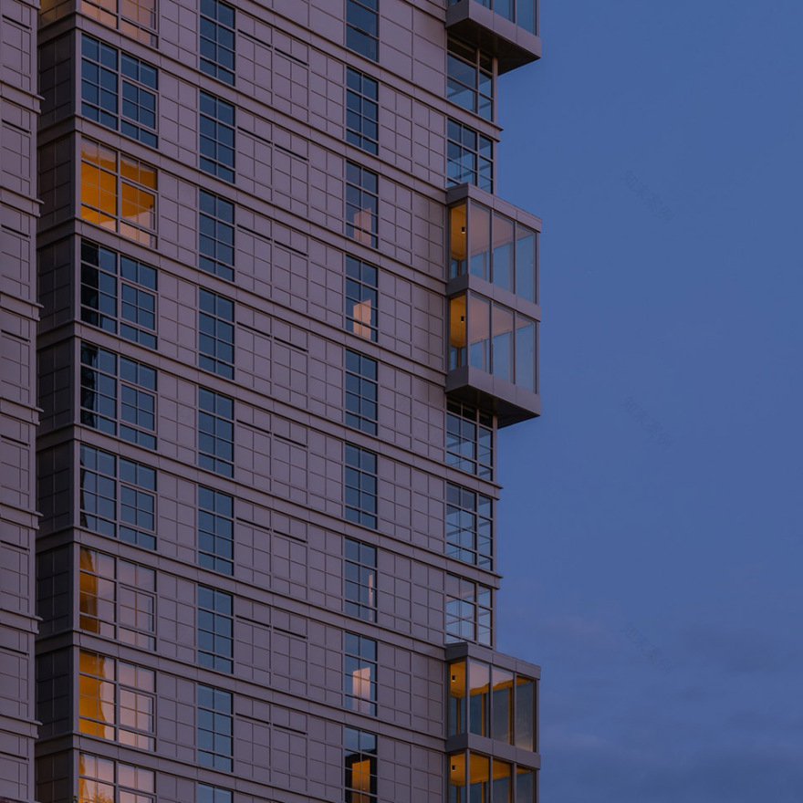
▼塔楼外观,exterior view of the tower© Nicholas Worley
▼突出的阳台体量,prominent balcony structure© Nicholas Worley
基地与一座三层的都铎复兴风格多户住宅及一座单层乔治亚复兴风格建筑相邻,这两者均建于20世纪20年代,并采用砌体与人造石外饰。Kaye被设计为“塔楼+基座”的组合形式——这一策略使基座在尺度与材质上与周边砖砌建筑形成呼应,同时支撑上方拔地而起的塔楼。
Our site shares a block with a three-story Tudor Revival multifamily residence and a single-story Georgian Revival structure, both built in the 1920s and clad in masonry and cast stone. We designed Kaye as a tower on a podium—a configuration that allowed us to create a plinth congruent with both our immediate brick-clad neighbors and the tower that rises from it.
▼三层的都铎复兴风格多户住宅,
three-story Tudor Revival multifamily residence© Nicholas Worley
▼外观细部,details of exterior© Nicholas Worley
▼砖材的拼接,bricklaying© Nicholas Worley
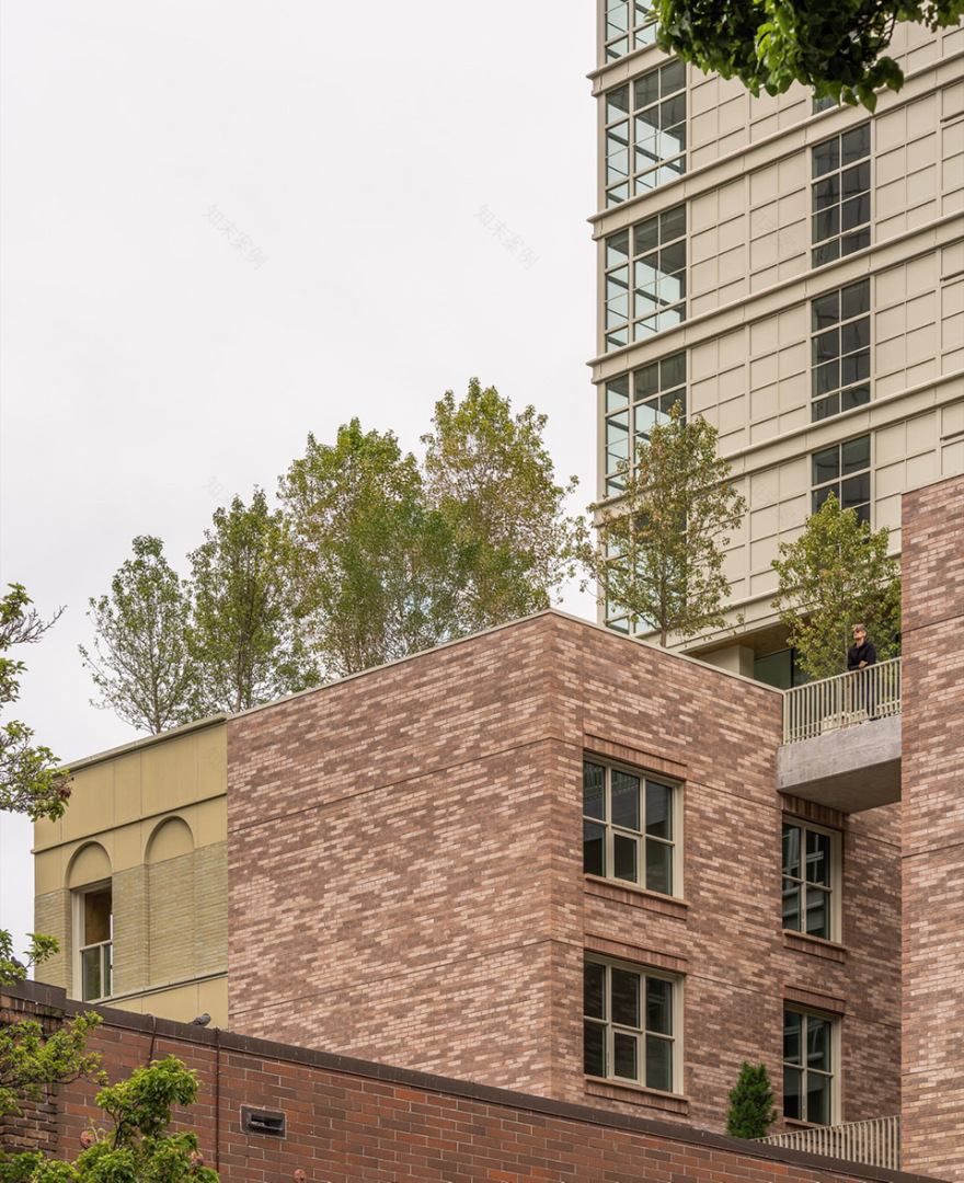
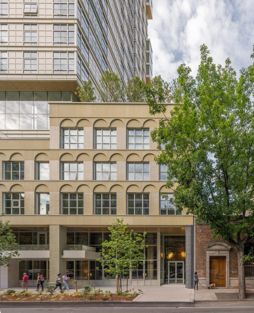
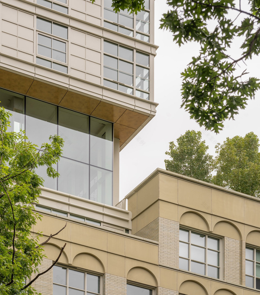
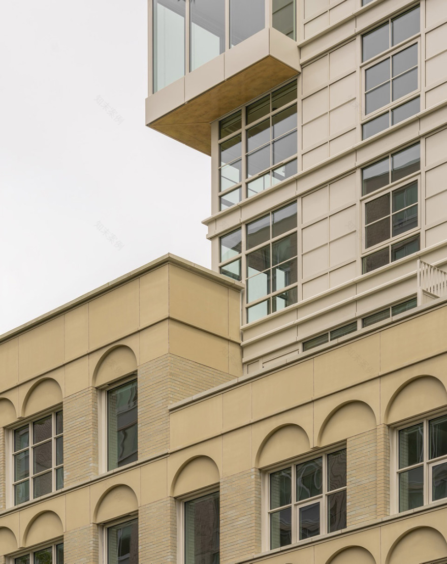
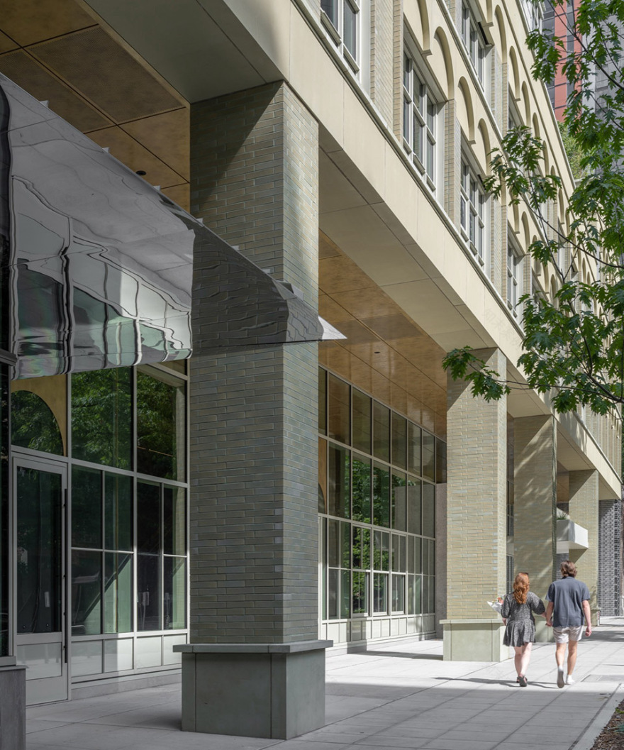
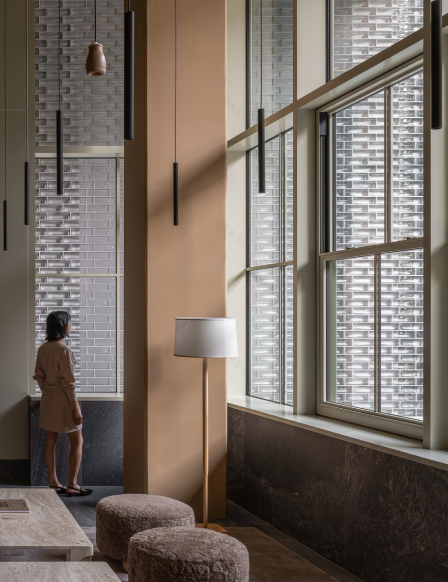
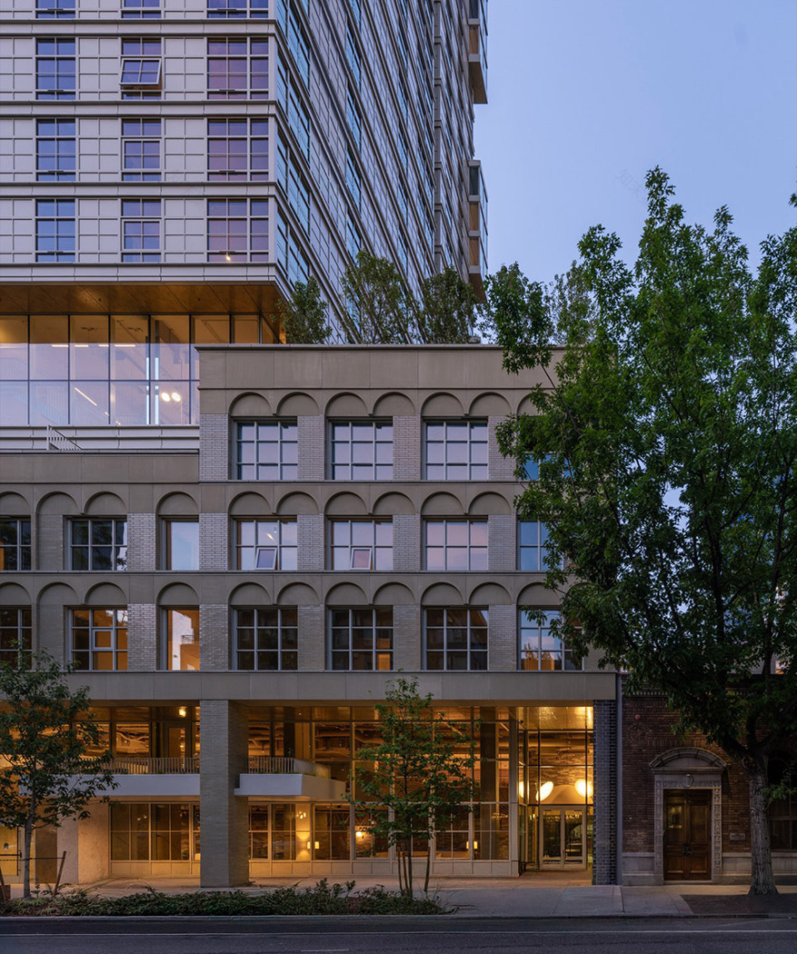
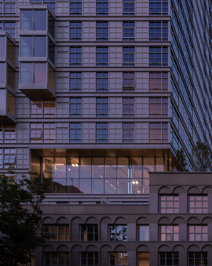
基座部分面向街道展开,与周边中高层建筑形成对话——呈现出稳重、厚实且明确的存在感;而塔楼则朝向城市天际线,随着高度的上升逐渐趋于轻盈与通透。这一意图在材料与形体上得到体现:底部强调结构与重量的表达,而顶部则成为关于光与反射的研究。针对六层高的基座部分,设计确立了一系列原则:希望其在街道层面具有清晰可读性,通过明确的功能布局、开放空间与直观的流线组织来实现。高挑开敞的空间既宏大又具亲和力,通过细部中温暖而富有触感的材料加以呈现。由于建筑与室内由同一团队整体设计,首层空间得以被视为街道的延伸,进一步强化公共性与城市联系。
▼分析图,analysis diagram© Grzywinski + Pons
We designed the podium to be oriented toward the street and conversant with our mid-rise neighbors—anchored, masonic, and resolute. Conversely, the tower is oriented toward the skyline, becoming ever more ethereal and diaphanous as it rises. These intentions manifest in material and form: the base is a celebration of tectonic weight, while the top is a study in light and reflection. We established guiding principles for Kaye’s six-story base. We wanted the podium legible from the street, with conspicuous program elements, open spaces, and intuitive circulation. Grand spaces and soaring volumes feel approachable and friendly, with granular details rendered in warm, tactile materials. Since we designed both building and interior, we were able to treat the ground-floor spaces as an extension of the street.
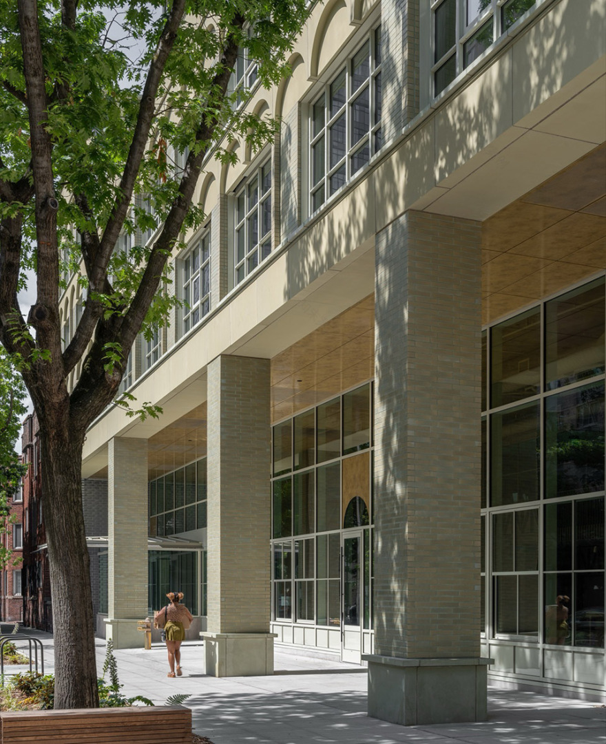
▼底层骑廊,ground floor colonnade© Nicholas Worley
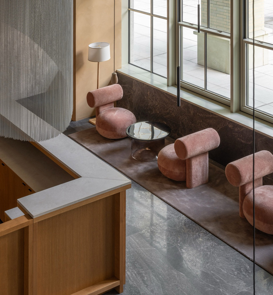
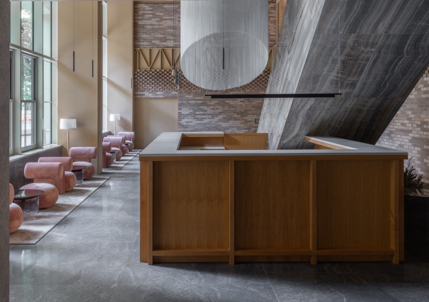
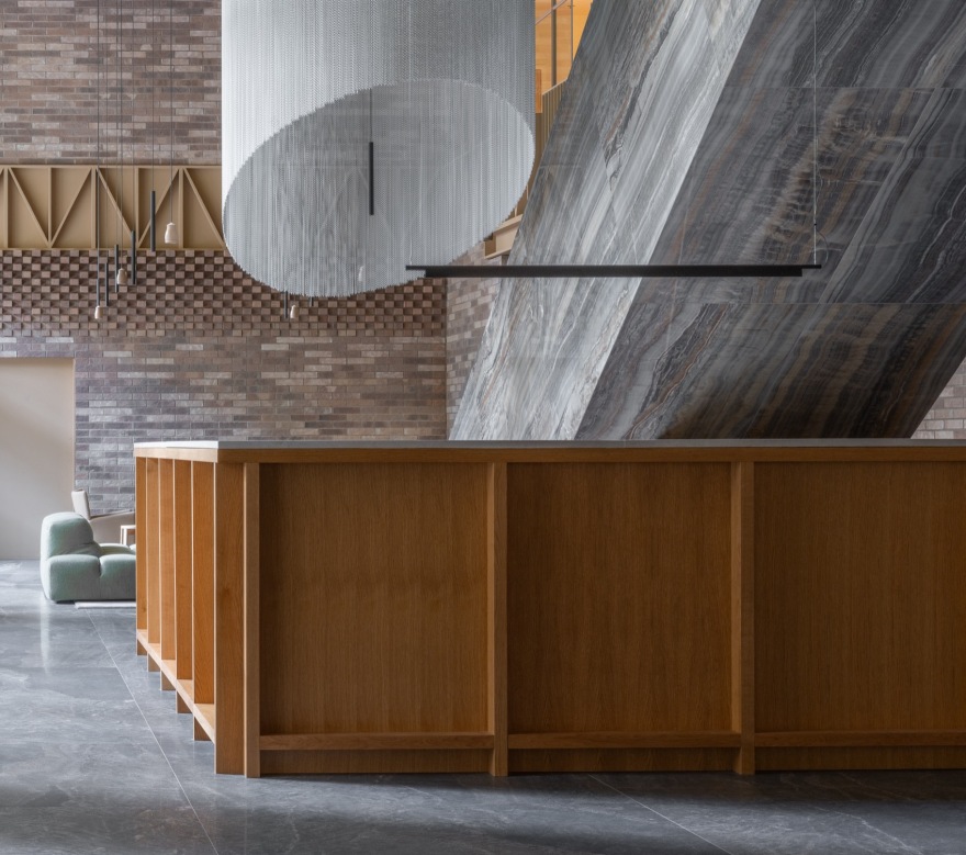
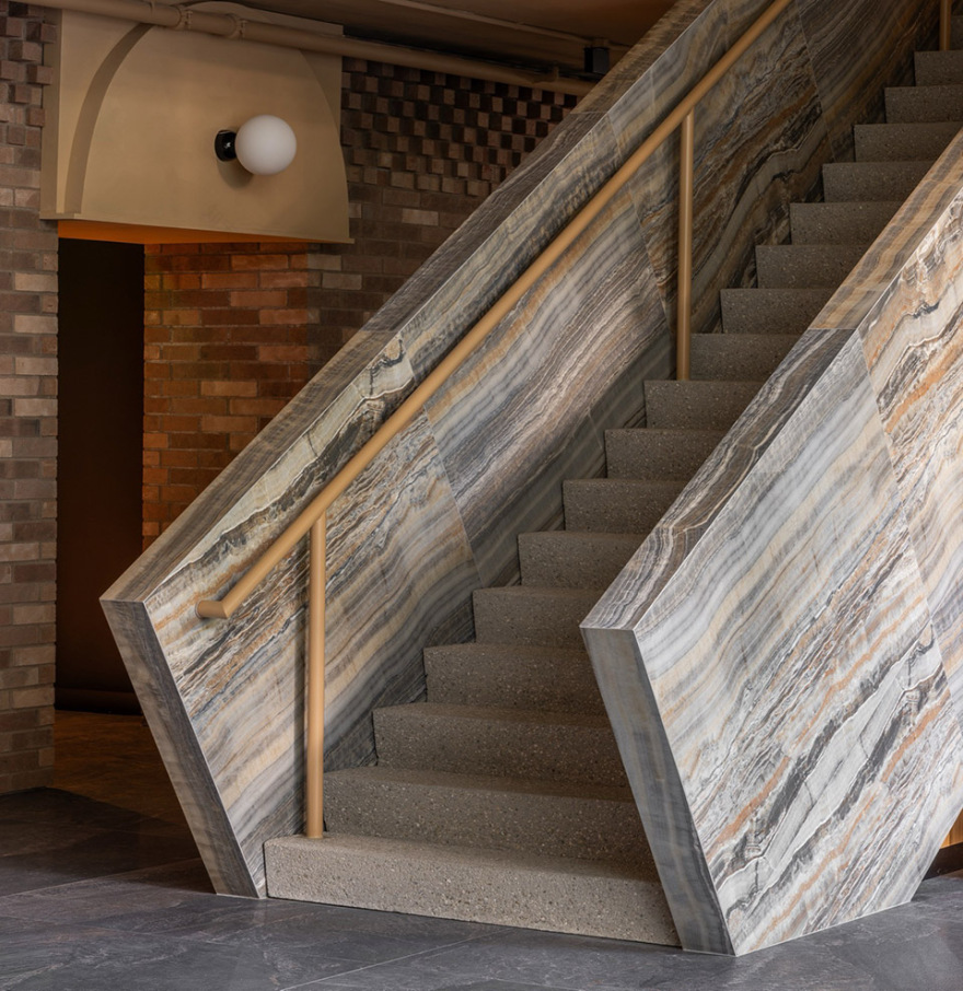
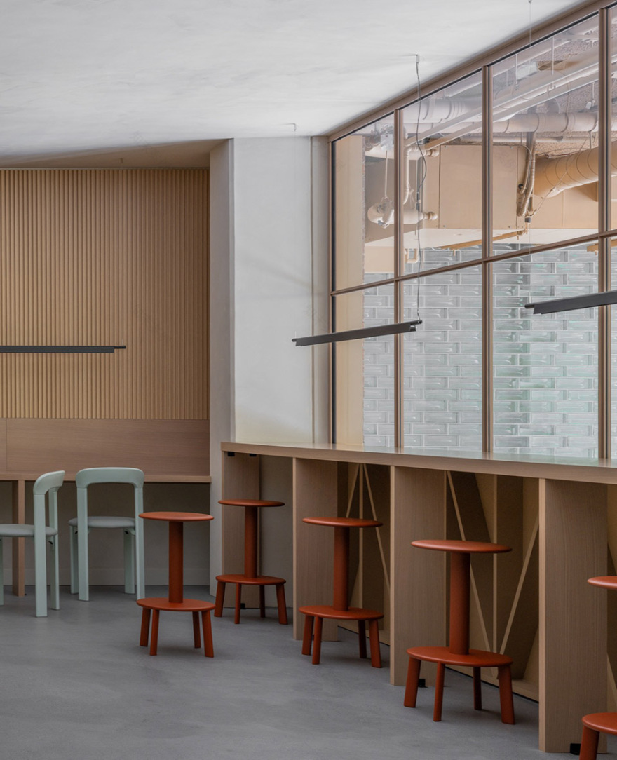
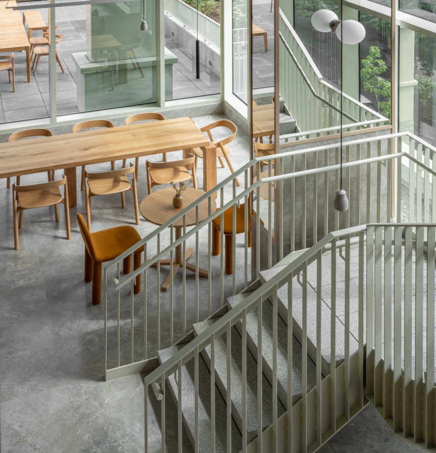
我们在可开启的玻璃店面之后打造了一个“大厅”(great hall),其内部设置了一道覆以砌体的次级立面,并通过开窗处理,使其仿佛成为另一面街道界面。一座覆以缟玛瑙的纪念性楼梯引导访客与住户通往夹层的公共设施空间,这些空间沐浴在自然光中,并与第四大道相连。邮件室与自行车房则同时作为视觉与动线的通道,将第四大道、大厅以及后巷串联起来——这一设计回应了住户向东或向南通行的“期望路径”。大厅两端的分户墙采用定制玻璃砖完成,而一个由玻璃与田纳西粉色大理石构成的零售体量则置于镜面雨棚之下,映射着来往行人的身影。
▼分析图,analysis diagram© Grzywinski + Pons
We created a “great hall” behind an operable glass storefront, with an internal secondary facade clad in masonry and fenestrated as though it were another street wall. A monumental onyx-clad stair invites guests and residents to the amenity spaces on the mezzanine, all bathed in natural light and connected to Fourth Avenue. The mail and bike room doubles as a visual and physical connection from Fourth Avenue, through the great hall, and out to the alley behind—the architectural realization of an anticipated “desire path” for residents heading east or south. The party walls at either end of the great hall are finished with custom-made glass bricks, and a projected retail volume of glass and Tennessee pink marble sits underneath a mirror-finished awning, reflecting pedestrians passing by.
▼大堂,the lobby© Nicholas Worley
▼公共大厅,public lobby© Nicholas Worley
▼细部,details© Nicholas Worley
▼室内设计,interior design© Nicholas Worley
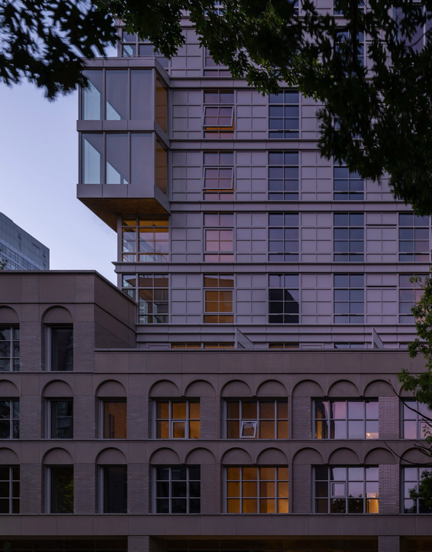
为了使基座更具人性尺度,我们将其体量视为可被“侵蚀”的对象。通过减法体量操作,在关键位置形成退台与空隙,引导街道与建筑内部之间的联系。在第四大道一侧的街墙,我们以柱廊替代西雅图常见的悬挑式遮雨构件。这一策略将建筑入口界面向内退让,使公共空间延伸进入建筑内部,模糊了私密室内与公共人行道之间的边界。在布兰查德街一侧,我们进一步通过退台处理,使体量降低,以呼应南侧单层的Otis建筑尺度,从而形成一个内部庭院,作为住户儿童的安全活动空间。六层露台设置了一座横跨这一空隙的外部连桥——这一显性的交通元素为基座上部带来了清晰的尺度感与动态感。
To human-scale the plinth, we treated the mass as something to be eroded. Through subtractive massing, we created setbacks and voids at strategic locations, inviting connections from the street into the building’s core. At the Fourth Avenue street wall, we designed a colonnade in lieu of Seattle’s prescriptive overhead weather protection. This move pushed the building’s threshold back, extending the public realm into the structure and diffusing the barrier between private interior and public sidewalk. At our Blanchard Street elevation, we utilized a further setback, stepping down to acknowledge the scale of the single-story Otis building to our south. This created an internal courtyard that serves as a protected playground for resident children. The sixth-floor terrace features an external bridge spanning this void—conspicuous circulation that provides a legible sense of scale and movement to the podium’s upper reaches.
▼吧台,bar counter© Nicholas Worley
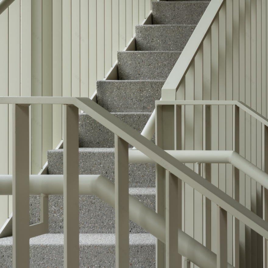
▼楼梯,staircase© Nicholas Worley
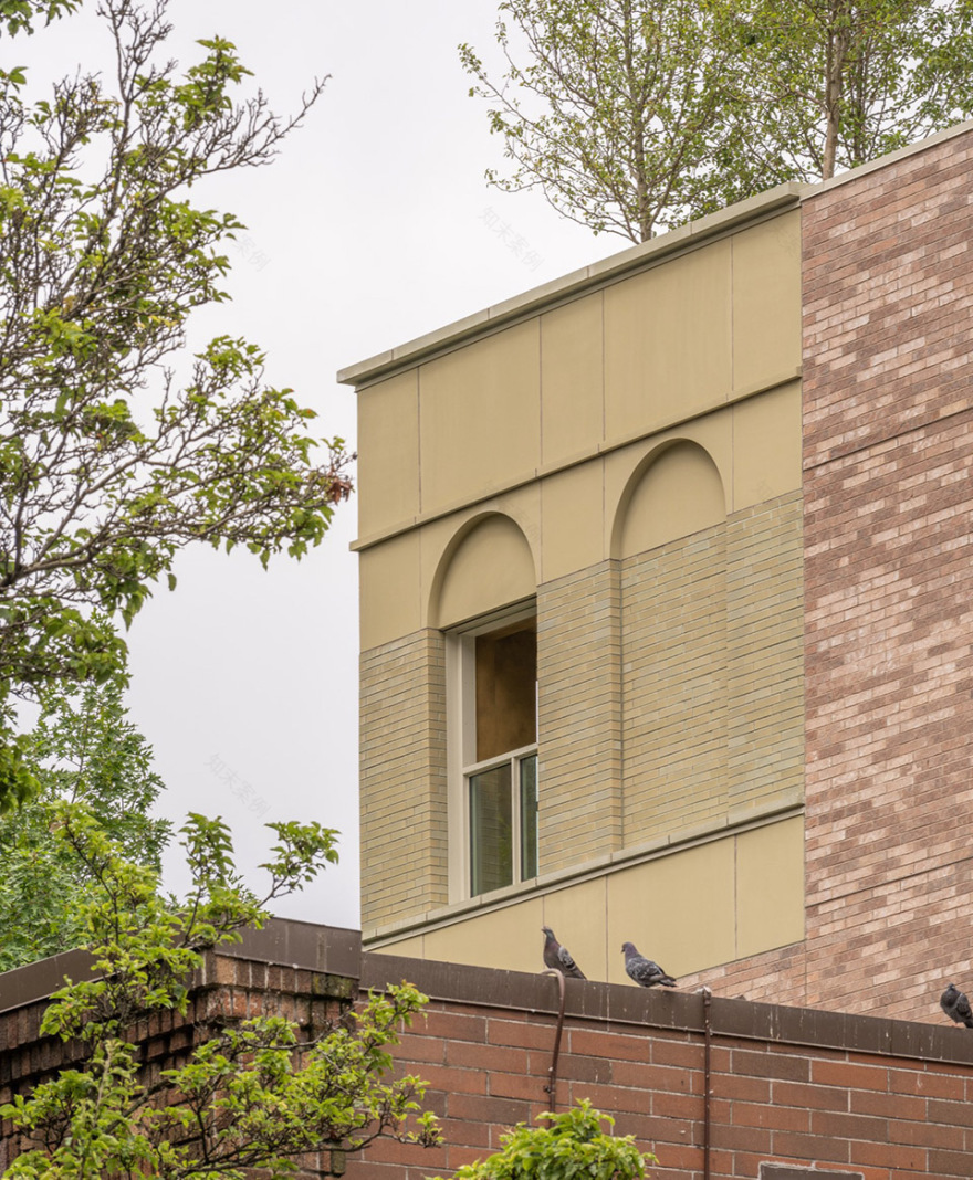
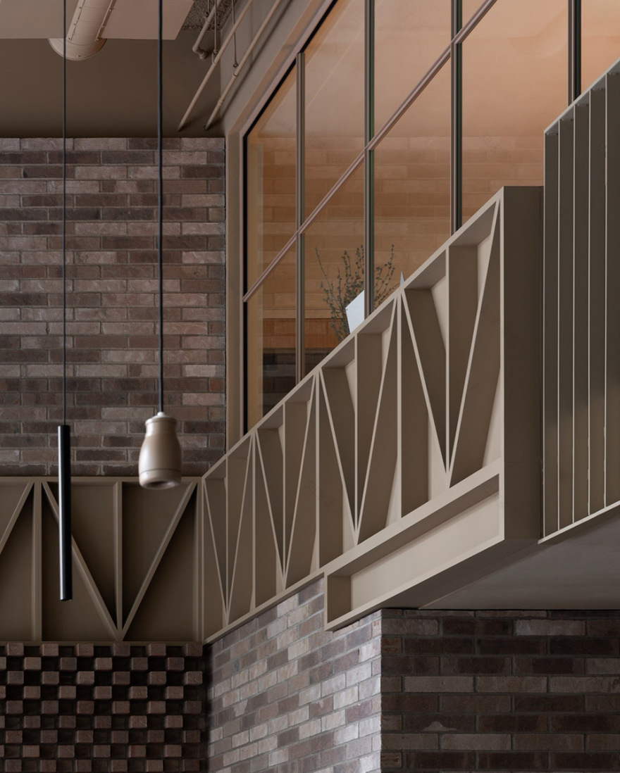
在立面设计上,我们从周边建筑中汲取灵感。双层通高的一层空间退于由砖与铸石构成的柱廊之后,其前方设置玻璃店面,包括一体化矮墙、可开启窗扇以及石材包裹的入口前室。其上方的檐底被视为“第五立面”,采用仿旧黄铜质感的金属面板覆面。街道家具与丰富的绿化邀请居民与行人共同使用这一被拓展的外部空间。其余基座部分采用鼠尾草色调的釉面罗马砖饰面,并辅以预制水平线脚。每个窗洞上方均设计了简洁的凹刻拱形细部。在西南角,我们设置了一处冬季花园,使第四大道一侧的立面材料转折延续至地块边界的布兰查德街立面,而后者其余部分则采用未上釉的普通砖完成。
Drawing inspiration from our neighbors, we designed the podium facade with these principles in mind. The double-height ground floor, setback behind the colonnade of brick and cast stone, is fronted by a glass storefront featuring an integral pony wall, operable sash windows, and a stone-clad entry vestibule. The soffit above is treated as a “fifth facade” and clad in metal panels with an aged brass finish. Street furniture and generous plantings invite residents and passersby to inhabit the augmented external space. The rest of the base is clad in sage-hued, glazed Roman brick with precast string courses. We designed a simple debossed arch at each window header. On the southwest corner, we created a winter garden where the Fourth Avenue cladding turns the corner onto the lot-line Blanchard facade, otherwise finished in non-glazed stock brick.
▼室内一角,corner of interior© Nicholas Worley
▼家具选择,furniture© Nicholas Worley
▼细部,details© Nicholas Worley
▼二层公共空间,upper floor public area© Nicholas Worley
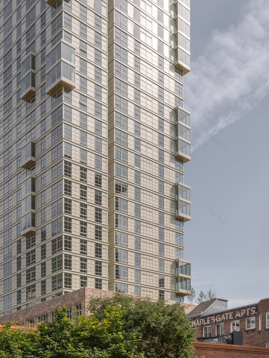
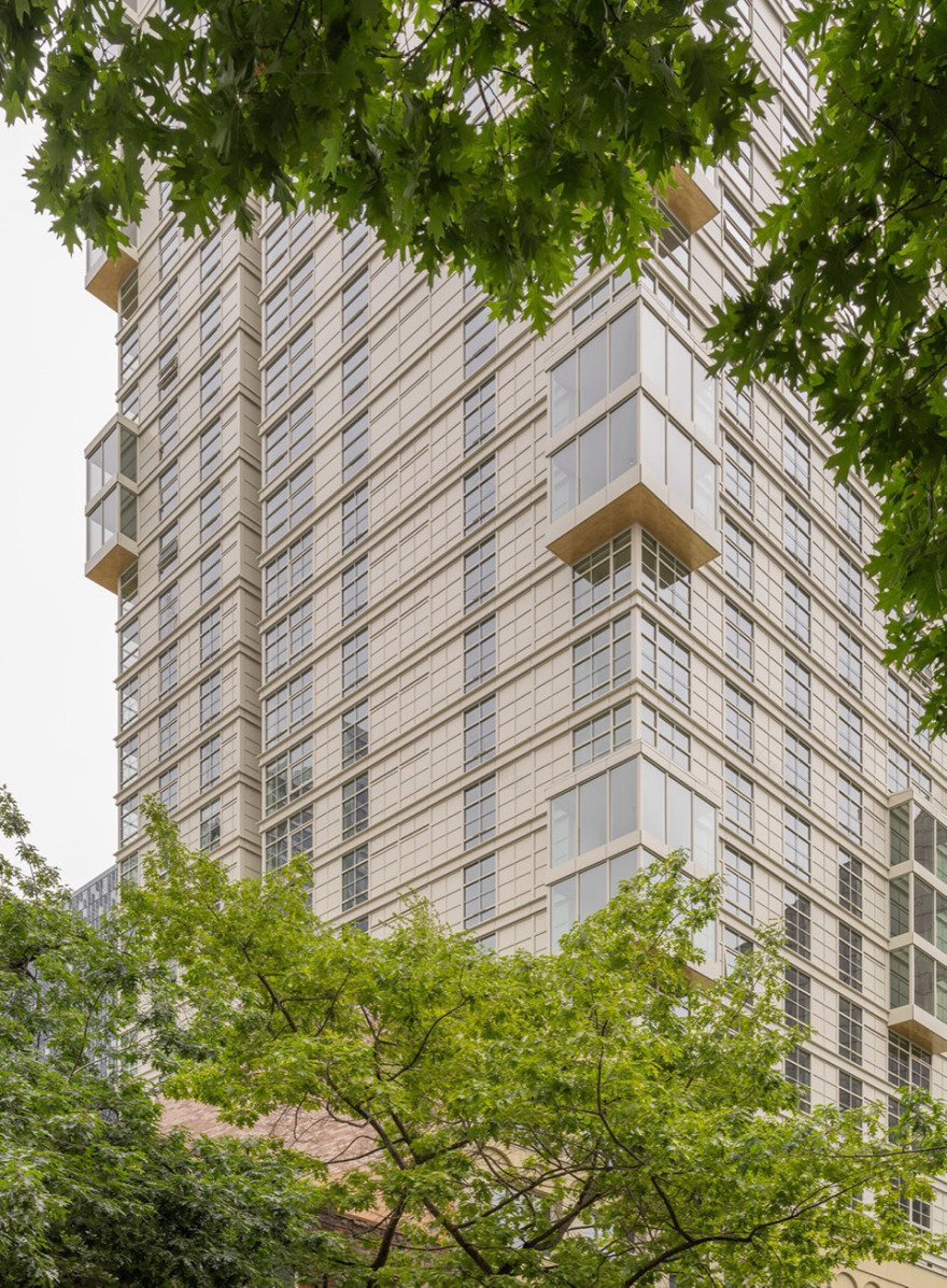
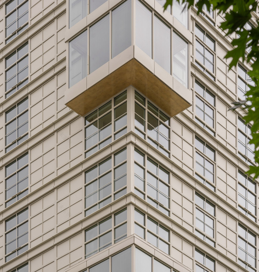
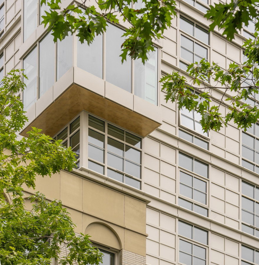
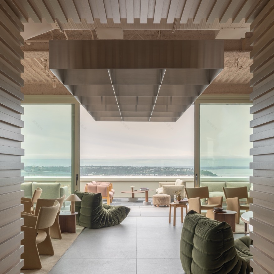
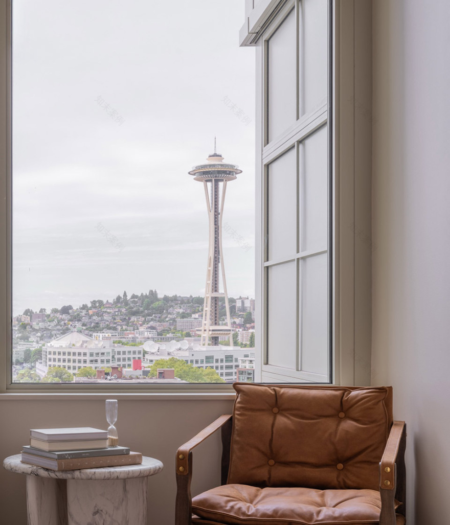
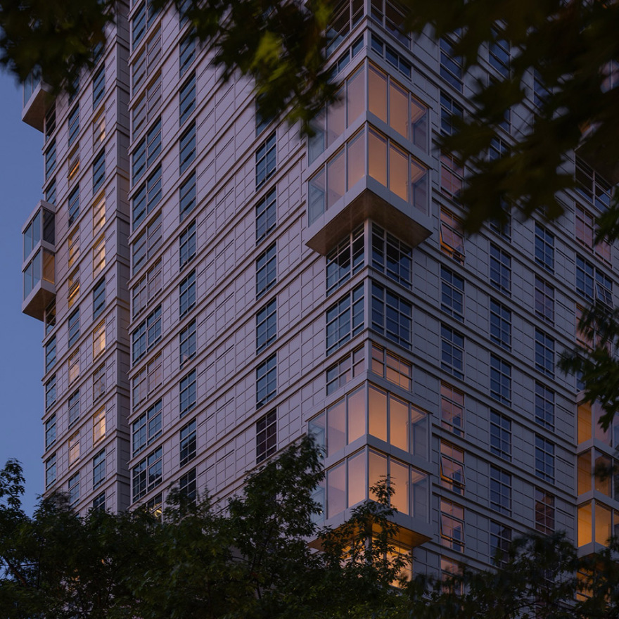
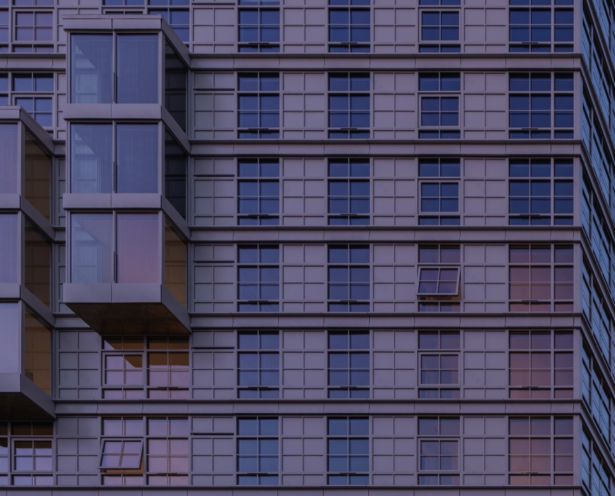
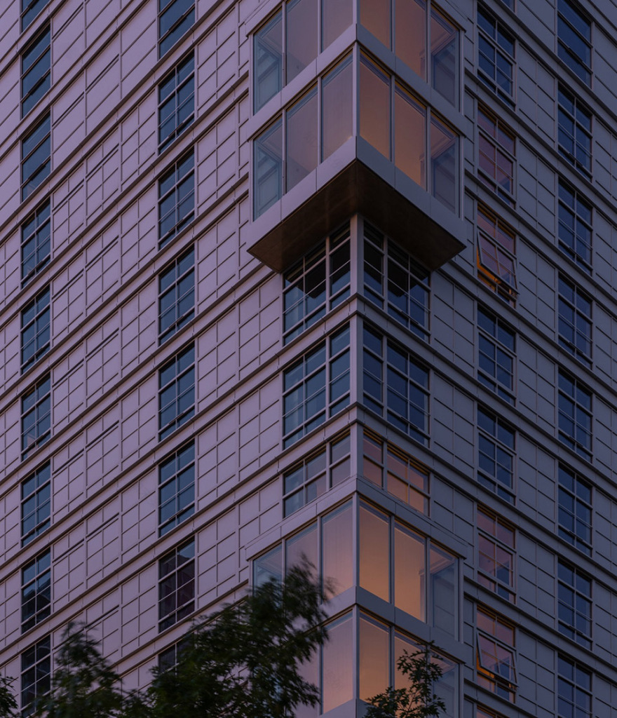
对于塔楼部分,我们希望建筑在向上生长的过程中呈现出更加轻盈、通透的状态。Skanska 对我们在建筑与室内设计上的全面信任,使我们能够做出兼顾两者的整体性决策。在形式上最具结构性的操作,是在部分住宅单元中引入外挑体量,即“空中客厅(sky lounges)”。在整体严谨克制的立面体系中,我们尝试引入一种“切分节奏”(syncopation)——对有序体量与围护结构的有意打断。这些外挑空间使部分单元获得270度视野。其垂直相交的玻璃界面,让居住者不仅可以回望建筑本体,还可以越过建筑视线延伸:有时在同一空间内即可向西眺望Elliott Bay,向北望见Space Needle,向东看到Lake Union。这些体量延续了我们在基座中采用的“侵蚀”策略——在街道层面,通过角部空中客厅的大面积玻璃,让人能够“透视”建筑。
For the tower portion, we wanted the building to feel more diaphanous as it rises. Skanska’s trust in us to design both architecture and interiors afforded us the opportunity to make decisions that would benefit both. The most tectonic formal move was the creation of projected volumes, or “sky lounges,” in some units. In an otherwise rigorous facade, we explored syncopation—the curated interruption of organized elements of mass and envelope. These projections afford some units 270-degree views. The glazing on the perpendicular faces allows an inhabitant to look back at and past the building, sometimes opening sightlines west to Elliott Bay, north to the Space Needle, and east to Lake Union from a single room. These projections further the principle of erosion we pursued on the podium, where expansive glazing on the corner sky lounges allows people to “look through” the building from the street.
▼空中客厅,sky lounges© Nicholas Worley
▼细部,details© Nicholas Worley
▼公共空间,public area© Nicholas Worley
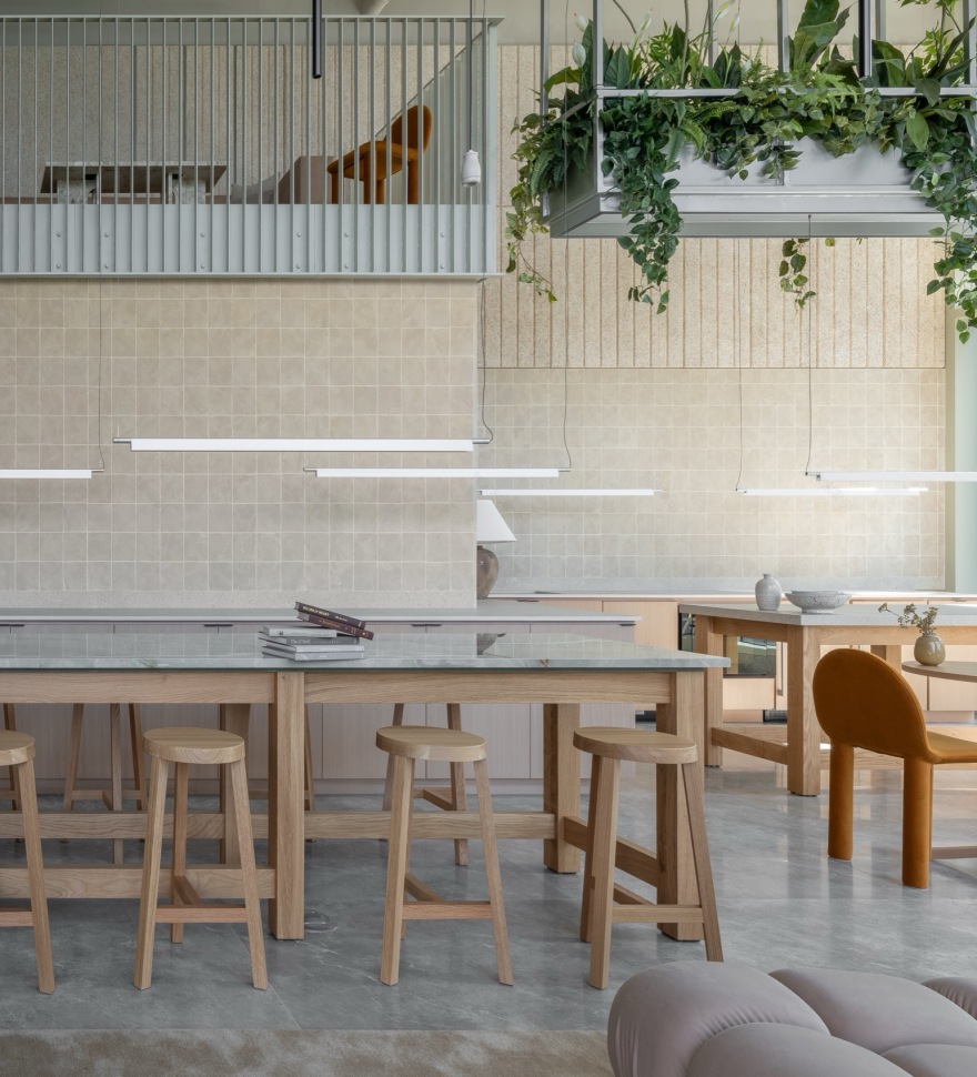
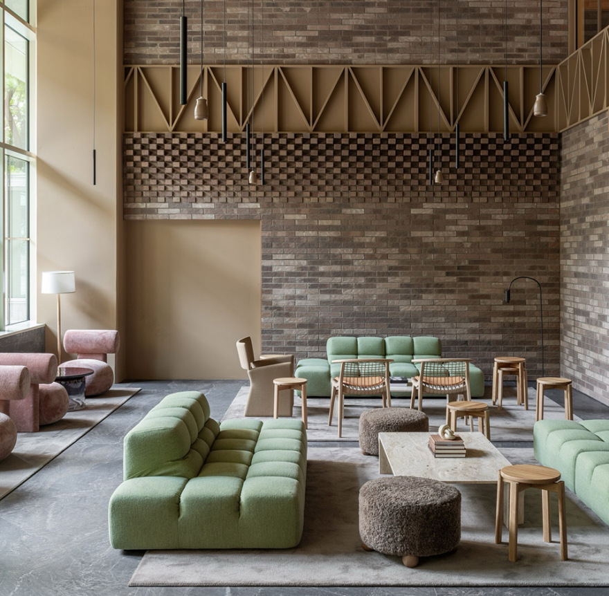
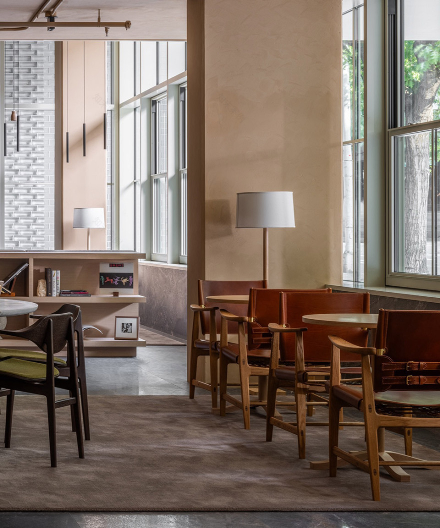
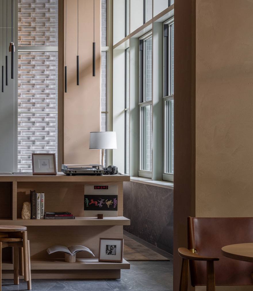
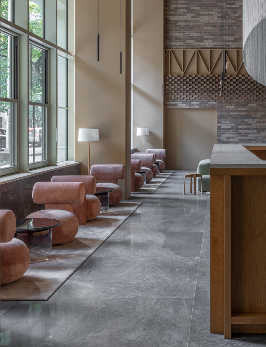
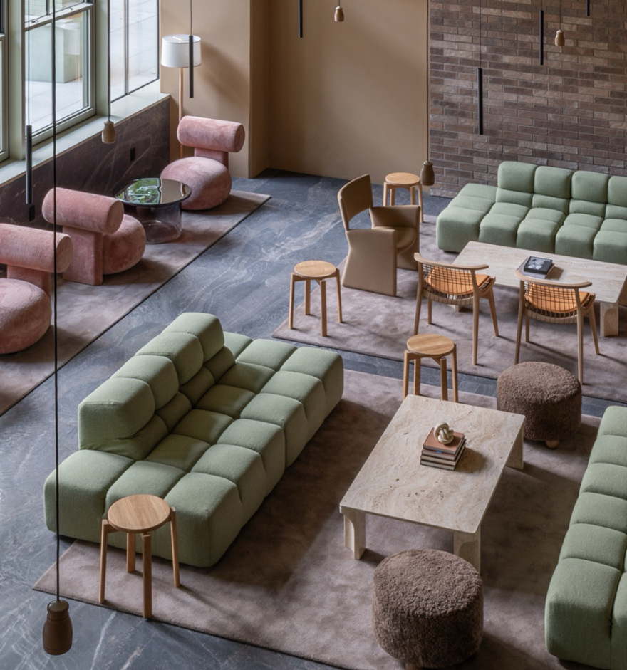
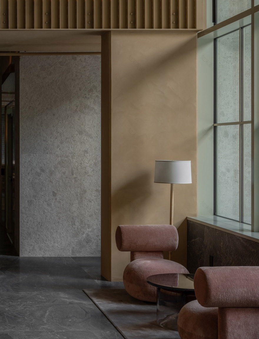
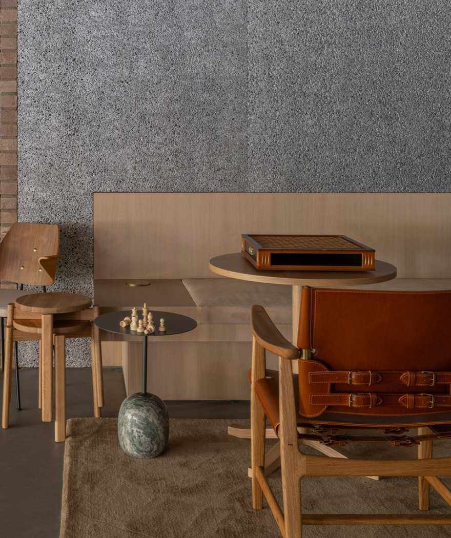
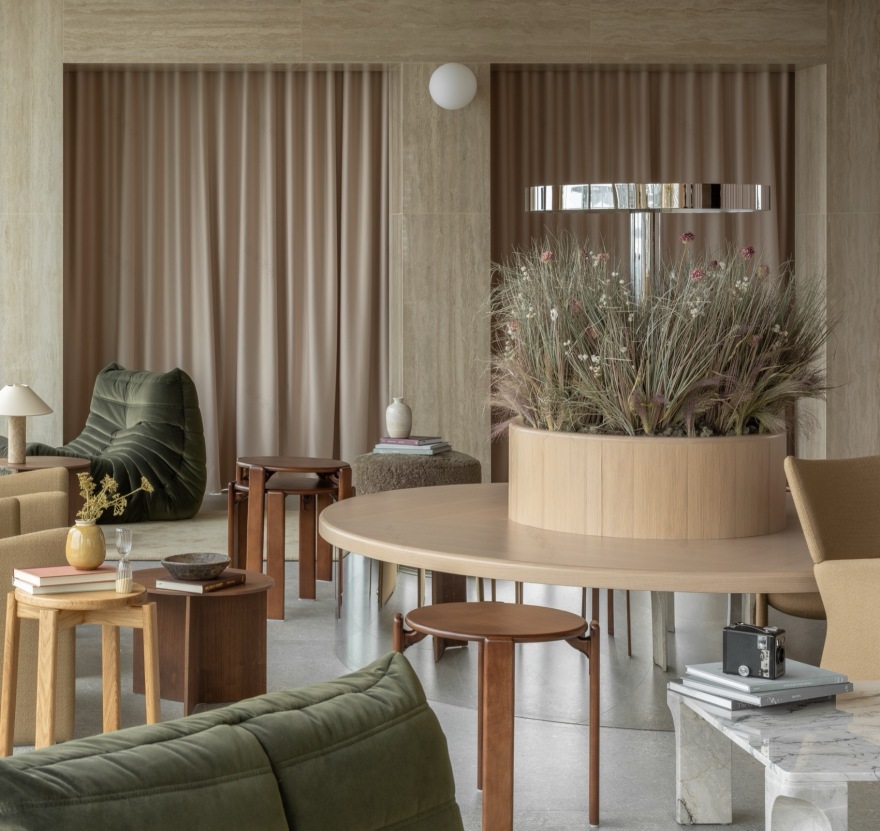
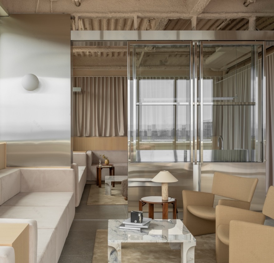
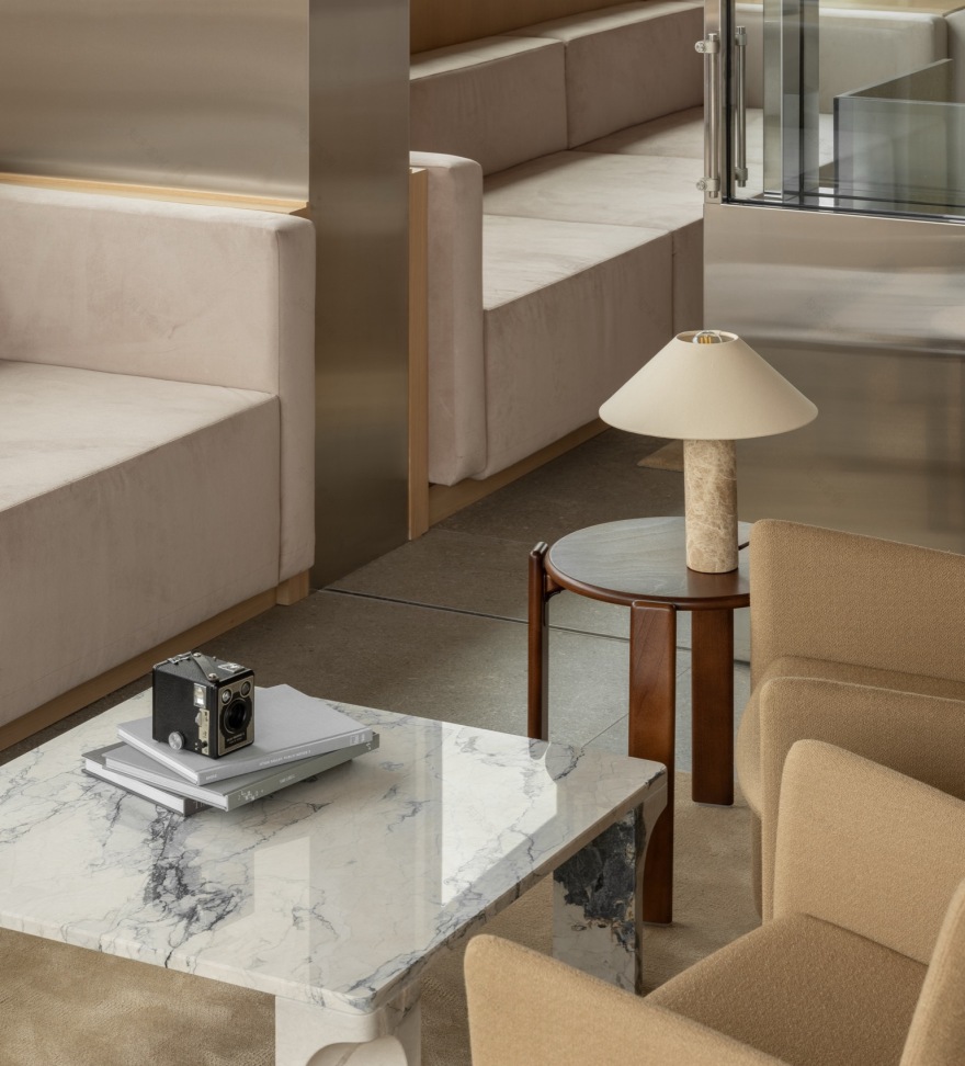
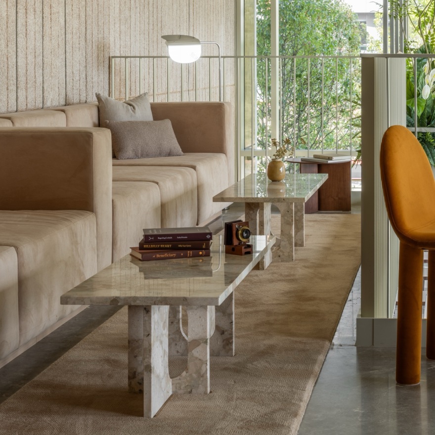
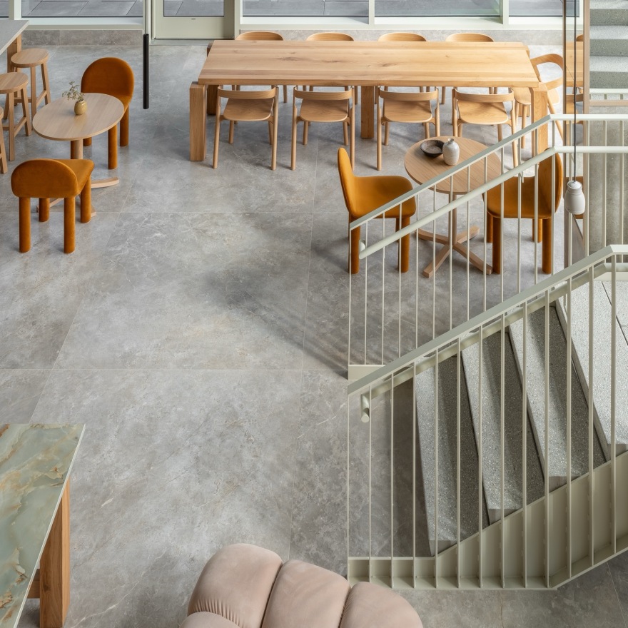
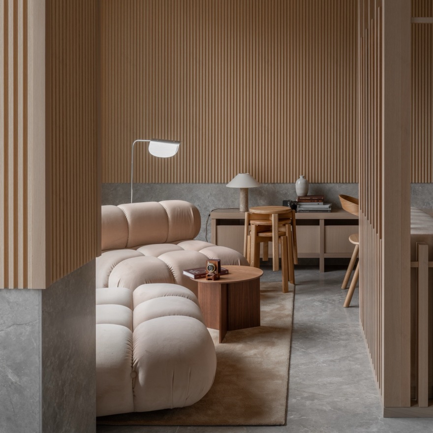
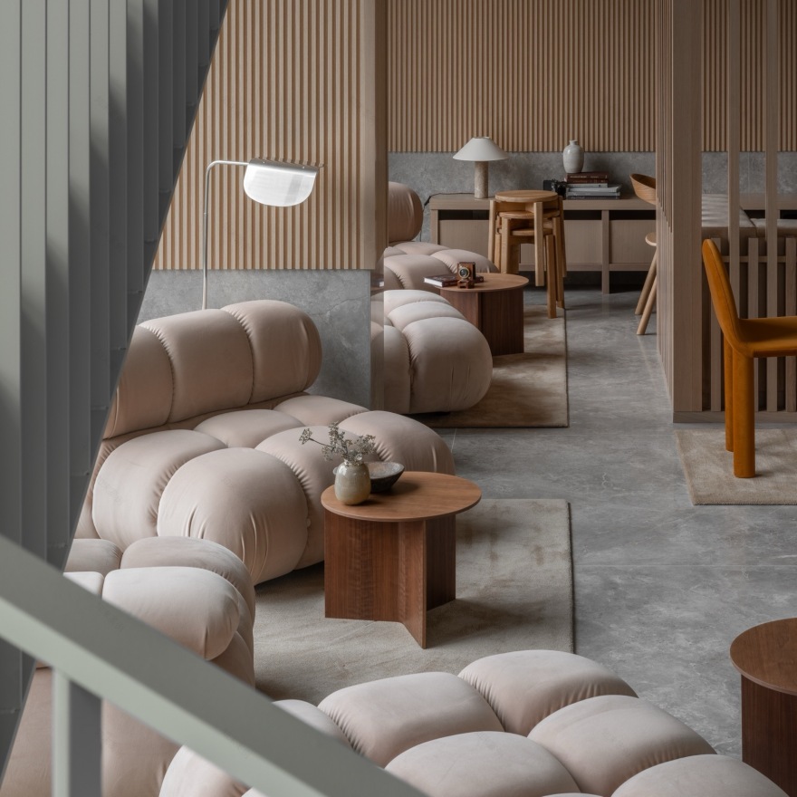
我们希望强化立面的质感,并增强塔楼表皮的空间层次与进深感。即便在高度通透的围护体系中,我们依然强调所有不透明构件的粗粝肌理处理,包括竖梃、窗间墙以及可开启构件的框架。同时,我们在玻璃面板前设置悬浮的网格层,通过阴影与反射强化立面的深度感知。这类构件在塔楼下部更为密集,随着高度上升逐渐减少,从而在整体上强化一种垂直渐变的感知。在公共空间中,我们以温暖、亲切且耐久的材料体系来柔化结构表现主义的语言:铺设大面积地毯的石材地面;以砌体、石灰抹灰与木质波纹板饰面的墙体;以及覆盖柔软织物的窗帘。家具选择上,则以沙发、卡座与厚垫扶手椅为主,营造出鼓励停留与交流的氛围。
We wanted to maximize texture and amplify the spatial recession of the tower’s facade. Even within a highly transparent envelope, we prioritized rustication within all opaque components, including mullions, spandrels, and frames of operable panels. We also developed grids that hover in front of glazed panels, enhancing the perception of depth through shadow and reflection. We concentrated more of these components lower in the tower, decreasing the texture on higher floors and enhancing the perception of vertical gradation. In the public spaces, we softened the structural expressionism with a palette of warm, inviting, and resilient materials: stone floors plied with generous rugs; walls finished with masonry, lime plaster, and timber tambour panels; and windows dressed in lush curtains. We furnished the spaces with sofas, banquettes, and overstuffed chairs to encourage lingering.
▼公共休息区,public lounge© Nicholas Worley
▼多种座位选择,various seat options© Nicholas Worley
▼楼梯,staircase© Nicholas Worley
▼楼梯细部,details of the staircase© Nicholas Worley
▼宁静的室内氛围,the serene indoor atmosphere© Nicholas Worley
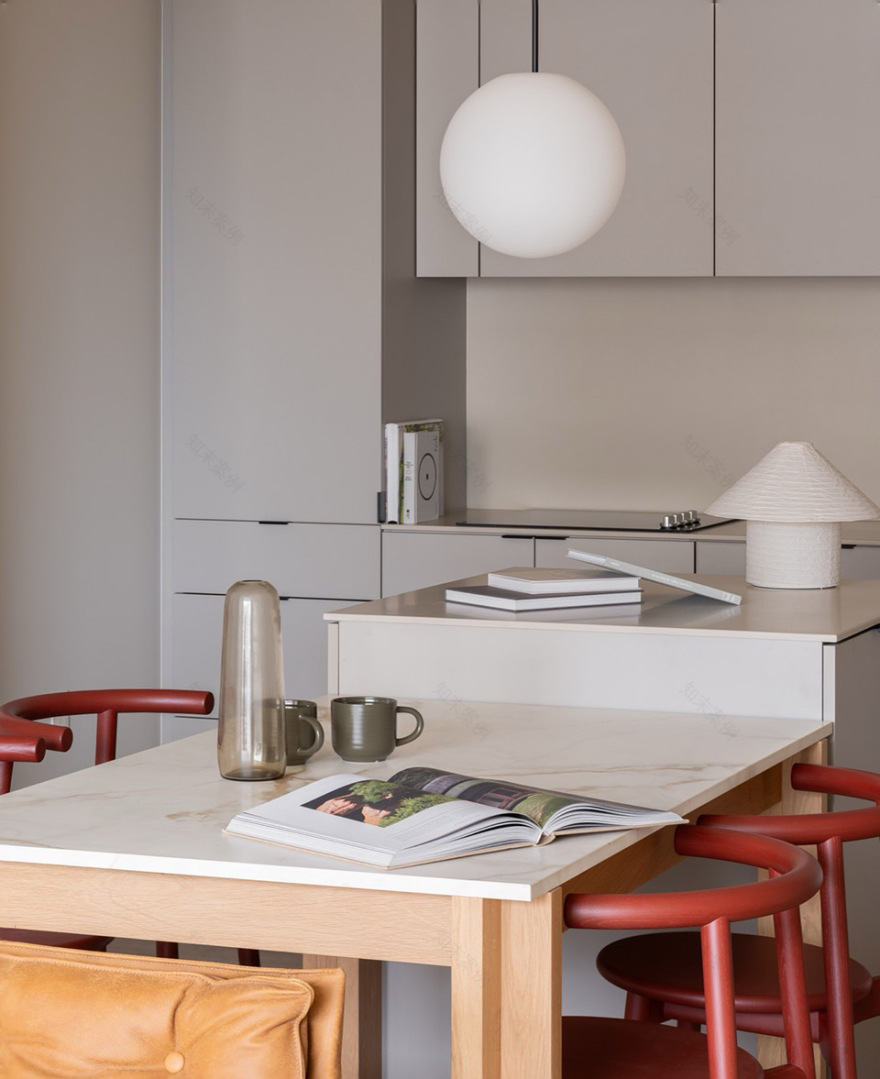
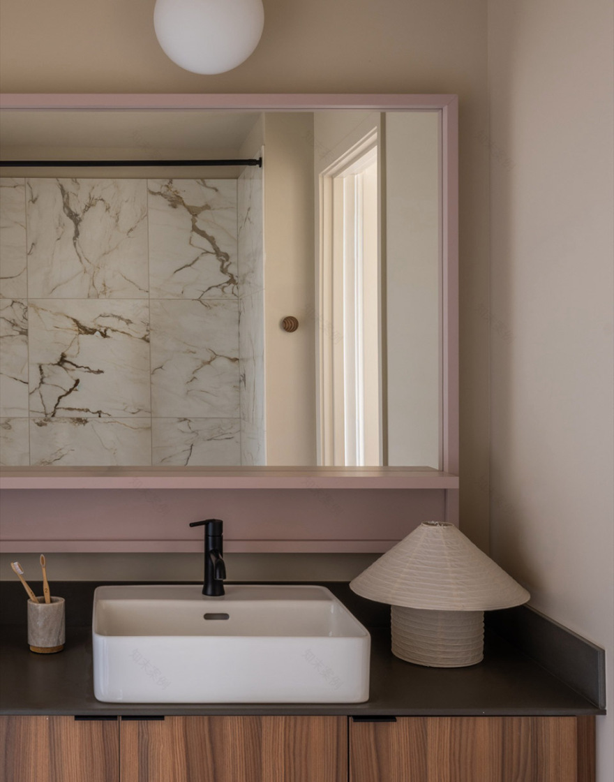
在住宅单元内部,我们采用柔和的中性色调,并设计了整体嵌入式家具。一张大理石台面、木结构框架的桌/岛一体装置垂直于宽敞的厨房布置;在大面积窗之间嵌入一组带有书架的边柜,其尺度与相邻玻璃分格(muntin)保持一致。照明与窗饰的设计既回应空间的使用功能、氛围与温度,也在夜间从外部参与塑造整栋建筑的观感体验。
In the residential units, we used a palette of soft neutrals and designed built-in furniture. A marble-topped, timber-framed table/island hybrid sits perpendicular to the expansive kitchens. A large sideboard with integrated bookshelves is built into the space between the units’ expansive windows, the dimensions of which are equal to the muntins of the adjacent glazing. We designed the lighting and window treatments to complement the utility, mood, and warmth of the units from within and contribute to the experience of the building at night from without.
▼住宅单元室内,interior of the residential units© Nicholas Worley
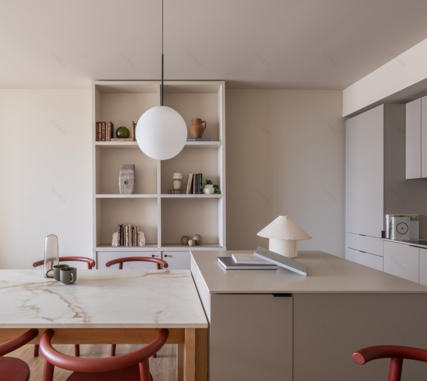
▼餐厅厨房,kitchen- dining© Nicholas Worley
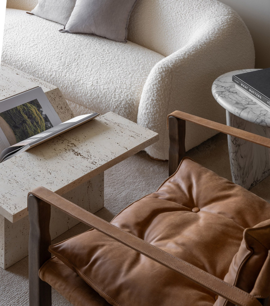
▼客厅,living room© Nicholas Worley
▼卧室,bedroom© Nicholas Worley
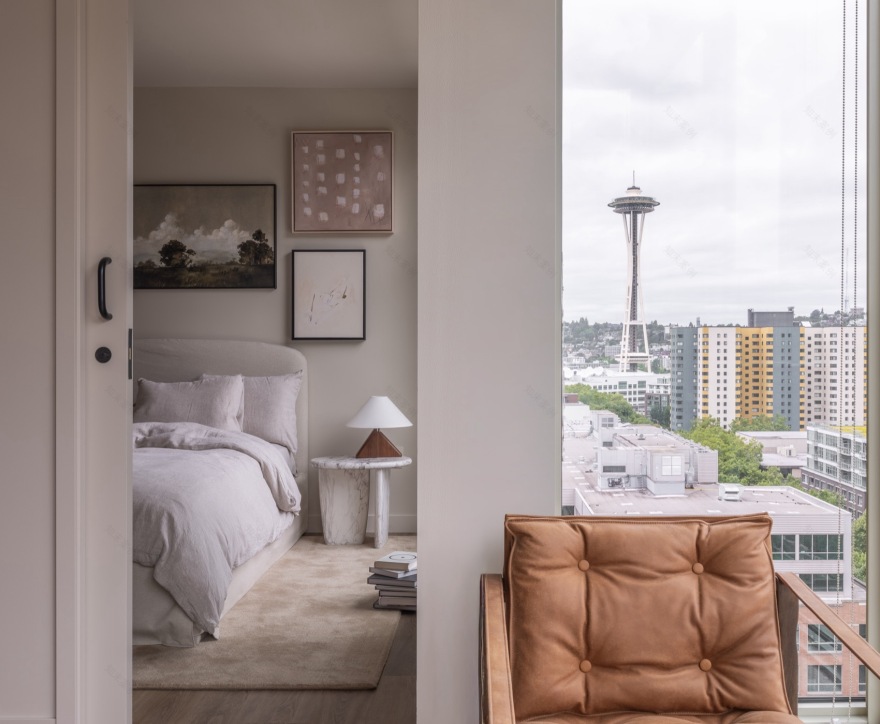
▼细部,details© Nicholas Worley
▼浴室,bathroom© Nicholas Worley
我们希望Kaye能够成为这一多层次街区中的重要角色。通过将20世纪20年代的砌体语言与轻盈通透的塔楼相结合,我们试图创造一种既尊重其历史邻里——如Charlesgate与Otis building——厚重感,又面向西雅图未来的建筑。Kaye参与到持续演进的城市对话之中,探索一种既稳重又轻盈的密度表达。能够看到Kaye融入这一不断变化、充满活力的城市肌理之中,是一件极具意义的事情。
It is our hope that Kaye will be a protagonist in a neighborhood defined by its layers. By synthesizing the masonic language of the 1920s with a diaphanous tower, we have sought to create an architecture that respects the gravity of its heritage neighbors—the Charlesgate and the Otis—while embracing Seattle’s future. Kaye participates in an ongoing urban dialogue, exploring a density that can be both stolid and ethereal. It is hugely rewarding to see The Kaye integrated into the fabric of this ever-evolving and dynamic neighborhood.
▼夜景,night views© Nicholas Worley
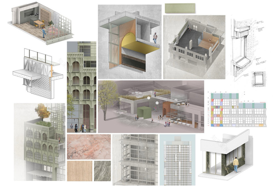
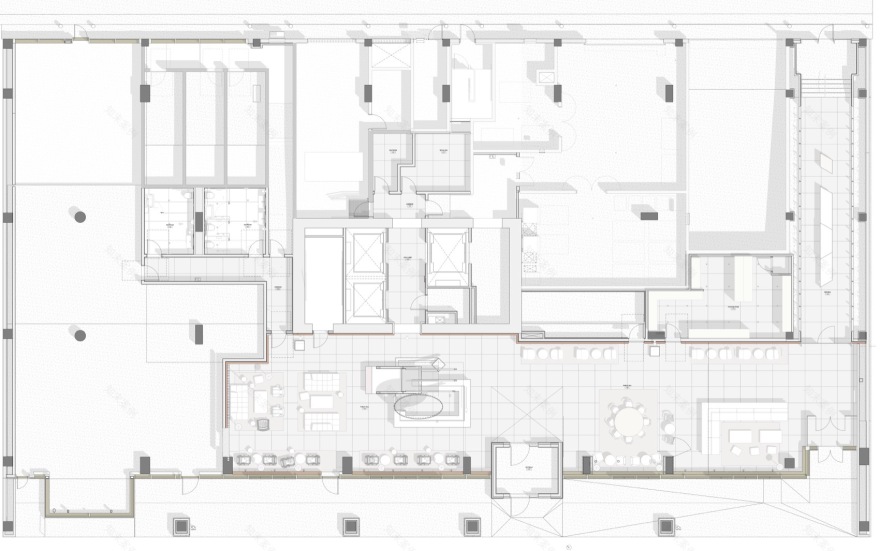
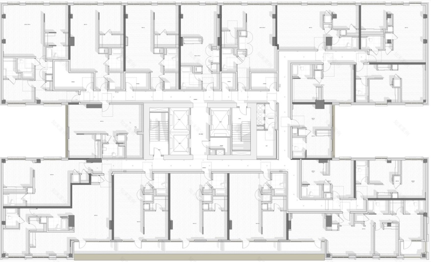
▼一层平面图,ground floor plan© Grzywinski + Pons
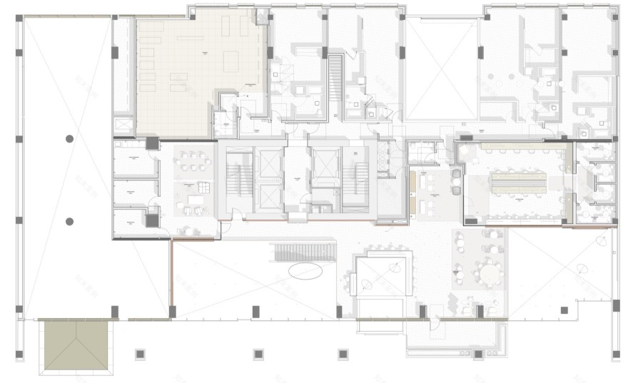
▼二层平面图,level 02 floor plan© Grzywinski + Pons
▼五层平面图,level 05 floor plan© Grzywinski + Pons
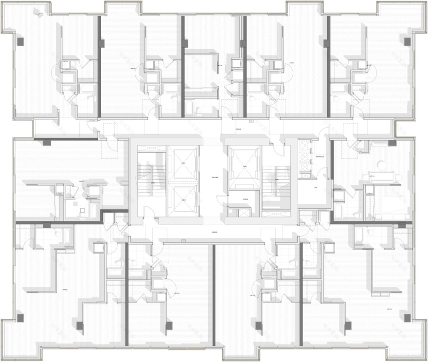
▼塔楼平面图,tower floor plan© Grzywinski + Pons
LOCATION: Seattle, WA USA
AREA: 35,117 SM
YEAR: 2026
ARCHITECTS: Grzywinski + Pons
PHOTO CREDITS: Nicholas Worley
南京喵熊网络科技有限公司 苏ICP备18050492号-4知末 © 2018—2020 . All photos and trademark graphics are copyrighted by their owners.增值电信业务经营许可证(ICP)苏B2-20201444 苏公网安备 32011302321234号
苏公网安备 32011302321234号客服
消息
收藏
下载
最近