

创作上传
VIP
收藏下载
登录 | 注册有礼
查看完整案例

收藏

下载

分享
翻译
Project 2: Typeface Poster
Here is my first idea that came to life, I was going to use this as the poster I present but felt a little off from it because of the contrast between the background and the actual title font. I feel like I could've executed this idea better by fixing the composition more but I really liked the caving in O background with fading colors.

This was my last minute composition and although I really liked the idea of this poster, it still felt off to me because it felt like it needed more definition but couldn't figure out how to do that. I liked the glowing parts of the "i" and wanted to add more but didn't know what to add. I liked the idea of the running off title from both sides and the dark backgrounds.

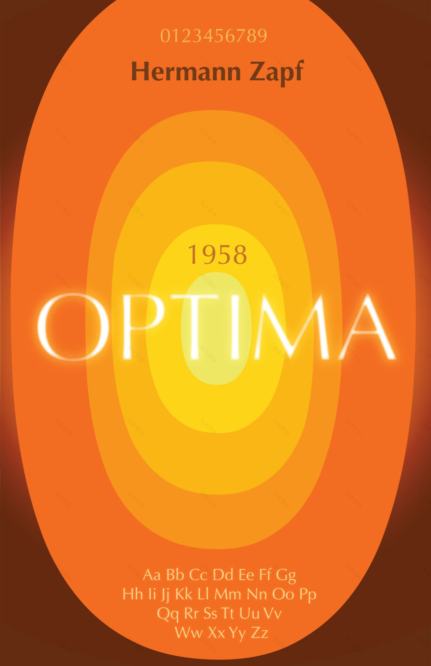
Finally, we have the 2nd idea I had for this typeface, this was the poster I chose to display as my final. Originally, I wanted a pattern that displayed over the screen. As you can see, all the O's have similar but different colors but same sizes. Also, in the first version, all the O's were in the same transparency, none were brighter than the other but I asked opinions from my friends and said they liked the glow from my last idea with the "i." So I decided to add the glow to all of them but thought it looked too complicated so I ended up adding it to just one O and that was the one that had the title in it. I like to think that by enhancing and bringing so much attention to the middle, it might draw people's attention from far away and wonder what this poster is and come closer to see what it might be about and then their eyes wander away from the title and look further into it.


Sketches of my ideas
南京喵熊网络科技有限公司 苏ICP备18050492号-4知末 © 2018—2020 . All photos and trademark graphics are copyrighted by their owners.增值电信业务经营许可证(ICP)苏B2-20201444 苏公网安备 32011302321234号
苏公网安备 32011302321234号客服
消息
收藏
下载
最近