

创作上传
VIP
收藏下载
登录 | 注册有礼
查看完整案例

收藏

下载

分享
翻译
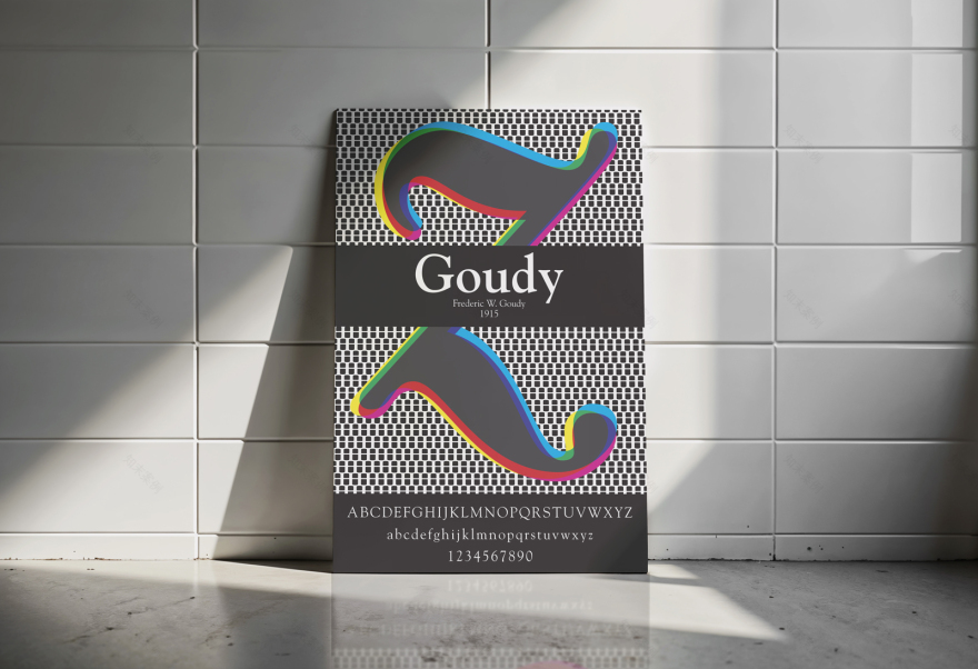
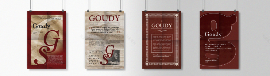
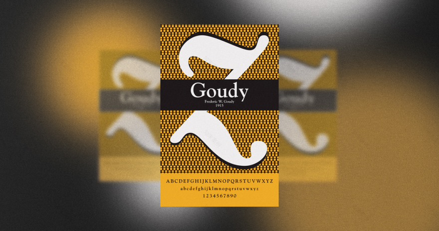
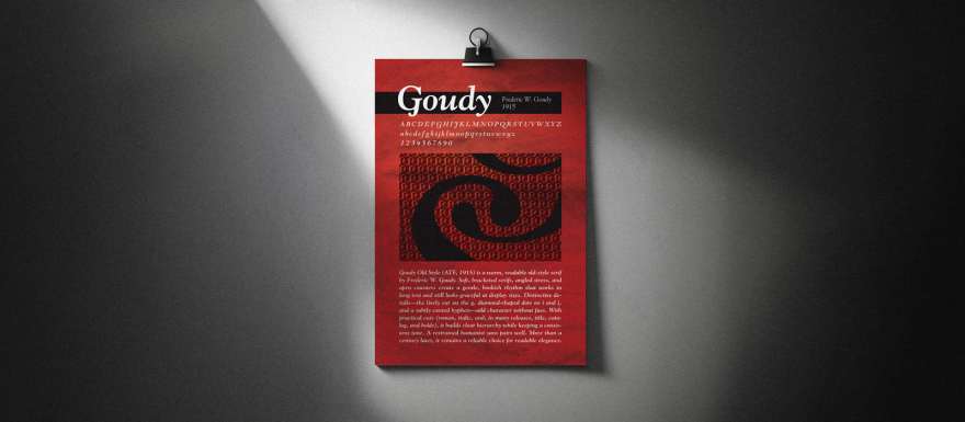
This project explores the visual DNA of Goudy through a typographic-only poster that treats letterforms as the graphic element. Guided by grid and Gestalt principles, the composition highlights Goudy’s warm old-style rhythm—open counters, bracketed serifs, angled stress—and how those traits scale for legibility.
Assignment scope
- Typeface name, designer, full A–Z / a–z, 0–9, and key symbols
- 3–6 sentence historical synopsis (research-based)
- Type + color only; no imagery
- Final size 11" × 17" with ⅛" bleeds, printed in color (matte/low-gloss)
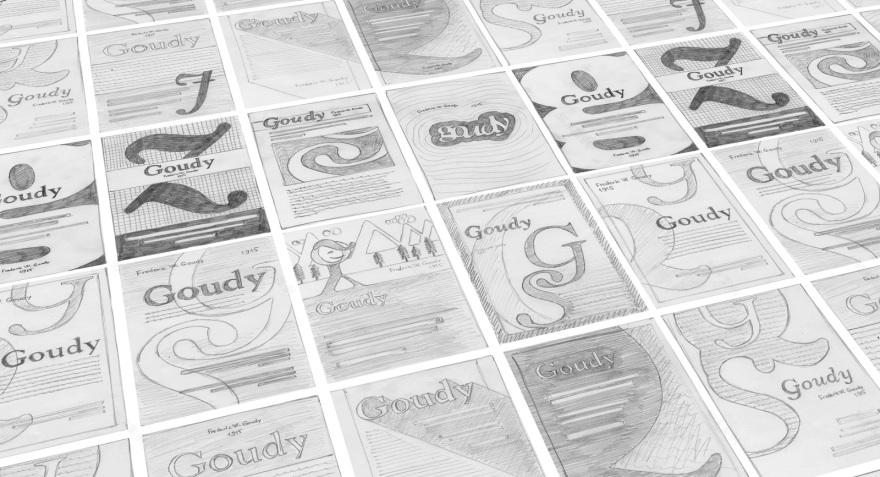
ProcessI began with a research checklist (designer, release context, unique letterform details, typical use cases), then generated 12 thumbnails to test hierarchy and rhythm using only type weight, scale, and spacing. From there I refined digital directions, made letter-size test prints and finalized a layout that foregrounds Goudy’s distinctive forms (notably the lively g, organic serifs, and readable text color) while reflecting contemporary usage.
FocusThe poster is an homage to Goudy’s bookish warmth and clarity—balancing historical character with modern typographic systems. Color is subtle but intentional, serving hierarchy and flow rather than decoration.
Specs & Tools
Tabloid 11" × 17" (vertical), ⅛" bleeds, print ready
Letter-size proof with marks/bleeds for critique
Built in Adobe Illustrator; test prints for optical adjustments
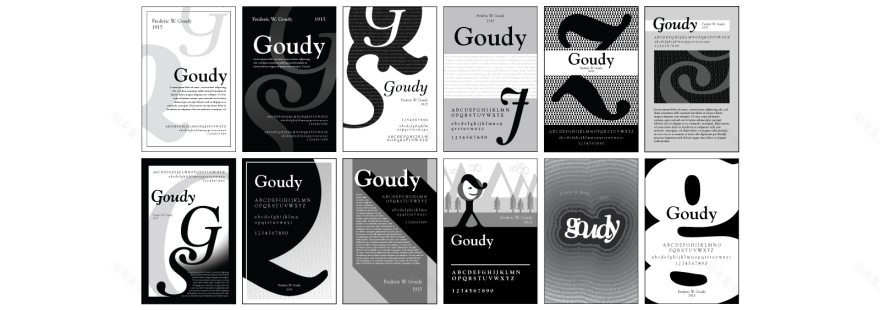
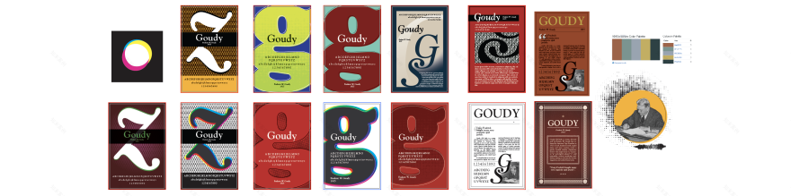
Color exploration
Final Posters
南京喵熊网络科技有限公司 苏ICP备18050492号-4知末 © 2018—2020 . All photos and trademark graphics are copyrighted by their owners.增值电信业务经营许可证(ICP)苏B2-20201444 苏公网安备 32011302321234号
苏公网安备 32011302321234号客服
消息
收藏
下载
最近