

创作上传
VIP
收藏下载
登录 | 注册有礼
查看完整案例

收藏

下载

分享
翻译
PHARMACY RENOVATION
DESIGNERS: Yasmine Khowessah, Lara El Naggar, Clara Alvarez
Date: 2025
PROJECT OVERVIEW
The task is to expand and renovate an existing pharmacy, integrating the garage into the retail space while maintaining the eco-friendly values the business wants to reflect.
SOFTWARES: AutoCAD, Sketchup, D5 render
INTERIOR SPACE ANALYSIS
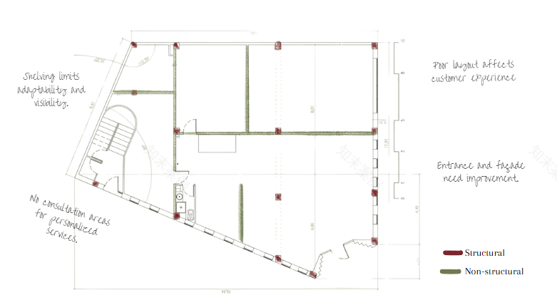
CONCEPT
A user-focused space with a central hub for service and consultation, surrounded by an open, flowing layout. The design encourages intuitive movement, accessibility, and personalized attention, creating an experience that is efficient.

PROPOSAL PLAN
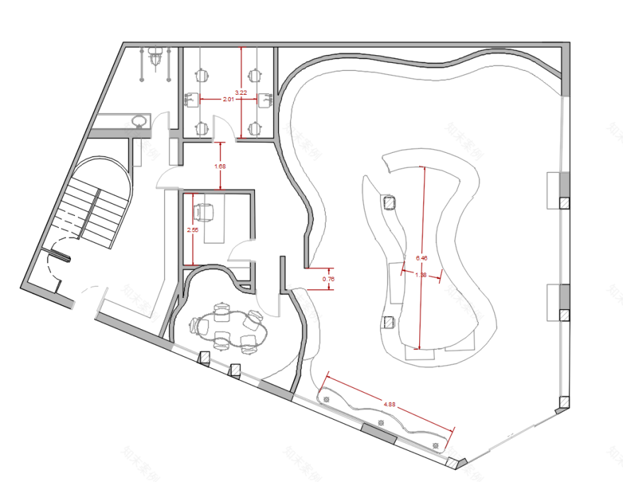
To carry out the renovation of the pharmacy, we began by identifying all the essential programmatic requirements: a reception area, a cashier station, a break room, a custom medication lab, the pharmacy owner’s private office, a staff meeting and workshop room for 5 to 8 people, and a bathroom. Additionally, the project had to include clearly defined product display sections:
First Aid / Cure and Care
Hygiene
Dermo
Dietetics / Nutritional Supplements
Phytotherapy / Aromatherapy
To address this, we structured the pharmacy into two main zones:
A public zone, organized around a central nucleus that serves as the cashier point, information desk, and also houses the prescription medication storage. This nucleus acts as the heart of the pharmacy, offering clarity, accessibility, and a sense of orientation.
A private zone, which includes the remaining functions: the laboratory, storage room, break room, bathroom, and office, as well as the meeting and workshop space.
One of the core goals was to ensure transparency and fluidity throughout the entire space. We introduced large windows across both zones, allowing clients to visually access all parts of the pharmacy, including the meeting room. This decision was grounded in a user-centric approach, where nothing is hidden, and users can feel part of the environment. To reinforce this, we designed the meeting room with curved walls, extending the same sense of softness and flow found in the public zone. This cohesive, open layout creates a welcoming, efficient, and transparent experience for both users and staff.
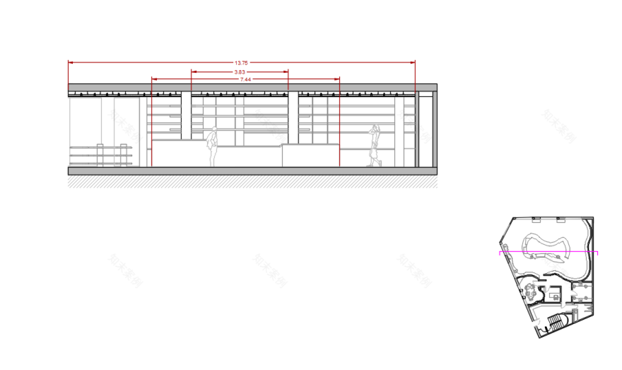
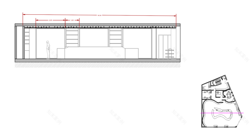
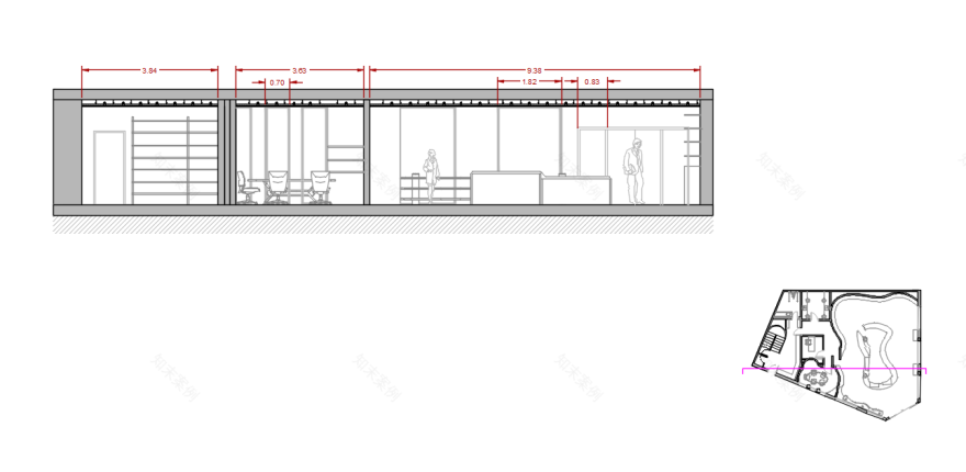
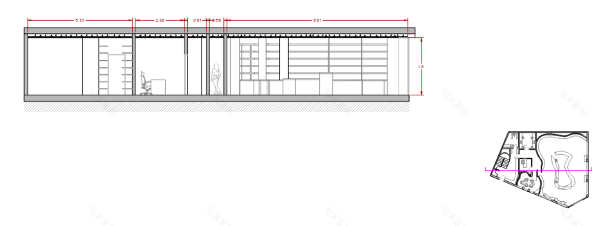
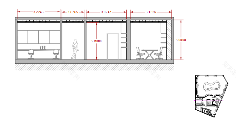
SECTIONS
Section A
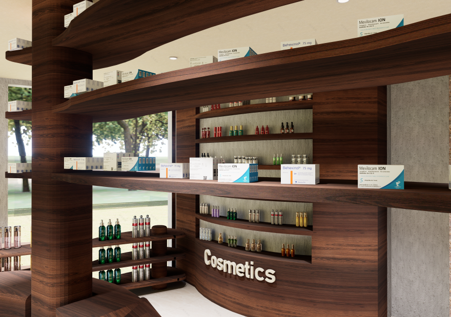
This section clearly illustrates how the columns were seamlessly integrated into the design, how the shelves remain visible from behind the central nucleus counter, and how the walls are fully lined with shelving to optimize product display throughout the space.
Section B
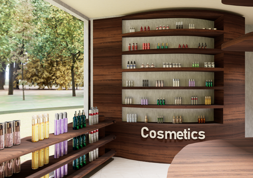
This section offers an alternate point of view, showcasing how the large windows shape the space and how shelves are strategically placed between each window. It highlights how nearly every part of the wall surface has been thoughtfully utilized, leaving minimal unused space.
Section C
This longitudinal section captures the viewpoint of a person standing and facing the entrance, offering a clear view of the window display. It also emphasizes the intentional use of large windows in the meeting room, designed to convey transparency and openness, ensuring that visitors feel a sense of trust and that nothing is concealed.
Section D
This is another longitudinal section, intended to illustrate how the walls are lined with shelves dedicated to product display, emphasizing the efficient use of vertical space and the integration of storage into the architectural design.
Section E
Finally, this section reveals the area of the pharmacy that is not accessible to clients. It highlights the emphasis placed on the functional aspects of the design, ensuring that all necessary elements for the efficient operation of the pharmacy are thoughtfully integrated and present.
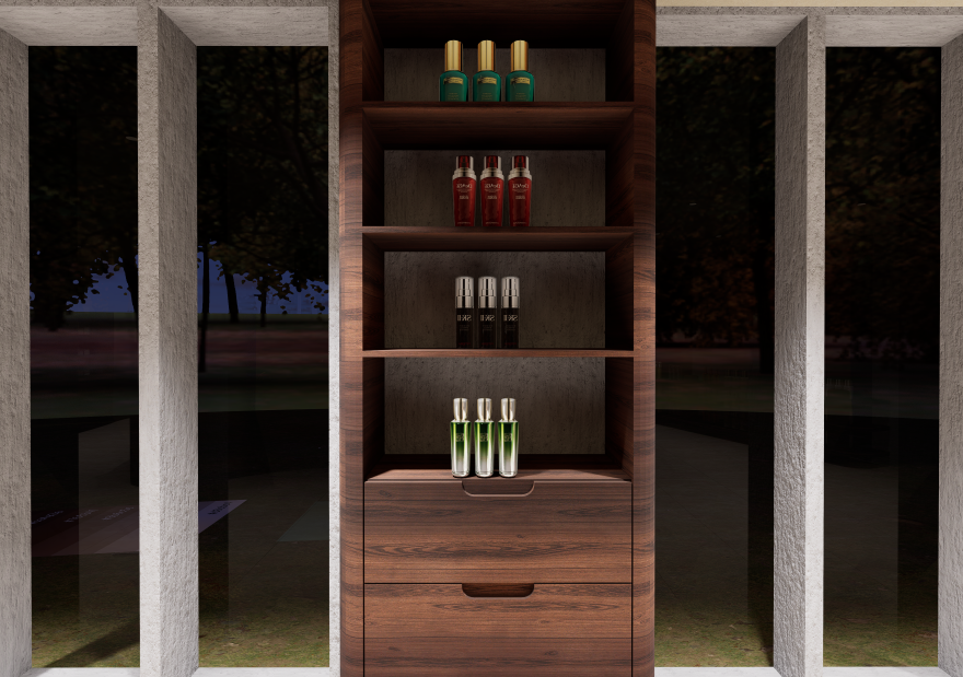
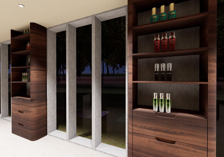
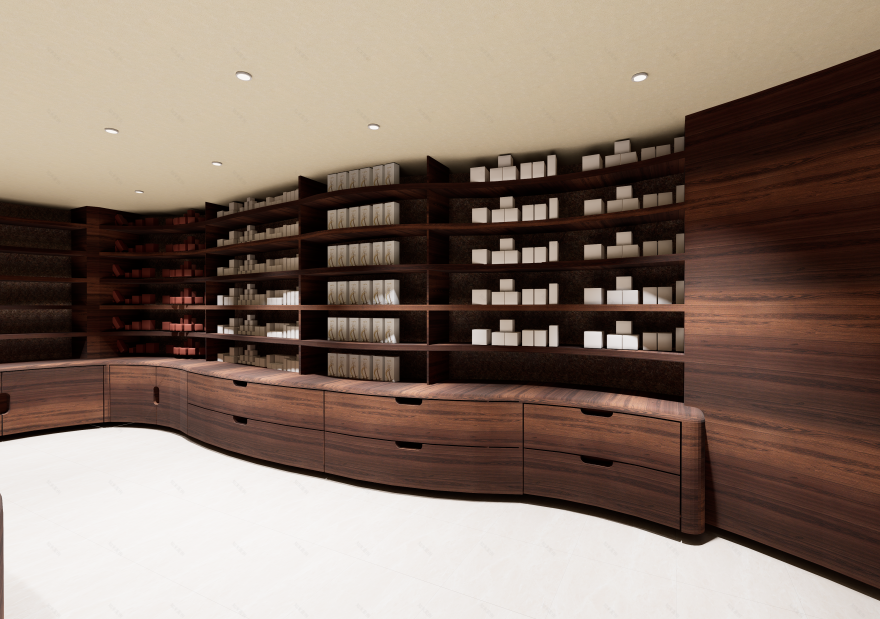
FURNITURE DETAIL
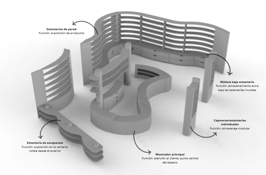
The furniture proposal aims to reinforce the spatial identity of the new pharmacy through a fluid, continuous, and organic design. Straight lines and closed volumes have been avoided in favor of curved shapes that guide the user along their path and create a friendlier, more welcoming atmosphere. Beyond aesthetics, the design focuses on ensuring functionality, spatial integration, and optimized storage, while respecting ergonomics and facilitating the work of the pharmacy staff.
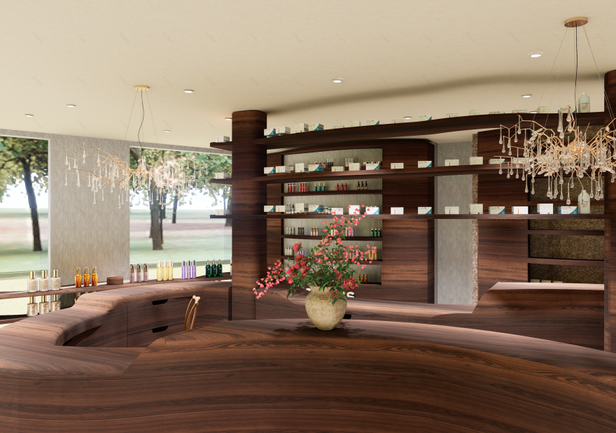
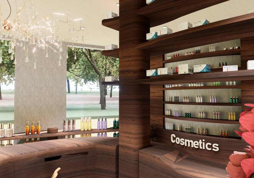
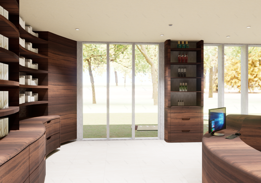
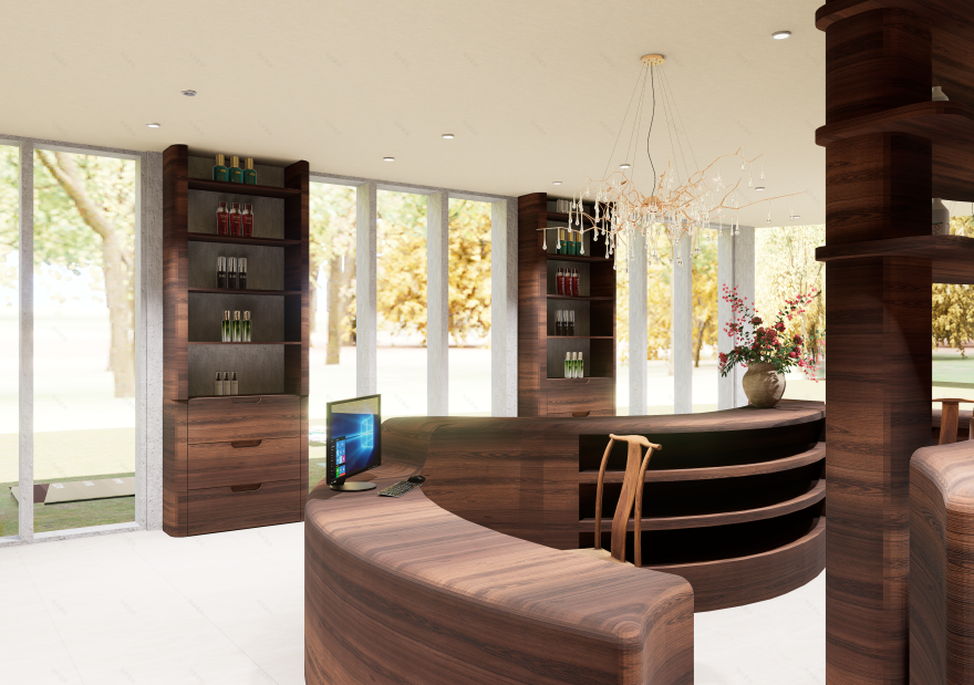
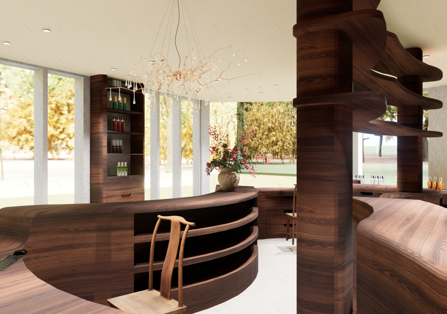
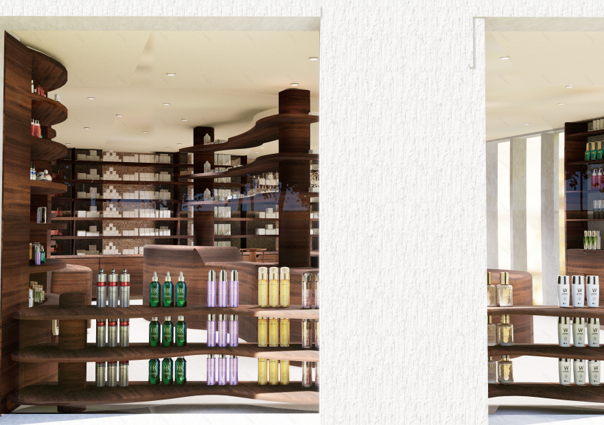
RENDERS
These renders were created to provide a comprehensive understanding of the overall design of the pharmacy and to offer a realistic visualization of how the space would look once built. They also showcase the selected materials, helping to convey the intended atmosphere and aesthetic.
南京喵熊网络科技有限公司 苏ICP备18050492号-4知末 © 2018—2020 . All photos and trademark graphics are copyrighted by their owners.增值电信业务经营许可证(ICP)苏B2-20201444 苏公网安备 32011302321234号
苏公网安备 32011302321234号客服
消息
收藏
下载
最近