

创作上传
VIP
收藏下载
登录 | 注册有礼
查看完整案例

收藏

下载

分享
翻译
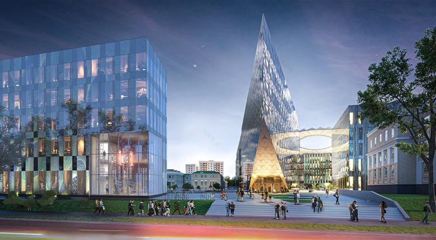
The famous “Bauman University” has always been one of the country’s key centers of scientific potential. However, in the near future, thanks to a new development concept focused on innovation and breakthrough research, the institute will become a true science city of the future within the capital. Alongside educational innovation, the appearance of Bauman University will also change: a stylish campus and a large-scale scientific cluster will be added to the historic buildings.For this large-scale joint project between Bauman Moscow State Technical University and the Moscow City Committee for Architecture and Urban Planning, we developed the general principles of the wayfinding system and adapted them to the individual identity of each specialized building and zone within the future cluster.
Сampus
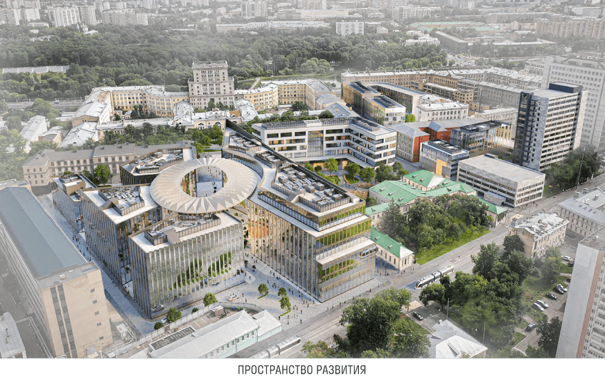


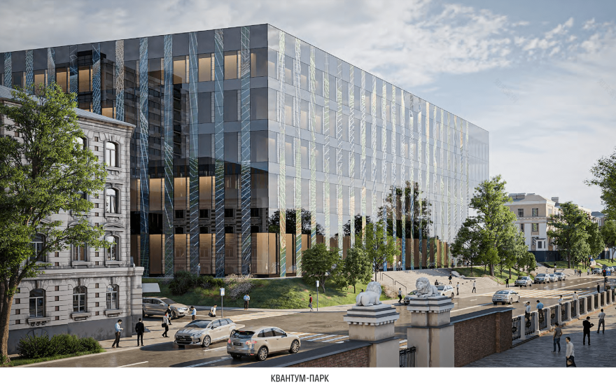
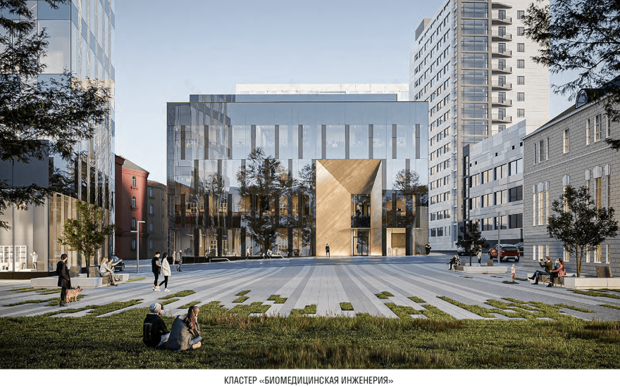
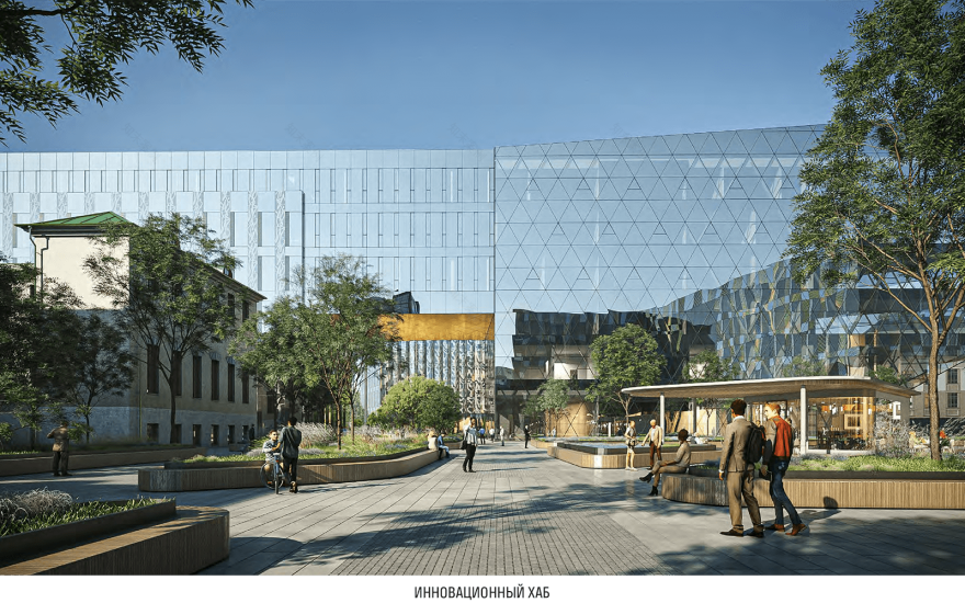
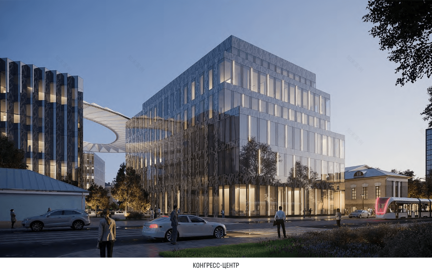
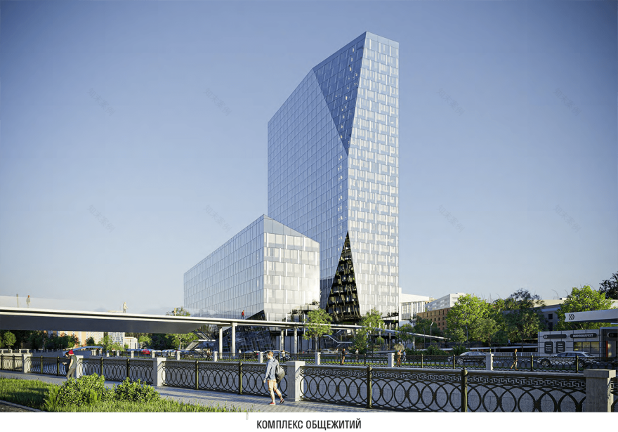
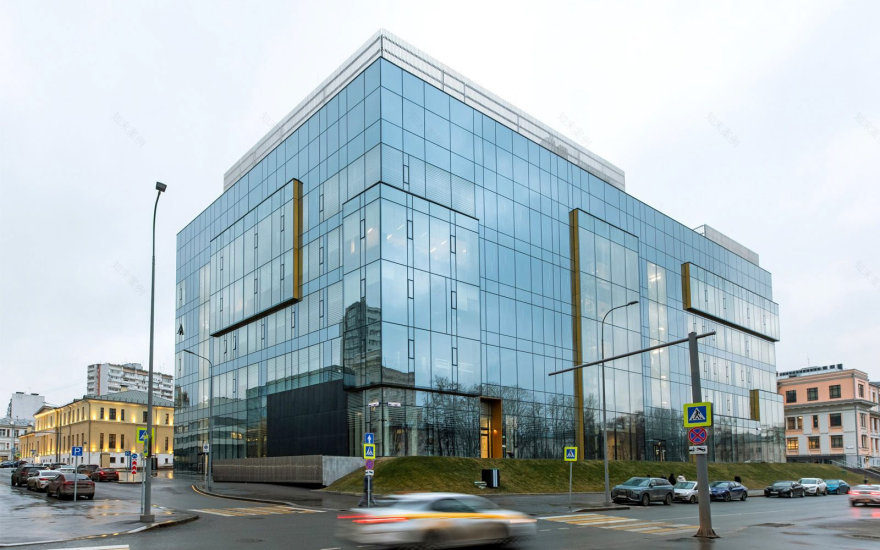
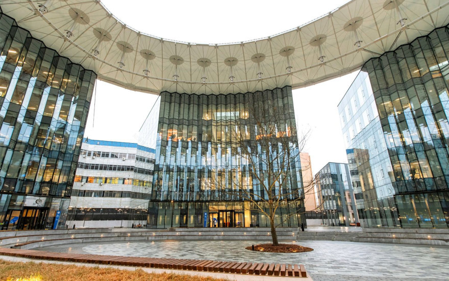
The development concept for the territory of Bauman Moscow State Technical University (MSTU), which is planned to be fully completed in 2024 (work has already begun), is the largest university science campus project in recent years: • 170,000 sq. m of new space, • restoration of historical monuments, • 7 land plots being developed (including previously inaccessible areas to the public), • 14 modern buildings, whose contemporary design adorns the progressive capital’s skyline.Among the new buildings included in the project are: • The Federal (National) Testing Center of MSTU named after N. E. Bauman, • Digital Transformation Cluster (Bauman Digital World), • Innovation Hub, • Multifunctional Technological and Scientific-Educational Complex “Quantum Park,” • Exhibition and Educational Media Space “Palace of Technologies,” • Multifunctional Library Complex, • Scientific and Educational Clusters “Arctic Technologies,” “Defense Technologies,” and the Bauman Aerospace Cluster, • Center of Excellence and Scientific-Educational Cluster “Digital Materials Science: New Structural and Functional Materials,” • Building of the Biomedical Systems and Technologies Center, • Engineering Center for Ground Transport and Technological Systems, • Cultural and Leisure Center (“Art Club”), • Congress Center, • Dormitory Complex.

Zoning and numbering
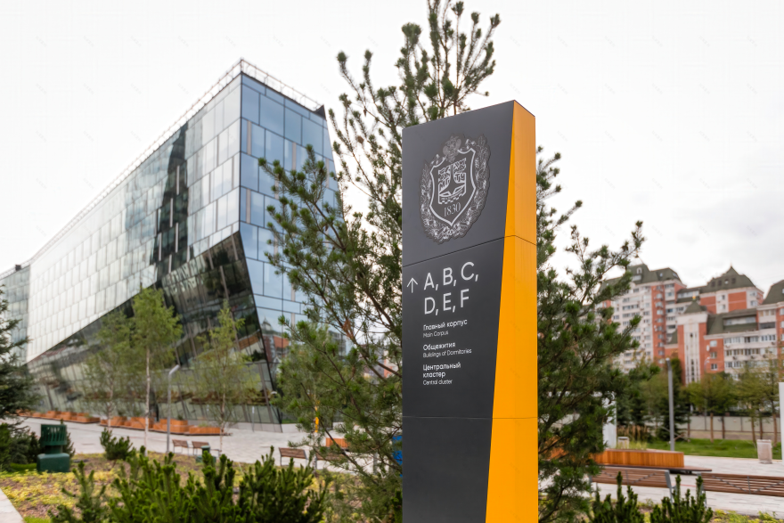
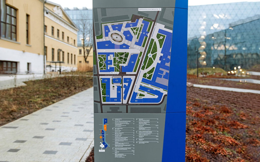
Since the Bauman innovative campus project involved not only the construction of new buildings but also the development of green spaces between them, it was important for us to address several key points:— Ensure the “recognizability” of the buildings (according to their purpose and assigned numbering),— Indicate the most accessible routes for visitors to move between them,— Simplify navigation inside the buildings themselves,— Create a unified wayfinding design that unites all elements of the cluster while allowing for personalization.
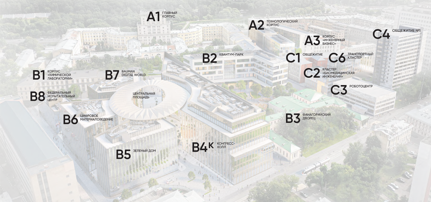
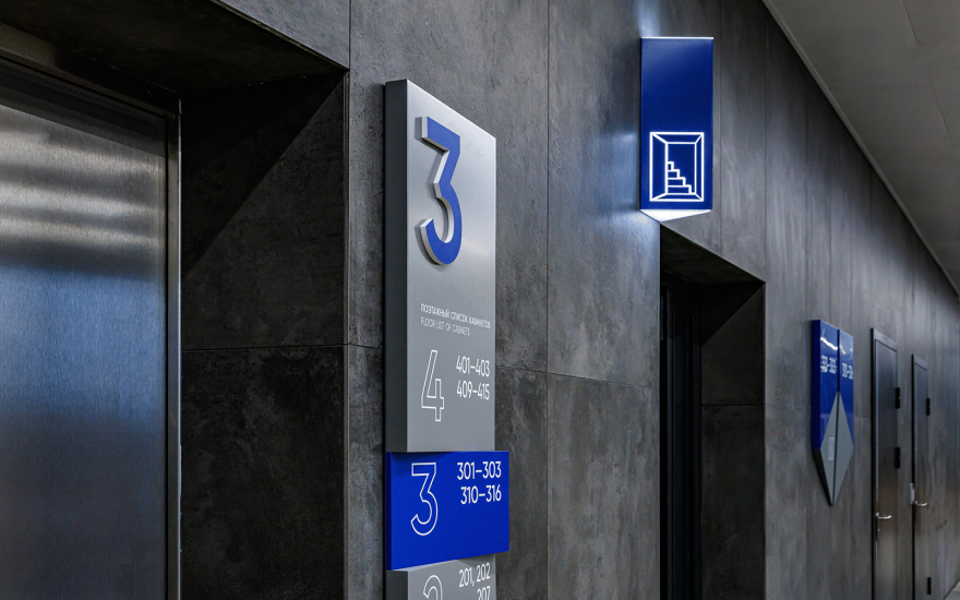
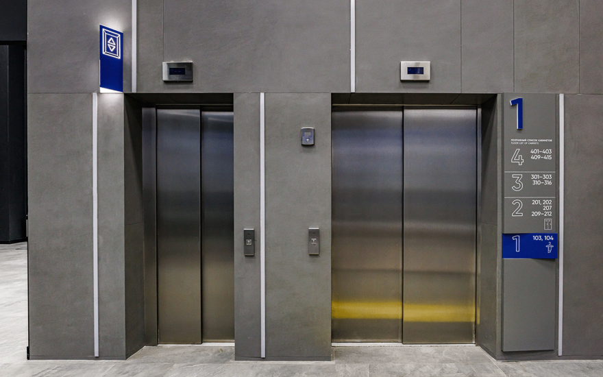
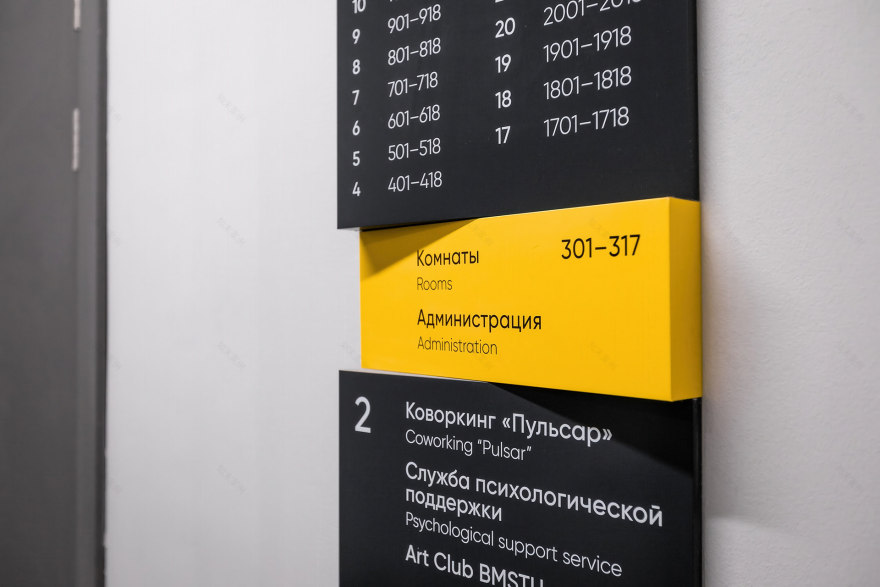
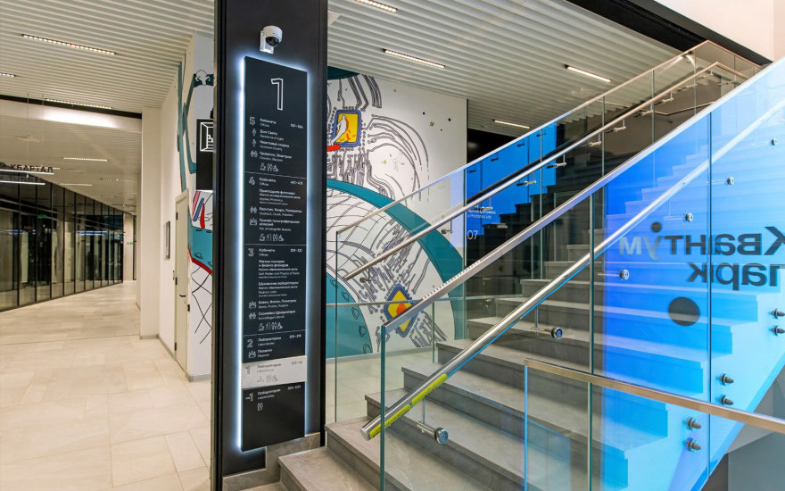
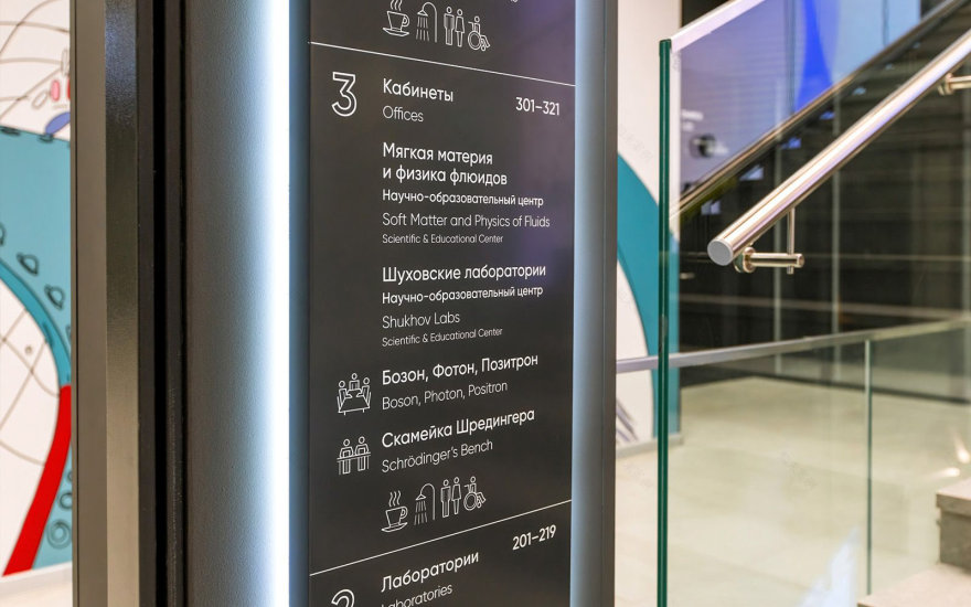
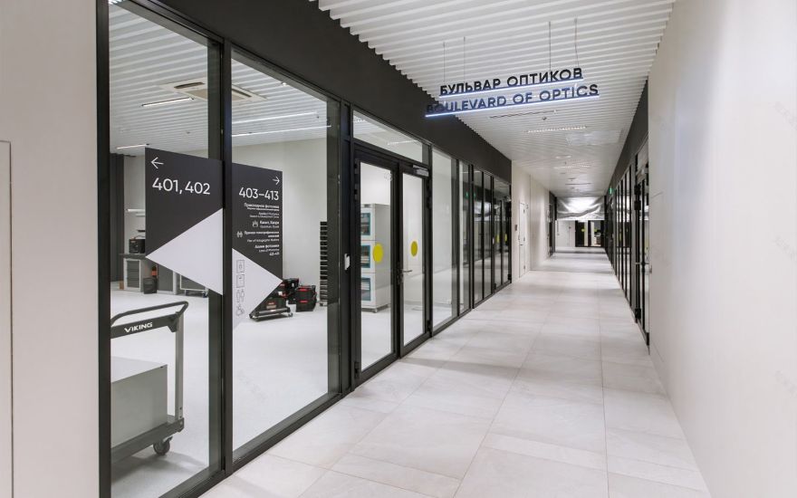
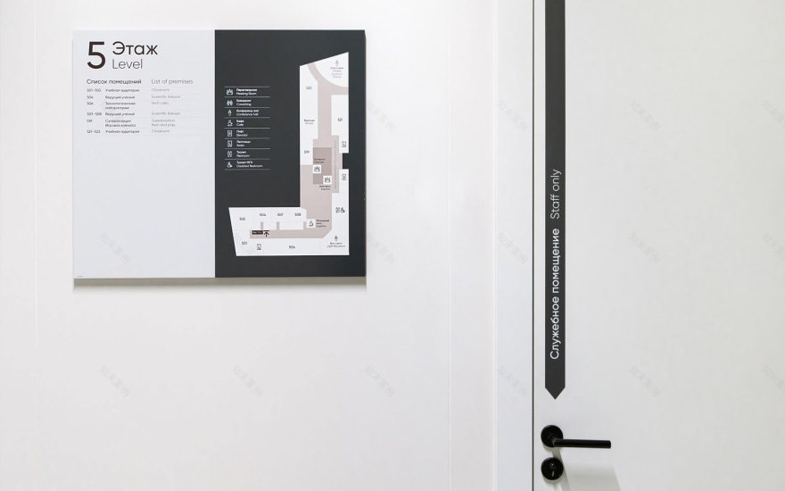
We developed a comprehensive zoning and numbering system that covers not only the new buildings but the entire complex, including dormitories, student administration, and existing academic buildings. For ease of navigation, all clusters are divided into their own zones, and each building is assigned a sequential number. This simplifies orientation between buildings through concise alphanumeric designations.
Design code

The color concept of the new information media is based on the colors of the university’s historic logo — noble blue and rich orange. The calm blue has become the key color for both internal and external navigation within the academic buildings, while the cheerful orange brightens the atmosphere in the student dormitory areas. The university’s “own” colors — deep gray, white, and metallic — have also been adopted for the new research-oriented buildings (“Quantum Park,” “Palace of Technologies,” testing center, etc.).
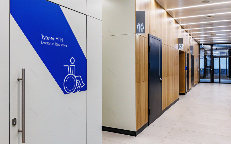
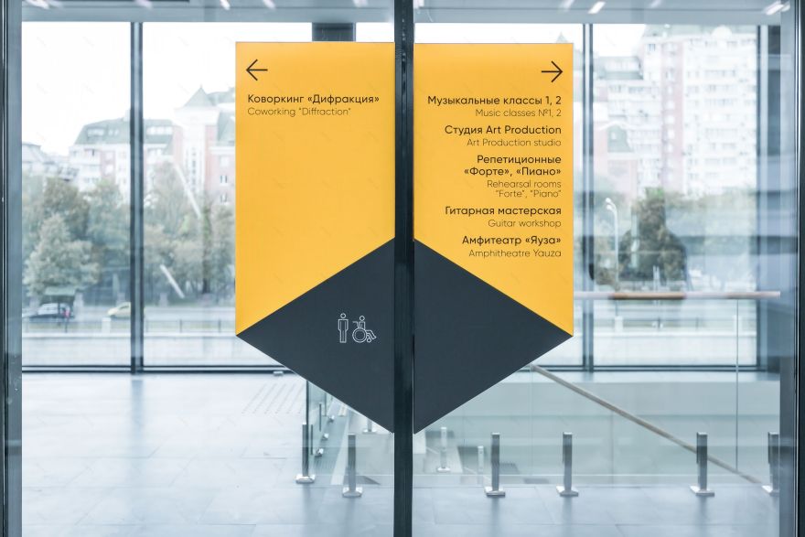
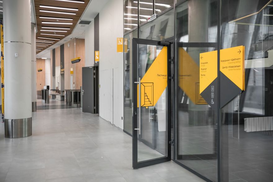
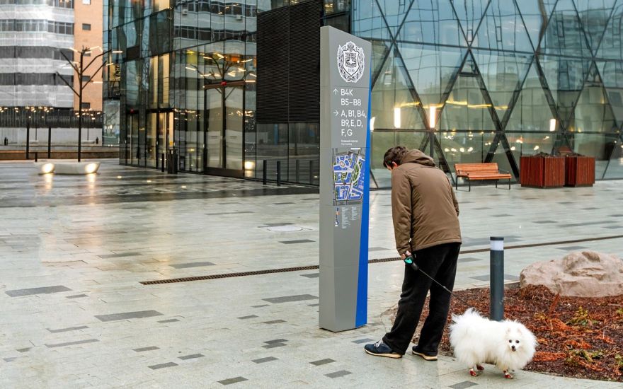
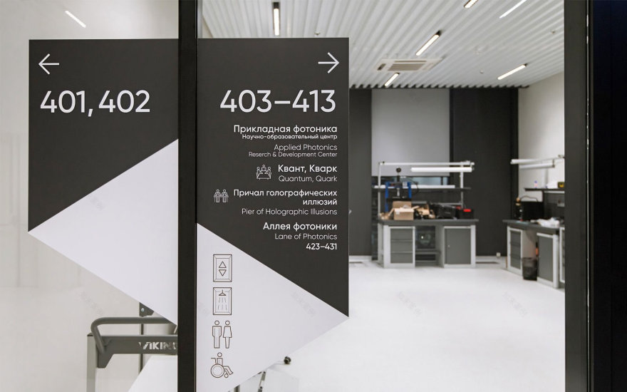
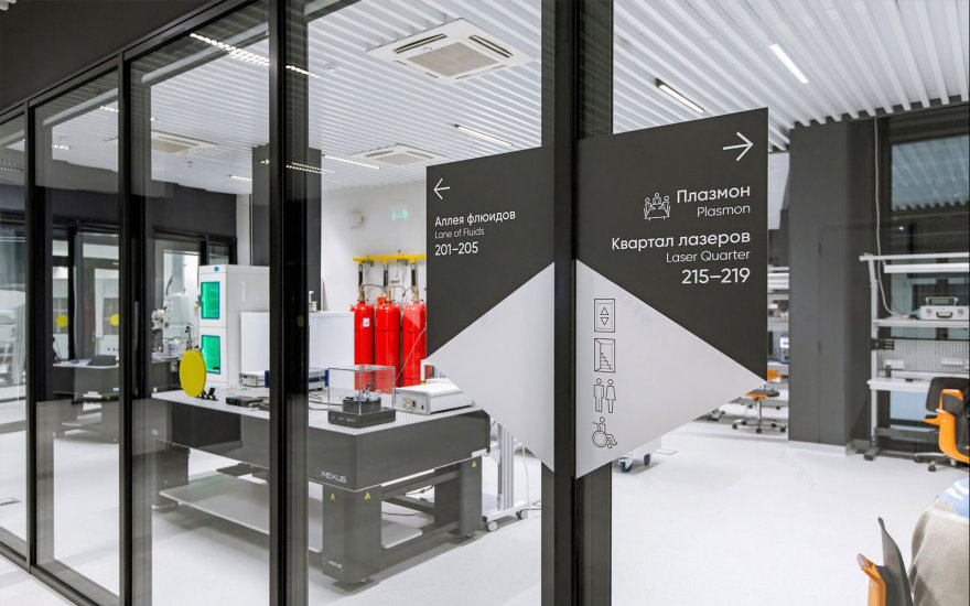
For external wayfinding, we designed:— Street steles that are bright, massive, and visible from a distance, featuring maps, directional signs, and building names,— Markers for main and service entrances, as well as doors for visitors with limited mobility,— Designations of parking zones.
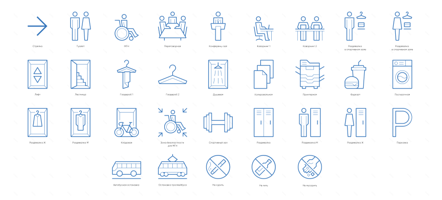
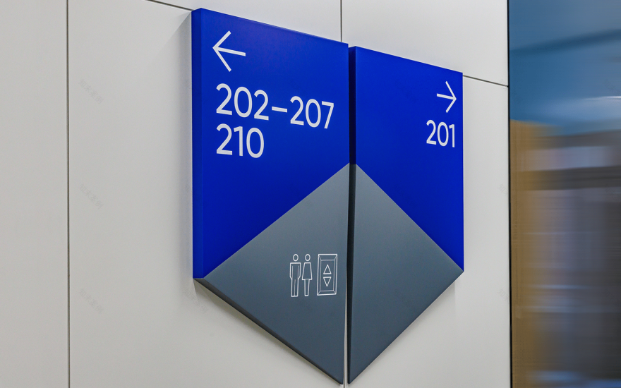
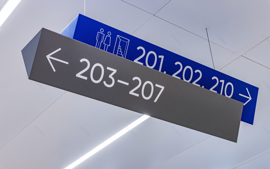
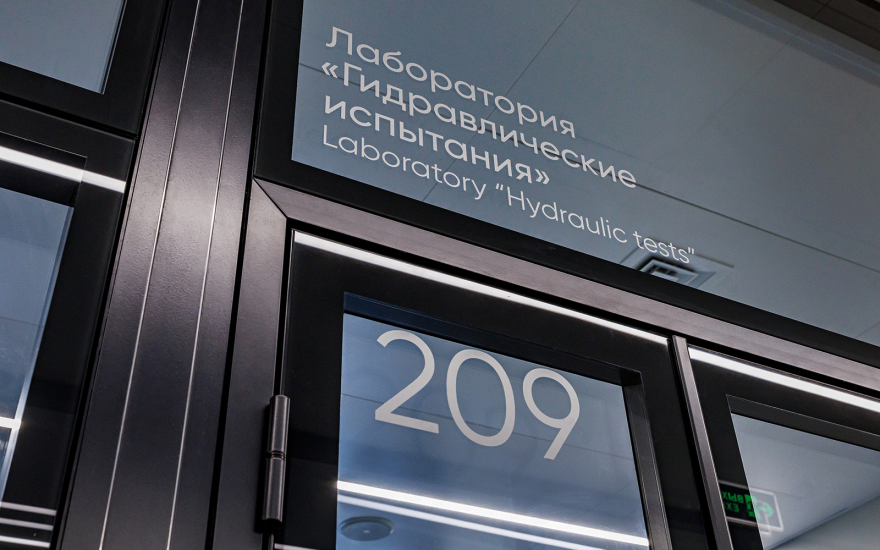
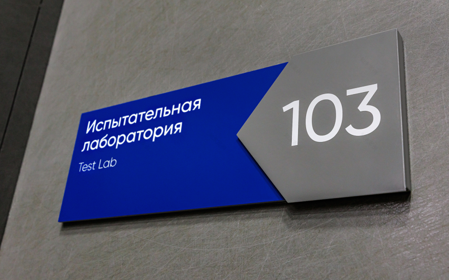
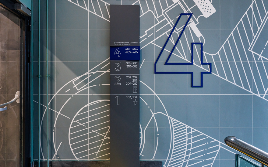
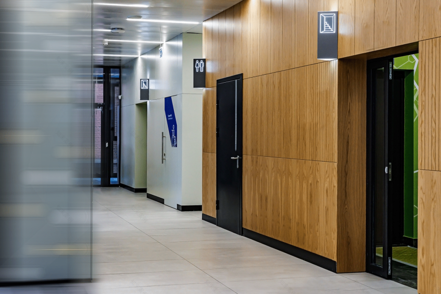
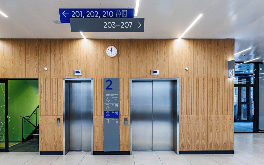
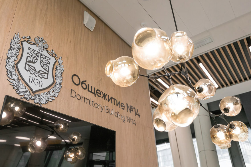
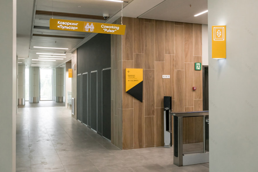
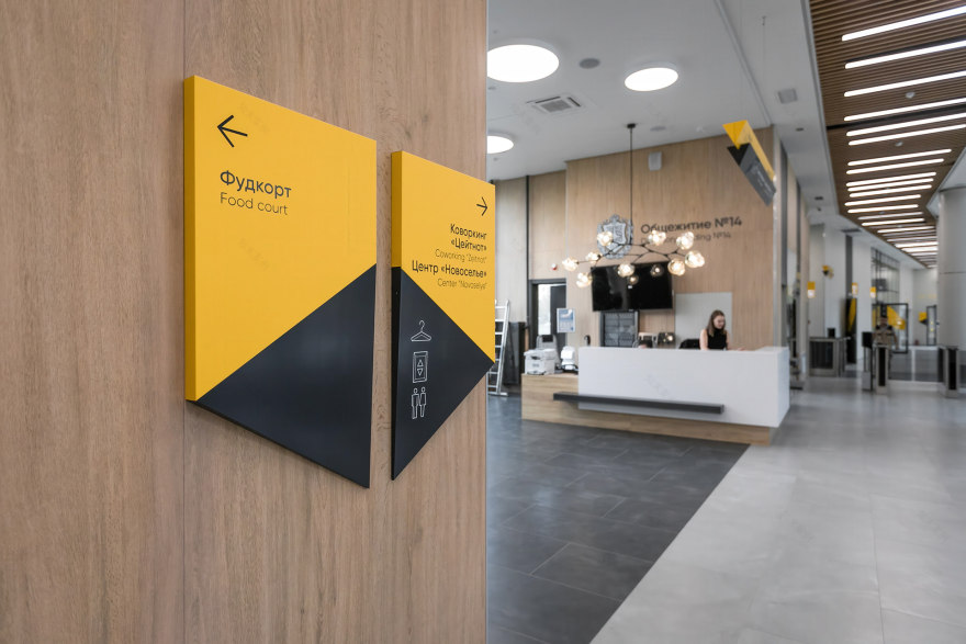
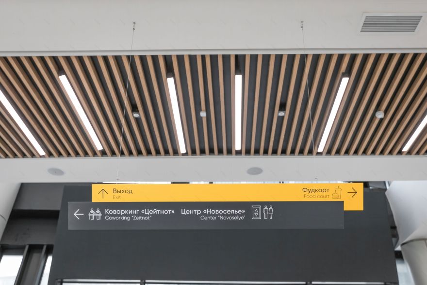
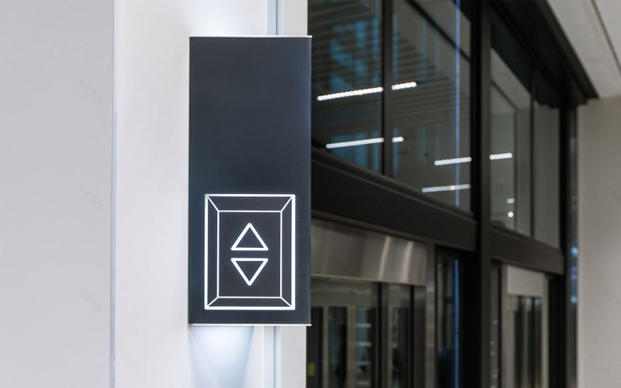
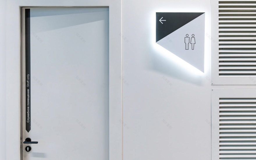
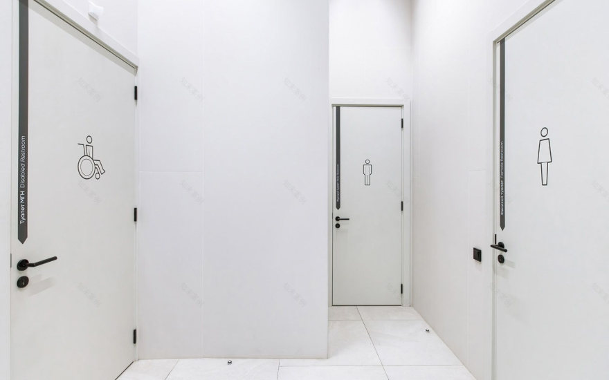
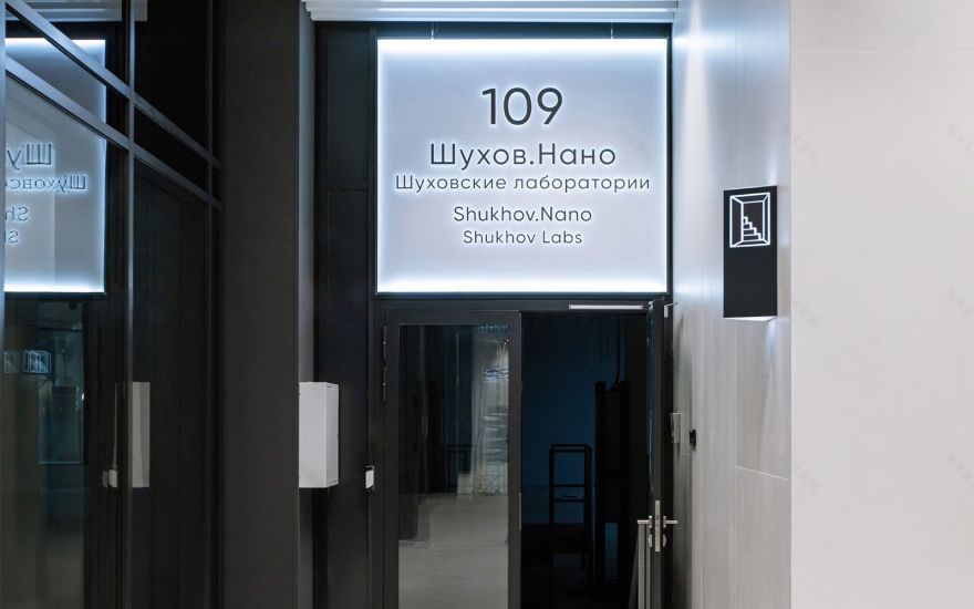
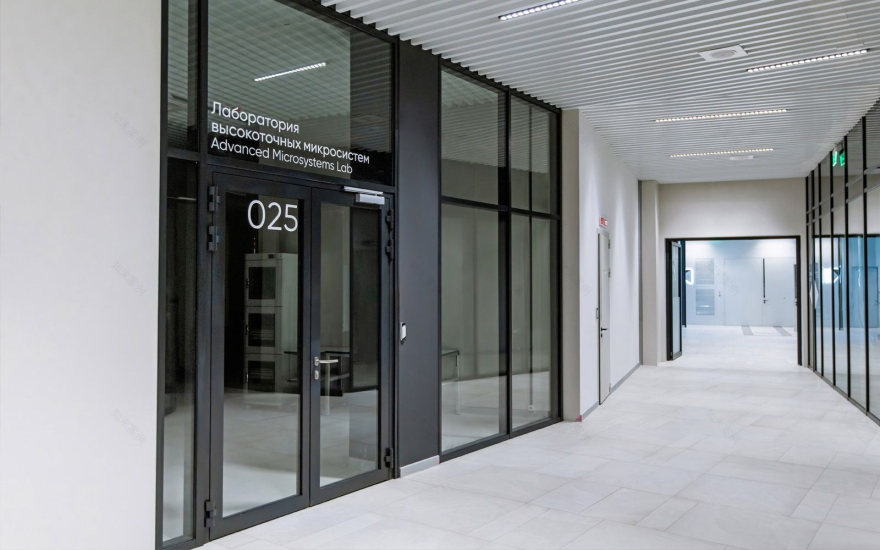
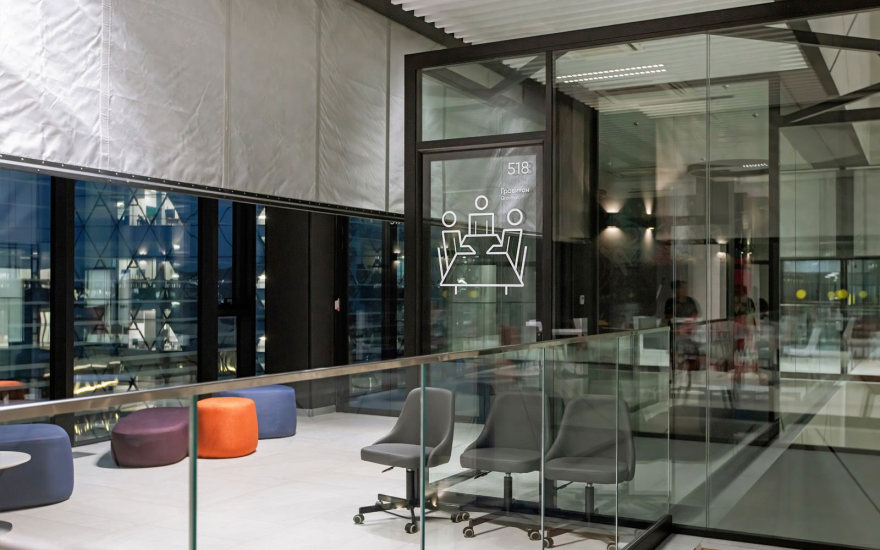
For internal wayfinding:— Wall-mounted directional signs,— Navigation inside and outside elevators (floor lists, elevator markers in the form of panel brackets on walls, floor indicators),— Hanging zoning signs (cafes, cloakrooms, themed sections inside research buildings, etc.),— Service area signs (restrooms, staff rooms),— As well as so-called “end-point markers”: room numbers and names for classrooms, offices, conference halls, and others. Depending on the design solutions of the buildings, different options were provided: stickers on glass, classic plaques, and plaques with interchangeable parts that allow changing the room name if necessary.
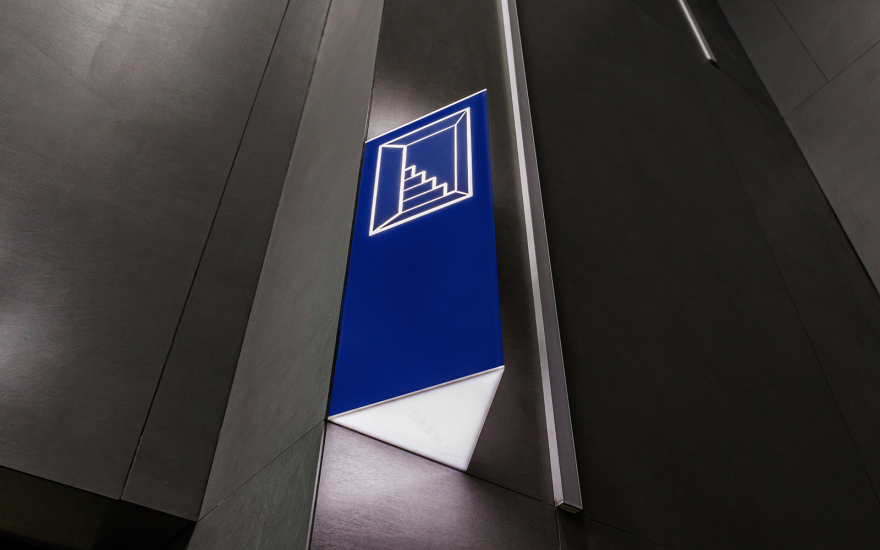

The most successful, yet simple, clear, and effective design element for navigation in the new buildings became the triangle-arrow, which stands out most prominently in the wall panels indicating directions.This idea was so well received by the client that the “triangle theme” became central to the additional decoration of public areas: triangles appeared in the finishing of glass walls and partitions, in the design solutions of stair railings, and so on.
In this project, where the newly designed buildings—perfectly crafted according to the latest global architectural trends—looked stylish yet sometimes impersonal, the navigation solutions developed, produced, and installed by our agency became a striking design accent within the carefully balanced, highly neutral interiors.
Dormitories

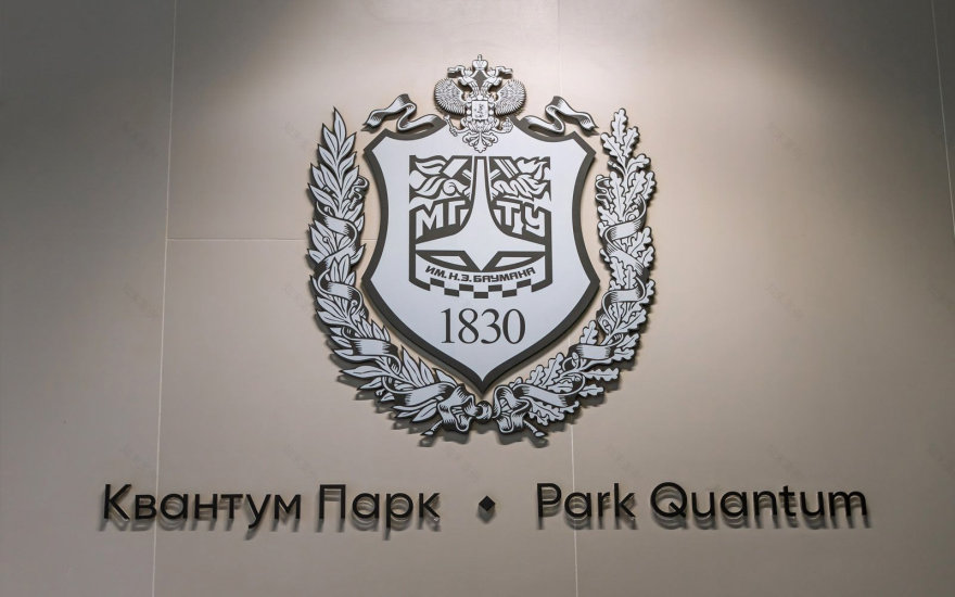
Quantum Park


–––––––––––––––––––––––––––––––––––––––––
Credits:Art Direction: Marina SlobodyaninaLead Designer: Olga Poplavskaya, Elena Gey, Marina Vorobyeva
Design Team: Sasha Tikova, Olga GorbushinaMap Design: Alexander Pivovarov
Icon Design: Marina Novikova
Analytics Direction: Ekaterina Moskaleva
Analytics: Nikita Dolgishev
3D visualization: Oleg Mushta
Project Management: Anastasiya MikhalevaСase Presentation: Alisa Kharas
ZLT group, 2025
南京喵熊网络科技有限公司 苏ICP备18050492号-4知末 © 2018—2020 . All photos and trademark graphics are copyrighted by their owners.增值电信业务经营许可证(ICP)苏B2-20201444 苏公网安备 32011302321234号
苏公网安备 32011302321234号客服
消息
收藏
下载
最近