

创作上传
VIP
收藏下载
登录 | 注册有礼
查看完整案例

收藏

下载

分享
翻译

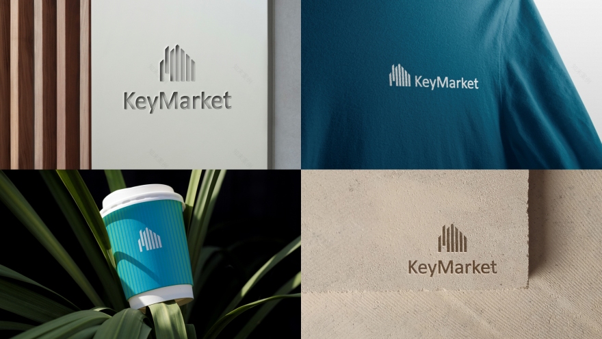
KEYMARKET is a real estate brand built around the idea of structure and space.The logo represents a house formed from vertical elements — combining architectural logic
with a clear visual rhythm.One element is intentionally shifted, creating both a chimney and an entrance — a subtle but distinctive detail.This modular approach becomes the foundation for the entire identity system.
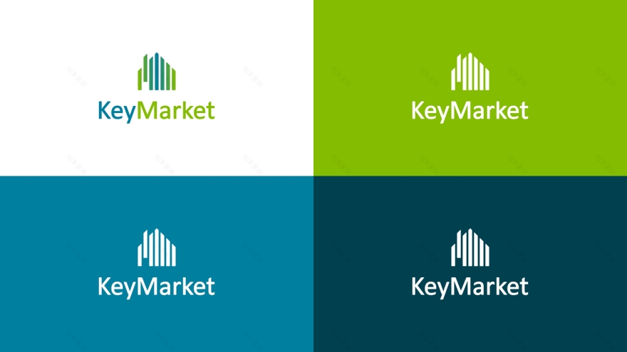
The logo is based on vertical modular elements, referencing both natural forms and architectural structures.
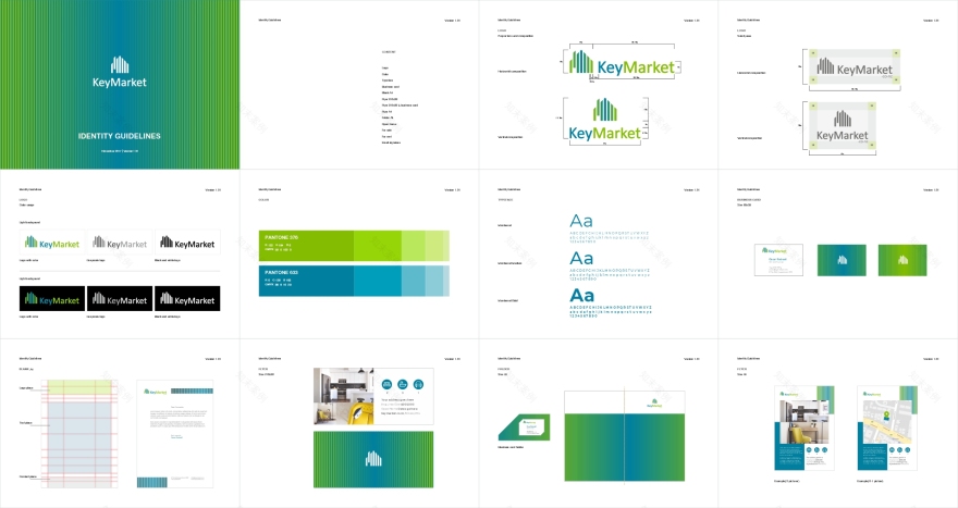
A flexible identity system was developed, including color, typography, and modular grid.
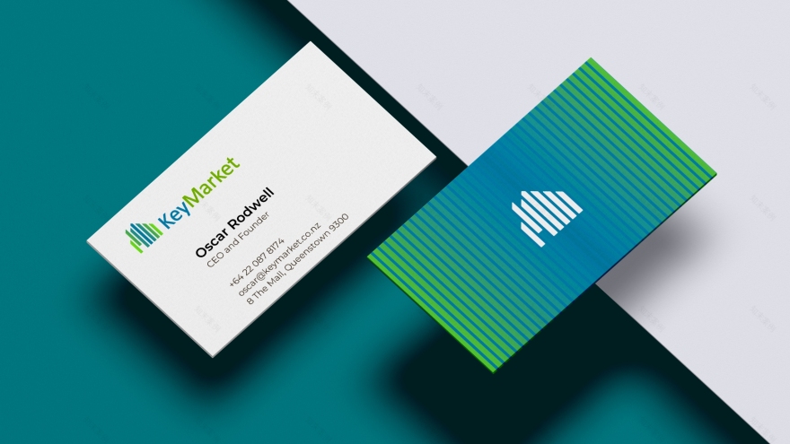
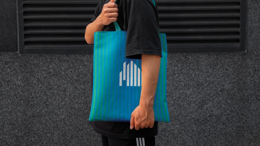
The striped pattern becomes a key element of the system, creating rhythm and visual continuity across all applications.
The identity is applied across different touchpoints — from print materials to branded objects.

The concept is designed to extend into space.The vertical structure of the logo naturally translates into architectural elements such as fасades,
panels, and spatial rhythms.
A cohesive visual system that connects branding with spatial thinking, ready to be developed
into real-world environments.
From identity to space — a system ready for real-world implementation.

南京喵熊网络科技有限公司 苏ICP备18050492号-4知末 © 2018—2020 . All photos and trademark graphics are copyrighted by their owners.增值电信业务经营许可证(ICP)苏B2-20201444 苏公网安备 32011302321234号
苏公网安备 32011302321234号客服
消息
收藏
下载
最近