

创作上传
VIP
收藏下载
登录 | 注册有礼
查看完整案例

收藏

下载

分享
翻译
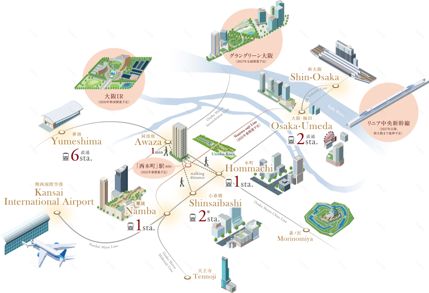


This location map was created for real estate marketing to clearly communicate urban accessibility and surrounding city functions.
Major stations, airport access, and redevelopment areas are organized into a simple and intuitive visual structure, allowing viewers to quickly understand distance and connectivity.
To improve readability, complex transportation information is simplified using color-coded routes, minimal icons, and generous white space.The calm color palette and typography were carefully selected to maintain a premium and trustworthy tone suitable for real estate advertising.
The illustration is designed for use across multiple media, including brochures, advertisements, and websites.
新築分譲マンションの立地訴求のために制作したロケーションマップです。主要駅・空港・再開発エリアなどの都市機能を整理し、距離感とアクセス性が直感的に伝わるビジュアルを目指しました。
複雑になりがちな交通情報は、色分けした路線・シンプルなアイコン・余白設計により視認性を向上。不動産広告としての信頼感と上質感を意識し、落ち着いたカラーリングとタイポグラフィで統一しています。
パンフレット・広告・WEBなど複数媒体での使用を想定し、情報量と可読性のバランスを重視して設計しました。
南京喵熊网络科技有限公司 苏ICP备18050492号-4知末 © 2018—2020 . All photos and trademark graphics are copyrighted by their owners.增值电信业务经营许可证(ICP)苏B2-20201444 苏公网安备 32011302321234号
苏公网安备 32011302321234号客服
消息
收藏
下载
最近