

创作上传
VIP
收藏下载
登录 | 注册有礼
查看完整案例

收藏

下载

分享
翻译
Mastercard
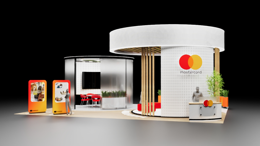
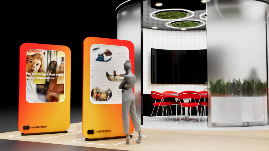
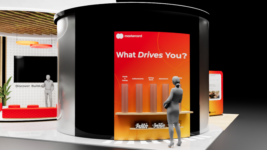
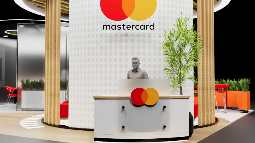
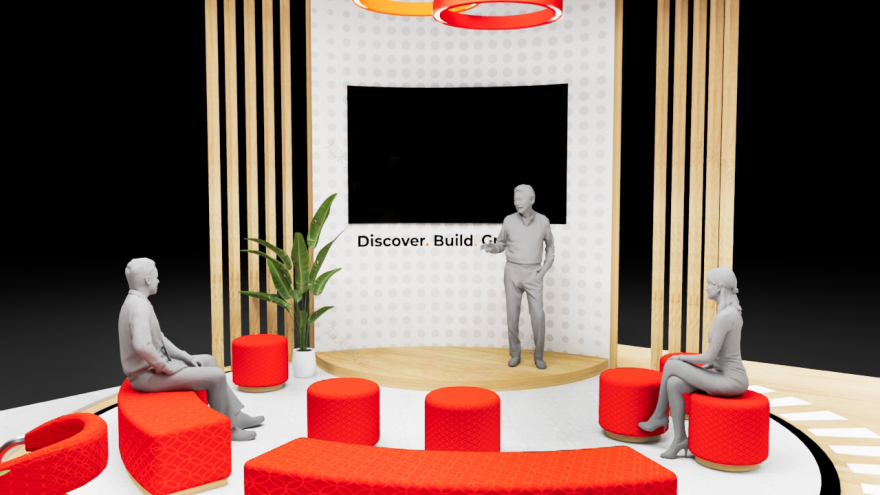
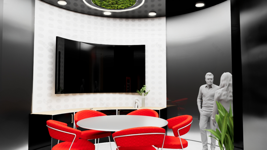
For this analogous color study, I designed a 30x40 booth for Mastercard using colors from their logo: red, red-orange, and yellow. I applied the 60-30-10 rule to balance the space: neutrals like white, gray, and soft wood grounded the design, while the brighter hues popped in furniture, gradients, and interactive elements. The booth’s circular form mirrors Mastercard’s overlapping logo shapes, reinforcing brand identity through the layout. I created a presentation zone under the main circle, framed with vertical wooden slats, and arranged seating to encourage conversation. Touchscreens and activations let attendees engage directly with the brand, while frosted glass added privacy to the conference room without disconnecting it from the rest of the space. The goal was a space that felt open, dynamic, and visually tied to Mastercard’s identity.


南京喵熊网络科技有限公司 苏ICP备18050492号-4知末 © 2018—2020 . All photos and trademark graphics are copyrighted by their owners.增值电信业务经营许可证(ICP)苏B2-20201444 苏公网安备 32011302321234号
苏公网安备 32011302321234号客服
消息
收藏
下载
最近