

创作上传
VIP
收藏下载
登录 | 注册有礼
查看完整案例

收藏

下载

分享
翻译
Unreal
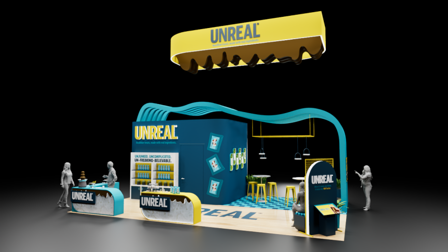
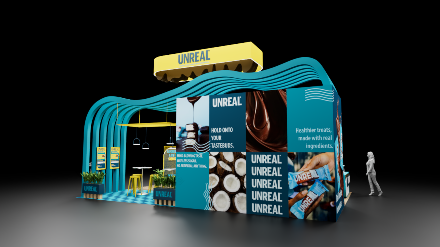
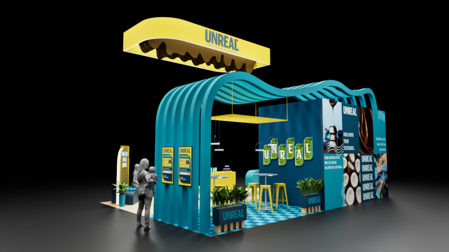
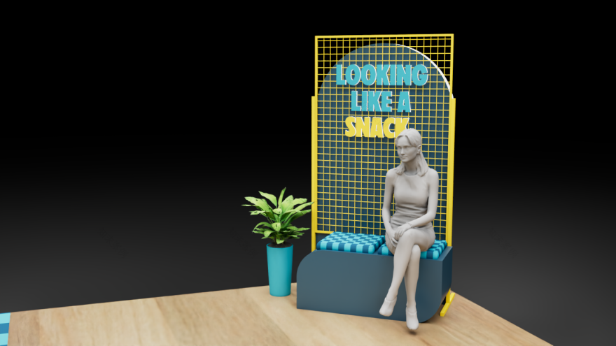
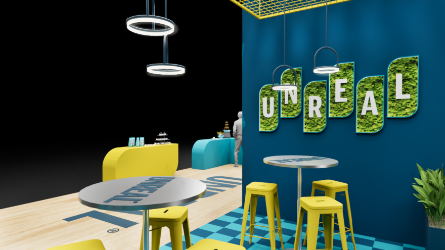
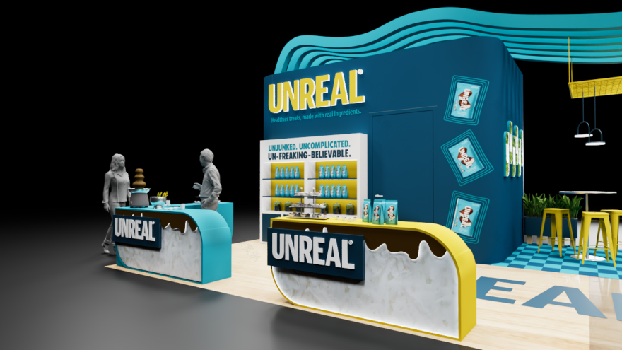
For this Color Study, I used complementary colors to build out a branded exhibit space. I chose Blue and yellow from the Munsell hue circle. My goal was to explore how a complementary color harmony can shape mood, hierarchy, and the overall flow of an immersive environment. I created a playful and energetic booth concept for UNREAL, a brand known for making better-for-you treats. I wanted the space to feel bold and fun, while still staying clean and approachable. The blue and yellow pairing became the backbone of how the booth communicates the brand’s personality. I used deep blues as the main structural color to create stability and ground the layout. The yellow accents act as the complementary highlight because of their brightness and vibrancy. This allowed the yellow elements like the signage, lighting frames, and brand moments to stand out without overwhelming the space, naturally guiding visitors toward key areas like the sampling counters and interaction points. I kept everything grounded with quick hits of black, white, and other neutrals to keep the palette balanced and consistent.

南京喵熊网络科技有限公司 苏ICP备18050492号-4知末 © 2018—2020 . All photos and trademark graphics are copyrighted by their owners.增值电信业务经营许可证(ICP)苏B2-20201444 苏公网安备 32011302321234号
苏公网安备 32011302321234号客服
消息
收藏
下载
最近