查看完整案例

收藏

下载

翻译
Boutique entrance
Hanging system detail
Accessories
Lighting
shoes area
Cash desk
Window display
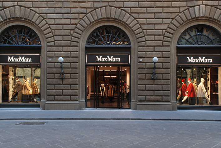
Exterior facade, Via Tornabuoni
Exterior facade, Via Tornabuoni
Inside an exceptional historical context right in the center of one of the most famous cities worldwide, DUCCIO GRASSI ARCHITECTS redesigns and renews the MAX MARA boutique of Florence, on the exclusive Tornabuoni Street, in an ancient building that describes its own history through precious frescoes and antiquities.
Outside, the project consists in a simple redesign of the shop windows' logo: simple and elegant black metal signs, with a few lines of light enhancing the sixteenth-century arches of the traditional façade.
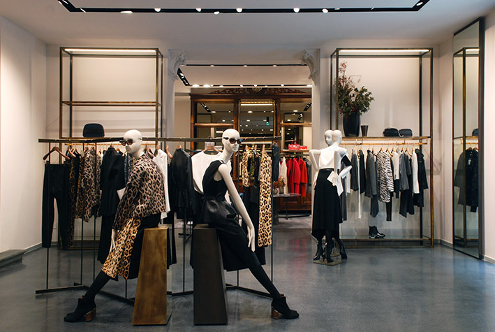
Accordingly, DGA designed a project to highlight the historical and artistic features of the building also for the interiors, focusing on details.
The general appearance results in a sophisticated mix of ancient and contemporary elements: the old fashioned Venetian flooring recalls the Italian history and thanks to its homogeneity it values the existing elements in Serena stone, a typical Tuscan material.
DGA paid special attention to the layout: all space is designed to create specific perspectives that let the different zones stand out without a physical division, enhancing the spaces of the existing structure.
This location was previously a library, very popular among the Anglo-Saxon community in Florence; as the large library cases that dominate the central hall testify. These exquisite pieces of furniture were restored and converted in an elegant accessories display, enriched by precious details of glass and brass. Their dimensions and proportions are recalled by wide metal structures at the entrance: those elements point to the main hall and shape the space without weighing the general look, still dominated by the subtle colors of the ancient wall
decorations.
Also the cash desk follows this path: a wide metal volume emerges in front of an exquisite Renaissance grotesque fresco in the most ancient part of the building. In front of it, a nineteenth-century staircase accesses the first floor, where the most exclusive collections take place.
Elegant linear elements in dark metal carry the light and allow a perfect combination between the need of the best visual comfort and the conservation of the wall decorations, leaving the walls and the ceilings untouched.
This shop represents the most important phase of the Max Mara concept evolution, becoming a milestone for the brand thanks to the prestigious location and the quality of the design.
Year 2014
Work finished in 2014
Main structure Mixed structure
Client Max Mara Fashion Group
Status Completed works
Type Showrooms/Shops / Interior Design / Lighting Design / Photography / Furniture design
客服
消息
收藏
下载
最近


