查看完整案例


收藏

下载
ZWEIGArchitects: balbek bureau \ Slava Balbek, Anastasiia Mirzoyan, Yulia Barsuk, Alla Vitas-ZakharzhevskaProject Manager: Svitlana KazanchukProject Area: 210 sq. m
Project Year: 2020
Photo credits: Yevhenii AvramenkoLOCATION | CONCEPT | ZONING | ENGINEERING | DESIGN | SEMANTIC UNITS | BRANDING | TEAM
LOCATIONZweig bar has recently opened its doors in revitalized premises of the old military plant Arsenal, just a few steps away from the popular Kyiv Food Market and café-bar Molodist.
It is always both challenging and rewarding to work on historically-significant buildings. Often structurally complex, such buildings require great care during construction, and warrant a range of limitations as to extent of intended changes.
CONCEPTZweig is a 210-sq.m space with a 60-guest capacity; you can’t but make a connection between the bar’s target guests – people with shared interests in art and fine dining, love for travel and reading – and the name of Stefan Zweig, an Austrian novelist, playwright, journalist and biographer, and the most translated author in Europe in the 1920s and 1930s. Leaving the connection question aside, Zweig is sure to attract young intelligentsia and connoisseurs of fine wine and cuisine.
ZONING
ENGINEERINGOne of the most prominent features of the space is the original brickwork groin-vaulted ceiling. The decision to keep it clear of any visible utility and communications lines were made on the spot. This brought up a question of how to ensure the ventilation of the premises. We solved this issue by installing vent systems in the flooring, spandrels of the vault, and in-wall recesses.
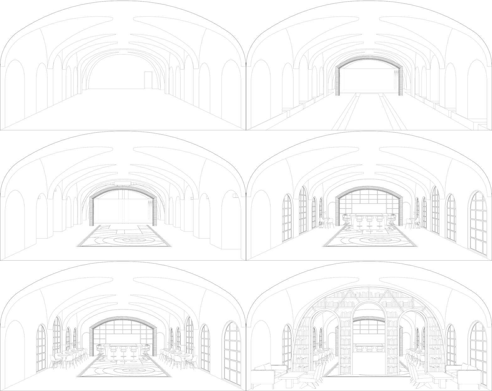
DESIGNA large bookstand stylized as an arch welcomes Zweig’s guests and sets up the tone of the place. Its shape bears unmistakable reference to historical architecture, while structural details are refreshingly modern. Three tall openings in the arch lead to the main seating area.
The arch is multi-functional: it serves as a bookcase where you can grab a book to read at your table; it is a retail station where you can buy a book; it is also a partition that separates the entrance zone featuring a soft seating area by the window from the main hall.
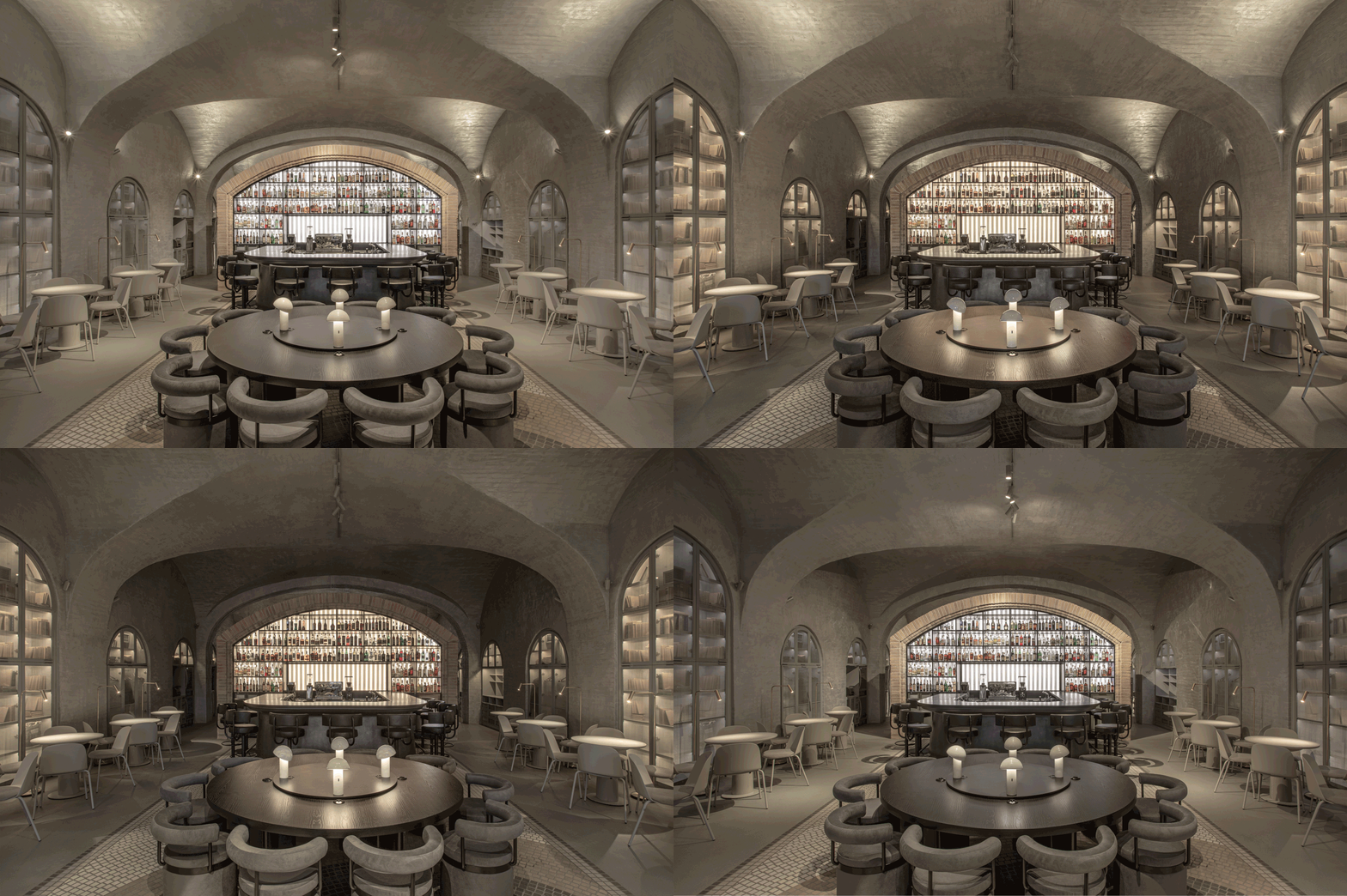
The focal point of the main hall is the bar with its liquor bottle shelving unit. It is shaped like a wide arch trimmed with sand-colored brickwork. The brick ‘frame’, colorful bottles on the shelves, and the unit’s illumination create a resemblance to a stained-glass window that fits effortlessly in the interior.
There are small tables on both sides of the bar, and a large round table in the middle of the hall.
To preserve the texture of the brickwork while avoiding a typical ‘pub interior’ look, we applied a thin coat of plaster in a satin finish. This accentuated the complex geometry and texture of the vault and created a warm glow of reflective surfaces, filling up the room with ambient light.
Hidden behind a partition of the main hall are guest lavatories and a service zone.
There is an atmosphere of harmony and comfort at Zweig that encourages pleasant pastimes over quiet conversations or tête-à-tête with a book. The colors are muted, the light is soft, and the lines are curved. Even hard surfaces – the vaulted ceiling, mosaic floor, the arched bar – are softened with warm shades of grey and honey.
Like a good book, Zweig is built on nuances and details. It is for the guests to discover them and enjoy it. SEMANTIC UNITSBOOK RACK
BAR
BRICKWORK
MOSAIC TILE
BRANDINGKostia Chikurov and Sasha Blagov from New Agency developed branding for Zweig bar, whereas drawings are from a Kyiv-based illustrator Sergiy Maidukov.
TEAM
Instagram Facebook
作者:
图片@Yulia Barsuk, slava balbek, Anastasia Mirzoyan, yevhenii avramenko
语言:英语
客服
消息
收藏
下载
最近


