查看完整案例


收藏

下载
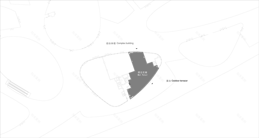
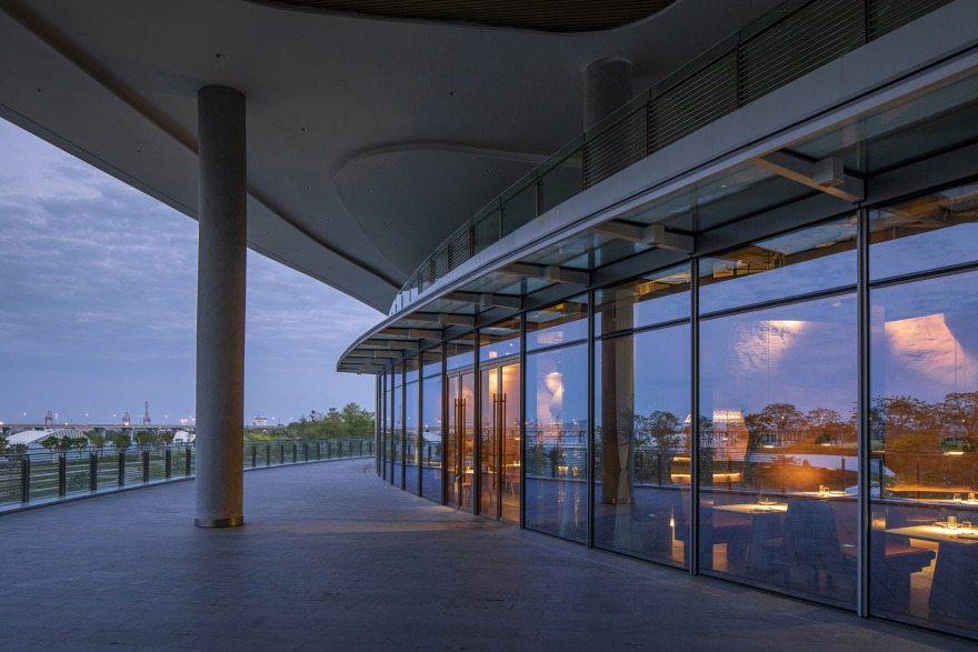
项目位于深圳市宝安区欢乐港湾二层,整栋楼是一栋商业综合体建筑,建筑外形呈流线型,有若干类椭圆形大公共空间高低错落串联而成,空间变化丰富有趣。建筑中间为绿地景观,两侧商户排列,人在此建筑中游走如同进入一段“现代版建筑峡谷”。本项目是遇见花瓣Met Patal继北京店之后的第二家店,场地大面积采光面朝西南,户外有近150平米大露台,站在露台可以看远眺深圳浅海湾。
The project is located on the second floor of happy harbor, Bao’an District, Shenzhen city. The whole building is a commercial complex building. The building is streamlined in shape. There are several types of oval large public spaces in series, with rich and interesting spatial changes. The green space landscape in the middle of the building is lined with merchants on both sides. People walking in the building is like entering a “modern architectural Canyon”,. This project is met petal met patal’s second store after Beijing store. The site has a large area of lighting facing southwest. There is a large outdoor terrace of nearly 150 square meters. Standing on the terrace, you can see the shallow bay of Shenzhen.
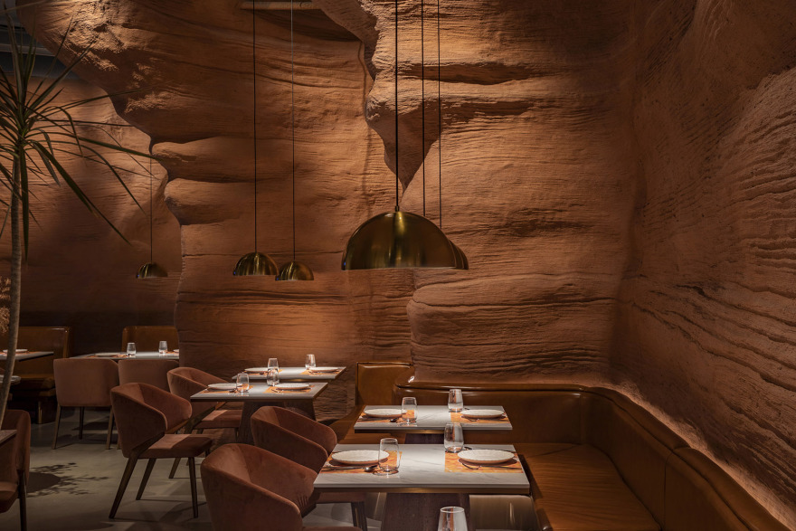
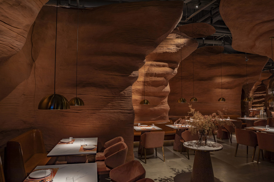
▼项目一瞥,preview © 金伟琦
一,城市活力:深圳正在成为一座神奇的超级大都市,不同体量及内容的公共建筑和生态景观不断落成,是国内或国际建筑师与建筑事务所角逐的主战场,它包容、多元极具活力; 二,场地外部空间张力:户外露台、海边起伏景观、深圳浅海湾,整体来看这个三个空间次序由高到低,由城市延伸至海湾,人站在露台上如同身体置身于“峡谷”高地不由地望向海边远方。 三,内部峡谷空间营造:由于场地主入口位置在整栋建筑的内侧,次入口(连接大露台)在建筑外侧,人的行为动线必然会由内向外“流淌”,因此我们营造了一个能引人入胜的峡谷序列空间。
▼总平面图,site plan ©Linkchance Architects
1.Vitality of the city: Shenzhen is becoming a magical super metropolis. Public buildings and ecological landscapes of different sizes and contents are constantly completed. It is the main battlefield for domestic or international architects to compete with architectural firms. It is inclusive, diverse and full of vitality; 2.The external space tension of the site: outdoor terrace, seaside undulating landscape and Shenzhen shallow bay. On the whole, the order of the three spaces is from high to low, extending from the city to the bay. Standing on the terrace, people can’t help looking to the seaside as if they are in the “Canyon” highland. 3.Internal Canyon space construction: since the main entrance of the site is located on the inner side of the whole building, and the secondary entrance (connecting with the grand terrace) is on the outer side of the building, people’s action line will inevitably “flow” from the inside to the outside, so we create an attractive Canyon sequence space.
▼户外露台立面,outdoor terrace © 金伟琦
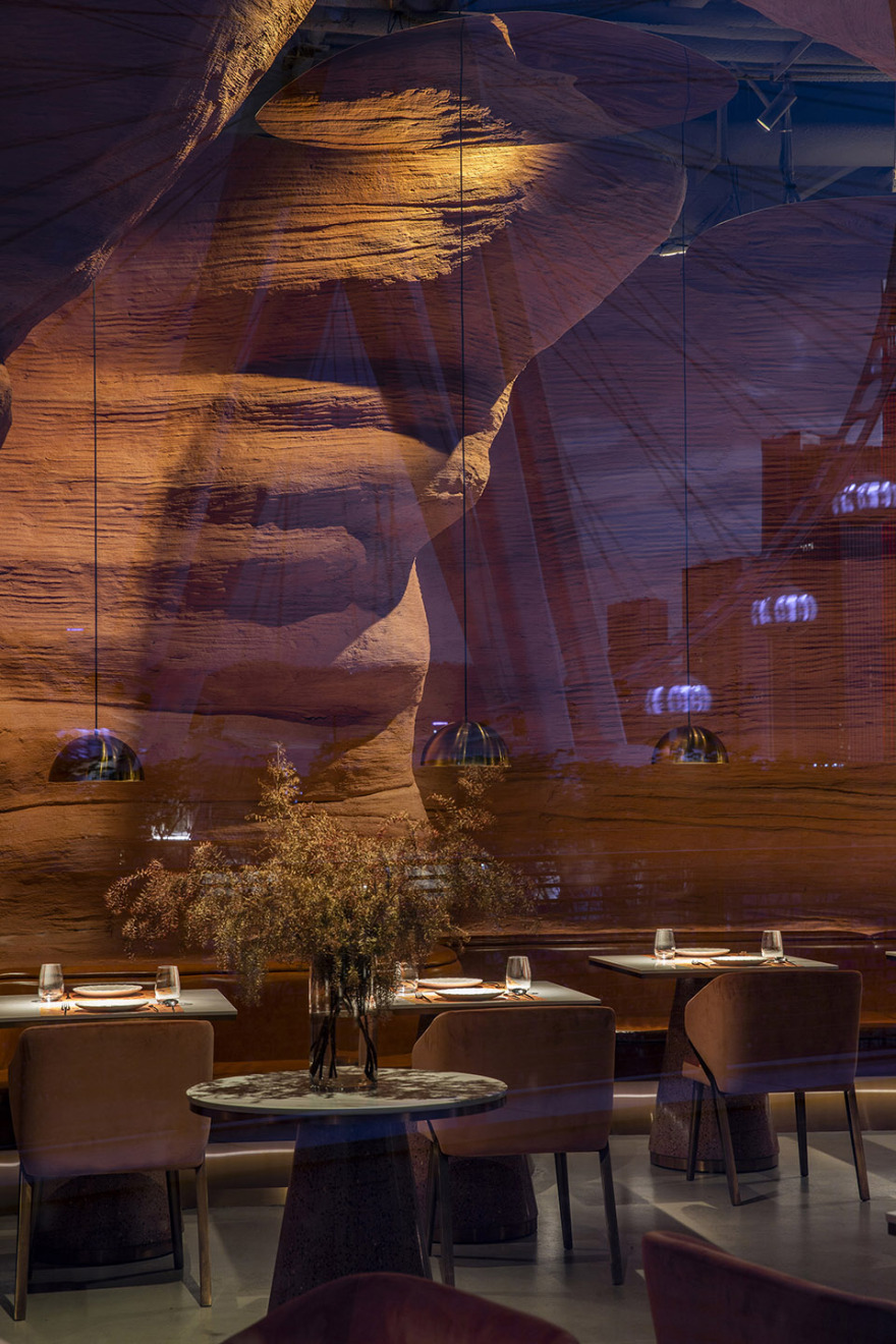
▼透过玻璃向内看,view through the transparent facade © 金伟琦
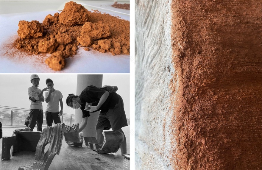
峡谷空间造型的具象与抽象如何平衡?太抽象过于光滑显得现代而缺乏原始力量,而太具象容易做成所谓的“游乐园“效果;技术上如何有效把控并实现原初空间构想;如何实现原始力量感与现代感的平横;如何携同匠人们对装饰混凝土造型及着色进行实验。
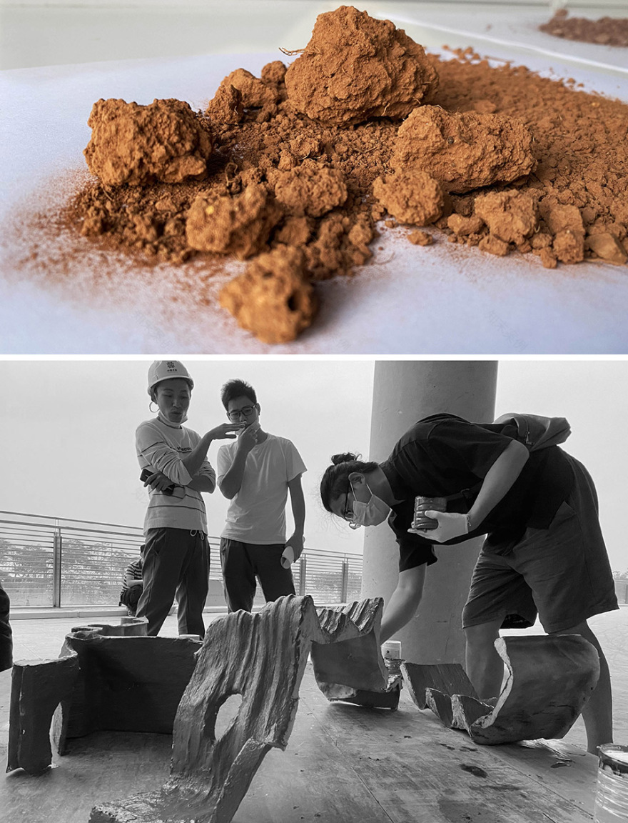
How to balance the representativeness and abstraction of Canyon space modeling? Too abstract, too smooth, too modern and lack of primitive power, too concrete, easy to make the so-called “amusement park” effect; How to effectively control and realize the original space conception technically; How to realize the balance between the original sense of power and the modern sense; How to carry out experiments with craftsmen on coloring decorative concrete.
▼红土颜色研究 & 混凝土着色实验,experiments with craftsmen on coloring decorative concrete ©Linkchance Architects
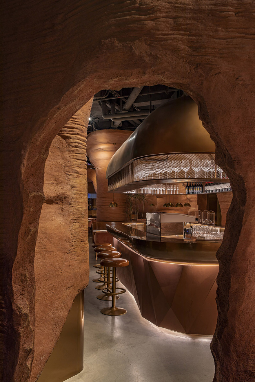
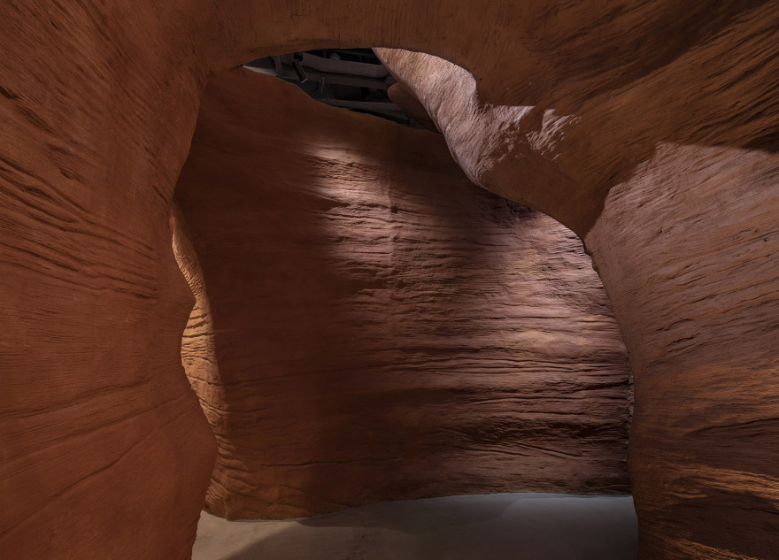
“峡谷“力场营造:当人走进场地主入口后首先是一段缓冲空间做为接待区,进门右手边是导台;左手边做为“峡谷”的开启,站在这一端可以看到峡谷另外一端从露台进来的自然光,同时视线的末端会出现椭圆形吧台,吧台上半部分为金属罩被光打亮,远望过去很光滑很现代会引发人继续向前探索的兴趣;
“Canyon” force field construction: when people enter the entrance of the field, first of all, a buffer space is used as the reception area, and the right side of the entrance is the guide platform for daily guidance and reception; The left side is the opening of the “Canyon”. Standing at this end, you can see the natural light coming in from the terrace at the other end of the canyon. At the same time, an oval bar will appear at the end of the line of sight. The upper part of the bar is a metal cover, which is illuminated by light. Looking from afar, it is very smooth and modern, which will arouse people’s interest in further exploration;
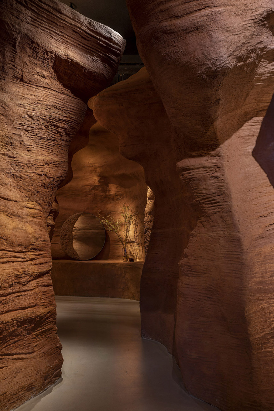
▼峡谷空间,the “canyon” space © 金伟琦
▼吧台区,bar area © 金伟琦
▼金属吧台与粗糙墙面对比,the metal bar contrasts with the rough wall © 金伟琦
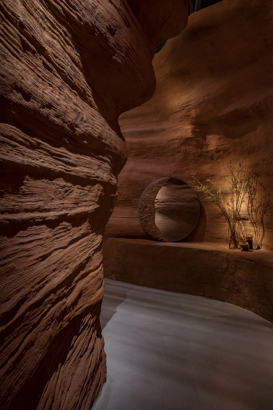
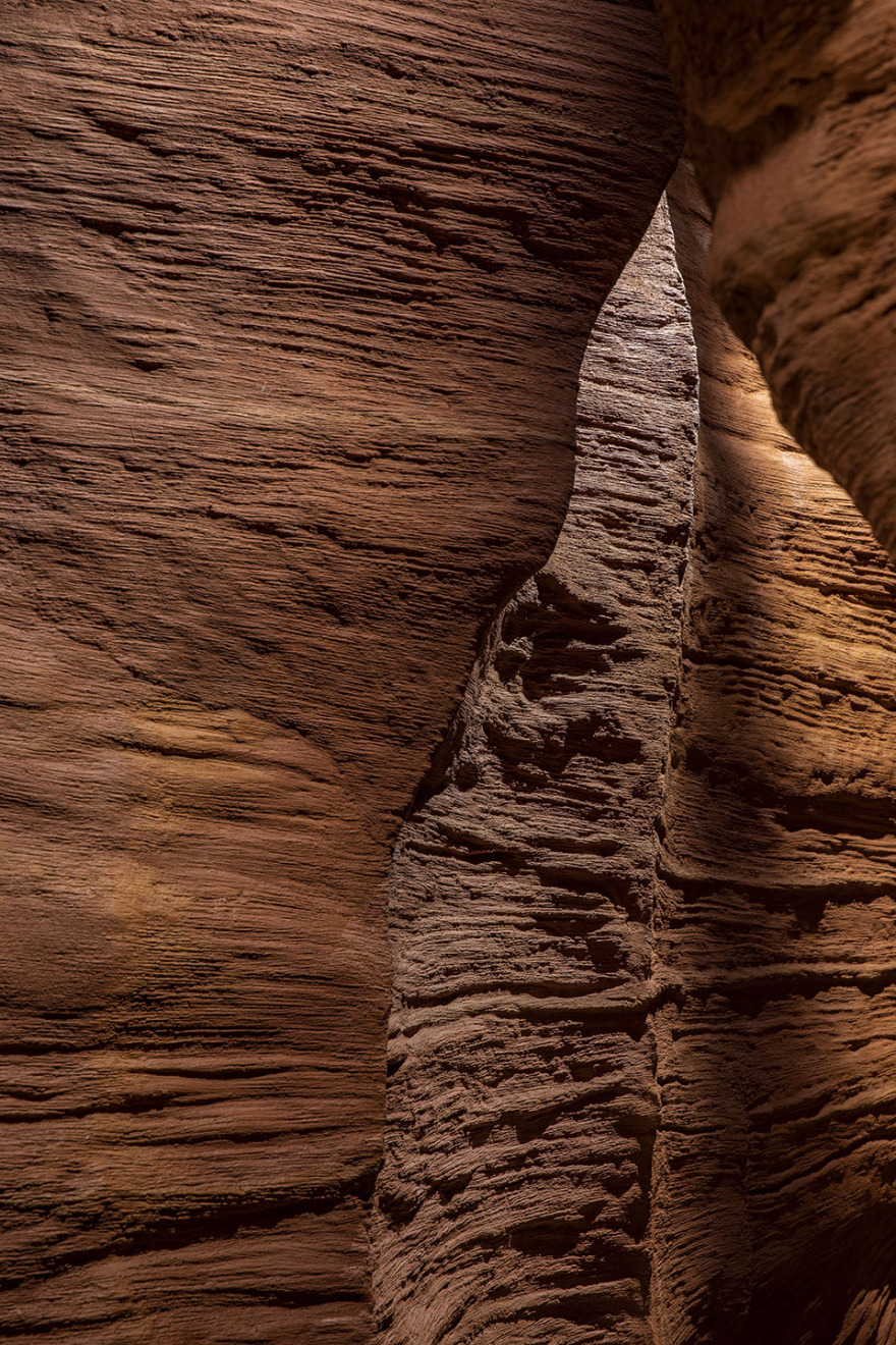
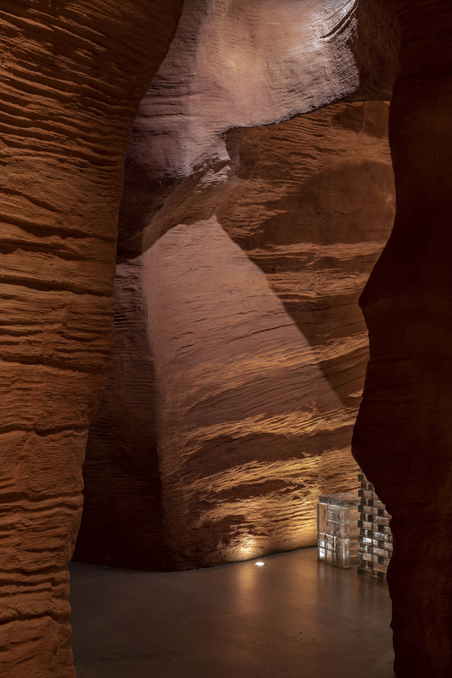
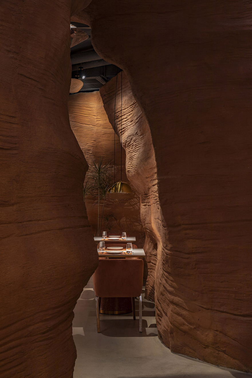
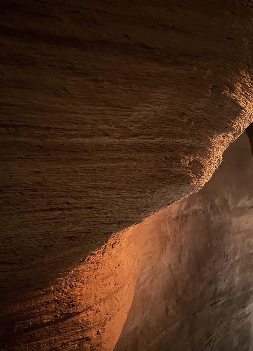
通道最窄处只有1.2米,因此客人在过往时距离会靠的很近,甚至会有意避让,走进这一狭长空间人如同水流徜徉在峡谷之中;立面造型曲折有力,是一段“纯粹的峡谷”地段”,横向上营造一种“水流湍急”的空间冲刷感,纵向上望去可以看到清晰的峡谷轮廓,立面墙壁上的纹理处理像流水冲刷的痕迹;
The narrowest part of the passage is only 1.2 meters, so pedestrians will be very close to each other when passing by, and even deliberately avoid walking into this narrow space to roam in the canyon with the water. The facade is tortuous and powerful, which is a “pure Canyon” section. Horizontally, it creates a sense of “turbulent water” space erosion, and vertically, you can see a clear outline of the canyon. The texture processing on the facade wall is like the trace of water erosion.
▼峡谷墙面纹理,the wall details of the canyon © 金伟琦
▼“水流湍急”的空间冲刷感,a sense of “turbulent water” space erosion © 金伟琦
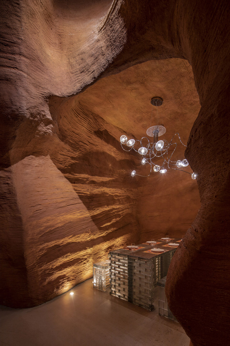
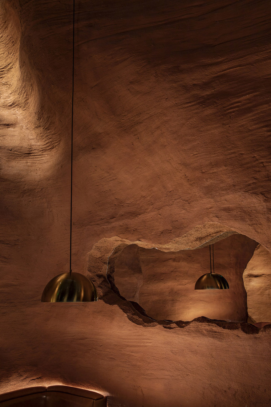
再往里面行走左手边会遇见一处“洞穴”包间,营造一种在原始洞穴空间中用餐的体验,餐桌是由定制橘面玻璃砖垒砌而成,顶部吊灯灯罩也是玻璃制品,地面预埋射灯照在墙壁上形成的光影,充分凸显原始空间与现代工业产品的直接碰撞。
If you walk inside again, you will meet a “cave” space on the left, which functions as a private room, creating a dining experience in the original cave space. The dining table is made of customized orange glass bricks, the top Chandelier Lampshade is also made of glass, and the light and shadow formed by the embedded spotlight on the wall fully highlights the direct collision between the original space and modern industrial products.
▼“峡谷”包间,the “cave” space © 金伟琦
▼现代灯具与原始粗糙感的对比,the modern lighting fixtures contrasts with the rough walls © 金伟琦
▼包间入口,entrance to the “cave” © 金伟琦
穿过这段峡谷,豁然开敞来到主用餐区,餐桌围绕中岛吧台展开水平向布局,中岛吧台夜间可切换为酒吧模式;北侧靠“峡谷地段”处设置长条卡座,客人在用餐时可观赏南侧户外风景。
Through this section of Canyon, you suddenly come to the main dining area. The dining table is arranged horizontally around the Zhongdao bar, which can be switched to the bar mode at night; The north side is close to the “Canyon side” and a long card seat is set on the side. When dining, the guests can enjoy the delicious food on the canyon side and enjoy the outdoor scenery on the south side.
▼主用餐区,main dining area © 金伟琦
▼卡座用餐区,booth area © 金伟琦
▼用餐区,dining area © 金伟琦
▼墙面起伏空间与餐桌,dining tables are surrounded by undulating walls © 金伟琦
▼墙面局部,wall details © 金伟琦
正如勒内·德勒兹所言人生就是一场遇见,人们在非常现代化的都市、现代的综合体楼内,遇见一处充满粗糙质料的、原始的空间,会暂时抽离于周边环境;在峡谷空间中穿梭、遇见、互动、用餐,尽情体验这种既原始又现代的氛围空间。
Just as Rene Deleuze said, life is a meeting. In a very modern city and modern complex building, people encounter a primitive space full of rough materials, which will be temporarily separated from the surrounding environment; Shuttle, meet, interact and eat in the canyon space, and enjoy the original and modern atmosphere space.
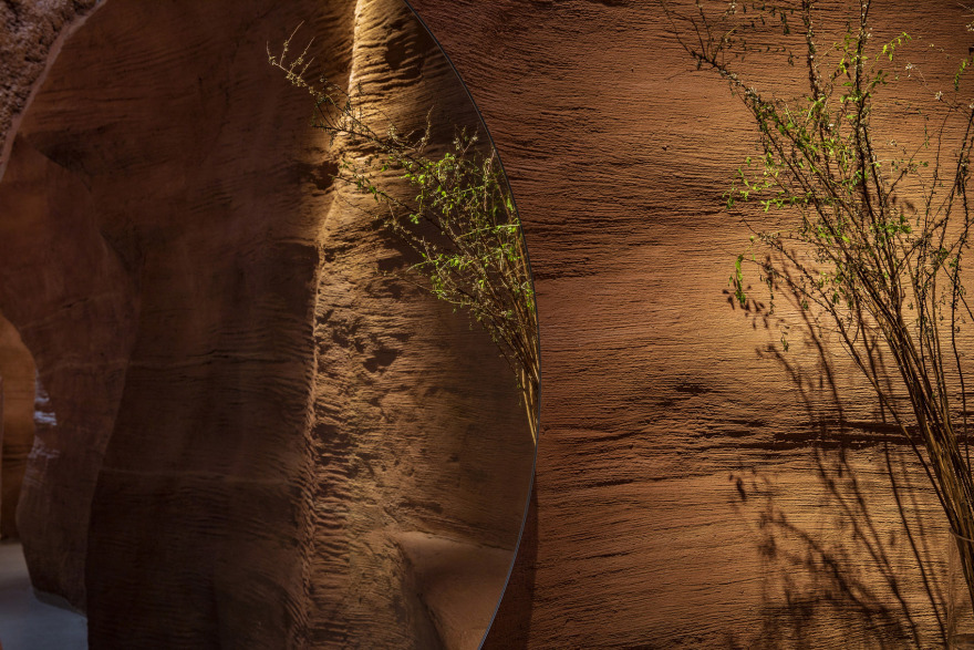
▼花台局部,flower terrace © 金伟琦
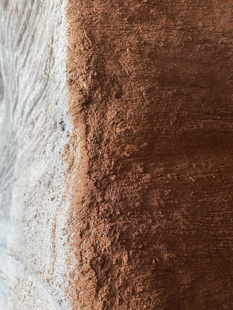
▼墙面纹理,wall texture ©Linkchance Architects
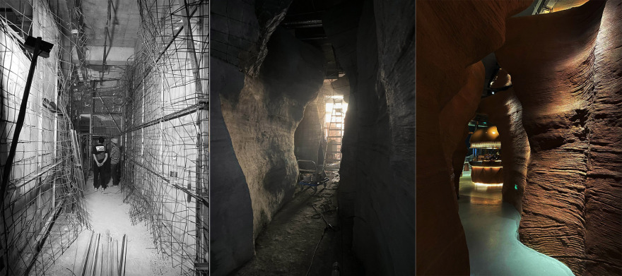
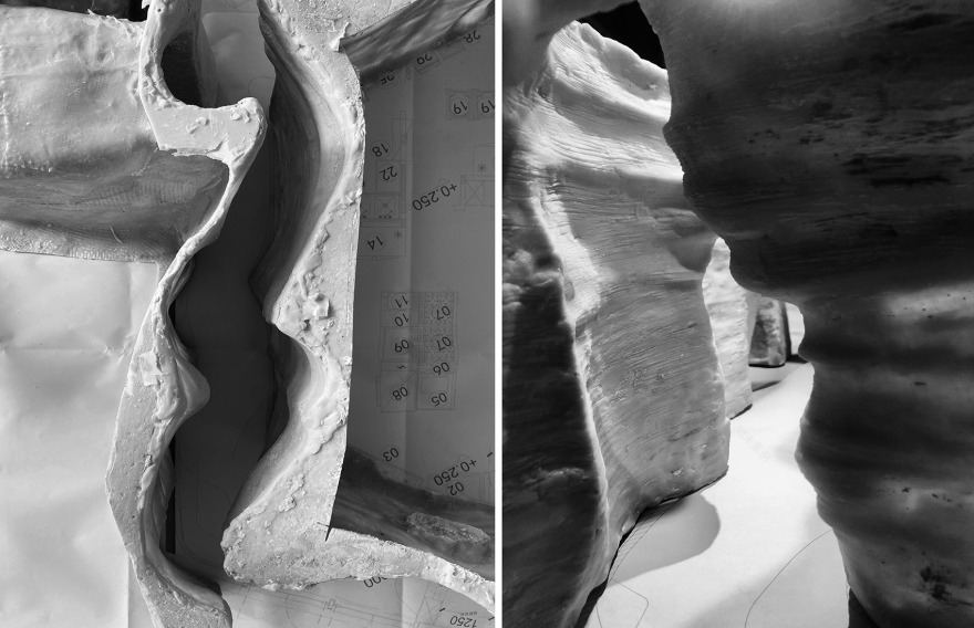
▼空间营造变化过程,process © Linkchance Architects
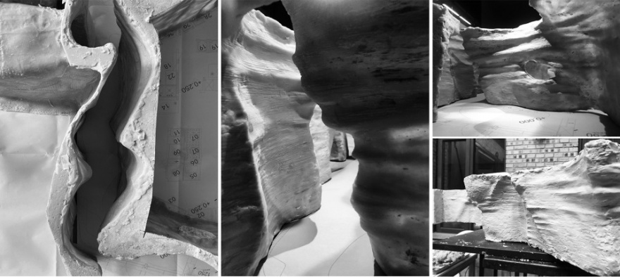
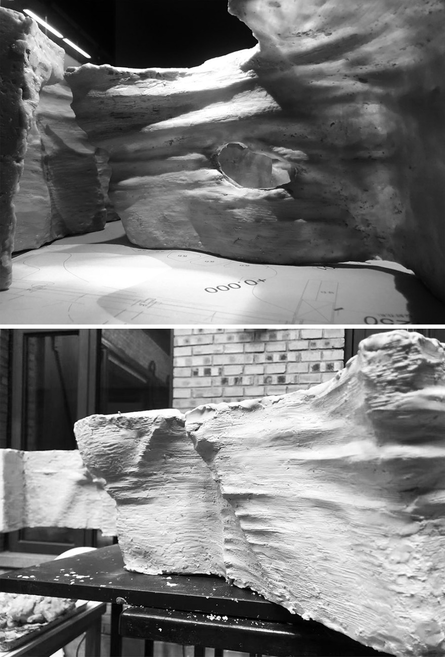
▼模型研究,study model © Linkchance Architects
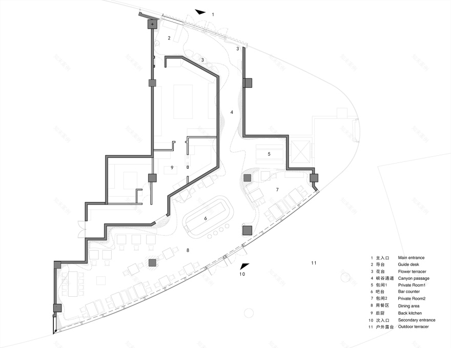
▼平面图,plan © Linkchance Architects
项目名称:峡谷中遇见 项目地址:深圳,宝安区 项目业主:遇见花瓣Met Petal 建造时间:2020年11月-2021年2月 室内面积:300平方米 设计单位:力场(北京)建筑设计 Linkchance Architects 主创设计:安兆学 设计团队:陆继铭、候雪、张伟、杨树军、李冰、王琳 艺术顾问:谷道旭 照明设计:Linkchance Architects 建造材料:装饰混凝土、波纹穿孔铝板、不锈钢板、条纹玻璃、玻璃砖、镜面不锈钢、金属网、水泥艺术漆等 项目摄影:金伟琦、Linkchance Architects 工程施工:深圳市中建沃森工程有限公司(总包)、北京华韵园林工程有限公司(内饰面施工) 设计撰文:Linkchance Architects
Project name: Meet in the canyon Project location: Bao an District, Shenzhen Project owner: Met patal Project period: Nov 2020-Fabruary 2021 Project area: 300 m2 Design firm: Linkchance Architects Chief designer: An Zhaoxue Designer team: Lu Jimin ,Hou Xue, Zhang Wei,Yang Shujun, Li Bin, Wang Lin Art consulting: Gu Daoxu Materials: Decorative concrete, Corrugated perforated aluminum plate, stainless steel panel, Striped glass, Glass bricks, Mirror stainless steel, Metal mesh ,concrete paint Photography: Jin Weiqi, Linkchance Architects Construction team: Shenzhen CSCEC Watson Engineering Co., Ltd. (general contractor) Beijing Huayun garden Engineering Co., Ltd. (interior decoration construction) Design copywriting: Linkchance Architects
客服
消息
收藏
下载
最近


