查看完整案例


收藏

下载
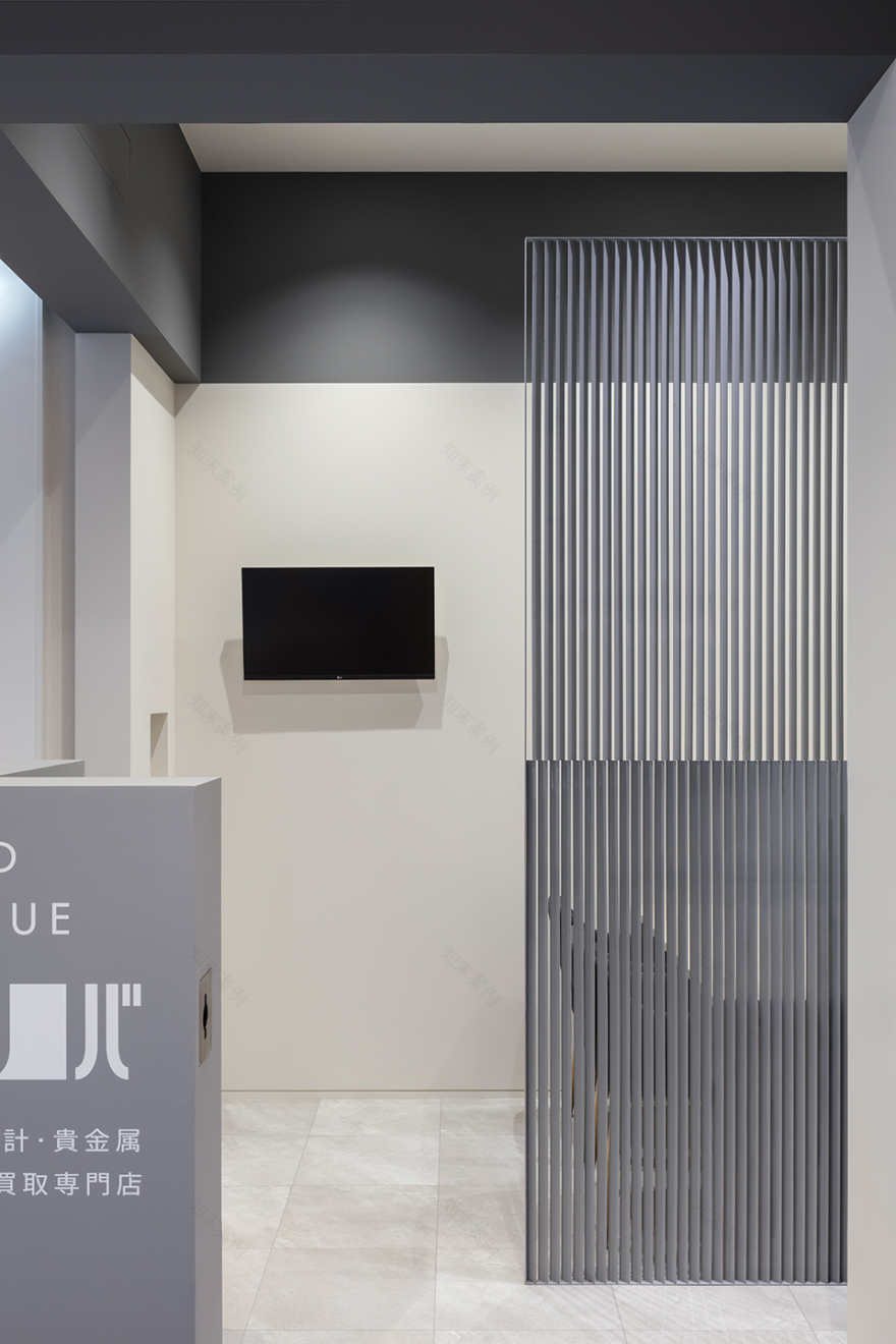
该项目是小型高档寄售商店的室内设计项目,它位于购物中心一角,面向受欢迎的咖啡店、一家时装店和一个电梯厅。对于买卖名牌和贵金属的商店来说,隐私是必要条件。然而店内没有陈列的商品来遮挡视线或吸引顾客注意,因此店铺需要靠设计创造私密而醒目的空间。
A small-scale interior design project, for a upscale consignment shop. Located in a corner of a shopping mall, facing a popular coffee shop, a fashion store, and an elevator hall. Privacy is necessary for a store, which buys brand-name goods and precious metals. However, as the store does not have products on display to obscure the view nor catch the attention of customers, it is up to the design to create a private but noticeable space.
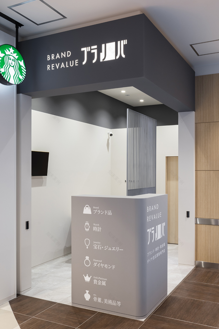
▼店铺概览,general view © Norihito Yamauchi
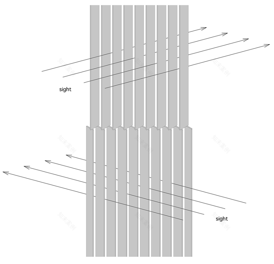
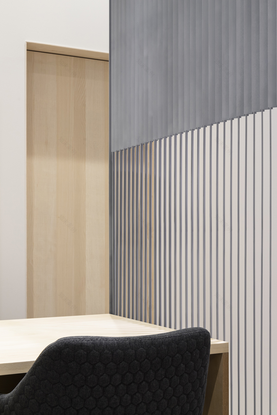
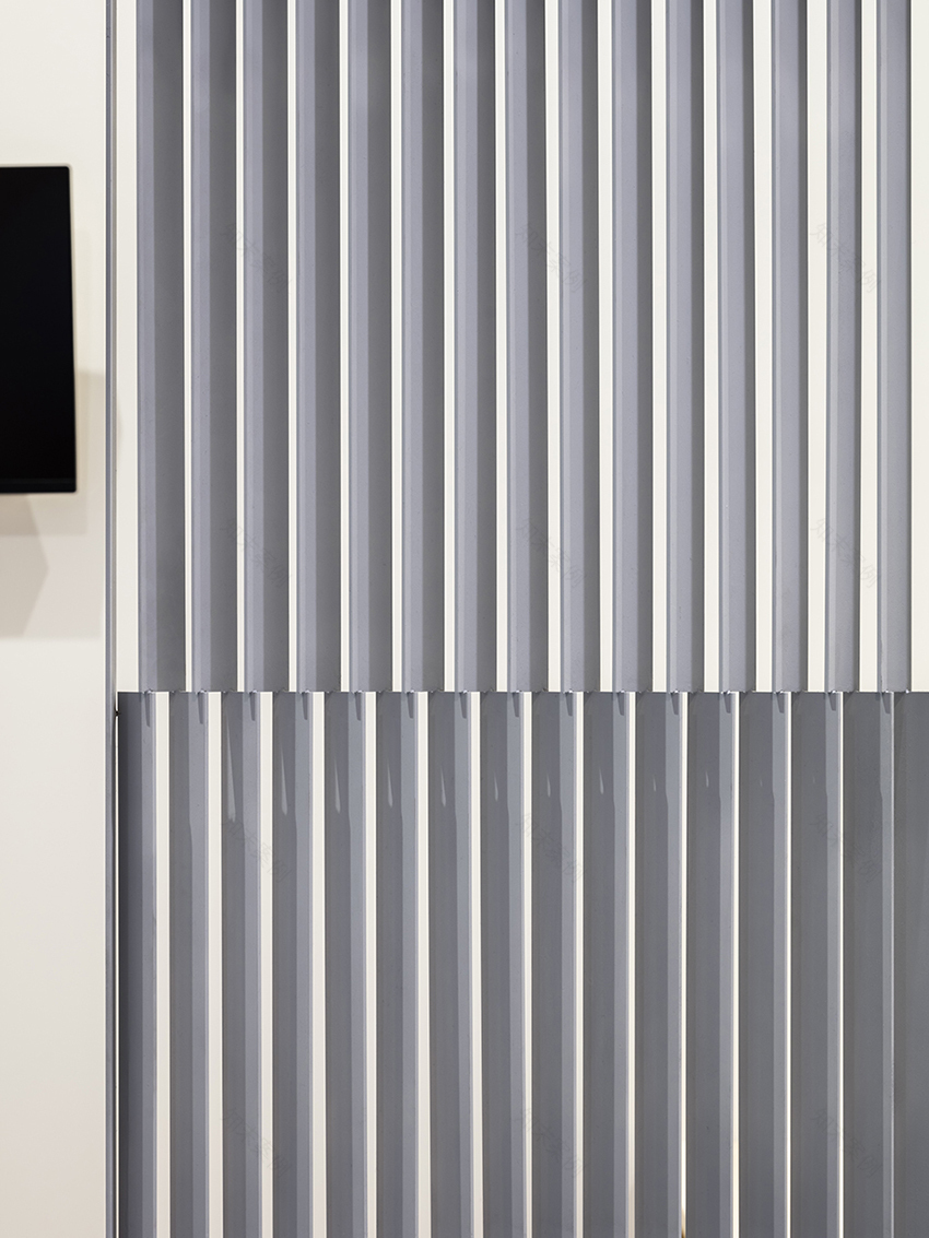
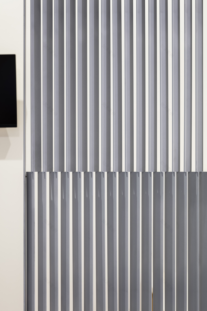
在小型店铺内,兼顾私密性和显著性十分重要,像帘幕这样可以灵活使用的元素是兼顾二者的首选。然而,“关上”帘幕遮挡人们视线的行为会给店内顾客带来束缚感,使顾客产生不安和紧张的感觉。因此,设计师试图设计不需要“关闭”行为的装置,它是固定结构,但又具有可变性。设计师创造出百叶隔断,上下部分具有不同方向的杆件。
▼装置视线分析 © Shimpei Oda Architect Office & Atelier Loowe Inc. eye light analysis of the installation
In a tiny store, like this, it is important to balance both privacy and noticeability; flexible operable elements such as curtains would be an obvious choice. However, the act of “closing” the curtains to cut off people’s line of sight can create a confining feeling for the customer in the small store, leading to a sense of intimidation and tension. Therefore, I wondered if it would be possible to create an installation that does not involve the act of “closing”, a fixed element, always present as an object, but with fluidity as a phenomenon. I created a partition-like louver element, constructed with different directions of wings at the top and bottom.
▼店铺外观,appearance © Norihito Yamauchi
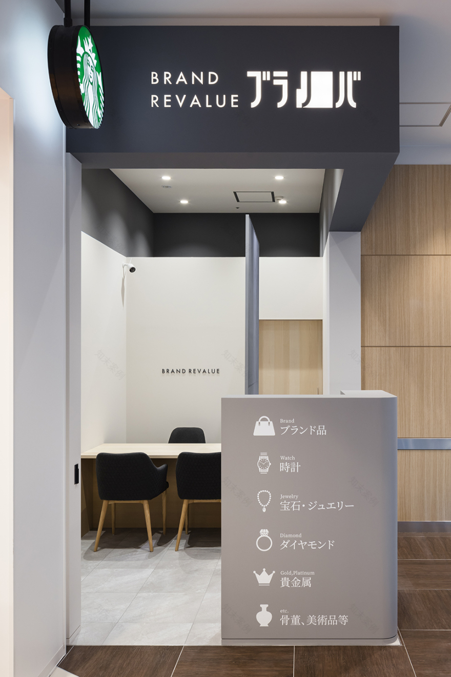
▼店铺立面,facade © Norihito Yamauchi
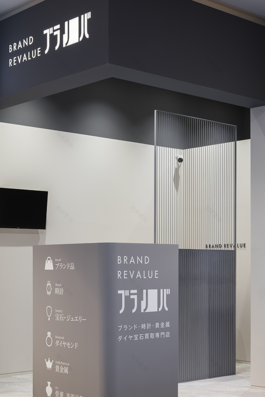
▼百叶隔断,louvered partition © Norihito Yamauchi
▼店铺内部,inside view © Norihito Yamauchi
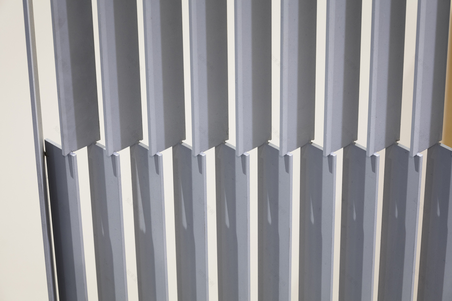
轻薄的自支撑杆件减轻了整体分量感,从某些角度看,它看似由金属线等轻型材质制成的装置,给人一种开放的感觉。从其他角度看,它又给人一种坚实屏幕的感觉,使装置成为这家商店独有的引人元素。
The thin self-supporting elements reduce the feeling of weight, and from certain perspectives, it looks like the installation is made of a light material such as wire, giving the impression of an open store. From other perspectives, it gives the impression of a solid screen, making the installation an eye-catching element unique to this store.
▼轻薄的自支撑杆件,thin self-supporting elements © Norihito Yamauchi
作为一家没有展出标志性产品的商店,加强店铺本身的存在至关重要。当人们遇到商店并发现空间的层次时,装置的体验功能便得以实现。
As a store without signature products on display, strengthening the stores presence in itself was essential. When a person encounters the store and discovers the layers of spatialities, the installation as an experience is completed.
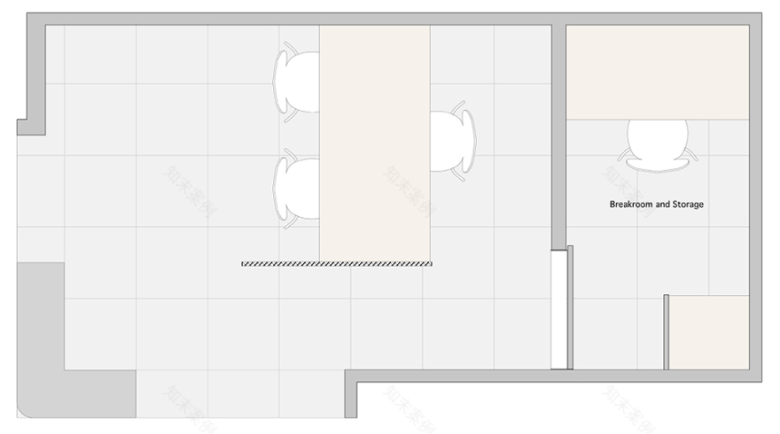
▼平面图,plan © Shimpei Oda Architect Office & Atelier Loowe Inc.
客服
消息
收藏
下载
最近


