查看完整案例


收藏

下载

翻译
Studio Alexander Fehre recently completed the headquarters design for Bosch Automotive Steering located in Schwäbisch Gmünd, Germany.
The new building was originally constructed for predecessor ZF Lenksysteme, who wanted a building with emblematic character. Following the takeover by Bosch, a new direction was chosen for the site and the headquarters were repurposed as a development campus. SAF was asked to illustrate this process of change by redesigning the interior space with a focus on inviting, open-plan spaces in place of traditional office structures, and an inspiring colour world instead of sharp, black and white contrasts.
The building itself was planned and realised by Wulf Architekten, and consists of two organically flowing structures. It integrates harmoniously into the idyllic green valley in which the factory premises are situated. The floor plan with its convex façades represents a spatial challenge, particularly in the apexes, as the client specifically requested a larger number of meeting spaces and individual offices.
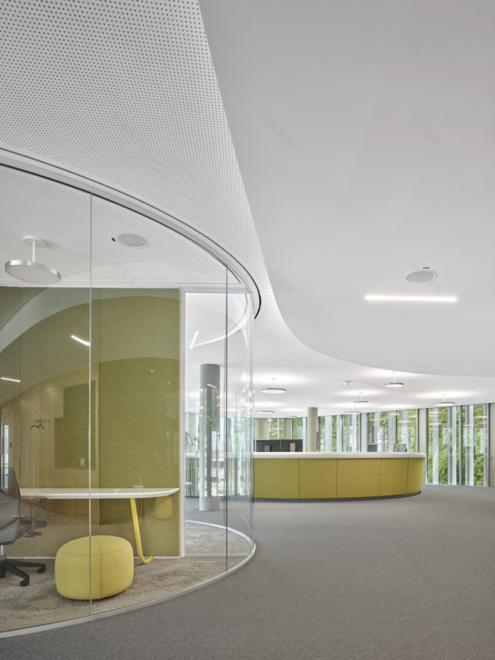
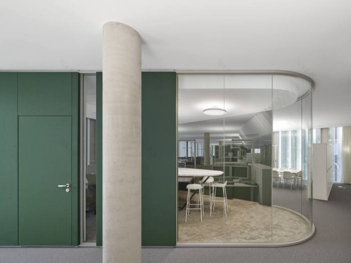
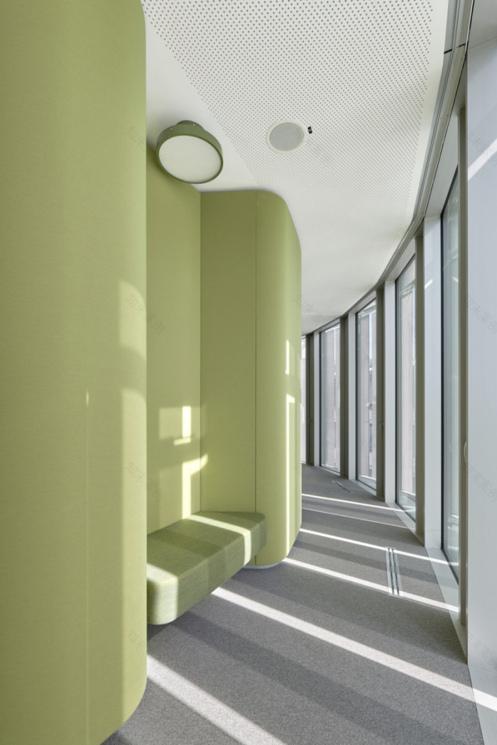
SAF addressed this problem through the use of space capsules with rounded corners to reflect the overriding layout. The capsules are positioned a short distance away from the façade, thereby creating an outer corridor situation. The outer sides of the capsules integrate recessed niches that provide additional space for small communication zones – some with a table, some with a bench seat, but all with a delightful view of the surroundings. Each of the eight repeating floors is equipped with three of these capsules at the apexes of the building. A larger version with a large conference room is located at the centre of the floor. Smaller renditions, positioned at the two flanks of the building, contain a room with a glass façade and a bar table for standing meetings, as well as two ‘focus rooms’ that are peaceful havens for concentrated study. The capsules have a wooden framework construction and fabric-covered walls. The fabric colour world uses the green of the surrounding landscape as a starting point, with variations on this theme for each floor, giving each one an individual character.
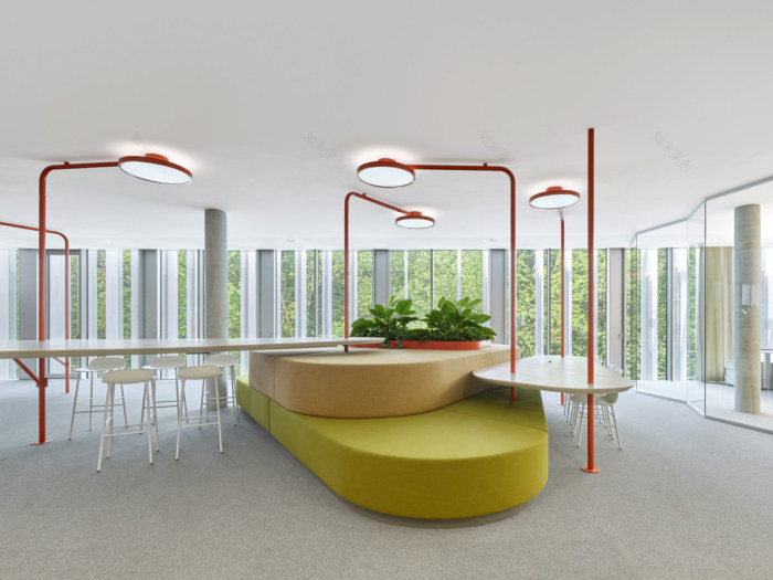
The three capsules are supplemented by team areas with an adjoining kitchenette. With their striking arc lamps and vibrant colour palette, they are communicative meeting places and visual points of attraction on every floor.
The design also tackled the executive board area. The design process was initiated by interviews with the four board members and their assistants. It became clear that the board members mostly envisioned themselves in meetings, so a deliberate decision was taken to strike individual offices. The board now shares an open-plan office at the centre of the space. It is partially glazed and open to one side, signalling an unswerving approachability that counters hierarchical inhibition thresholds. As the board members willingly relinquished their traditional spatial privileges, their assistants were able to have a prominent area at the end of one axis. The assistants requested short communication channels, a waiting area for visitors and as much visual connection to the management board and all other rooms as possible. In response, an elevated island counter was constructed in prominent position in the space and in the immediate vicinity of the board office. A spacious waiting area executed in dark colours with various seating arrangements and meeting zones is set opposite. The executive board floor is rounded off by a creative space in dynamic yellow, designed to stimulate the senses and the thinking process. The flexible furnishings enable a wide diversity of potential usages.
With the design of the Bosch AS headquarters, Studio Alexander Fehre implements an open work world with diverse quiet havens on a sophisticated floor plan, and succeeds in creating a memorable and visually appealing place. The shape of the spatially determining capsules is derived from the floor plan and thus underscores the overall fluidity. The colour world deliberately employs strong contrasts to stimulate communication and provide space for creative thinking. Potential inhibition thresholds have been removed throughout. As a result, the colour and materials worlds of the executive board floor are no different to those of the employee floors.
Design: Studio Alexander Fehre
Photography: Zooey Braun
17 Images | expand for additional detail
客服
消息
收藏
下载
最近


