查看完整案例


收藏

下载
Architects: Atelier RZLBD Project: Flipped House Project team: Reza Aliabadi, Arman Azar Location: Scarborough, Toronto, Ontario, Canada Area: 2300 sqft / 215 m2 Year 2017 Photography: Borzu Talaie
建筑师:AtelierRZLBD项目:FlippedHouseProjectteam:RezaAliabadi,ArmanAzarLocation:Scarboroughoughough,Toronto,Ontarea,CanadaArea:2300sqft/215m2Year2017摄影:BorzuTalaie.
The product of a gut renovation and second-storey addition to an existing brick bungalow on the south-west edge of the Knob-Hill Park in a residential neighbourhood in Eglinton East on the border between Toronto and Scarborough, Flipped House is a two-storey property designed for a developer looking to offer real estate buyers a modern, turnkey home in a neighbourhood dominated by more traditional architecture.
在多伦多和斯卡伯勒交界处埃格林顿东部的住宅区诺布希尔公园(knob-Hill Park)西南边缘,一栋现有的砖砌平房的装修和二层改造的产物,是一套两层楼高的房产,专为开发商设计,旨在为购房者提供一套现代的、统包式的住宅,这个街区被更传统的建筑所主导。
The project gets its name from its unconventional “flipped” layout. While a typical dwelling keeps all public-facing spaces confined to its main floor, with private areas like bedrooms sequestered upstairs, Flipped House instead adopts a configuration that divides its public and private zones on either side of a vertical plane. As a result, the home’s den, kitchen, dining, and living rooms are all located on its street-facing northeast side, while the house’s three bedrooms span both levels of the building’s more secluded southwestern end.
这个项目的名字来自于它非常规的“翻转”布局。一个典型的住宅将所有面向公共的空间都限制在主楼层,而卧室等私人空间则被隔离在楼上,而翻转住宅则采用了一种将其公共和私人区域分隔在垂直平面两侧的配置。因此,房子的书房、厨房、餐厅和起居室都位于其面向东北的街道上,而房子的三间卧室则横跨该建筑西南端较为隐蔽的两层。
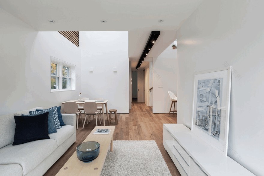
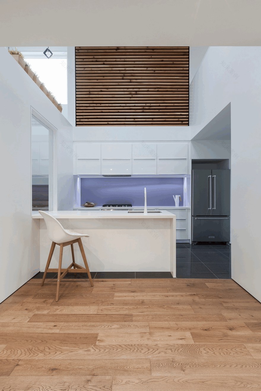
The home’s varying ceiling heights work to communicate this symbolic dividing line. The linked first-floor kitchen and dining room are double-height spaces, with the ceiling then dropping down to single-storey height as one enters the hallway moving towards the residence’s more intimate back bedrooms. Knotty cedar slats surround the linked kitchen and dining room, wrapping up the side walls and onto the ceiling above to create a sense of warmth and grandiosity — a feeling further heightened by the two skylights that top this atrium. Passing under this wooden ceiling feature is the second floor’s bridge corridor. Overlooking the double-height dining space to one side, and the kitchen to the other, this interesting architectural feature is used to emphasize the home’s secondary axis along its key circulation route. On the first floor, the base of this bridge is fitted with a long black light track that visually accentuates the linearity of the path it’s positioned along.
房子不同的天花板高度可以传达这条象征性的分界线。连在一起的一楼厨房和餐厅都是双高空间,天花板随后下降到单层的高度,当一个人进入走廊,向住宅更亲密的后卧室移动。连在一起的厨房和餐厅周围环绕着棘手的雪松板条,把侧壁包裹起来,贴在上面的天花板上,营造出一种温暖和宏伟的感觉-在中庭上方的两个天窗进一步提升了这种感觉。穿过这个木制天花板的特点是二楼的桥梁走廊。从一边俯瞰双高餐厅空间,另一边俯瞰厨房,这一有趣的建筑特色被用来强调家庭的第二轴沿着其关键的循环路线。在一楼,这座桥的底部安装了一个长长的黑光轨道,视觉上强调了它所处的路径的直线性。
After crossing this bridge passageway in the upstairs addition, one arrives to a flexible family room. This carries on to a small wooden patio built atop the existing garage. At the bridge’s other end is an airy home office providing desk space for two. Moving southwest from here, the home again becomes increasingly private — one first enters the master bedroom, complete with a walk-in closet and his-and-hers skylights above the two nightstands, then turns a corner into the ensuite. A bathtub is given pride of place in the centre of the room positioned in front of a generous window, with the shower and water closet concealed in symmetrical niches at the room’s western end.
经过这座桥在楼上的过道后,一人来到一个灵活的家庭房间。这是在现有车库的基础上建造的一个小木露台。桥的另一端是一个通风良好的家庭办公室,为两个人提供办公桌空间。从这里向西南方向移动,这个家再次变得越来越私密-一个人首先进入主卧室,在两个床头柜上方有一个步入式壁橱和他和她的天窗,然后转一个拐角处进入套间。浴缸位于房间的中心位置,位于宽敞的窗户前,淋浴和厕所隐藏在房间西端对称的壁龛里。
Throughout, the project uses geometric volumes to play with the boundaries between its various spaces. The home’s kitchen island, for instance, extends to become a landing for the adjacent staircase. As one continues to the staircase’s next flight, a small cutout in a partial-height partition offers a view northeast that aligns with the axis created by that landing and island. Elsewhere on the first floor, a small powder room is enclosed in a free-standing volume near the front entrance that helps to delineate the house’s mudroom from the adjacent den area — a transition further played up by a change in flooring materials from tile to oak.
在整个项目中,该项目使用几何体积来处理其各个空间之间的边界。例如,家里的厨房岛延伸到了相邻楼梯的着陆处。当一个人继续到楼梯的下一次飞行时,在一个部分高度的隔板上的一个小切口提供了一个东北方向的视图,它与着陆和岛屿所创造的轴线是一致的。在一楼的其他地方,一间小的化妆间被围住在前门附近的一个独立的空间里,这有助于把房子的泥房从相邻的巢穴区域划分出来-这一转变由于地板材料从瓷砖到橡木的改变而进一步发挥作用。
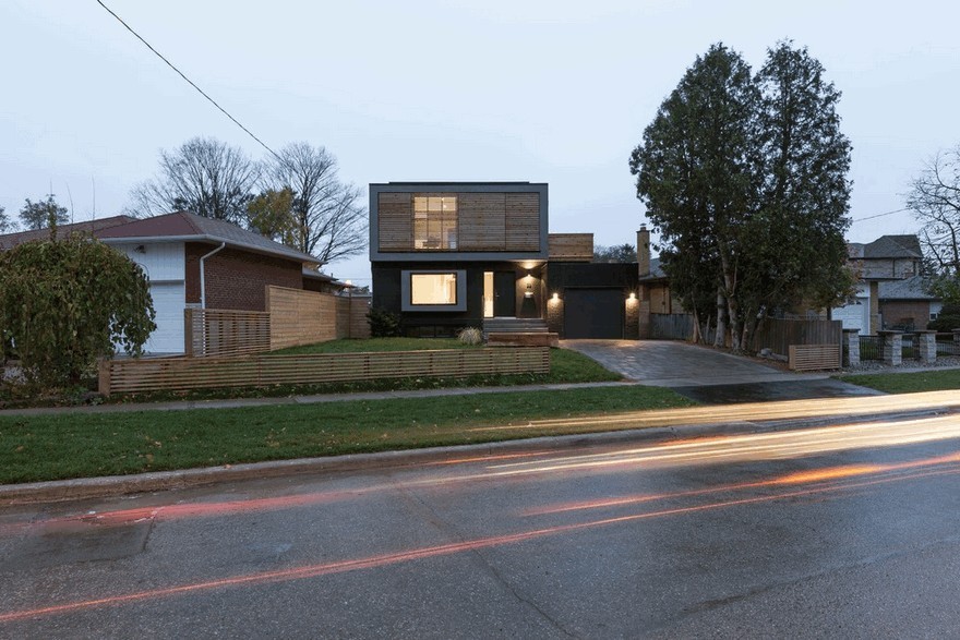
In contrast to the home’s warm, light-soaked interiors, the property’s dark front elevation creates the impression of a strong, fortified abode. By maintaining the brick enclosure of its predecessor — now painted black — the house required no excavation, making it a more affordable and sustainable solution than a design that would have required significant demolition and starting new construction from scratch. With the exception of one large window installed in the pop-out volume that extends out from the living room, all of the main-floor and basement windows are carried over from the original structure.
与家庭温暖、通过维护其前身的砖墙(现在漆成黑色),房子不需要开挖,使之比需要大量拆除和从头开始新施工的设计更经济和可持续的解决方案。除了安装在从客厅向外延伸的弹出体中的一个大窗口外,所有的主楼层和地下室窗都是从原始结构中移走的。
Maintaining the original footprint of the structure it replaces also keeps Flipped House sensibly sized relative to its neighbours. A slatted screen on the second storey is installed to distort the scale of the property and ensure that the structure reads more like a monolithic object than a typical home. New construction — including the first-storey living room pop-out, and the second storey addition — is distinguished in grey stucco to chart the dwelling’s evolution.
保持原有的结构足迹,它所取代的,也保持了翻转的房子相对于它的邻居明智的大小。在第二层安装了一块板条屏幕,以扭曲房产的规模,并确保结构读起来更像一个整体的物体,而不是一个典型的家庭。新的建筑-包括一层起居室的突出部分和二层的额外建筑-在灰色灰泥中被区分开来,以描绘住宅的演变过程。
客服
消息
收藏
下载
最近


