查看完整案例


收藏

下载

翻译
Our long-time client, who has been present on the Croatian market since 2005, has set a new challenge for us – an upgrade of the retail concept that stems from the brand’s new visual identity. The client’s understanding of users’ needs and a fearless approach to creating innovative offerings also requires flexibility, openness and innovation on the design side. For us, the new Tele2 retail concept has meant a critical look at our own design and its upgrade.
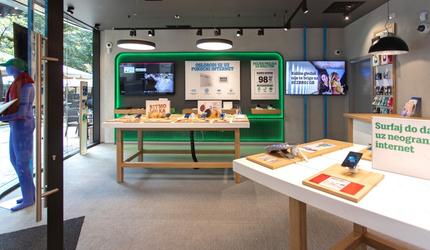
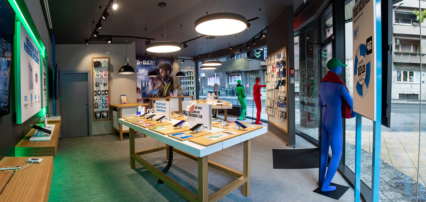
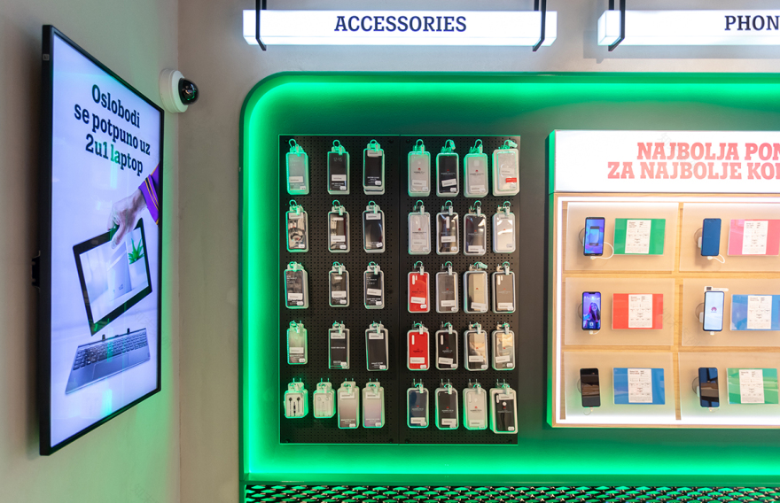
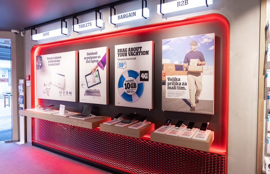
The new concept is based on the current guidelines of the visual identity of the company, which uses three basic colours: red, blue and green, and the achromatic colours black, white and grey. The space planning is based on the fluidity of space where products are displayed on desks located in the centre of the space and inside the wall niches. In this way, the customer can move freely around the space and explore it without visual barriers, and at the same time the space is neat and easy to perceive so that customers can notice the point of their interest as quickly as possible.
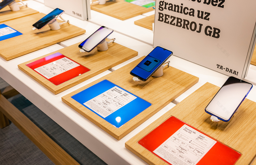
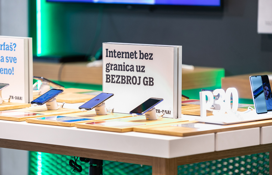
The design of the furniture uses neutral and warm materials, and combines the white colour and oak wood veneer. A visually clear and minimalist space is an ideal basis for the new Tele2 graphic identity, which is equally clear and direct in transmitting messages. This visual and spatial concept raises the experience of the space and the recognition of Tele2 identity, the movement of customers is maximally facilitated, and the offer in the store is accessible for the customers, as well as the brand itself.
客服
消息
收藏
下载
最近


